
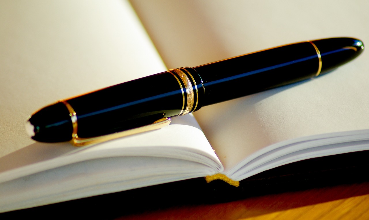
Mastering the Use of Pen and Ink in Your Drawings
Are you ready to dive into the fascinating world of pen and ink drawing? Whether you're a budding artist or a seasoned pro, mastering this timeless medium can open up a realm of creative possibilities. The beauty of pen and ink lies not only in its simplicity but also in its capacity for depth, texture, and expression. In this article, we'll explore various techniques, tips, and tools that will help you effectively harness the power of pen and ink in your artwork.
First things first, let's talk about the essentials. Understanding the fundamental aspects of pen and ink is crucial for creating successful drawings. This means familiarizing yourself with the different types of pens, inks, and papers available. Each element plays a significant role in the final outcome of your artwork. For instance, did you know that the type of ink you use can dramatically affect the way your lines appear? Some inks are more fluid and allow for smoother strokes, while others can provide a more textured finish. Choosing the right combination will set the stage for your artistic journey.
Now, let’s take a moment to consider the various techniques that can elevate your line work. Line work is a critical component of pen and ink drawing, and mastering it can significantly enhance your artistic expression. Techniques like hatching, cross-hatching, and stippling can help you create different line qualities that add interest and dimension to your work. Imagine using hatching to create the illusion of light and shadow, or stippling to build texture in a landscape scene. The possibilities are endless!
Speaking of texture, have you ever thought about how lines can be used to create a sense of depth in your drawings? By varying the thickness and spacing of your lines, you can produce a range of textures that draw the viewer's eye and add complexity to your work. For instance, closely spaced lines can suggest shadow, while wider gaps can indicate light. This interplay between light and dark is a powerful tool in your artistic arsenal.
As we delve deeper into techniques, let’s not forget about the role of color. While pen and ink drawings are often monochrome, incorporating color can elevate your work to new heights. Techniques such as watercolor washes or colored ink can add vibrancy without overpowering the intricate details of your pen work. Just imagine the impact of a subtle wash of color behind a detailed ink drawing—it can transform your piece from ordinary to extraordinary!
However, the journey doesn't stop at technique; the choice of paper is equally important. The type of paper you use can significantly affect your pen and ink drawings. Textured papers can enhance the tactile quality of your lines, while smooth papers allow for cleaner, more precise strokes. Understanding the differences between these paper types will help you select the best surface for your unique style. For instance, if you’re working on detailed illustrations, a smooth paper might be your best bet, whereas a textured paper could be ideal for expressive sketches.
Additionally, paper weight plays a crucial role in how ink is absorbed and how your final piece looks. Heavier papers tend to absorb ink differently than lighter ones, which can influence the overall appearance of your artwork. Always consider the weight of the paper in relation to the techniques you plan to use. It’s like choosing the right canvas for a painting—a critical step that can make or break your artistic vision.
But let’s not forget, even experienced artists can stumble into common pitfalls when working with pen and ink. Overworking your lines can lead to muddied details and a loss of clarity. Knowing when to stop is just as important as knowing how to start. Similarly, neglecting composition can result in an unbalanced piece that fails to engage the viewer. Planning your composition ahead of time ensures that your artwork flows naturally and captures attention.
In conclusion, mastering the use of pen and ink in your drawings is a rewarding endeavor that requires practice, patience, and a bit of experimentation. By understanding the basics, honing your techniques, choosing the right materials, and avoiding common mistakes, you can create stunning artworks that truly reflect your unique artistic voice.
- What type of pen is best for beginners? A good starting point is a fine-tipped gel pen or a fountain pen, as they offer smooth ink flow and control.
- Can I use colored ink with my pen drawings? Absolutely! Just be mindful of how it interacts with your ink work.
- Is it necessary to use special paper for pen and ink? While you can use regular paper, using paper designed for ink can enhance your results.
- How do I prevent smudging when using ink? Allow the ink to dry completely before handling the paper, and consider using fixatives if necessary.
The Basics of Pen and Ink
When it comes to mastering pen and ink drawing, getting a grip on the basics is like laying a solid foundation for a house. Without it, everything else might just come crashing down! So, let’s dive into the essential components that every artist should know before they start creating their masterpieces.
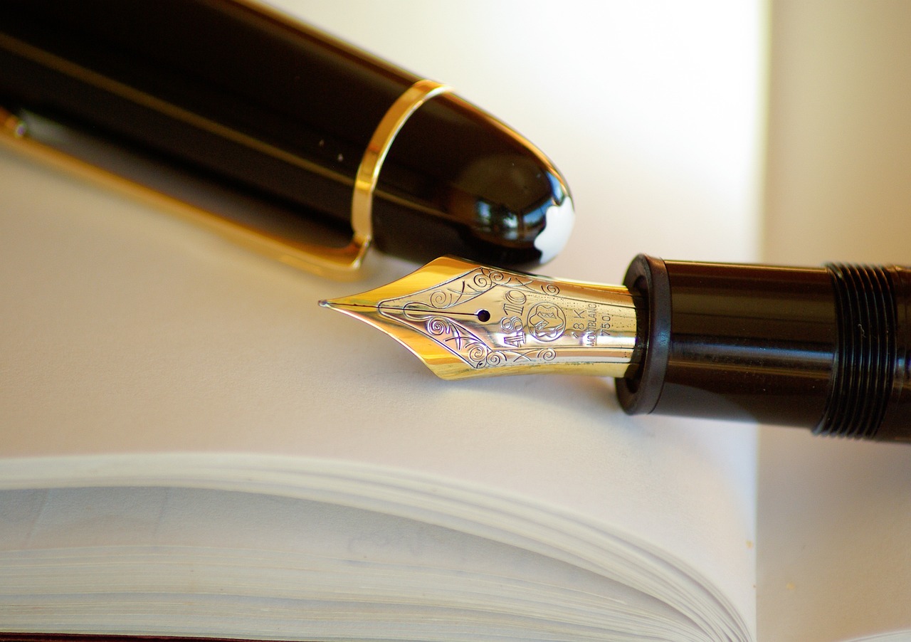
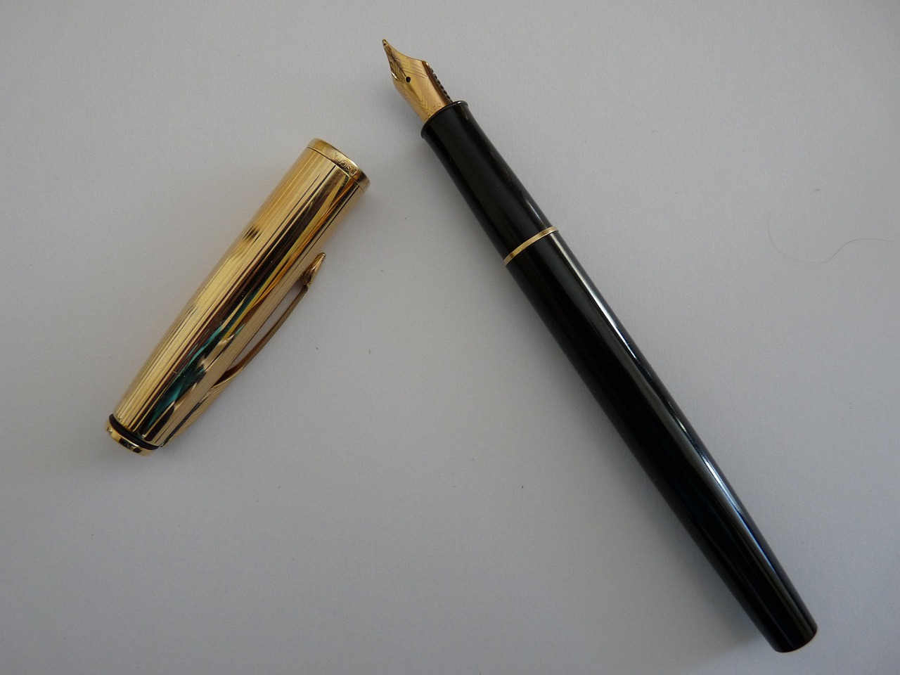
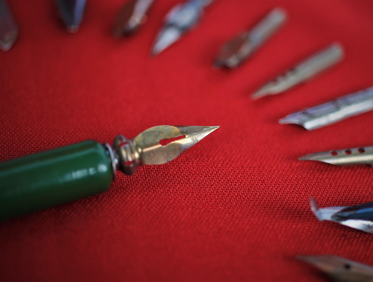
First off, let's talk about the types of pens. There are various options available, each offering a unique experience. For instance, fountain pens allow for a smooth flow of ink and can create beautiful, varied line widths. Technical pens, on the other hand, provide precision and consistency, making them ideal for detailed work. And let's not forget about brush pens, which can add a dynamic flair to your drawings with their flexible tips.
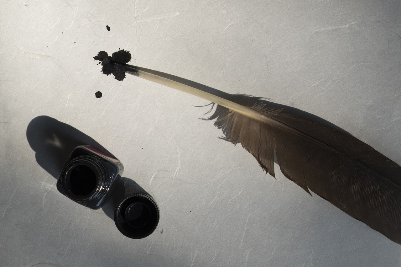
Next, we have inks. The choice of ink can dramatically influence the final result. You’ll find India ink is a favorite among many artists due to its deep, rich black color and permanence. If you’re feeling adventurous, try out colored inks or even water-soluble inks, which can add a splash of creativity to your work. Remember, the ink you choose will interact with your pen and paper, so don’t rush this decision!
Speaking of paper, the type of paper you use is crucial. Not all paper is created equal, and the right choice can enhance your artwork significantly. For instance, cold-pressed watercolor paper has a textured surface that can capture ink beautifully, while smooth Bristol board is fantastic for fine details. Understanding how different papers react with ink will save you from potential headaches in the future.
In summary, grasping the basics of pen and ink involves understanding the tools at your disposal. By choosing the right pens, inks, and papers, you set yourself up for success. So, before you start sketching, take the time to explore these fundamentals. They’re the building blocks that will elevate your art from ordinary to extraordinary!
- What type of ink is best for beginners? India ink is a great choice due to its versatility and permanence.
- Can I use regular printer paper for pen and ink? While you can, it’s better to use paper specifically designed for ink to avoid bleeding and smudging.
- How do I clean my pens? Depending on the type of pen, you can use warm water or specific cleaning solutions to keep them in top shape.
Techniques for Line Work
When it comes to pen and ink drawing, mastering line work is absolutely essential. Think of it as the backbone of your artwork; without strong lines, your piece can feel flat and lifeless. There are various techniques that you can employ to create different qualities of lines, each adding its own unique flair to your drawings. From hatching to stippling, each method serves a distinct purpose, allowing you to express yourself more effectively.
One of the most fundamental techniques is hatching. This involves drawing closely spaced parallel lines to create shading and texture. The closer the lines are, the darker the area appears, and vice versa. Hatching is like building a house; the more layers of lines you add, the sturdier and more complex the structure becomes. You can also experiment with the angle of your lines to see how it affects the overall appearance. For instance, lines drawn at different angles can create a sense of movement or depth.
Next up is cross-hatching, which takes hatching to the next level. By layering lines in different directions, you can achieve a richer texture and more nuanced shading. Imagine cross-hatching as weaving a tapestry; each layer adds depth and complexity, creating a more vibrant final product. It’s a fantastic way to depict shadows and highlights, making your drawings pop off the page. You can practice this technique by starting with simple shapes and gradually adding layers until you feel comfortable with the amount of detail.
Another technique to consider is stippling, which involves creating texture through tiny dots. It’s almost like a dance; the placement and density of the dots can create rhythm in your artwork. Stippling can be time-consuming but incredibly rewarding, as it allows for a delicate and intricate finish. You can use stippling to emphasize certain areas or to create a gradient effect, giving your work a unique touch. The beauty of stippling lies in its versatility; whether you’re creating a soft shadow or a bold focal point, this technique can do it all.
To further enhance your line work, you might want to explore line variation. This means altering the thickness and darkness of your lines to create emphasis and interest. Think of it as using a paintbrush; a thick stroke can draw attention, while a thin line can add subtlety. By varying your lines, you can guide the viewer's eye through your artwork, making it a more engaging experience. Consider using different types of pens or nibs to achieve this variation; a fine-tipped pen can create delicate details, while a broader nib can deliver bold statements.
Incorporating these techniques into your practice will not only enhance your skills but also give your artwork a distinctive voice. Whether you’re sketching a simple still life or working on a complex scene, mastering line work is key to capturing the essence of your subject. So grab your pens, experiment with these techniques, and watch as your drawings come to life!
- What type of pen is best for line work? It depends on your style! Fine-tipped pens are great for detailed work, while brush pens can create varied line widths.
- How can I practice line techniques effectively? Start with simple shapes and gradually introduce more complexity. Consistent practice will help you develop your skills.
- Can I combine different line techniques in one drawing? Absolutely! Mixing techniques like hatching and stippling can create stunning effects and add depth to your artwork.
Creating Texture with Lines
When it comes to pen and ink drawing, creating texture is like adding a secret ingredient to a recipe—it can transform a simple dish into a culinary masterpiece. Using lines to generate texture is an essential skill that can elevate your artwork to new heights. Think of lines as the brushstrokes of a painter; they can convey emotion, depth, and even movement. So, how do you master this technique? Let’s dive in!
One of the most effective ways to create texture is through the use of various line techniques. Here are some methods you can experiment with:
- Hatching: This technique involves drawing closely spaced parallel lines. The closer the lines are, the darker the area appears, which can simulate shadows or depth.
- Cross-Hatching: By layering lines in different directions, you can create a more complex texture. This method is particularly useful for rendering three-dimensional forms.
- Stippling: Instead of lines, this technique uses dots to create texture. The density of the dots can suggest light and shadow, making it a unique way to add depth.
Imagine you’re drawing a fluffy animal. By using hatching to indicate the shadowy areas and stippling for the lighter parts, you can create a realistic fur texture that practically leaps off the page. The interplay of these line techniques allows you to manipulate the viewer's perception, guiding their eyes across the drawing and enhancing the overall experience.
Another important aspect of creating texture with lines is understanding the pressure you apply to your pen. A light touch can create delicate, soft lines, while a firmer grip can produce bold, striking marks. This variation in line weight is crucial for adding interest and complexity to your artwork. Consider experimenting with different pens, as some may offer more flexibility in line quality than others.
As you practice these techniques, remember that patience is key. Developing a keen sense for how lines interact and create texture takes time. Try to embrace the process and allow yourself to make mistakes; they can often lead to unexpected and delightful results. You might find that the accidental smudge can add a touch of character to your piece!
Lastly, don't hesitate to combine these techniques. Mixing hatching with stippling or cross-hatching can yield fascinating results and truly unique textures. Your creativity is your only limit! So grab your pen, experiment with different line techniques, and watch as your drawings come to life with texture.
Q: What is the best pen to use for creating textures?
A: The best pen often depends on personal preference, but fine-liners and brush pens are popular choices for their versatility in line quality.
Q: Can I use colored ink for texture?
A: Absolutely! While traditional pen and ink drawings are typically monochrome, adding color can enhance texture and bring your artwork to another level.
Q: How do I know when to stop adding texture?
A: A good rule of thumb is to step back and view your work from a distance. If the texture enhances the overall composition without overwhelming it, you’re on the right track!
Using Hatching for Shading
When it comes to adding depth and dimension to your pen and ink drawings, hatching is a technique that can truly transform your artwork. Essentially, hatching involves drawing closely spaced parallel lines to create the illusion of shading. The closer the lines are to each other, the darker the area appears. This technique is not just about filling in shadows; it’s about understanding light and how it interacts with surfaces. Imagine sunlight filtering through leaves, casting intricate patterns on the ground. That’s the kind of effect you can achieve with hatching!
To get started with hatching, it’s essential to consider the direction of your lines. Depending on the form of the object you’re drawing, you might want to angle your lines differently. For instance, when shading a round object like a sphere, you would typically follow the curvature of the shape. This mimics how light wraps around the surface, giving your drawing a more realistic feel. On the other hand, if you’re working on a flat surface, straight lines might be more appropriate.
Another aspect to keep in mind is the pressure you apply while drawing. Varying your pressure can create a range of tonal values, which is crucial for achieving a realistic shading effect. Light pressure results in finer, lighter lines, while applying more pressure yields darker, bolder lines. This technique can be particularly effective in creating a gradient effect, where one area transitions smoothly into another. Experimenting with different pressures will help you find your unique style and voice in your artwork.
Here’s a quick table to summarize the key elements of effective hatching:
| Technique | Description |
|---|---|
| Direction | Align lines according to the object's form. |
| Line Spacing | Closer lines create darker areas; wider spacing results in lighter areas. |
| Pressure | Vary pressure for different tonal values. |
As you practice hatching, don’t hesitate to explore various line weights and styles. You can even mix hatching with other techniques like stippling or cross-hatching to add complexity and richness to your shading. Remember, art is about exploration and expressing yourself. The more you play with these techniques, the more you’ll discover what works best for you. So grab your pen, put on some music, and let your creativity flow!
- What is the difference between hatching and cross-hatching?
Hatching uses parallel lines to create shading, while cross-hatching involves layering lines in different directions to build up darker areas and texture. - Can I use hatching with colored ink?
Absolutely! Hatching can be effectively used with colored inks to create vibrant and dynamic artwork. - How do I know when to stop hatching?
It’s essential to step back and assess your work periodically. If you feel the shading looks too dark or overwhelming, it might be time to stop and let the ink dry.

Cross-Hatching Techniques
Cross-hatching is more than just a technique; it's a powerful tool that can transform your pen and ink drawings from simple sketches into intricate masterpieces. At its core, cross-hatching involves layering lines in various directions to create depth, texture, and shading. The beauty of cross-hatching lies in its versatility—whether you’re aiming for a soft gradient or a bold contrast, this technique can help you achieve your desired effect.
To get started with cross-hatching, it’s important to understand the basic principles. First, consider the direction of your lines. By varying the angles and spacing of the lines, you can manipulate the perception of light and shadow in your artwork. For instance, closely spaced lines can create a darker area, while more widely spaced lines can suggest lighter tones. This is akin to how clouds block sunlight; the closer they are together, the darker the shadow they cast.
One of the most effective ways to practice cross-hatching is by using a simple grid method. Start with a basic shape, like a sphere or cube, and apply cross-hatching in different sections. This exercise will not only help you understand how to build up tones but also train your hand to maintain consistency in line quality. Remember, the goal is to create a smooth transition between light and dark, so be patient as you layer your lines.
Another important aspect of cross-hatching is the pressure you apply with your pen. Varying your pressure can add even more dimension to your work. Light pressure will yield finer lines, while heavier pressure will produce bolder strokes. This dynamic can evoke different emotions and atmospheres in your drawings. For example, a light touch can suggest delicacy, while a heavy hand can convey strength.
As you become more comfortable with cross-hatching, experiment with different line weights and styles. Try using a combination of straight and curved lines to create more organic forms. You might find that adding some wavy lines within your cross-hatching can introduce a sense of movement, much like the ripples in water. This technique can breathe life into your drawings, making them more engaging and dynamic.
For those who want to push the boundaries of cross-hatching, consider incorporating color into your work. While traditional cross-hatching is monochromatic, adding a splash of color can enhance the visual impact of your piece. Just be cautious not to overpower the delicate interplay of lines; the color should complement rather than overshadow the intricate details of your cross-hatching.
In summary, mastering cross-hatching techniques requires practice and experimentation. By understanding the relationship between line direction, pressure, and weight, you can create stunning visual effects in your pen and ink drawings. So grab your pens, find a comfortable spot, and start layering those lines. You might just surprise yourself with what you can create!
- What is the best pen to use for cross-hatching?
While you can use any pen, fine-tipped pens like Microns or gel pens are popular for their precision. - How do I know when to stop cross-hatching?
It's essential to step back and assess your work frequently. If the lines start to look muddied or lose definition, it may be time to stop. - Can I use colored ink for cross-hatching?
Absolutely! Colored inks can add a beautiful dimension to your work, just be sure to balance it with the black ink to maintain contrast.
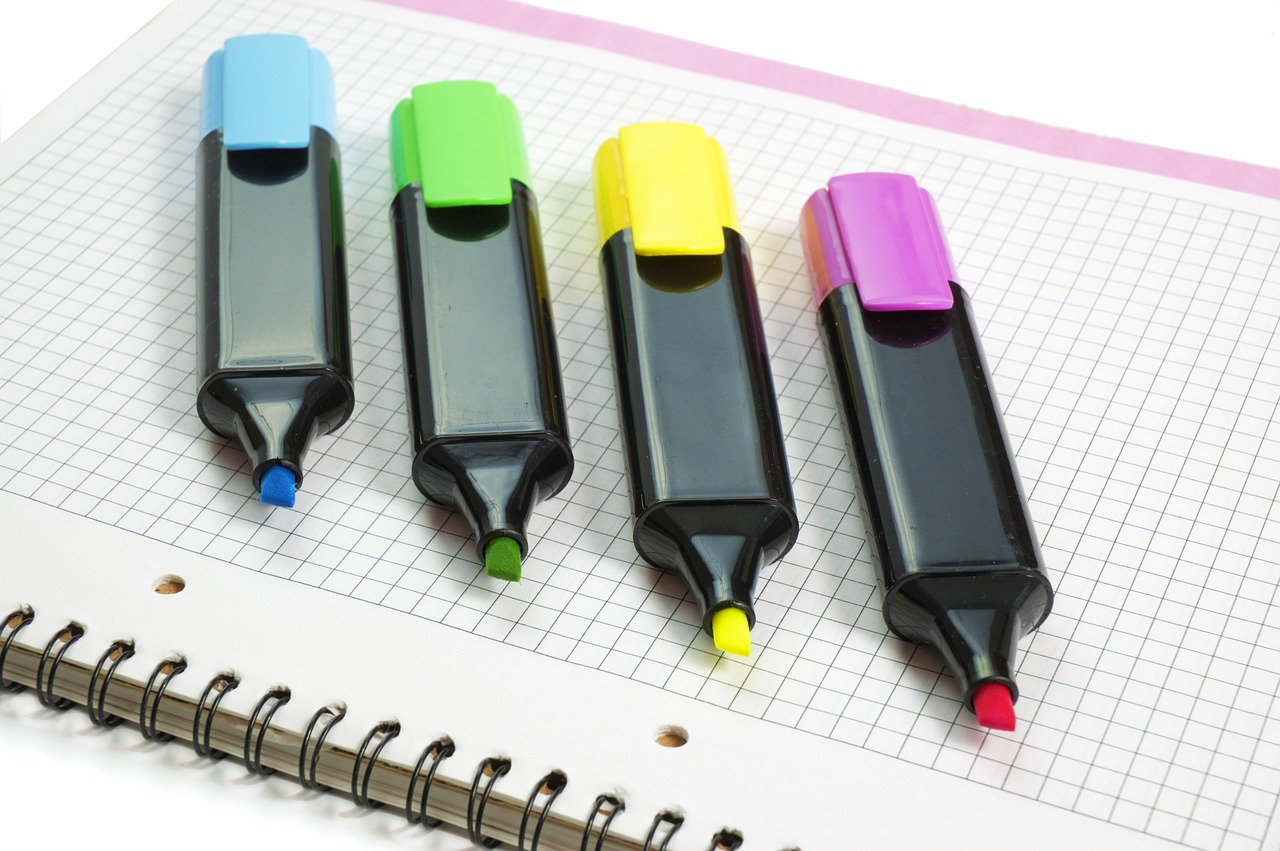
Incorporating Color with Ink
When it comes to pen and ink drawing, the traditional approach often leans towards a monochrome palette, creating stunning works that rely solely on the interplay of black ink against white paper. However, adding color can breathe new life into your creations, transforming them from simple sketches into vibrant masterpieces. But how do you incorporate color without overshadowing the intricate details of your ink work? The answer lies in a delicate balance and a few key techniques.
One effective method is to use watercolor washes. This technique allows you to apply a light layer of color over your ink drawing, enhancing it while maintaining the integrity of the lines. Start by ensuring your ink is dry; otherwise, you risk smudging your work. Then, using a soft brush, gently apply a diluted wash of watercolor. This way, the ink remains the focal point, while the color adds a subtle depth to your artwork.
Another approach is to utilize colored inks. These inks come in a variety of shades and can be applied directly with pens or brushes. The key is to choose colors that complement the ink lines you've created. For instance, if your drawing features intricate hatching, consider using a contrasting color to highlight certain areas. This not only draws the viewer's eye but also emphasizes the texture and depth of your lines.
Here’s a quick breakdown of popular methods for incorporating color:
- Watercolor Washes: Lightly applied layers of color that enhance without overpowering.
- Colored Inks: Direct application of colored inks can create vibrant, eye-catching effects.
- Colored Pencils: Adding color with colored pencils allows for fine control and blending.
Lastly, don't underestimate the power of digital tools. If you're comfortable with technology, scanning your ink drawings and using software like Photoshop or Procreate can open up a world of color possibilities. You can experiment with different palettes, adjust hues, and layer colors until you find the perfect combination that complements your ink work.
Incorporating color into your pen and ink drawings is all about experimentation and finding what works best for your style. Whether you choose to stick with traditional methods or embrace modern technology, the goal is to enhance your artwork while preserving the striking beauty of your ink lines. So grab your pens, your colors, and let your creativity flow!
Q: Can I use markers instead of pens for ink drawings?
A: Absolutely! Markers can provide a different texture and finish. Just make sure they are archival quality to prevent fading.
Q: How do I prevent my ink from smudging when adding color?
A: Ensure your ink is completely dry before applying any color. You can also use a fixative spray to set the ink.
Q: What type of paper is best for colored ink work?
A: Look for heavyweight, smooth paper that can handle both ink and watercolor without warping.
Choosing the Right Paper
When it comes to pen and ink drawing, the choice of paper is not just a trivial decision; it can make or break your artwork. Think of paper as the canvas for your creativity. Just like a painter chooses their canvas based on the paint they use, you should select your paper based on the type of ink and the effects you want to achieve. The right paper can enhance the depth and vibrancy of your lines, while the wrong one can lead to smudging or bleeding. So, what should you consider when choosing paper for your pen and ink drawings?
First and foremost, it's essential to understand the different types of paper available. Generally, artists gravitate towards two main categories: textured and smooth paper. Each type has its unique characteristics and can yield different results in your artwork. Textured paper, for instance, can add a tactile quality to your lines, enhancing the overall visual appeal. On the other hand, smooth paper allows for cleaner, sharper lines, which can be particularly beneficial for detailed work.
Here’s a quick overview of the pros and cons of each type:
| Type of Paper | Pros | Cons |
|---|---|---|
| Textured Paper |
|
|
| Smooth Paper |
|
|
Another crucial factor to consider is the weight of the paper. Paper weight is typically measured in grams per square meter (gsm), and it significantly influences how ink interacts with the surface. Heavier paper (usually above 200 gsm) is excellent for pen and ink as it prevents warping and allows for multiple ink applications without bleeding through. Conversely, lighter papers may buckle or bleed, leading to frustration during your creative process.
Moreover, ink absorption is another aspect that can’t be overlooked. Different papers absorb ink at varying rates, which can affect the final appearance of your work. If you’re using a wet ink, such as India ink, opting for a paper that can handle heavy applications without feathering is essential. Conversely, if you prefer a lighter touch, a smoother paper might be more appropriate.
In summary, choosing the right paper is a blend of personal preference and practical considerations. Experimenting with different types and weights can help you discover what works best for your unique style. Don't hesitate to try out various combinations until you find that perfect match that makes your pen and ink drawings come alive!
- What type of paper is best for beginners? For beginners, smooth, medium-weight paper (around 180-200 gsm) is often recommended as it allows for easy handling and consistent results.
- Can I use regular printer paper for pen and ink? While you can use regular printer paper, it may not hold up well to heavy ink applications and could lead to bleeding or tearing.
- How do I prevent ink from bleeding through the paper? To prevent bleeding, choose heavier paper and test your ink on a small area first to see how it absorbs.
Textured vs. Smooth Paper
When it comes to pen and ink drawing, the type of paper you choose can make or break your artwork. Think of paper as the canvas for your creativity; it can either enhance your vision or hinder it. There are two primary types of paper that artists often debate over: textured and smooth. Each has its own unique characteristics that cater to different styles and techniques, so understanding the differences is essential for making an informed choice.
Textured paper is often favored for its ability to hold ink in a way that creates depth and character. The raised surfaces of the paper catch the ink, allowing for interesting variations in line quality. This can add a dynamic feel to your work, making it visually engaging. Artists who enjoy a more organic look tend to gravitate toward textured paper, as it complements techniques like hatching and stippling beautifully. However, it’s important to note that the uneven surface can sometimes lead to unpredictable results, especially if you’re aiming for precision.
On the other hand, smooth paper is the go-to choice for artists seeking crisp, clean lines. This type of paper allows for greater control over ink application and is ideal for detailed work. If you’re working on intricate designs or fine illustrations, smooth paper will enable you to achieve the precision you desire. However, it may not absorb ink as well as textured paper, which can lead to some ink pooling if you’re not careful. Smooth paper is particularly popular among artists who favor techniques that require a steady hand and a meticulous approach.
To help you visualize the differences, here’s a quick comparison table:
| Feature | Textured Paper | Smooth Paper |
|---|---|---|
| Line Quality | Varied and dynamic | Crisp and clean |
| Ink Absorption | Holds ink well | May pool if overused |
| Best For | Organic styles, hatching, stippling | Detailed work, fine illustrations |
| Control | Less control | More control |
Ultimately, the choice between textured and smooth paper boils down to personal preference and the specific requirements of your project. It’s worth experimenting with both types to see which one resonates with your artistic style. After all, art is about exploration and finding what works best for you. So grab some samples, try out different techniques, and discover how each paper type influences your pen and ink drawings!
- Can I use textured paper for detailed work?
Yes, but it may require more practice to achieve the precision you want. - What type of ink works best on smooth paper?
Most inks will work, but waterproof inks are recommended to prevent smudging. - How do I choose the right paper weight?
Consider the type of ink and techniques you plan to use; heavier paper is generally better for wet inks.
Paper Weight and Ink Absorption
When it comes to creating stunning pen and ink drawings, the weight of the paper you choose plays a pivotal role in the final outcome of your artwork. Paper weight is measured in grams per square meter (gsm), and this measurement directly affects how the paper interacts with ink. Heavier papers, usually above 200 gsm, tend to absorb ink differently than lighter papers, which can lead to varying results in terms of line quality and shading. For instance, a heavier paper can handle more ink without warping, allowing for richer, deeper tones, while lighter papers may buckle or bleed if too much ink is applied.
Moreover, the absorption properties of the paper also matter. Some papers are designed to absorb ink quickly, which can be beneficial for achieving sharp lines, but might not allow for much blending or layering. On the other hand, papers with slower absorption rates give artists more time to manipulate the ink before it dries, which can be advantageous for techniques like hatching or stippling. Understanding these characteristics helps you select the right paper for your specific style and technique.
To give you a clearer picture, here's a simple table comparing different paper weights and their absorption characteristics:
| Paper Weight (gsm) | Absorption Rate | Best For |
|---|---|---|
| 190-200 | Moderate | General drawing, light washes |
| 200-300 | High | Detailed line work, shading |
| 300+ | Very High | Heavy ink applications, mixed media |
Choosing the right paper weight is crucial, but it doesn’t have to be daunting. Think of it like selecting the right canvas for a painting. Just as a painter wouldn’t use a flimsy canvas for a heavy oil painting, an artist should avoid using light paper for intricate pen and ink work. Experimenting with different weights can lead to surprising discoveries about your personal style and preferences. So, don’t hesitate to try out various options until you find the perfect match for your artistic vision!
- What is the best paper weight for beginners? Generally, a weight between 200-300 gsm is recommended for beginners, as it provides a good balance between absorption and durability.
- Can I use regular printer paper for pen and ink drawings? While you can use printer paper, it's not ideal as it may not absorb ink well and can lead to bleeding or smudging.
- How do I know if my paper is suitable for ink? Look for papers labeled as "ink-friendly" or "watercolor paper," which are designed to handle various ink applications.
Common Mistakes to Avoid
When diving into the world of pen and ink drawing, even seasoned artists can find themselves stumbling over some common pitfalls. It's almost like stepping into a minefield; one wrong move could lead to a disaster that wrecks your masterpiece! So, what are these mistakes, and how can you steer clear of them? Let’s break it down.
One of the most prevalent mistakes is overworking your lines. Picture this: you're meticulously adding detail to your drawing, and suddenly, you realize that those once crisp lines are now muddied and indistinct. It's easy to get carried away, but knowing when to stop is crucial. Each line should contribute something meaningful to your artwork. If you find yourself constantly going back to tweak and adjust, take a step back. Sometimes, less truly is more. A fresh perspective can help you see the beauty in the simplicity of your work.
Another common error is neglecting composition. Think of composition as the backbone of your artwork; without it, everything can feel disjointed. Before you even pick up your pen, take a moment to plan out your composition. Ask yourself questions like, "What story am I trying to tell?" or "How do I want the viewer's eye to move across the page?" A well-composed piece not only looks appealing but also engages the viewer, drawing them into your creation. Spend some time sketching out thumbnails or using a grid system to map out your design. Trust me, your future self will thank you!
Additionally, many artists overlook the importance of ink selection. Not all inks are created equal, and using the wrong type can lead to disastrous results. For example, if you're working on a piece that requires fine details, a heavy-bodied ink might not be the best choice. Instead, opt for a lighter, more fluid ink that allows for precision. On the flip side, if you're going for bold, dramatic lines, a thicker ink could be your best friend. Experimenting with different inks can open up a world of possibilities for your artwork.
Lastly, let’s not forget about the significance of paper choice. The surface you draw on can dramatically affect your final piece. Using a paper that’s too smooth might not hold the ink as well, leading to unexpected bleeding or feathering. Conversely, overly textured paper can disrupt your line work. It's essential to find a balance that suits your style. Consider creating a small test piece on different types of paper to see how your ink behaves. This simple step can save you a lot of frustration down the line.
In summary, avoiding these common mistakes can significantly enhance your pen and ink drawing experience. By being mindful of overworking your lines, planning your composition, selecting the right ink, and choosing suitable paper, you’ll be well on your way to creating stunning works of art. Remember, every artist makes mistakes; the key is to learn from them and keep improving. Now, let’s dive into some frequently asked questions that might help clarify any lingering doubts!
- What type of pen is best for beginners? For beginners, a simple fineliner or a gel pen offers great control and precision.
- Can I use watercolor with pen and ink? Absolutely! Just ensure your ink is waterproof so it doesn't bleed when wet.
- How do I clean my pens? Cleaning your pens regularly with water and a soft cloth can help maintain their longevity.
Overworking Your Lines
When diving into the world of pen and ink drawing, one of the most common pitfalls that artists encounter is the tendency to overwork their lines. It's like trying to polish a diamond until it loses its sparkle; too much attention can lead to muddied results that detract from the original beauty of your piece. So, how do you know when enough is enough? The key lies in developing an intuitive understanding of your work and recognizing the signs that indicate you should step back.
Overworking occurs when you continuously add more ink or detail to an area, thinking that it will improve your drawing. Instead, it can lead to a loss of clarity and definition, making your lines appear heavy and lifeless. Imagine a beautiful melody being played on a piano; if you keep pressing the keys without pause, the music becomes a cacophony rather than a harmonious tune. Similarly, in your artwork, too many strokes can create confusion rather than clarity.
To avoid overworking your lines, consider the following strategies:
- Step Back Regularly: Periodically take a step back from your work. This will give you a fresh perspective and help you see areas that may need less intervention.
- Trust Your Initial Instincts: Often, the first strokes you lay down are the most instinctual and expressive. Trust that initial vision and resist the urge to over-embellish.
- Practice Restraint: Challenge yourself to limit the number of strokes in a particular area. This can help you focus on quality over quantity, leading to cleaner, more effective line work.
Furthermore, it's important to remember that less is often more in art. A few well-placed lines can convey depth and emotion more effectively than a flurry of strokes. Think of it like seasoning a dish; too much salt can overpower the flavors, while just the right amount enhances the overall experience. By keeping your line work intentional and purposeful, you can maintain the integrity of your drawing while still achieving the desired impact.
Ultimately, learning to recognize when to stop is a skill that develops over time. With practice and patience, you'll find a balance that allows your artistic voice to shine through without the noise of overworked lines. So next time you pick up your pen, remember: sometimes, the most powerful statement comes from knowing when to let go.
Q1: What are the signs that I've overworked my lines?
A1: Signs of overworked lines include muddiness, loss of detail, and a heavy appearance of the lines. If your drawing looks less vibrant than it did initially, you may have overworked it.
Q2: How can I practice restraint in my line work?
A2: You can practice restraint by setting a limit on the number of strokes you allow yourself in a specific area and by consciously stepping back to evaluate your work regularly.
Q3: Is it possible to fix overworked areas in my drawing?
A3: While it can be challenging, you can attempt to lighten overworked areas with careful erasing or by overlaying lighter ink washes. However, prevention is often the best strategy.

Neglecting Composition
When it comes to pen and ink drawing, composition is often the unsung hero. Many artists dive headfirst into their work, fueled by inspiration, only to realize later that their piece lacks a cohesive structure. Imagine building a house without a blueprint; it might look great in parts, but the overall design could be a disaster. Composition is your blueprint, guiding the viewer's eye and creating a sense of balance and harmony in your artwork.
One common mistake is failing to plan your layout. Before you even touch your pen to paper, take a moment to visualize how you want your drawing to unfold. Consider the following elements:
- Focal Point: What do you want the viewer to notice first? Make sure this element stands out.
- Balance: Distribute visual weight evenly across your drawing. Too much detail on one side can make the piece feel lopsided.
- Flow: Guide the viewer's eye through the artwork. Use lines and shapes to create a natural path for them to follow.
Another pitfall is neglecting the rule of thirds. This classic guideline suggests dividing your canvas into a 3x3 grid and placing key elements along these lines or at their intersections. This technique can create a more dynamic and engaging composition, making your artwork feel alive. Think of it as a way to add a little spice to your drawing, rather than having everything centered like a plain old boiled potato!
Moreover, consider the negative space in your drawing. This refers to the areas around and between the subjects. A well-thought-out use of negative space can enhance the overall composition, adding depth and intrigue. It’s like the silence in a song; it’s just as important as the notes themselves. If you ignore this aspect, you might find your drawing feeling cramped or cluttered, which is the last thing you want.
In conclusion, composition is not just an afterthought; it’s the backbone of your artwork. Take the time to plan, experiment, and refine your layout before diving into the details. Your pen and ink drawings will thank you for it, and your audience will be captivated by the balance and harmony that a well-composed piece can bring.
Q: What is composition in art?
A: Composition refers to the arrangement of elements within a work of art. It involves how different components like lines, shapes, and colors interact to create a cohesive whole.
Q: Why is composition important in pen and ink drawing?
A: Good composition helps to guide the viewer's eye, creates balance, and enhances the overall impact of the artwork. Without it, a drawing can feel disorganized or chaotic.
Q: How can I improve my composition skills?
A: Practice sketching using the rule of thirds, experiment with different layouts, and study the compositions of artists you admire. Over time, you'll develop a stronger sense of what works.
Q: Is it necessary to plan my composition before starting?
A: While some artists thrive on spontaneity, having a plan can significantly improve the quality of your work. It allows you to visualize the final piece and make adjustments as needed.
Frequently Asked Questions
- What type of pen is best for beginners?
For beginners, a good starting point is a fine-tipped gel pen or a technical pen. These pens offer precision and control, making them perfect for practicing different line techniques without the frustration of ink flow issues.
- Can I use any type of ink with my pen?
Not all inks are created equal! It's essential to use ink that is compatible with your pen. For example, fountain pens require liquid ink, while many drawing pens use pigment-based inks that dry quickly and resist smudging.
- How do I choose the right paper for pen and ink drawing?
Choosing the right paper can make a significant difference in your artwork. Look for paper that is smooth if you want clean lines, or textured for more depth and character. Also, consider the weight of the paper; heavier paper absorbs ink better and reduces bleed-through.
- What are some common mistakes to avoid when using pen and ink?
Some common pitfalls include overworking your lines, which can lead to muddiness, and neglecting composition, which can result in unbalanced artwork. Always remember to step back and assess your work periodically!
- How can I create texture in my drawings?
Texture can be achieved through various line techniques like hatching and stippling. Experiment with different pressures and angles to see how they affect the appearance of your lines and add depth to your artwork.
- Is it possible to add color to pen and ink drawings?
Absolutely! Adding color can enhance your pen and ink drawings. Just be cautious not to overpower the ink. You can use colored pencils or watercolors to subtly integrate color while maintaining the integrity of your ink lines.


