
A Complete Breakdown of Painting Composition
Welcome to the fascinating world of painting composition, where every brushstroke and color choice tells a story! This article explores the essential elements of painting composition, providing insights into techniques and principles that enhance visual storytelling and artistic expression. Whether you're a seasoned artist or a curious beginner, understanding composition is crucial to elevating your artwork. Think of composition as the backbone of your painting; without it, your work may lack the structure and impact needed to captivate an audience.
So, what exactly is composition? It's the arrangement of visual elements in a painting, and it plays a pivotal role in how viewers perceive and emotionally respond to your artwork. Imagine walking into a gallery filled with various paintings; some grab your attention immediately, while others fade into the background. This is where the magic of composition comes into play! By mastering the principles of composition, you can guide the viewer's eye, evoke emotions, and create a narrative that resonates long after they've left the room.
Throughout this article, we will break down the key elements of composition, including line, shape, color, texture, balance, symmetry, focal points, and hierarchy. Each of these components contributes uniquely to the overall effectiveness of your painting. For instance, using strong lines can create a sense of movement, while a well-thought-out color palette can set the mood and tone. As we dive deeper into each of these elements, you'll discover practical techniques and tips that can help you make informed decisions in your artistic journey.
In addition to exploring each element, we'll also touch on the importance of balance and symmetry, which are vital for creating harmony in your artwork. Whether you prefer an asymmetrical approach that feels more dynamic or a symmetrical one that exudes stability, understanding how to implement these concepts will enhance your compositions significantly. And let's not forget about focal points and hierarchy! Establishing a clear focal point allows viewers to know precisely where to look, while a well-defined hierarchy organizes elements to tell a more compelling story.
By the end of this article, you'll be equipped with a comprehensive understanding of painting composition, ready to apply these principles to your own work. So grab your brushes, and let's embark on this creative journey together!
- What is the most important aspect of painting composition? While many aspects are crucial, the balance between elements often stands out as a key factor that can make or break a composition.
- How can I improve my painting composition skills? Practice is essential! Study the work of other artists, experiment with different compositions, and seek feedback from peers.
- Is there a right or wrong way to compose a painting? Art is subjective, and while there are guidelines, ultimately, your creativity and vision should lead your composition choices.
Understanding Composition
Composition is the backbone of any painting, serving as the framework that holds all visual elements together. Think of it as the blueprint of a house; without a solid structure, everything else falls apart. In the world of art, composition refers to the arrangement of various components—like line, shape, color, and texture—to create a cohesive and engaging piece. It’s not just about where to place things; it’s about how those placements influence the viewer’s experience and emotional response. Imagine walking into a gallery and being immediately drawn to a particular painting; that’s the power of effective composition at work.
The significance of composition cannot be overstated. It affects how we perceive the artwork and can evoke a wide range of emotions. For example, a chaotic composition might create feelings of tension or excitement, while a balanced composition can evoke calmness and stability. This emotional connection is what makes art so compelling. When we understand composition, we gain the ability to tell stories visually, guiding the viewer through the narrative we wish to convey.
Moreover, composition is not a one-size-fits-all approach. It varies across different styles and cultures, and it evolves with trends in the art world. Artists often experiment with composition to challenge norms and push boundaries. For instance, consider the difference between classical and modern art. While classical compositions often adhere to strict rules of balance and symmetry, modern art may embrace asymmetry and chaos to provoke thought and discussion. Understanding these nuances can enhance your artistic expression and allow for greater creativity.
In essence, mastering composition is like learning the rules of a game before you start playing. Once you know the rules, you can break them creatively to produce unique and impactful artwork. So, whether you’re a seasoned artist or a beginner, take the time to explore the principles of composition. It will not only improve your skills but also deepen your appreciation for the art around you.
Elements of Composition
When you dive into the world of painting, the are like the building blocks of your artistic vision. Understanding these elements is crucial because they not only define the structure of your artwork but also influence how viewers perceive and emotionally respond to it. Each element contributes to the overall harmony and effectiveness of the piece, making it essential for artists to master them. So, let's break down these key components: line, shape, color, and texture.
The first element, line, serves as the invisible thread that connects various aspects of a painting. Lines can be straight, curved, thick, or thin, and they guide the viewer’s eye through the artwork. Think of lines as the pathways in a map; they can lead you to a destination or create a sense of movement. For example, a diagonal line might evoke a feeling of action or dynamism, while horizontal lines can impart a sense of calm and stability.
Next up is shape. Shapes are the forms that make up the visual elements of your painting. They can be geometric, like squares and circles, or organic, resembling the irregular forms found in nature. The shapes you choose can create a sense of balance or tension within the composition. For instance, a large, bold shape can dominate the canvas, while smaller shapes can create intricate patterns that draw the viewer in. The interplay of shapes can evoke emotions, tell stories, and even create rhythm within the artwork.
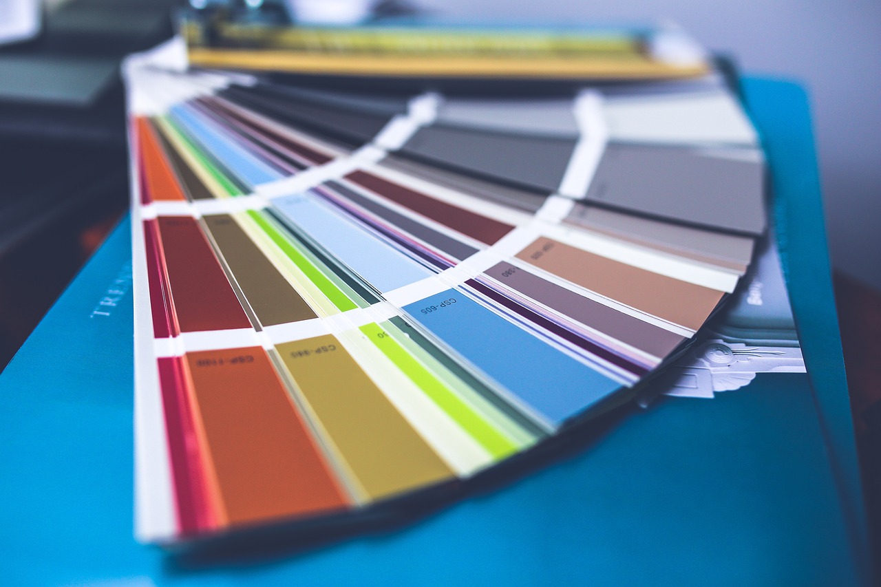
Now, let’s talk about color. Color is perhaps the most expressive element of composition. It has the power to evoke feelings and set the mood of a painting. The right color palette can make your artwork feel warm and inviting or cool and distant. Understanding color theory—how colors interact, contrast, and complement each other—is essential for creating a visually appealing composition. For example, using complementary colors can create vibrant contrasts, while analogous colors can provide harmony and unity.
Finally, we have texture. Texture adds depth and interest to a painting, making it more engaging for the viewer. It can be actual (tactile) or implied (visual). Actual texture involves the physical surface of the painting, while implied texture is created through techniques like brushwork or layering. By incorporating different textures, you can enhance the sensory experience of your artwork, inviting viewers to not only see but also feel the piece.
To summarize, the elements of composition—line, shape, color, and texture—are essential tools for any artist. Mastering these elements allows you to create compelling and dynamic compositions that resonate with your audience. Remember, each element plays a unique role, and when combined thoughtfully, they can transform a simple painting into a captivating visual narrative.
- What is the most important element of composition? Each element plays a vital role, but many artists consider line to be foundational as it guides the viewer's eye.
- How can I improve my understanding of color theory? Experiment with different color palettes and study the works of master artists to see how they use color.
- Is texture necessary in painting? While not mandatory, texture can significantly enhance the viewer's experience and add depth to your artwork.

Line and Movement
When we think about art, one of the first things that comes to mind is the line. It's the backbone of any painting, acting like a roadmap that guides the viewer’s eye through the artwork. Imagine you’re on a road trip; the lines on the map direct your journey, just as the lines in a painting lead your gaze. They create a sense of movement, drawing you into the artist's world and making you feel the emotions they intended to convey. Lines can be bold and dramatic, or soft and subtle, but their role in establishing movement is undeniably crucial.
There are various types of lines, each eliciting different responses from the viewer. For instance, horizontal lines can evoke feelings of calmness and stability, reminiscent of a serene horizon. In contrast, vertical lines often suggest strength and growth, reaching upward like a skyscraper or a tree. Meanwhile, diagonal lines create a sense of action and dynamism, as if something is in motion or about to happen. Understanding these distinctions can significantly enhance your composition, allowing you to manipulate emotions through your choice of lines.
But how do we create movement with lines? It’s all about placement and direction. For example, if you position a diagonal line from the bottom left to the top right of your canvas, it can create a sense of upward motion, suggesting aspiration or excitement. Conversely, a line that moves downward might evoke feelings of sadness or decline. By strategically placing lines, you can orchestrate a visual dance that captivates your audience and keeps them engaged. Think of it like a conductor guiding an orchestra; every line plays a part in the symphony of your painting.
Moreover, it’s not just about the lines themselves but also how they interact with other elements in your composition. For instance, combining lines with color and texture can create even more dynamic effects. A jagged, dark line against a bright background can create tension, while smooth, flowing lines can evoke tranquility. The interplay between these elements can transform a simple painting into a complex narrative, inviting viewers to explore deeper meanings and emotions.
In conclusion, mastering the use of lines and movement in your artwork is essential for effective composition. By understanding how different types of lines influence viewer perception and emotional response, you can create paintings that are not just visually appealing but also rich in storytelling. So the next time you pick up a brush, remember: every line you draw has the power to take your audience on a journey, guiding them through the landscape of your imagination.
- What is the role of lines in painting composition? Lines serve as guides that lead the viewer's eye and create movement within the artwork.
- How do different types of lines affect emotions? Horizontal lines evoke calmness, vertical lines suggest strength, and diagonal lines create a sense of action.
- Can lines work with other elements in a painting? Absolutely! Lines can interact with color and texture to enhance the overall dynamic of the composition.
- What techniques can I use to create movement in my paintings? Consider the placement and direction of your lines, as well as their interaction with other elements to guide the viewer's experience.
Types of Lines
When we think about the visual language of art, lines are the foundational elements that shape our perception and emotional response. Just like words in a sentence, lines convey meaning and can guide the viewer through the narrative of a painting. There are several types of lines, each with its own unique character and emotional resonance. Understanding these can significantly enhance your artistic compositions. Let's dive into the primary types of lines and how they function within a painting.
Horizontal lines are often associated with calmness and tranquility. Imagine a serene landscape where the horizon stretches across the canvas; these lines create a sense of stability, evoking feelings of peace and relaxation. In contrast, vertical lines convey a sense of strength and growth. Think of a towering tree or a skyscraper; these lines can inspire feelings of aspiration and elevation. They draw the viewer's eye upward, creating a sense of dynamism and potential.
Now, let's not forget about diagonal lines. These lines are the rebels of the bunch! They introduce a sense of movement and energy, suggesting action and excitement. Picture a racing car speeding across a track; the diagonal lines in the composition create a visual path that suggests motion. This can lead to a sense of urgency or tension in the artwork, making it more engaging for the viewer.
Additionally, there are curved lines, which bring a different flavor to compositions. These lines can evoke feelings of softness and fluidity, often seen in natural forms such as waves or the contours of the human body. They guide the viewer's eye in a gentle, flowing manner, creating a sense of harmony and balance within the composition.
To summarize, here’s a quick overview of the main types of lines and their emotional implications:
| Type of Line | Emotional Impact | Common Usage |
|---|---|---|
| Horizontal | Calmness, Stability | Landscapes, Horizons |
| Vertical | Strength, Growth | Buildings, Trees |
| Diagonal | Movement, Energy | Action Scenes, Dynamic Compositions |
| Curved | Softness, Fluidity | Natural Forms, Organic Shapes |
By mastering the use of these various types of lines, artists can create compositions that not only capture attention but also convey profound emotions and stories. Whether you are creating a peaceful landscape or a dynamic action scene, the lines you choose to incorporate will play a crucial role in how your artwork is perceived. So, the next time you pick up your brush, consider the power of lines and how they can transform your painting into a compelling visual narrative.
- What is the importance of line in painting? Lines are essential in guiding the viewer's eye and conveying emotions, making them fundamental to effective composition.
- How can I use lines to create movement in my artwork? By strategically placing diagonal lines, you can suggest action and energy, drawing the viewer into the scene.
- Are there any rules for using lines in composition? While there are no strict rules, understanding the emotional impact of different types of lines will help you make more informed artistic choices.
Creating Movement
Creating movement in a painting is like orchestrating a dance; it guides the viewer's eye through the artwork, making the experience dynamic and engaging. Just as a choreographer uses various techniques to lead dancers across a stage, artists can use lines, shapes, and colors to create pathways for the viewer's gaze. Movement doesn’t just happen randomly; it’s a deliberate strategy that can evoke emotions and tell a story. Imagine standing in front of a painting where your eyes are drawn from one element to another, like a flowing river guiding you through a lush landscape. That’s the power of movement!
One effective way to create movement is through the strategic placement of lines. For instance, diagonal lines can suggest action and energy, while curved lines can convey a sense of grace and fluidity. Think about how a winding road leads you on a journey; similarly, lines in your painting can lead the viewer's eye from one point to another. By incorporating various types of lines, you can manipulate the viewer's experience, making them feel as though they are part of the scene. Here are some types of lines to consider:
- Diagonal Lines: These lines create a sense of tension and excitement, often suggesting movement and direction.
- Curved Lines: They evoke a sense of softness and flow, guiding the viewer gently through the composition.
- Horizontal Lines: These lines can create a feeling of stability and calm, grounding the viewer in the scene.
- Vertical Lines: They often suggest strength and height, drawing the viewer's attention upward.
Additionally, consider the use of color to enhance movement. Warm colors, like reds and yellows, can create a sense of urgency and action, while cool colors can provide a calming effect. This interplay of color can be used to direct attention and create a rhythm within the artwork. For example, a bright red object placed strategically in a predominantly cool-toned painting will naturally draw the viewer's eye, creating a focal point that feels alive and vibrant.
Moreover, the arrangement of shapes can also contribute to the sense of movement in a painting. Overlapping shapes can create depth and a sense of progression, much like layers in a story. When shapes are placed in a way that suggests motion, it can feel as if the painting is alive, inviting the viewer to explore every corner. Think of it as setting up a visual journey; each shape and line is a stepping stone leading the viewer deeper into the narrative of your artwork.
Finally, don’t overlook the importance of negative space. The areas around and between the subject matter can also guide movement. By leaving certain areas open, you can create a contrast that emphasizes the elements you want to highlight. This technique allows the viewer to breathe and gives them a moment to pause before moving on to the next point of interest. Just like a well-placed pause in music can enhance a melody, well-considered negative space can elevate your painting.
In conclusion, creating movement in your artwork is a multifaceted approach that combines lines, colors, shapes, and negative space. By thoughtfully arranging these elements, you can craft a visual experience that captivates and engages your audience, making them feel as if they are part of the story you are telling. So, the next time you pick up a brush, remember: you’re not just creating a static image; you’re inviting viewers on a journey through your imagination.
Color Theory in Composition
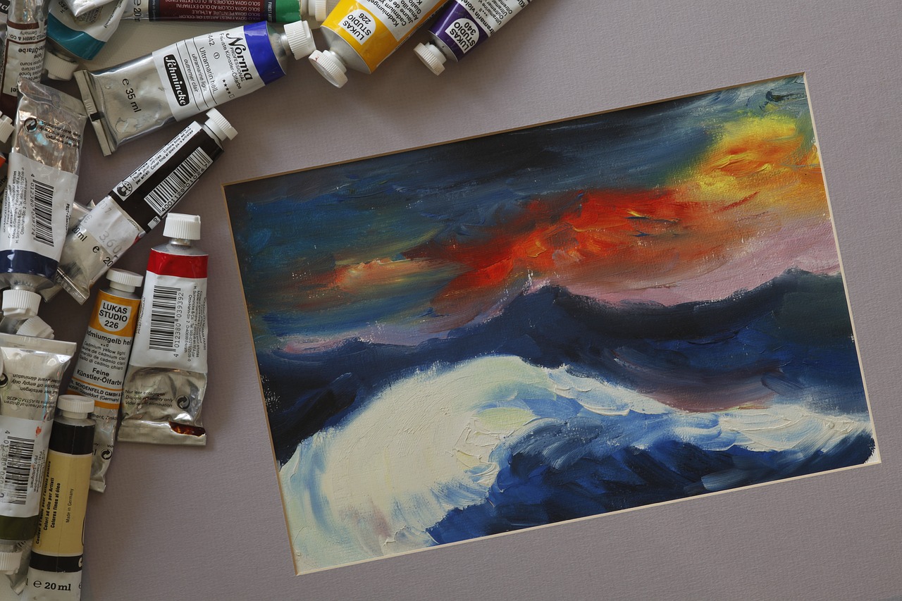
Color is not just a visual delight; it’s a powerful tool that can evoke emotions, set the mood, and guide the viewer's perception in a painting. Think of color as the heartbeat of your artwork—each hue pulsating with its own unique energy. Understanding color theory is essential for any artist looking to enhance their composition and create a compelling visual narrative. So, how does color influence a painting's composition? Let's dive into the vibrant world of color theory!
At its core, color theory revolves around the color wheel, which categorizes colors into primary, secondary, and tertiary hues. The primary colors—red, blue, and yellow—are the building blocks of all other colors. By mixing these, artists create secondary colors like green, orange, and purple. Tertiary colors emerge from mixing a primary color with a secondary color. This interconnectedness of colors is crucial in developing harmony and contrast within a painting.
When incorporating color into your composition, consider the emotional responses different colors can evoke. For instance:
- Red: Passion, energy, and urgency
- Blue: Calmness, trust, and serenity
- Yellow: Happiness, optimism, and warmth
- Green: Nature, growth, and tranquility
- Purple: Creativity, luxury, and spirituality
Utilizing these emotional triggers can transform your artwork from a simple depiction into a profound statement. For example, if you're painting a sunset, incorporating rich oranges and deep purples can evoke a sense of peace and beauty, while sharp reds could convey a feeling of intensity or drama. The choice of color palette can drastically alter the viewer's experience, making it essential to think critically about your selections.
Moreover, color harmony plays a vital role in composition. Artists often employ various color schemes to create balance and unity. Some popular schemes include:
| Color Scheme | Description |
|---|---|
| Complementary | Colors opposite each other on the color wheel (e.g., blue and orange) that create high contrast and vibrant compositions. |
| Analogous | Colors next to each other on the wheel (e.g., blue, blue-green, and green) that produce serene and comfortable designs. |
| Triadic | Three colors evenly spaced on the wheel (e.g., red, yellow, and blue) that offer a vibrant yet balanced composition. |
Each of these schemes serves a different purpose and can be used to achieve various effects in your artwork. For instance, a complementary color scheme can create a striking visual impact, drawing the viewer's attention immediately to focal points, while an analogous scheme can provide a more soothing and cohesive feel.
In addition to harmony, understanding the concept of color temperature is crucial. Colors can be categorized as warm (reds, oranges, yellows) or cool (blues, greens, purples). Warm colors tend to advance in a composition, making objects appear closer, while cool colors recede, creating depth. This interplay can be manipulated to guide the viewer's eye through the painting, establishing a sense of movement and perspective.
Ultimately, mastering color theory in composition is about experimentation and intuition. Don’t be afraid to play with colors, break the rules, and find your unique voice. Every brushstroke is an opportunity to express your artistic vision, so embrace the chaos and let your colors sing!
- What is the importance of color in painting? Color can evoke emotions, create depth, and guide the viewer's attention, making it a critical element of composition.
- How can I create a harmonious color palette? Use the color wheel to explore complementary, analogous, and triadic color schemes to achieve balance and unity in your artwork.
- What are warm and cool colors? Warm colors (reds, oranges, yellows) tend to advance in a composition, while cool colors (blues, greens, purples) recede, affecting depth perception.
Balance and Symmetry
When it comes to painting, achieving a sense of balance and symmetry is not just a choice; it's an essential aspect that can make or break your artwork. Think of balance as the foundation of a house; without it, everything can crumble. Balance in a painting refers to the distribution of visual weight, while symmetry relates to the arrangement of elements in a way that creates harmony and proportion. Together, they work to create a cohesive look that draws viewers in and keeps their eyes moving across the canvas.
There are various types of balance that artists can employ, each serving a different purpose and evoking unique feelings. For instance, symmetrical balance involves mirroring elements on either side of a central axis, creating a sense of order and formality. This type of balance can be likened to the calmness of a still lake, where everything is perfectly reflected. On the other hand, asymmetrical balance allows for a more dynamic composition, where different elements hold visual weight without being identical. Picture this as a lively dance, where each dancer moves independently yet harmoniously.
To illustrate these concepts further, consider the following table that outlines the different types of balance:
| Type of Balance | Description | Emotional Impact |
|---|---|---|
| Symmetrical Balance | Elements are evenly distributed around a central point. | Creates a feeling of stability and formality. |
| Asymmetrical Balance | Uneven distribution of elements that still achieves balance. | Conveys energy and movement, often more engaging. |
| Radial Balance | Elements radiate from a central point, like the spokes of a wheel. | Creates a sense of unity and connection. |
Incorporating symmetry into your artwork can be a powerful tool for creating a sense of order. For example, if you're painting a landscape, placing a large tree in the center flanked by smaller trees on either side can create a pleasing visual effect. It’s like arranging furniture in a room; when things are balanced, it feels inviting and comfortable. However, don't shy away from asymmetry! This technique can add excitement and intrigue, making the viewer's eye dance across the canvas. Imagine a bustling cityscape, where buildings of various heights and shapes create a vibrant and lively scene.
Ultimately, the key to mastering balance and symmetry lies in practice and observation. Spend time studying how other artists use these principles in their work. Notice how they create focal points through balance and how the overall composition feels. The more you understand these concepts, the more effectively you can apply them to your own paintings, transforming your artistic expression into a captivating visual narrative.
- What is the difference between balance and symmetry in painting? Balance refers to the distribution of visual weight in a composition, while symmetry specifically involves mirroring elements around a central point.
- Can a painting have both symmetrical and asymmetrical balance? Absolutely! A skilled artist can incorporate both types of balance to create a more dynamic and interesting composition.
- How do I determine the right type of balance for my artwork? Consider the mood and message you want to convey. Symmetrical balance is great for formal subjects, while asymmetrical balance can add energy and movement.

Types of Balance
When it comes to painting composition, understanding the is essential for creating a visually appealing and harmonious artwork. Balance refers to the distribution of visual weight in a painting, and it can significantly affect how the viewer perceives the piece. There are three primary types of balance that artists often utilize: asymmetrical balance, symmetrical balance, and radial balance. Each type has its own unique characteristics and emotional impacts, making it crucial for artists to choose the right one based on the message they wish to convey.
Asymmetrical balance involves arranging elements of different visual weights in a way that still creates a sense of equilibrium. This type of balance often feels more dynamic and interesting, as it can evoke a sense of movement or tension. For example, placing a large dark object on one side of the canvas can be countered by several smaller, lighter objects on the opposite side. This creates a visual pull that keeps the viewer engaged. Asymmetrical balance is often used in modern and abstract art, where the goal is to challenge traditional views of composition.
On the other hand, symmetrical balance is achieved when elements are evenly distributed around a central axis. This type of balance often evokes feelings of stability and order, making it a popular choice for classical and traditional artworks. For instance, consider a landscape painting where trees are mirrored on either side of a river. This creates a sense of harmony and calm, drawing the viewer in with its predictability and balance. Symmetrical balance can be particularly effective in portraits or religious artworks, where the intention is to convey a sense of dignity and respect.
Lastly, we have radial balance, where elements radiate out from a central point. This type of balance creates a sense of movement and energy, drawing the viewer's eye towards the center of the composition. Think of a sunflower or a mandala; the design naturally leads your gaze outward, creating a feeling of expansion. Radial balance is often used in designs and patterns, but it can also be effectively incorporated into paintings to create focal points that captivate the audience.
In conclusion, understanding the different types of balance in painting composition allows artists to convey emotions and messages effectively. Whether you choose asymmetrical, symmetrical, or radial balance, each type serves a purpose and can profoundly influence the viewer's experience. By experimenting with these balances, you can create artworks that not only appeal visually but also resonate on a deeper level.
- What is the importance of balance in painting?
Balance is crucial in painting as it helps create harmony and guides the viewer's eye, making the artwork more engaging. - Can I mix different types of balance in one painting?
Absolutely! Mixing different types of balance can create a more dynamic and interesting composition. - How do I know which type of balance to use?
Consider the message you want to convey. Use symmetrical balance for stability, asymmetrical for dynamism, and radial for energy.
Using Symmetry
Symmetry in painting is like the calm after a storm; it brings a sense of order and predictability to the chaos of creativity. When you think about symmetry, imagine a perfectly balanced scale. On one side, you have a vibrant burst of color, and on the other, a complementary hue that balances it out. This visual equilibrium can evoke feelings of stability and harmony, making your artwork more inviting and easier to engage with. But how do you effectively incorporate symmetry into your paintings?
First, it's essential to understand that there are different types of symmetry you can use in your work. The most common forms are vertical symmetry, horizontal symmetry, and radial symmetry. Each type serves a unique purpose and can dramatically change the viewer's experience. For example, vertical symmetry often conveys a sense of strength and power, while horizontal symmetry can evoke calmness and tranquility. Radial symmetry, on the other hand, draws the viewer's eye towards the center, creating a focal point that can be incredibly captivating.
To implement symmetry effectively, consider the following techniques:
- Divide Your Canvas: Imagine your canvas as a grid. By dividing it into equal sections, you can strategically place elements to achieve balance.
- Mirroring Elements: Use similar shapes or colors on either side of a central axis. This mirroring effect can create a cohesive look that feels intentional.
- Color Balance: Pair bold colors with softer tones across your composition. This contrast can enhance the symmetry while keeping the viewer's interest piqued.
However, it’s important to remember that too much symmetry can sometimes lead to a sense of monotony. Just like a well-composed piece of music, a painting needs some variation to keep it engaging. Consider introducing asymmetrical elements to break the pattern while still maintaining a harmonious feel. For example, you might have a symmetrical arrangement of trees on either side of a path, but add an unexpected splash of color from a flower bed on one side. This creates a visual tension that invites the viewer to explore the piece further.
Ultimately, using symmetry in your paintings is about finding the right balance between order and creativity. It’s like walking a tightrope; too much on one side can lead to a fall, while too little can leave you unsteady. By mastering the art of symmetry, you can create compositions that not only draw the viewer in but also leave a lasting impression. So, the next time you pick up your brush, think about how symmetry can enhance your storytelling and elevate your artistic expression.
Q: What is the difference between symmetrical and asymmetrical balance?
A: Symmetrical balance involves mirroring elements on either side of a central axis, creating a sense of stability. Asymmetrical balance, however, involves using different elements that have equal visual weight to create a more dynamic and interesting composition.
Q: Can I use symmetry in abstract paintings?
A: Absolutely! Symmetry can be effectively used in abstract art to create a sense of harmony and balance, even when the elements are non-representational.
Q: How do I know if my painting is too symmetrical?
A: If your painting feels static or lacks interest, it might be too symmetrical. Introducing slight asymmetrical elements can help create a more engaging composition.
Focal Points and Hierarchy
When it comes to painting, focal points serve as the stars of the show. They are the areas in a composition that draw the viewer's attention first, acting like a magnet for the eyes. Imagine walking into a gallery and being instantly captivated by a vibrant red apple in an otherwise muted landscape. That apple is the focal point, and it creates a sense of drama and interest within the piece. Establishing a strong focal point is crucial because it helps to guide the viewer's gaze and sets the tone for the entire artwork.
But how do you create a focal point? There are several techniques artists can use to achieve this effect. One method is to utilize contrast; for instance, placing a brightly colored object against a dark background can make it pop. Additionally, you can draw attention through size—a larger element will naturally attract more attention than smaller ones. Another effective technique is to use line and shape to lead the viewer’s eye toward the focal point. Think of it as creating a visual pathway that guides the viewer from one element to another.
Now, let's talk about hierarchy. Hierarchy is all about organizing the elements within your composition in a way that makes sense. It helps to prioritize what the viewer should notice first, second, and so on. Imagine a newspaper article; the headline grabs your attention, the subheadings provide additional information, and the body text conveys the details. Similarly, in a painting, you want to establish a clear order of importance among the various elements. This can be achieved through size, color, and placement.
For example, the main subject of your painting should be the largest and most vibrant element, while supporting details can be smaller and more subdued. This creates a natural flow that guides the viewer through the artwork, allowing them to appreciate each component without feeling overwhelmed. A well-established hierarchy not only enhances the visual storytelling but also provides clarity, making it easier for the viewer to engage with your work.
To illustrate this concept better, consider the following table that outlines the relationship between focal points and hierarchy:
| Element | Role in Composition | Techniques to Enhance |
|---|---|---|
| Focal Point | Attracts viewer's attention | Contrast, Size, Line |
| Secondary Elements | Support the focal point | Subdued Colors, Smaller Size |
| Background | Provides context | Muted Tones, Less Detail |
In conclusion, mastering focal points and hierarchy is essential for any artist looking to enhance their painting composition. By effectively guiding the viewer's attention and establishing a clear order of importance, you can create a more engaging and impactful piece of art. So next time you pick up your brush, remember the power of a well-placed focal point and a thoughtfully organized hierarchy!
- What is a focal point in painting? A focal point is the area of a painting that attracts the viewer's attention first, often created through contrast, size, or placement.
- How can I create a focal point? You can create a focal point by using contrasting colors, varying sizes, and leading lines to direct the viewer's gaze.
- What is hierarchy in art? Hierarchy refers to the organization of elements in a composition, indicating which parts are most important and should be noticed first.
- Why is hierarchy important in painting? Hierarchy helps create a visual flow, guiding the viewer through the artwork and enhancing the storytelling aspect of the piece.
Creating Focal Points
When it comes to painting, is like giving your audience a roadmap; it guides their eyes to the most important aspects of your artwork. Think of a focal point as the main character in a story—without it, the narrative feels flat and unengaging. A well-defined focal point not only captures attention but also tells a story, drawing the viewer deeper into the visual experience. So, how do you create these captivating focal points in your paintings? Let's dive into some techniques that can elevate your work.
One effective method is to use contrast. By placing a bright color against a muted background, you create a visual tug-of-war that forces the viewer to look at the brighter area first. For example, imagine a vibrant red apple sitting on a dull gray table; the apple becomes the star of the show. This technique can be applied not just with color but also with texture. A smooth surface next to a rough one can create a striking difference that highlights your focal point.
Another way to establish focal points is through size and scale. Larger elements naturally draw more attention than smaller ones. If you want a particular feature in your painting to stand out, consider making it larger than the surrounding elements. For instance, if you're painting a landscape, a gigantic tree can serve as a focal point amidst smaller bushes and flowers. This method not only emphasizes the focal point but also creates a sense of depth in your composition.
Additionally, the placement of your focal point is crucial. The rule of thirds is a popular guideline in art and photography that suggests dividing your canvas into a 3x3 grid. By positioning your focal point at one of the intersections, you can create a more dynamic and engaging composition. Instead of placing your focal point smack dab in the center, which can feel static, try positioning it off-center for a more interesting visual flow.
Finally, consider using lines to lead the viewer's eye toward your focal point. Lines can be literal, like a path winding through a landscape, or they can be implied through the arrangement of elements. For example, a series of diagonal lines can create movement that guides the viewer's gaze directly to the focal area. Think of it as a visual pathway that invites the viewer to explore the painting further.
In summary, creating focal points is all about strategic choices. By utilizing contrast, size, placement, and leading lines, you can craft a captivating narrative that engages your audience. Remember, your focal point is the heart of your painting; it deserves the spotlight!
- What is a focal point in painting? A focal point is the area in a painting that draws the viewer's attention, serving as the main subject or area of interest.
- How do I create a focal point? You can create a focal point through contrast, size, placement, and leading lines, among other techniques.
- Can I have more than one focal point? Yes, but be cautious! Multiple focal points can create a busy composition. Make sure they work together harmoniously.
- What is the rule of thirds? The rule of thirds is a composition guideline that suggests dividing your canvas into a 3x3 grid and placing focal points at the intersections for a more dynamic layout.
Establishing Hierarchy
Establishing hierarchy in your painting is like creating a roadmap for your viewers; it guides them through the visual journey you’ve crafted. Just as a good story has a clear beginning, middle, and end, a well-composed painting should lead the eye from one element to another in a deliberate manner. This is crucial because without a clear hierarchy, your artwork may feel chaotic, leaving viewers confused about where to look first. So, how do you create this sense of order? Let's dive into some techniques that can help you prioritize visual elements effectively.
One of the primary ways to establish hierarchy is through the use of size and scale. Larger elements naturally draw more attention than smaller ones, so consider making your focal point significantly bigger than other components in your painting. For instance, if you’re depicting a landscape, a towering mountain or a grand tree can serve as a stunning focal point, overshadowing smaller details like bushes or rocks. This technique not only emphasizes the importance of the larger element but also creates a visual anchor for the viewer's eye.
Another effective method is through contrast. By juxtaposing lighter elements against darker backgrounds, or vibrant colors against muted tones, you can create a striking visual impact. Imagine a bright red apple sitting on a dark wooden table; the apple immediately draws the eye, making it the star of the show. In your compositions, think about how you can use contrast to highlight essential features while subtly downplaying others.
Additionally, consider the placement of elements within the composition. The rule of thirds is a popular guideline that suggests dividing your canvas into a 3x3 grid and placing key elements along these lines or at their intersections. This technique not only creates a natural flow but also helps in establishing a hierarchy that feels balanced and engaging. For example, placing your focal point at one of these intersections can create a sense of tension and interest, compelling the viewer to explore the surrounding elements.
Furthermore, repetition can also play a significant role in establishing hierarchy. By repeating certain shapes, colors, or patterns throughout your painting, you can create a rhythm that leads the viewer’s eye across the canvas. For example, if you have a series of trees, varying their height while keeping their color consistent can guide the viewer's gaze from one tree to the next, creating a sense of movement and continuity.
In summary, establishing hierarchy is about making choices that inform the viewer's experience. By manipulating size, contrast, placement, and repetition, you can create a cohesive narrative within your painting. Remember, the goal is to lead your audience through your artwork, allowing them to appreciate each element while understanding its significance in the overall composition. So, the next time you pick up a brush, think about how you can implement these techniques to enhance the storytelling aspect of your art.
- What is the importance of hierarchy in painting?
Hierarchy helps organize visual elements, guiding the viewer's eye and enhancing storytelling. - How can I create a focal point in my artwork?
Use size, contrast, and placement to draw attention to specific areas of your painting. - What techniques can I use to establish hierarchy?
Consider using size, contrast, placement, and repetition to create a visual roadmap for your viewers. - Is the rule of thirds essential for composition?
While not mandatory, the rule of thirds is a helpful guideline for creating balance and interest in your artwork.
Frequently Asked Questions
- What is painting composition?
Painting composition refers to the arrangement of visual elements within a painting. It plays a crucial role in how a viewer perceives the artwork and can significantly impact the emotional response evoked by the piece.
- Why is composition important in painting?
Composition is vital because it guides the viewer's eye and helps convey the artist's intended message. A well-composed painting can create a sense of balance, harmony, and movement, making it more engaging and visually appealing.
- What are the key elements of composition?
Key elements of composition include line, shape, color, and texture. Each of these elements contributes uniquely to the overall artwork, influencing the viewer's experience and interpretation.
- How do lines affect painting composition?
Lines are fundamental in guiding the viewer's eye and creating movement within a painting. Different types of lines—such as horizontal, vertical, or diagonal—can evoke various emotions and direct attention to specific areas of the artwork.
- What is color theory, and how does it relate to composition?
Color theory encompasses the principles of how colors interact and affect mood. In terms of composition, understanding color theory can enhance a painting's visual appeal and emotional impact, helping to create harmony and balance.
- What types of balance exist in painting composition?
There are several types of balance, including asymmetrical, symmetrical, and radial balance. Each type contributes differently to the overall composition, influencing how the viewer perceives the artwork's stability and harmony.
- How can I create focal points in my paintings?
Focal points can be created using contrast, color, or placement within the composition. By emphasizing certain elements, you can draw the viewer's attention to specific areas, enhancing the narrative and overall impact of the artwork.
- What is the significance of hierarchy in painting composition?
Hierarchy helps organize elements within a painting, guiding the viewer's focus and clarifying the story being told. By prioritizing visual elements, artists can create a more coherent and engaging composition.


