
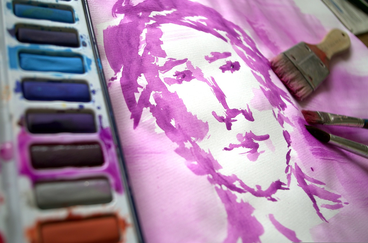
How to Paint Food: A Complete Tutorial
Have you ever gazed at a beautifully plated dish and thought, "I wish I could capture that in a painting?" Well, you're in luck! This article provides a comprehensive guide on painting food, covering techniques, materials, and tips to create realistic and appealing food art that captures the essence of your favorite dishes. Whether you're a seasoned artist or just starting out, you'll find valuable insights that will help you transform your culinary inspirations into stunning artwork. So, grab your brushes and let's dive into the delicious world of food painting!
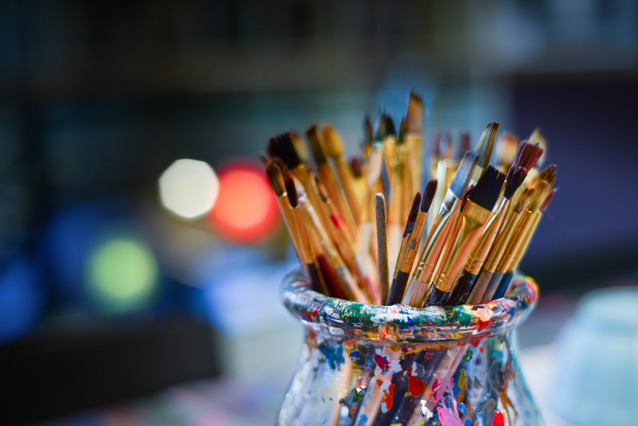
When it comes to painting food, the materials you choose can make or break your artwork. Selecting high-quality paints, brushes, and canvases is essential for achieving vibrant and realistic food paintings. Start with acrylic paints or oil paints, as both offer unique properties that can enhance your work. Acrylics dry quickly and are easy to layer, while oils provide a rich texture and longer drying time for blending. Don't forget to invest in a variety of brushes; flat brushes are great for broad strokes, while finer ones are perfect for intricate details.
Additionally, the choice of canvas can affect the final look of your painting. A textured canvas can add depth, while a smooth surface allows for finer details. To help you in your selection, here’s a quick comparison:
| Material | Characteristics | Best For |
|---|---|---|
| Acrylic Paints | Fast-drying, versatile | Layering, bold colors |
| Oil Paints | Rich texture, slow drying | Blending, detailed work |
| Canvas | Textured or smooth | Varied styles |
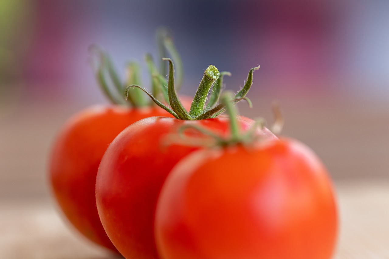
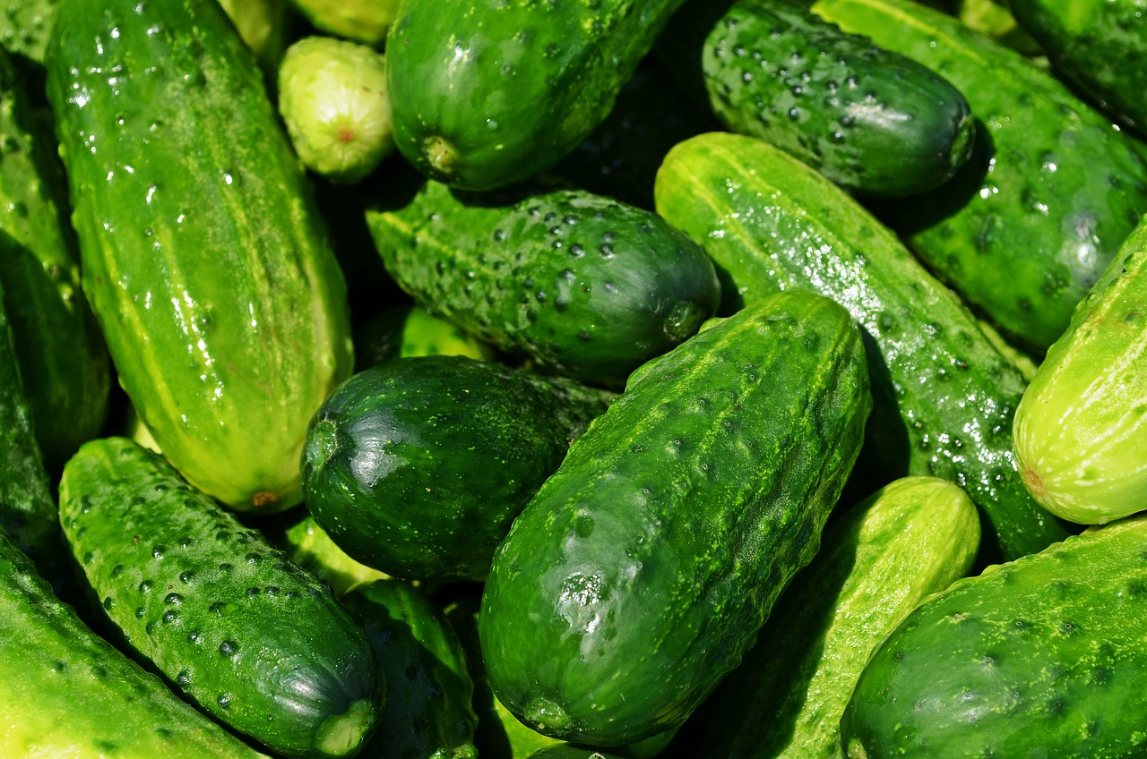
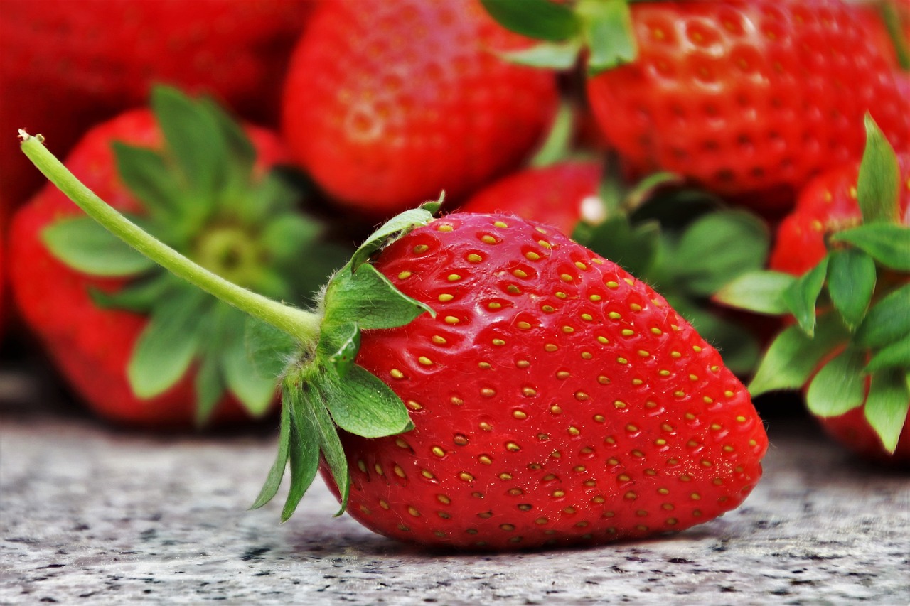
Color theory is crucial in food painting. Understanding how to mix colors effectively and choose palettes that enhance the visual appeal of your food subjects can elevate your artwork from ordinary to extraordinary. Think about the vibrant reds of ripe strawberries or the deep greens of fresh basil; these colors evoke freshness and flavor. By mastering color mixing techniques, you can replicate the true essence of the food you’re painting.
Exploring the impact of warm and cool colors can significantly affect the mood of your painting. Warm colors like reds, oranges, and yellows can make your food appear more inviting, while cool colors like blues and greens can provide a refreshing contrast. For instance, a warm yellow can make a plate of pasta look even more delicious, while a cool blue can complement the freshness of a salad. The interplay of these colors can create a dynamic visual experience.
Shadows add dimension to your food paintings. Without them, your artwork may appear flat and lifeless. Techniques for creating realistic shadows include observing how light interacts with your subject. Use a darker shade of your base color to create shadows, paying attention to where the light hits the food. This practice will enhance the three-dimensionality of your artwork, making it more lifelike.
Incorporating highlights is vital for realism. Highlights can make your food paintings pop and appear more appetizing. Use a lighter shade of your base color, or even white, to add highlights where the light naturally hits your subject. For example, a glistening cherry or a shiny apple can be brought to life with just the right amount of highlight. This technique can transform a simple painting into a mouth-watering masterpiece!
Mastering color mixing is essential for capturing the true colors of food. Blending and layering colors can help you achieve the desired effect. A common technique is to start with a base color and gradually mix in complementary colors to create depth. Remember, practice makes perfect! Don't be afraid to experiment with different combinations until you find the perfect mix that represents your subject.
Different painting techniques can dramatically affect your artwork. Essential methods like glazing, layering, and dry brushing can enhance your food paintings. Each technique offers unique benefits that contribute to the overall realism of your artwork. For instance, glazing allows you to create transparency, while layering adds intricate details. Understanding these techniques will give you the tools to create stunning food art.
Glazing allows for the creation of depth and luminosity in your paintings. By applying thin layers of transparent paint over dried layers, you can achieve a rich, glowing effect that mimics the natural shine of food. This technique is particularly effective for items like ripe fruits or glossy sauces.
Layering colors can create intricate details in food art. Build layers gradually, allowing each one to dry before adding the next. This method can help you achieve a lifelike representation of various food items, such as the delicate folds of a pastry or the distinct textures of different ingredients.
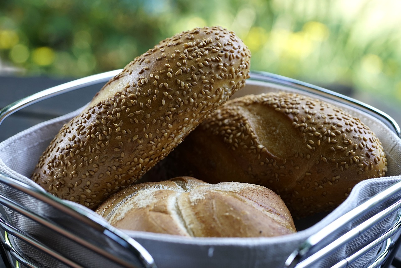
Textures play a significant role in food painting. Techniques for rendering textures like the glossiness of fruits or the roughness of bread can greatly enhance realism. Pay attention to the surface quality of the food you’re painting. Use different brush strokes and tools to mimic these textures; for instance, a sponge can create a rough surface, while a fine brush can be used for smooth finishes.
Finishing touches can elevate your food painting. Assess your work critically and make necessary adjustments to enhance the overall composition. Once satisfied, consider how to properly preserve your final piece for display. This step is crucial to ensure your artwork remains vibrant and protected over time.
Choosing the right frame can enhance your painting's presentation. Select a frame that complements the colors and style of your artwork. A simple, elegant frame can draw attention to your food painting without overwhelming it. Consider the location where you’ll display your art, as lighting and surroundings can affect how it’s perceived.
Proper preservation ensures longevity. Use varnishes or protective sprays to shield your artwork from fading and damage over time. Additionally, storing your paintings in a cool, dry place can prevent deterioration. By taking these steps, you can enjoy your food art for years to come!
Q: What type of paint is best for food painting?
A: Acrylic and oil paints are both excellent choices, depending on your preference for drying time and texture.
Q: How do I create realistic shadows?
A: Observe how light interacts with your subject and use a darker shade of your base color to create depth.
Q: Can I use any canvas for food painting?
A: Yes, but consider the texture. A smoother canvas is better for fine details, while a textured one can add depth.
Choosing the Right Materials
When it comes to painting food, the materials you choose can make all the difference between a mediocre piece and a stunning work of art. Just like a chef selects the finest ingredients to create a delicious dish, an artist must carefully select their paints, brushes, and canvases to achieve vibrant and realistic food paintings. So, what should you look for? Let's dive into the essentials!
First and foremost, the type of paint you use is crucial. Acrylics are often favored for food painting due to their quick drying time and versatility. They can mimic the glossy finish of fruits or the matte texture of bread. Alternatively, oil paints offer a rich depth of color and a slower drying time, allowing for more blending and manipulation. If you're just starting out, a basic set of acrylic paints is a fantastic choice, as they are easy to work with and clean up!
Next up, brushes! The right brushes can transform your painting experience. Here are some types you might want to consider:
- Flat Brushes: Great for broad strokes and filling in large areas.
- Round Brushes: Perfect for detail work and creating fine lines.
- Fan Brushes: Ideal for texture, such as the leafy greens or the rough surface of bread.
Now, let’s not forget about the canvas. The surface you choose can influence the final look of your painting. A stretched canvas offers a classic feel and is excellent for oils, while canvas boards are affordable and perfect for acrylics. If you want to experiment, watercolor paper can also be an interesting choice, especially if you like to play with watercolors or gouache.
Finally, always invest in a good palette. A sturdy, easy-to-clean palette allows you to mix colors without worrying about making a mess. Whether you opt for a traditional wooden palette or a modern disposable one, having a reliable mixing surface is essential for achieving those perfect hues. And remember, the right materials not only enhance your painting but also inspire creativity and confidence in your artistic journey!
Understanding Color Theory
When it comes to painting food, understanding color theory is like having a secret weapon in your artistic arsenal. Color theory is the study of how colors interact, mix, and influence each other, and it plays a crucial role in creating realistic and appealing food art. Imagine walking into a bakery; the vibrant reds of strawberries, the rich browns of chocolate, and the creamy whites of icing all work together to create a feast for the eyes. By mastering color theory, you can replicate that visual delight on your canvas.
One of the first things to grasp is how to mix colors effectively. You might be wondering, "How do I get that perfect shade of ripe tomato red?" Well, it all starts with understanding the color wheel. The color wheel is a tool that shows the relationships between different colors. It consists of primary colors (red, blue, yellow), secondary colors (green, orange, purple), and tertiary colors. By mixing these colors, you can create a wide array of hues that can make your food paintings pop.
Another essential aspect to consider is the use of color palettes. A well-chosen palette can enhance the visual appeal of your food subjects significantly. For example, a palette featuring warm colors like oranges and yellows can evoke feelings of warmth and comfort, reminiscent of a cozy kitchen. On the other hand, cool colors like blues and greens can create a sense of freshness, perfect for depicting salads or seafood. Here’s a quick comparison:
| Warm Colors | Cool Colors |
|---|---|
| Red | Blue |
| Orange | Green |
| Yellow | Purple |
Now, let’s dive deeper into the impact of warm versus cool colors. Warm colors tend to advance in a painting, making objects appear closer, while cool colors recede, giving a sense of depth. This can be particularly useful when painting food, as you can create a sense of dimension and realism. For instance, if you’re painting a bowl of spaghetti, using warm colors for the pasta can make it feel inviting, while cool colors in the background can help it stand out.
Next, let’s talk about creating depth with shadows. Shadows are not just dark patches; they are essential for adding dimension to your food paintings. By understanding where the light source is coming from, you can create realistic shadows that enhance the three-dimensionality of your artwork. Think of it this way: the way light interacts with a juicy peach can dramatically change its appearance. A well-placed shadow can make it look plump and inviting, almost as if you could reach out and take a bite.
Incorporating highlights is equally important. Highlights are the lightest parts of your painting, and they can make your food look more appetizing and lifelike. For example, when painting a shiny apple, a small white highlight can give it that luscious, just-picked look. The interplay of light and shadow is what brings your food art to life, making it not just a painting, but an enticing visual treat.
Finally, mastering color mixing techniques will allow you to capture the true colors of food. Blending and layering colors is key to achieving the desired effect. For instance, if you want to paint a slice of watermelon, you’ll need to mix shades of green for the rind, deep pink for the flesh, and perhaps a touch of white for the seeds. Each layer adds depth and richness, transforming your work from a flat image into a vibrant representation of the food you love.
In conclusion, understanding color theory is an essential step in creating stunning food art. By experimenting with color mixing, palettes, shadows, and highlights, you can elevate your paintings to new heights. So grab your brushes, unleash your creativity, and let the colors guide you on your artistic journey!
Warm vs. Cool Colors
When it comes to painting food, understanding the difference between warm and cool colors can be a game changer. Imagine standing in a sunlit kitchen, where the golden hues of ripe oranges and the rich reds of tomatoes pop against the cool greens of fresh herbs. This visual contrast creates a vibrant atmosphere that can be replicated on your canvas. Warm colors, such as reds, yellows, and oranges, evoke feelings of warmth and energy, making food appear more inviting and delicious. Think about how a warm, golden crust on a loaf of bread can make your mouth water just by looking at it!
On the flip side, cool colors like blues, greens, and purples can create a sense of calm and freshness. Picture a beautifully plated dish featuring a cool green salad adorned with delicate purple radishes. The cool colors can be utilized to enhance the freshness of your food, making it appear crisp and refreshing. It's essential to balance these colors in your artwork to convey the right mood. For instance, a warm color palette can make a dish feel hearty and comforting, while a cool palette can give off a sense of lightness and health.
To help you visualize the impact of these colors, consider the following examples:
| Color Type | Examples | Emotional Impact |
|---|---|---|
| Warm Colors | Red, Yellow, Orange | Inviting, Energetic, Comforting |
| Cool Colors | Blue, Green, Purple | Calm, Fresh, Relaxing |
In your food paintings, consider using warm colors to highlight the main dish, while employing cool colors for the background or accompanying elements. This technique not only creates a focal point but also adds depth to your artwork. Think of it as creating a delicious dish where the main ingredients are vibrant and warm, while the garnishes and plating are fresh and cool, complementing the overall experience.
Ultimately, the choice between warm and cool colors in your food art is about the story you want to tell. Do you want your audience to feel the warmth of a cozy meal or the refreshing essence of a light salad? By mastering the use of these color temperatures, you can elevate your food paintings to a whole new level, captivating your viewers and evoking their senses.
Creating Depth with Shadows
When it comes to painting food, shadows are not just an afterthought; they are the secret ingredient that adds depth and realism to your artwork. Imagine biting into a juicy piece of fruit or a perfectly cooked steak. The way light interacts with these items creates shadows that define their shape and texture. Without shadows, your food art might look flat and uninviting. So, how do you effectively create shadows that enhance your food paintings? Let's dive into some essential techniques!
First and foremost, understanding the source of light in your composition is crucial. Light can come from various directions, and each direction will cast shadows differently. For instance, if your light source is coming from the left, the right side of your food item will naturally be darker. To illustrate this concept, consider the following table that shows how different light angles affect shadow placement:
| Light Source Direction | Shadow Placement |
|---|---|
| Left | Right Side Darker |
| Right | Left Side Darker |
| Above | Underneath Darker |
| Below | Above Darker |
Once you've established the light source, it’s time to pick your colors. Shadows are not just a darker version of the object’s color; they often have their own hue. For instance, a shadow on a ripe tomato might have a hint of green or purple, especially if the light is warm. This is where color mixing comes into play. You can create shadows by mixing your base color with a touch of complementary colors or by adding a bit of blue or purple to give it that cool tone. Remember, shadows should feel like they belong to the object they are cast from, so don’t hesitate to experiment!
Next, let’s talk about the technique itself. One effective method for creating shadows is to use a soft brush and apply a gentle wash of your shadow color where it’s needed. Start with a light touch; you can always build up the darkness as you go. Think of it like sculpting with paint—layering and refining until you achieve that perfect shadow. You can also use techniques like blending or dry brushing to soften the edges of your shadows, making them feel more natural. The goal is to create a smooth transition between light and dark, which will give your food painting a three-dimensional feel.
Lastly, don’t forget about the ground your food is sitting on. The surface can also cast shadows that interact with the food item. For example, a shiny plate will reflect light differently than a matte tablecloth, affecting how shadows appear. Make sure to consider these elements when placing your shadows. By paying attention to both your food and its surroundings, you can create a cohesive and visually engaging piece.
In summary, shadows are essential for adding depth and realism to your food paintings. By understanding your light source, selecting the right colors, and applying effective techniques, you can bring your food art to life. So grab your brushes and start experimenting with shadows—your artwork will thank you!
- What type of paint is best for food painting? Acrylics are highly recommended due to their versatility and quick drying time.
- How can I make my shadows look more realistic? Focus on the light source and use complementary colors to enhance the depth of your shadows.
- Is it necessary to frame my food art? While it’s not mandatory, framing can protect your artwork and enhance its presentation.
- What preservation methods should I use for my artwork? Consider using UV-protective glass and storing your paintings in a cool, dry place.
Highlighting with Light
When it comes to painting food, the use of light is absolutely crucial. Imagine biting into a ripe, juicy strawberry; the way the light catches its surface makes it look even more delicious, right? That’s the magic we want to capture in our artwork. Highlighting with light not only adds a sense of realism but also brings your food paintings to life, making them appear more appetizing and enticing. So, how do we achieve this effect? Let’s dive into some techniques that can help you master the art of highlighting.
First off, understanding where your light source is coming from is essential. Is it natural sunlight streaming through a window, or is it a soft lamp illuminating your scene? The direction and intensity of the light will dictate where you place your highlights. Generally, highlights are placed on the surfaces that face the light source. For instance, if you’re painting a shiny apple, the area that faces the light should be the brightest. This contrast between light and shadow creates depth, making your painting pop off the canvas.
To effectively apply highlights, consider using a lighter shade of the base color of the food item. For example, if you’re painting a piece of chocolate cake, you might use a creamy beige or light brown to represent the glistening frosting. The key is to blend this highlight gently into the base color to avoid harsh lines. You can use a soft brush or even your finger to smooth out the edges for a more natural look. Remember, the goal is to mimic how light interacts with the object in real life.
Another technique to enhance your highlights is to incorporate a bit of gloss. This can be achieved by using a high-gloss medium or a varnish after your painting is complete. Applying a glossy finish to certain areas, like the surface of a ripe tomato, can create a stunning effect that draws the viewer's eye. Just be careful not to overdo it; too much gloss can make your painting look unnatural.
Finally, don’t forget about the importance of layering. Start with your base colors and gradually add highlights in thin layers. This approach allows you to build up the intensity of the light without overwhelming the underlying colors. It’s like adding a sprinkle of sugar on top of a cake; you want just enough to enhance the flavor without overpowering it.
In summary, highlighting with light is an essential technique in food painting that can dramatically enhance the realism and appeal of your artwork. By understanding your light source, choosing the right colors, and applying highlights thoughtfully, you can create vibrant and mouth-watering food paintings that capture the essence of your favorite dishes. So grab your brushes and let the light guide your creativity!
- What type of paint is best for food art? Acrylic paints are often favored for their vibrant colors and quick drying time, but oils can also be used for more detailed work.
- How do I know where to place highlights? Observe your food item under a light source; the areas that reflect the most light are where you should place your highlights.
- Can I use a gloss medium on my painting? Yes, using a gloss medium can enhance the highlights and give a realistic sheen to certain food items.
Color Mixing Techniques
When it comes to painting food, mastering color mixing techniques is absolutely essential. Imagine trying to capture the rich, vibrant hues of a ripe tomato or the subtle variations in the creamy texture of a cheesecake. Without a solid grasp of how to mix colors effectively, your artwork may fall flat, lacking the depth and realism that truly brings food to life. So, how do you achieve that mouthwatering look? Let’s dive into some tips and tricks that will elevate your food paintings to a whole new level.
First, it’s important to understand the color wheel and how colors interact with one another. The color wheel is a handy tool that can help you visualize relationships between colors. For instance, complementary colors—those that are opposite each other on the wheel—can create striking contrasts. Imagine pairing a vibrant green salad with a splash of deep red cherry tomatoes; the combination not only looks appealing but also enhances the visual interest of your painting. On the other hand, analogous colors—those that sit next to each other—can create a harmonious and cohesive look, perfect for depicting the subtle tones of a golden-brown loaf of bread.
Another key aspect of color mixing is understanding the difference between transparent and opaque colors. Transparent colors allow underlying layers to show through, which can be particularly useful when creating depth in your artwork. For example, glazing techniques can be employed to add layers of color over a base layer, creating a luminous effect that mimics the natural shine of fruits or vegetables. In contrast, opaque colors can provide solid coverage, making them ideal for details that need to stand out, like the frosting on a cake.
To effectively mix colors, start with a basic palette of primary colors: red, blue, and yellow. From these, you can create a wide range of secondary colors by mixing them in equal parts:
| Primary Color | Mixed Color | Resulting Color |
|---|---|---|
| Red + Yellow | Orange | Bright and vibrant |
| Blue + Yellow | Green | Fresh and lively |
| Red + Blue | Purple | Rich and deep |
Once you’ve mastered the basics, don’t be afraid to experiment! Mixing colors is much like cooking; sometimes, the best flavors come from unexpected combinations. For instance, adding a touch of white to a color can lighten it, creating pastel shades that are perfect for depicting delicate desserts. Alternatively, adding a bit of black can deepen a color, giving it a more dramatic flair. Just remember to mix gradually, as a little can go a long way!
Lastly, always test your mixed colors on a scrap piece of paper or canvas before applying them to your main artwork. This practice will not only help you see how the colors interact but also allow you to adjust them as needed. It’s like tasting your dish before serving—it ensures that everything is just right!
In summary, mastering color mixing techniques is crucial for creating realistic and appealing food art. By understanding the color wheel, experimenting with transparency and opacity, and practicing your mixing skills, you can capture the essence of your favorite dishes in a way that not only looks delicious but also draws the viewer in. So grab your brushes, mix those colors, and let your creativity flow!
- What type of paint is best for food art? Acrylic paints are often recommended due to their versatility and quick drying time.
- How can I achieve realistic skin tones for food? Mixing a base of red, yellow, and white can help you create a variety of skin tones.
- What is glazing, and how does it work? Glazing involves applying a thin, transparent layer of paint over a dried layer to create depth and luminosity.
- Can I use oil paints for food art? Yes, oil paints can be used, but they take longer to dry and require more cleanup.
Essential Painting Techniques
When it comes to painting food, mastering essential techniques can be the difference between a mediocre artwork and a stunning masterpiece. Each technique brings its own flair and can dramatically alter the visual impact of your food art. Let’s dive into a few fundamental methods that every aspiring food painter should know.
One of the most effective techniques is glazing. This method involves applying a thin, transparent layer of paint over a dried layer. The beauty of glazing lies in its ability to create depth and luminosity. For instance, when painting a juicy slice of watermelon, a glaze of transparent red can enhance the vibrancy of the initial layer, making the fruit appear more succulent. To achieve a successful glaze, mix your paint with a glazing medium to ensure it flows smoothly. Remember, patience is key; allow each layer to dry before adding another to maintain clarity and avoid muddiness.
Another vital technique is layering. This involves building up colors in multiple layers to achieve a rich, realistic finish. Think of it like constructing a cake; each layer adds to the overall flavor and texture. For example, when painting a loaf of bread, you might start with a base layer of light brown, then add darker browns for shadows, and finally a touch of white for highlights. This method not only adds dimension but also allows you to refine details gradually. A good rule of thumb is to start with the lightest colors and work your way to the darkest, as it’s easier to darken than to lighten a painted surface.
Additionally, dry brushing can be an excellent technique for adding texture. This method involves using a dry brush with very little paint on it to lightly sweep over the surface of your painting. It’s particularly effective for creating the appearance of rough textures, like the crust of a freshly baked baguette or the subtle fuzz on a peach. To dry brush effectively, make sure your base layer is completely dry, then lightly drag the brush across the surface, allowing the bristles to catch only the raised areas. This technique can add a realistic tactile quality to your food art.
Combining these techniques can yield stunning results. For instance, you might start with a base layer using layering, apply glazes for depth, and finish with dry brushing for texture. The interplay of these methods can create an artwork that not only looks appetizing but also tells a story through its vibrant colors and intricate details.
Now, let’s not forget the importance of practice. Like any other skill, painting food art requires time and dedication. Experiment with these techniques on different food items, and don’t hesitate to make mistakes along the way. Each brush stroke is a step towards improvement, and soon enough, you’ll find your unique style emerging.
- What type of paint is best for food painting? Acrylic paints are often recommended due to their quick drying time and versatility.
- Do I need special brushes for painting food? While any good quality paintbrush will work, consider using detail brushes for intricate work.
- How can I make my food paintings more realistic? Focus on using color theory, layering, and glazing techniques to enhance realism.
- Can I use oil paints for food art? Yes, oil paints can also be used, but they require longer drying times and specific mediums for best results.
Glazing for Transparency
When it comes to painting food, glazing is a technique that can truly elevate your artwork to another level. Imagine the way sunlight filters through a glass of red wine or how the sheen on a perfectly ripe tomato catches your eye. Glazing allows artists to create a sense of depth and luminosity that makes food look irresistibly delicious. But what exactly is glazing? In simple terms, it involves applying a thin, transparent layer of paint over a dried layer of color. This technique can help you achieve a stunning, realistic effect that mimics the natural qualities of food.
To get started with glazing, you’ll need to choose the right type of paint. Acrylics are popular for glazing because they dry quickly and can be easily manipulated. However, oil paints can also be used for their rich, deep colors. The key is to mix your paint with a glazing medium, which will thin the paint and give it that transparent quality. A good rule of thumb is to use a ratio of about 1 part paint to 2 parts medium. This will ensure that your glaze remains transparent while still adding color.
Once you have your glaze ready, the application is where the magic happens. Start by applying a base layer of your food item, allowing it to dry completely. Then, using a soft brush, gently apply the glaze over the area you want to enhance. Remember, less is more! You can always add more layers, but it’s much harder to take away if you overdo it. As the glaze dries, you’ll notice how it interacts with the underlying colors, creating a beautiful, layered effect that captures the essence of the food.
One of the most exciting aspects of glazing is its versatility. You can use it to create a variety of effects, from the glossy surface of a chocolate cake to the delicate translucence of a fruit slice. For instance, to achieve that luscious look on a piece of fruit, you might apply a yellow glaze over a base of orange, allowing the colors to blend and shine through. The result? A stunning representation that looks almost good enough to eat!
Don’t forget to experiment with different colors and mediums. You might find that a glossy glaze works wonders on some foods, while a matte finish suits others better. The beauty of glazing lies in its ability to transform your artwork, making it appear more dynamic and inviting. So grab your brushes, mix up some glazes, and let your creativity flow!
- What is the best medium for glazing? Acrylic glazing medium is widely recommended for its ease of use and quick drying time.
- How do I know when to stop glazing? It's best to step back and assess your work from a distance. If the colors seem vibrant and the textures pop, it might be time to stop.
- Can I glaze over wet paint? No, glazing should only be done over completely dry layers to achieve the desired transparency and effect.
Layering for Realism
This article provides a comprehensive guide on painting food, covering techniques, materials, and tips to create realistic and appealing food art that captures the essence of your favorite dishes.
Selecting high-quality paints, brushes, and canvases is essential for achieving vibrant and realistic food paintings. This section explores the best materials suited for food art and their unique characteristics.
Color theory is crucial in food painting. This section discusses how to mix colors effectively and choose palettes that enhance the visual appeal of your food subjects.
Exploring the impact of warm and cool colors can significantly affect the mood of your painting. This subheading explains how to use these color temperatures in food art.
Shadows add dimension to your food paintings. This segment focuses on techniques for creating realistic shadows that enhance the three-dimensionality of your artwork.
Incorporating highlights is vital for realism. This section discusses how to effectively use light to make your food paintings pop and appear more appetizing.
Mastering color mixing is essential for capturing the true colors of food. This part provides tips on blending and layering colors to achieve the desired effect.
Different painting techniques can dramatically affect your artwork. This section covers essential methods like glazing, layering, and dry brushing that can enhance your food paintings.
Glazing allows for the creation of depth and luminosity. This part explains how to apply glazes effectively in food painting for a realistic look.
Layering is one of the most powerful techniques in food painting, allowing artists to build depth and realism in their artwork. By applying multiple layers of paint, you can create intricate details that mimic the textures and colors found in real food. Think of it as building a delicious cake; each layer adds flavor and complexity to the final piece. To start, you’ll want to use a base layer of color that captures the primary hue of your subject. For example, if you’re painting a ripe tomato, begin with a bright red base.
Once the base layer is dry, you can begin to add additional layers to create shadows and highlights. This is where the magic happens! By using slightly darker shades of red or even a hint of purple, you can create the illusion of depth in the tomato. Remember, the key here is to build gradually; too much paint at once can muddy your colors. Instead, allow each layer to dry before proceeding to the next. This technique not only enhances realism but also gives your painting a vibrant, life-like quality.
When layering, consider the following tips:
- Use transparent paints: Transparent paints allow the underlying colors to shine through, creating a more dynamic and realistic effect.
- Experiment with different brush strokes: Different strokes can produce varied textures, so don’t be afraid to try out different brushes and techniques.
- Observe real food: Keep a reference image or the actual food item nearby to guide your layering process and ensure authenticity.
Layering can also be used to depict the unique textures of various food items. For instance, when painting a loaf of bread, you might start with a light tan base, then layer darker browns to indicate the crust and lighter colors to highlight the soft interior. The interplay of light and shadow will create a three-dimensional effect that makes the bread look almost edible!
Textures play a significant role in food painting. This section shares techniques for rendering textures like glossiness of fruits or the roughness of bread to enhance realism.
Finishing touches can elevate your food painting. This section covers how to assess your work, make necessary adjustments, and properly preserve your final piece for display.
Choosing the right frame can enhance your painting's presentation. This part discusses options for framing and displaying your food art effectively.
Proper preservation ensures longevity. This section explains methods to protect your artwork from fading and damage over time.
Q: What type of paint is best for food painting?
A: Acrylic paints are often recommended for food painting due to their quick drying time and vibrant colors. However, oil paints can also be used for richer textures.
Q: How can I make my food paintings look more realistic?
A: Focus on layering colors, adding shadows and highlights, and paying attention to the textures of the food items you are painting.
Q: Do I need special brushes for food painting?
A: While you can use standard brushes, specialty brushes like fan brushes or detail brushes can help achieve specific textures and details in your food art.
Tips for Capturing Realistic Textures
When it comes to painting food, capturing realistic textures can make the difference between a flat image and a mouth-watering masterpiece. Think about it: when you look at a painting of a juicy strawberry, you want to feel the freshness and glossiness that comes with it. To achieve this, you need to pay close attention to the various textures that different foods present. Here are some essential tips to help you bring your food paintings to life:
First, start by observing the food closely. Take a moment to really study its surface. Is it smooth and shiny, like a ripe tomato, or is it rough and crusty, like a loaf of artisanal bread? Understanding these characteristics will guide your painting technique. For instance, to depict the glossiness of fruits, you might want to use a wet-on-wet technique, where you apply wet paint onto wet paint, allowing for beautiful blends and natural highlights.
Next, consider the use of textural tools. You can create different effects by using various tools beyond just brushes. For example, sponges can be used to dab on paint for a more textured look, mimicking the surface of a peach or the unevenness of a baked good. Additionally, palette knives can help create sharper edges, perfect for depicting the crust of a pie or the flaky layers of a croissant.
Another effective method is to use color layering. By applying multiple layers of paint, you can build up depth and complexity. Start with a base coat that captures the overall color of your subject, then gradually add layers of lighter and darker shades to create dimension. This technique works wonders for foods like cheese, where the interplay of light and shadow can create a realistic portrayal of its creamy texture.
Don't forget about the importance of highlights and shadows. These elements are crucial for making textures pop. Use a lighter color to create highlights on shiny surfaces, and darker shades to depict shadows. For example, when painting a shiny apple, a bright white or light yellow can be used to simulate the reflection of light, while a deeper red can be applied in the shadowed areas. This contrast will add to the realism of your painting.
Finally, practice makes perfect! Experiment with different techniques and materials until you find what works best for you. Keep a sketchbook handy to practice various textures and techniques. You might want to create a small series of studies focusing solely on textures—like the smoothness of yogurt, the roughness of nuts, or the intricate patterns on a fish's skin. Each study will teach you something new and improve your overall skill.
- What materials are best for capturing textures in food painting?
Using high-quality paints, brushes, and textural tools like sponges and palette knives can greatly enhance your ability to depict realistic textures. - How can I practice painting textures effectively?
Consider creating a sketchbook dedicated to texture studies. Focus on different food items and experiment with various techniques to find what works best for you. - Are there specific color palettes that work well for food textures?
Yes! Warm colors often enhance the appeal of food, while cool colors can add depth. Mixing and layering colors will help you achieve the desired texture.
Finalizing Your Artwork
Once you've poured your heart and soul into your food painting, the final touches can make all the difference between a good piece and a stunning masterpiece. is not just about putting down your brush; it’s about stepping back, assessing your work, and making those crucial adjustments that will elevate your painting to new heights. Think of it like the icing on a cake—without it, the cake might be good, but with it, it's simply irresistible!
First things first, take a moment to evaluate your painting. Look at it from different angles and distances. Are there areas that seem too flat or lacking in detail? Perhaps some colors need to be deepened or brightened to truly capture the essence of the food you’re depicting. Don’t hesitate to make adjustments; this is your chance to refine your work and bring out the best in it. Remember, art is subjective, and your perception is what ultimately matters.
Next, consider the importance of preservation. Once you’re satisfied with your painting, it’s crucial to protect it from the elements that could cause fading or damage. There are various methods for preserving your artwork, and each comes with its own set of advantages. Here are a few options to consider:
- Varnishing: Applying a clear varnish can protect your painting from dust, moisture, and UV rays. It also enhances the colors and gives a uniform finish.
- Framing: A well-chosen frame not only adds to the aesthetic but also provides a physical barrier against damage. Consider using glass or acrylic to shield your painting.
- Storing: If you’re not displaying your artwork immediately, store it in a cool, dry place away from direct sunlight to prevent any potential damage.
After you’ve preserved your painting, it’s time to think about how you want to display it. A great frame can transform your artwork, making it pop and drawing the eye. Consider the style of the frame—should it be ornate to match a classic painting, or sleek and modern for a contemporary feel? The right frame can enhance the overall impact of your artwork, so take your time choosing one that complements your food painting.
Finally, don’t forget to sign your work! Signing your painting adds a personal touch and signifies that it’s complete. It’s like putting your name on a delicious recipe; it shows ownership and pride in your creation. Place your signature in a discreet corner where it won’t distract from the main subject but is still visible enough for viewers to appreciate.
In conclusion, finalizing your artwork is a crucial step that shouldn’t be rushed. Take the time to assess, preserve, and display your food painting thoughtfully. Your dedication to these final details will not only enhance the visual appeal of your piece but also ensure its longevity for years to come.
Here are some common questions that aspiring food painters often ask:
- How long should I wait before varnishing my painting? It's best to wait at least a few weeks after completing your painting to allow the paint to cure properly.
- Can I use any type of frame for my artwork? While you can technically use any frame, it’s advisable to choose one that complements the style and colors of your painting.
- What type of varnish is best for food paintings? A non-yellowing, UV-protective varnish is ideal for preserving the vibrancy of your colors.
Framing and Displaying Your Art
When it comes to showcasing your food paintings, framing and displaying them correctly can make all the difference. Imagine pouring your heart and soul into a painting, only to have it lost in a cluttered space or poorly chosen frame. The right presentation not only enhances the visual appeal but also adds a touch of sophistication to your artwork. So, how do you choose the perfect frame? First, consider the style of your painting. Is it modern and vibrant, or classic and subdued? A sleek, minimalist frame might suit a contemporary piece, while an ornate, vintage frame could complement a more traditional style.
Next, think about the color of the frame. It should harmonize with the colors in your painting, drawing attention to the artwork without overpowering it. For instance, if your painting features warm tones, a wooden frame with a warm finish can create a cohesive look. Conversely, a cool-toned painting might benefit from a silver or black frame that brings out its hues. Don't forget about the matting as well! A well-chosen mat can create a buffer between the artwork and the frame, allowing the painting to breathe and enhancing its overall presentation.
Once you've framed your artwork, consider how you'll display it. Here are some tips to help you find the best spot:
- Lighting: Natural light can enhance the colors in your painting, but be cautious of direct sunlight, which can fade your artwork over time. Aim for a well-lit area that isn’t overly bright.
- Height: Hang your painting at eye level. This makes it easier for viewers to appreciate the details and enjoy the piece without straining their necks.
- Grouping: If you have multiple pieces, consider creating a gallery wall. Mixing different sizes and styles can create an engaging visual narrative, but be sure to maintain a cohesive theme.
Finally, don’t underestimate the power of a good display stand or easel for tabletop presentations. This can be a fantastic way to showcase smaller pieces, especially during events or exhibitions. Remember, the goal is to create an inviting atmosphere that draws viewers in and allows them to appreciate the beauty of your food art.
Q: What type of frame is best for food paintings?
A: The best frame depends on the style and color palette of your painting. Consider a frame that complements your artwork, such as a sleek modern frame for contemporary pieces or a classic ornate frame for traditional styles.
Q: How do I prevent my artwork from fading?
A: To prevent fading, avoid displaying your artwork in direct sunlight. Use UV-protective glass in your frame and consider placing your artwork in a location with stable lighting conditions.
Q: Can I display my paintings without a frame?
A: Absolutely! You can choose to display your paintings on easels or use canvas wraps, which don't require framing. Just ensure that they are placed in a safe and visible area.
Preservation Techniques
When it comes to preserving your stunning food paintings, taking the right steps can make all the difference in ensuring that your artwork remains vibrant and intact for years to come. Just like a delicious dish needs the right storage to maintain its flavor, your artwork requires proper care to prevent fading and damage. One effective method is to use a protective varnish. A good quality varnish can shield your painting from dust, UV rays, and moisture, which are the primary culprits behind deterioration. It's essential to choose a varnish that is compatible with the type of paint you used, whether it be oil, acrylic, or watercolor.
Another technique worth considering is the use of archival materials when framing your artwork. Archival mats and backing boards are designed to resist degradation over time, ensuring that your painting remains in pristine condition. When selecting a frame, opt for one that has UV-protective glass, which can significantly reduce the amount of harmful light that reaches your painting. This is akin to wearing sunglasses on a sunny day; it protects your eyes from damage, just as UV glass protects your artwork.
Lastly, storing your paintings in a controlled environment is crucial. Avoid placing your artwork in areas with extreme temperature fluctuations or high humidity, as these conditions can warp or damage the canvas. Instead, aim for a cool, dry place, ideally with a stable temperature. If you're unsure about the right conditions, consider investing in a hygrometer to monitor humidity levels. By following these preservation techniques, you can ensure that your food art remains as captivating as the day you painted it.
- How long can I expect my food paintings to last? With proper preservation techniques, your paintings can last for decades or even longer.
- Can I use regular varnish on my paintings? It's best to use a varnish specifically designed for the type of paint you used to avoid any adverse reactions.
- What materials should I avoid when framing my artwork? Avoid non-archival materials like regular cardboard and acidic mats, as they can cause damage over time.
Frequently Asked Questions
- What materials do I need for painting food?
To get started with painting food, you'll want high-quality paints, brushes, and canvases. Acrylics are a popular choice due to their vibrant colors and quick drying time, but oils can also be used for their rich textures. Don't forget to invest in a good set of brushes, as different shapes can help you achieve various effects!
- How do I choose the right colors for my food paintings?
Understanding color theory is key! Mixing colors effectively and knowing when to use warm versus cool tones can make a huge difference in your artwork. For instance, warm colors can make food look more appetizing, while cool colors can create a calming effect.
- What techniques can I use to create realistic textures?
Textures are essential in food painting. Techniques like layering and glazing can help you achieve realistic effects. For instance, glazing can add a glossy finish to fruits, while dry brushing can create the rough texture of bread. Experimenting with these methods will elevate your art!
- How can I make my food paintings look three-dimensional?
Shadows and highlights are your best friends! By adding shadows, you create depth, making your food look more lifelike. Highlights, on the other hand, can make your paintings pop and appear more appetizing. Pay attention to your light source to achieve the best results!
- What should I do after finishing my painting?
Once you've completed your artwork, take a moment to assess it. Make any necessary adjustments and consider how you want to display it. Framing your painting can enhance its presentation, while proper preservation techniques will ensure it lasts for years to come.


