
How to Paint a Sunlit Scene in Watercolor
Painting a sunlit scene in watercolor is like capturing a fleeting moment in time, where light dances across surfaces and colors come alive. Whether you're a beginner or an experienced artist, the challenge lies in effectively portraying the warmth and vibrancy of sunlight. This article will guide you through the essential techniques and tips to create your own breathtaking sunlit scenes, helping you to unlock the secrets of watercolor painting.
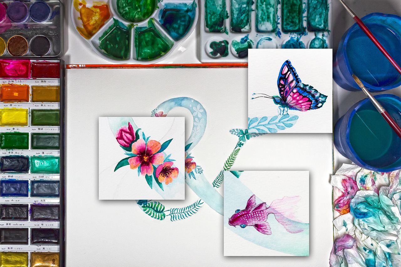
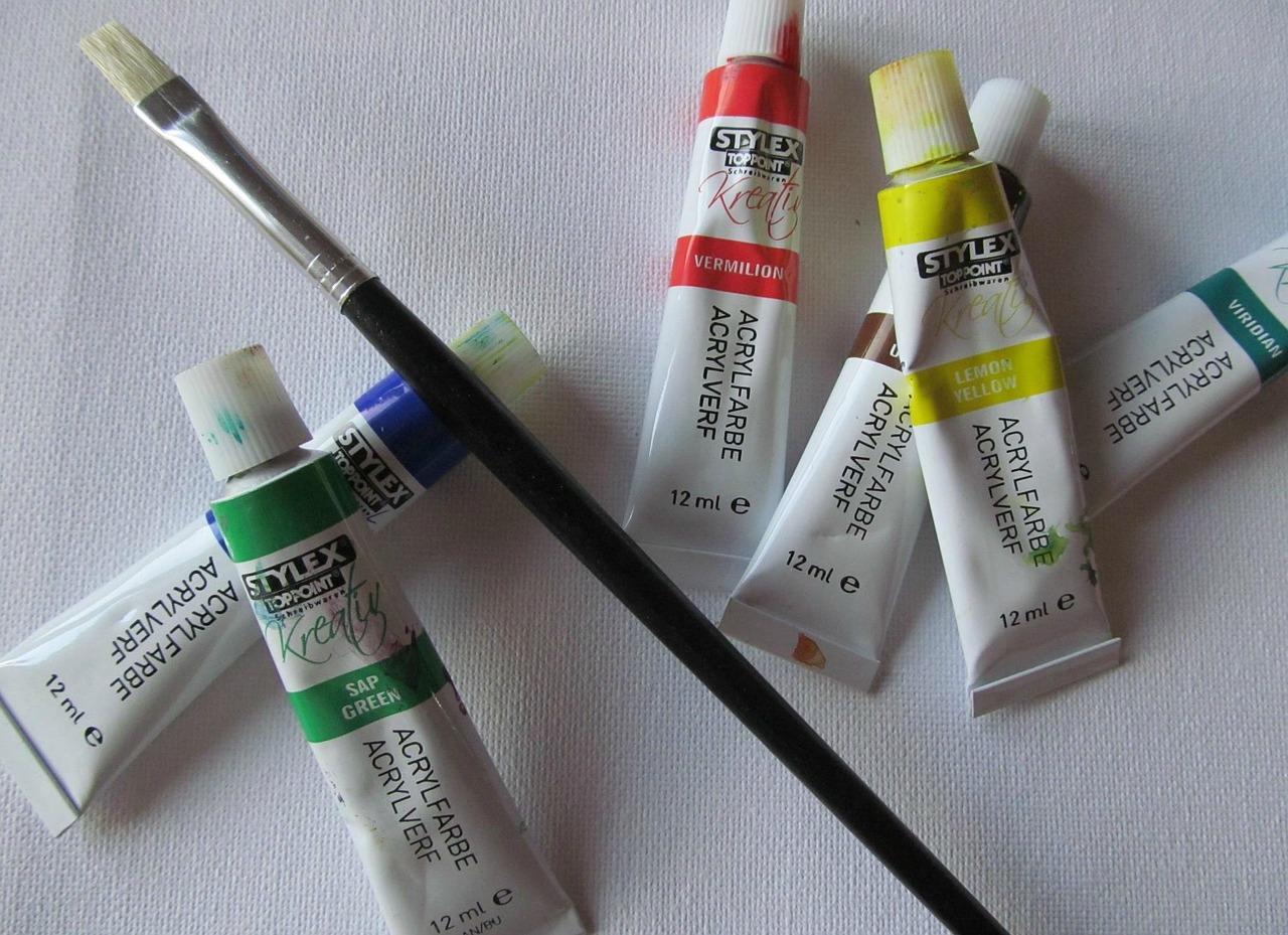
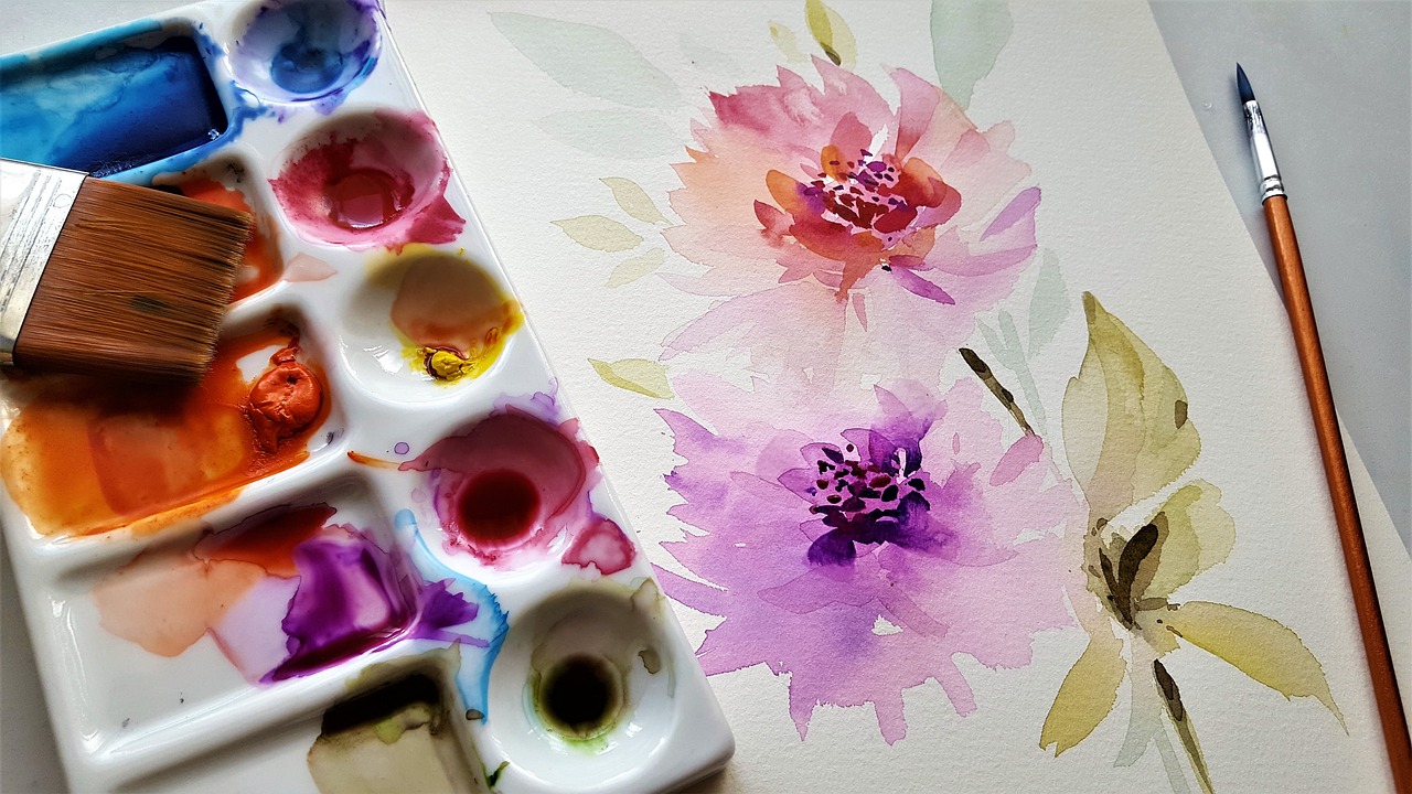
Before diving into your masterpiece, it's crucial to select the right materials. High-quality watercolor paints, brushes, and paper can make all the difference in your artwork. When choosing your paints, opt for professional-grade tubes or pans that offer high pigmentation and transparency. Brands like Winsor & Newton and Daniel Smith are renowned for their quality. As for brushes, a mix of round and flat brushes will give you versatility in applying washes and details. Don't forget about the paper! A heavy-weight, cold-pressed watercolor paper (at least 200 lb) will hold water well and allow for beautiful blending.
To truly capture the essence of sunlight, understanding light and shadow is essential. Think of sunlight as a sculptor, molding the shapes and colors of your subjects. When painting, observe how light interacts with objects—where it hits, where it reflects, and where shadows fall. Shadows are just as important as the light; they add depth and dimension to your work. Remember, the interplay between light and shadow can create drama and interest, drawing the viewer into your scene.
Now that you have your materials ready, let’s dive into color theory. Understanding the color wheel is vital for selecting hues that depict sunlight realistically. The wheel consists of primary, secondary, and tertiary colors. When mixing colors, consider the following:
- Complementary Colors: Colors opposite each other on the wheel enhance each other’s vibrancy.
- Analogous Colors: Colors next to each other create harmony and are pleasing to the eye.
Using these principles will help you create a palette that reflects the warmth of sunlight.
Understanding the difference between warm and cool colors is crucial when painting a sunlit scene. Warm colors—like reds, oranges, and yellows—evoke feelings of warmth and energy, while cool colors—such as blues and greens—can create a sense of calm and distance. To depict sunlight, focus on warm colors for areas where the light hits, and use cool colors in the shadows to create contrast. This balance will add realism and depth to your painting.
A well-thought-out color palette can significantly enhance the vibrancy of your painting. Start by selecting a few key colors that reflect the sunlight you want to capture. You might choose a bright yellow, a warm orange, and a soft pink for the sunlit areas, while incorporating cooler tones like a soft blue or green for the shadows. Mixing these colors will allow you to create a dynamic range that truly brings your sunlit scene to life.
Layering washes is a fundamental technique in watercolor painting that helps build luminosity and depth. Start with a light wash as your base, allowing it to dry completely before adding subsequent layers. Each layer should be progressively darker and more saturated, but remember to maintain transparency. This technique mimics the way light filters through layers of color, creating that beautiful glow characteristic of sunlit scenes.
A strong composition is key to a successful painting. Think of your canvas as a stage where every element plays a role in the story of light. Arrange your subjects thoughtfully, using the rule of thirds to create balance and interest. This rule suggests dividing your canvas into thirds, both horizontally and vertically, and placing focal points along these lines or at their intersections. This technique guides the viewer's eye and enhances the sunlit effect.
The rule of thirds is a valuable guideline for composition that can elevate your artwork. By positioning your main subjects off-center, you create a more dynamic and engaging scene. For instance, if you’re painting a tree bathed in sunlight, place it slightly to the left or right of center, allowing the surrounding landscape to complement it.
Identifying focal points is crucial for directing attention within your painting. Consider what you want the viewer to focus on—perhaps a sunlit flower or a glistening body of water. Use contrasting colors and sharper details to draw the eye. Additionally, achieving balance in your composition is essential. This can be done by distributing visual weight evenly across the canvas, ensuring that no area feels too heavy or empty.
Adding final touches can elevate your painting from good to great. Once your layers are dry, step back and assess your work. Look for areas that may need more contrast or detail. A fine brush can help you refine edges and add highlights that enhance the overall luminosity of your sunlit scene. Remember, the goal is to create a painting that not only captures the beauty of sunlight but also resonates with emotion.
Q: What type of paper is best for watercolor painting?
A: Cold-pressed watercolor paper is ideal as it holds water well and allows for beautiful blending.
Q: How can I make my colors more vibrant?
A: Use high-quality paints and consider layering washes to build intensity without losing transparency.
Q: What should I focus on when painting light?
A: Pay attention to how light interacts with your subjects, and use warm colors for highlights and cool colors for shadows.

Choosing the Right Materials
When it comes to painting a sunlit scene in watercolor, is your first step toward capturing that radiant glow. Think of your materials as the stage upon which your creativity will unfold. Just like an actor needs a solid script and a well-built set, you need high-quality watercolor paints, brushes, and paper to bring your vision to life. So, what should you look for?
First and foremost, let’s talk about watercolor paints. Investing in professional-grade paints can make a world of difference. These paints typically have a higher pigment concentration, resulting in more vibrant and luminous colors. You might want to explore brands like Winsor & Newton or Daniel Smith, as they offer a wide range of hues that can help you replicate the warm glow of sunlight. Remember, the right colors are crucial for achieving that sunlit effect!
Next up are the brushes. The choice of brush can significantly impact your painting style and technique. For watercolor, you’ll want to have a variety of brushes at your disposal—think round brushes for detail and flat brushes for washes. A good quality brush will hold water and pigment well, allowing you to create soft washes and sharp lines. Look for brushes made from sable or synthetic fibers, as they provide excellent control and flexibility.
Now, let’s not forget about paper. The type of paper you use can either make or break your painting experience. Watercolor paper should be thick enough to handle multiple washes without warping. A weight of 200 lb (or 425 gsm) is ideal for heavy washes, while 140 lb (or 300 gsm) is suitable for lighter applications. Cold-pressed paper, known for its textured surface, is fantastic for capturing the essence of sunlight, as it allows for beautiful blending and layering.
In summary, here’s a quick checklist of essential materials:
- High-quality watercolor paints (professional grade)
- A variety of brushes (round and flat)
- Thick watercolor paper (200 lb or 140 lb)
By investing in these materials, you set yourself up for success. Just as a chef carefully selects their ingredients to create a culinary masterpiece, you too must choose wisely to ensure your sunlit scene radiates with light and life. Remember, the journey of painting is as important as the final result, so enjoy the process of experimenting with different materials!

Understanding Light and Shadow
Grasping the concept of light and shadow is essential for any artist aiming to create depth and realism in their watercolor paintings. When you think about it, light is the life force of your artwork; it defines shapes, creates moods, and guides the viewer's eye through the scene. Imagine standing outside on a sunny day—the way the sunlight dances on the leaves, casting intricate shadows on the ground. Capturing this dynamic interplay is what makes a painting truly come alive!
To effectively represent light and shadow in your artwork, it's crucial to understand how sunlight interacts with different objects. Sunlight can be both direct and diffuse, influencing how we perceive colors and shapes. Consider the following aspects:
- Direct Light: This is when the sun shines directly on an object, creating bright highlights and dark shadows. Think of a shiny apple sitting in the sun; the side facing the light is vibrant and glossy, while the opposite side is shaded and darker.
- Diffuse Light: This occurs when sunlight is scattered, such as on an overcast day. The shadows are softer, and colors appear more muted. This can create a very different mood in your painting.
When painting a sunlit scene, it's vital to recognize the direction of the light source. This will determine where the highlights and shadows fall. For instance, if the sun is setting, the light will cast long shadows and warm tones, while midday sun will create shorter shadows and more intense colors. Observing real-life scenarios can greatly enhance your understanding of these principles.
Another important aspect is the contrast between light and shadow. High contrast can create drama and excitement in your painting, while low contrast can evoke a sense of calm and tranquility. To illustrate this, think about the difference between a bright, sunny beach scene and a soft, shadowy forest glade. Each setting has its own unique light qualities that affect how we perceive them.
In addition to understanding the nature of light and shadow, artists must also consider the color temperature of their shadows. Shadows are not merely gray or black; they can take on colors from the surrounding environment. For example, a shadow on a sunny day may appear warm with hints of yellows or oranges, while a shadow in a cool, shaded area may lean toward blues or purples. This is where your knowledge of color theory comes into play, helping you choose the right hues to convey the desired effect.
To sum it up, mastering light and shadow is about observing the world around you and translating those observations onto paper. By paying attention to how light interacts with different surfaces and understanding the emotional impact of contrast and color temperature, you can create stunning watercolor paintings that capture the essence of sunlight. So, grab your brushes and start experimenting with these techniques—your sunlit scenes are waiting to be brought to life!
Color Theory Basics
Understanding color theory is like having a secret map that guides you through the vibrant world of watercolor painting. It’s not just about slapping on paint; it’s about knowing how colors interact, how they can evoke emotions, and how to mix them to achieve that perfect sunlit effect. At the heart of color theory lies the color wheel, a circular diagram that organizes colors in a way that reveals their relationships. Think of it as your trusty compass, helping you navigate through the hues you’ll use to capture the essence of sunlight.
The color wheel is typically divided into three primary colors: red, blue, and yellow. These colors cannot be created by mixing other colors together. From these, you can create secondary colors by mixing two primary colors. For example:
| Primary Color | Secondary Color | Mixing |
|---|---|---|
| Red | Orange | Red + Yellow |
| Yellow | Green | Yellow + Blue |
| Blue | Purple | Blue + Red |
Once you have a grasp of primary and secondary colors, you can venture into the realm of tertiary colors, which are created by mixing a primary color with a secondary color. These combinations add depth and richness to your palette, allowing you to depict the nuances of sunlight more effectively. For instance, mixing yellow and green can give you a vibrant lime, perfect for capturing the glow of sunlight filtering through leaves.
Now, let’s talk about the emotional impact of colors. Each hue can evoke different feelings and atmospheres. For instance, warm colors like reds, oranges, and yellows can create a sense of warmth and energy, reminiscent of a sunny day. On the other hand, cool colors such as blues and greens can convey calmness and tranquility, which can be useful when portraying shadows or cooler areas in your painting. Understanding this relationship allows you to manipulate the mood of your artwork effectively.
When it comes to mixing colors, it’s essential to remember that less is often more. Start with a small amount of paint and gradually add more until you achieve your desired shade. This approach not only prevents waste but also gives you greater control over the final color. Remember, the goal is to create colors that reflect the vibrancy of sunlight, so don’t be afraid to experiment!
In summary, mastering color theory is a crucial step in your artistic journey. By understanding the relationships between colors and how to mix them effectively, you’ll be well on your way to creating stunning sunlit scenes that capture the viewer’s imagination. So grab that brush, unleash your creativity, and let the colors dance on your paper!
- What is the best way to learn color theory? Start by studying the color wheel and experimenting with mixing colors. Practice regularly to develop your understanding.
- How can I make my colors more vibrant? Use high-quality paints and try layering techniques to build depth. Also, consider using complementary colors to enhance vibrancy.
- What colors should I use for a sunlit scene? Focus on warm colors like yellows, oranges, and light reds for sunlight, and use cool colors for shadows to create contrast.

Warm vs. Cool Colors
When it comes to painting a sunlit scene, understanding the distinction between warm and cool colors is crucial. Imagine walking through a sun-drenched meadow; the golden yellows and fiery oranges of the sun contrast beautifully with the serene blues and greens of the shadows cast by trees. This interplay not only creates visual interest but also evokes emotions that resonate with the viewer.
Warm colors, such as reds, oranges, and yellows, are often associated with energy, warmth, and excitement. These colors can make a scene feel inviting and vibrant, mimicking the effect of sunlight as it bathes a landscape in its golden glow. For instance, when painting a sunset, using warm colors can enhance the feeling of warmth and comfort, drawing the viewer into the scene.
On the other hand, cool colors like blues, greens, and purples tend to evoke feelings of calmness and tranquility. They are often used to depict shadows or areas that are not directly lit by sunlight. When you balance these cool colors with warm colors in your painting, you create a sense of depth and dimension. It’s like a dance between light and shadow, where each color plays a vital role in conveying the overall mood of your artwork.
To effectively utilize warm and cool colors in your watercolor paintings, consider the following:
- Layering Techniques: Build up layers of warm colors in areas where sunlight hits, while using cool colors in the shadows. This contrast will enhance the luminosity of your painting.
- Color Mixing: Experiment with mixing warm and cool colors to create a wide range of hues. For example, adding a touch of orange to a blue can create a stunning gray, ideal for shadow areas.
- Contextual Use: Think about the time of day you are trying to capture. Morning light might lean more towards cooler tones, while late afternoon light is often warmer and richer.
In summary, the effective use of warm and cool colors can make your sunlit scenes come alive. By thoughtfully selecting your palette and applying these colors in a way that reflects the interaction of light and shadow, you can create artwork that not only looks beautiful but also resonates with viewers on an emotional level. So, the next time you sit down to paint, take a moment to consider the colors you’re using and how they can enhance the sunlight in your scene.

Creating a Color Palette
When it comes to painting a sunlit scene, creating a well-thought-out color palette is crucial for achieving that vibrant, luminous effect. Think of your color palette as the soul of your painting; it sets the mood and brings your artwork to life. To start, you'll want to select colors that not only complement each other but also reflect the essence of sunlight. The right combination can make your painting feel warm, inviting, and full of energy.
One effective approach is to limit your palette to a few key colors, which can help maintain harmony throughout your painting. A common technique is to use a triadic color scheme, which involves selecting three colors that are evenly spaced on the color wheel. For instance, you might choose a warm yellow, a soft orange, and a cool blue. This combination not only reflects natural sunlight but also creates a dynamic contrast that draws the viewer's eye.
When mixing your colors, keep in mind that the goal is to achieve a sense of depth and luminosity. You can do this by layering transparent washes. Start with lighter hues and gradually build up to darker shades. This technique mimics the way sunlight interacts with surfaces, allowing you to capture the play of light and shadow effectively. Here’s a simple table to illustrate a basic color palette for a sunlit scene:
| Color | Purpose |
|---|---|
| Warm Yellow | Represents sunlight and warmth |
| Soft Orange | Adds vibrancy and richness |
| Cool Blue | Provides contrast and depth |
| Light Green | Captures the essence of nature |
Additionally, consider incorporating some neutral tones, like grays or browns, to ground your composition. These colors can help balance out the vibrancy of your primary colors and add a layer of sophistication to your painting. Remember, the key is to experiment and find what feels right for your specific scene. Don’t be afraid to adjust your palette as you go; sometimes, the best color combinations come from spontaneous decisions!
In conclusion, creating a color palette is not just about choosing pretty colors; it's about understanding how they work together to evoke feelings and convey the beauty of light. By thoughtfully selecting and mixing your colors, you can create a stunning sunlit scene that captures the magic of light in watercolor.
- What colors should I use for a sunset scene? For sunset scenes, consider using vibrant oranges, deep reds, and soft purples to represent the warm hues of the setting sun.
- Can I use acrylics for a watercolor effect? While acrylics can mimic watercolors, they have different properties. You can dilute acrylics with water to create a watercolor-like effect, but the results may vary.
- How do I know if my colors are harmonious? A good test is to step back and look at your palette from a distance. If the colors feel balanced and pleasing to the eye, you're likely on the right track!
Techniques for Layering Washes
Layering washes is an essential technique in watercolor painting that can transform a simple piece into a stunning work of art. The beauty of watercolor lies in its transparency, which allows artists to build depth and luminosity through multiple layers. When you think about layering, imagine building a cake; each layer adds flavor and texture, creating a delightful experience. In watercolor, each wash adds richness and complexity to your sunlit scene.
To master this technique, it's important to start with a solid foundation. Begin with a light wash as your base layer. This initial wash sets the tone for your painting and should be applied evenly across the area where you want to depict sunlight. Use plenty of water to keep the paint transparent, allowing the white of the paper to shine through. This is crucial for capturing the essence of sunlight. Remember, the lighter the wash, the more vibrant the final piece will appear.
Once your first layer is dry, you can begin adding subsequent washes. Here are some tips to consider:
- Drying Time: Always ensure that each layer is completely dry before applying the next. This prevents colors from bleeding into each other and maintains the integrity of your layers.
- Color Mixing: Experiment with mixing colors on your palette before applying them to your painting. This allows you to see how different hues interact and helps you achieve the desired effect.
- Gradual Build-Up: Start with lighter colors and gradually build up to darker tones. This technique not only enhances the luminosity of your painting but also creates a sense of depth.
As you layer, pay attention to the transparency of your washes. Watercolor paints are designed to be transparent, so using them correctly will allow the underlying colors to show through. This is particularly important when trying to replicate the shimmering effect of sunlight. For instance, when painting a sunlit landscape, you might start with a pale yellow wash to represent sunlight filtering through leaves, and then add a green wash for the foliage. The yellow will glow through the green, creating a vibrant, sunlit effect.
Another crucial aspect of layering washes is understanding the wet-on-wet and wet-on-dry techniques. The wet-on-wet technique involves applying wet paint onto a wet surface, which allows for soft edges and a more blended look. This is perfect for creating atmospheric effects, like a hazy sky. On the other hand, the wet-on-dry technique involves applying wet paint onto a dry surface, resulting in sharper edges and more defined shapes. This is useful for adding details or creating contrasts in your sunlit scene.
Finally, remember that layering is not just about adding more paint; it’s about understanding how light interacts with your subject. Observe how sunlight creates shadows and highlights, and try to replicate this in your washes. By layering different colors and values, you can create a dynamic and engaging painting that captures the viewer’s attention and evokes the warmth of a sunlit day.
1. How many layers can I add to my watercolor painting?
There’s no strict limit to the number of layers you can add, but it’s essential to maintain the transparency of your washes. Generally, 3 to 5 layers are common, but it depends on the effect you want to achieve.
2. What should I do if my colors become muddy?
If your colors become muddy, it may be due to overmixing or using too many layers. To avoid this, limit your color palette and ensure each layer is dry before adding the next.
3. Can I use masking fluid while layering washes?
Yes! Masking fluid can be a great tool for preserving white areas of your painting while you layer colors. Just be sure to remove it carefully to avoid damaging the paper.
4. How can I tell if my washes are dry enough to add another layer?
You can gently touch the surface of the paper with your fingertip. If it feels cool and damp, it’s not ready. If it feels dry and warm, you can proceed with your next layer.
Composing Your Scene
When it comes to painting a sunlit scene, composition is your secret weapon. Think of your canvas as a stage where the sun plays the leading role, and every element—trees, buildings, or even a distant mountain—acts as supporting characters. The way you arrange these elements can dramatically influence how the viewer perceives the sunlight and the overall atmosphere of your painting. So, how do you create a composition that not only captures the essence of sunlight but also leads the viewer’s eye through your artwork?
The first step in composing your scene is to consider the focal points. These are the areas you want to draw attention to, and they should be strategically placed within the frame. Imagine you’re telling a story; your focal point is the climax. For instance, if you’re painting a sunlit meadow, perhaps the sun-drenched flowers in the foreground could be your focal point, while the soft, golden light filtering through the trees in the background adds depth. By placing your focal point off-center, you can create a more dynamic and engaging composition.
One effective technique for achieving balance in your composition is to utilize the Rule of Thirds. This classic guideline suggests dividing your canvas into a 3x3 grid. By placing your focal points along these lines or at their intersections, you can create a more harmonious and pleasing arrangement. For example, if your sunlit scene features a bright sunset over a lake, position the horizon along one of the horizontal lines and your sun near one of the vertical lines. This simple adjustment can transform your painting from ordinary to extraordinary.
Another essential aspect of composition is the use of negative space. This refers to the empty areas around your subject, which can help to emphasize the focal points and create a sense of balance. In a sunlit scene, the sky can serve as negative space, allowing the vibrant colors of your foreground elements to pop. Think of it like a well-composed photograph; the background can either enhance or detract from the main subject. So, don’t shy away from leaving areas of your canvas untouched to let the sunlight shine through!
Lastly, consider the overall flow of your composition. You want your viewer’s eye to move effortlessly across the painting, exploring every sunlit detail. To achieve this, you might create leading lines—paths, fences, or even shadows—that guide the viewer’s gaze towards the focal point. Imagine a winding path leading through a sunlit forest; the path naturally draws the eye deeper into the scene, inviting the viewer to explore the vibrant interplay of light and shadow.
In summary, composing your sunlit scene is about more than just placing objects on a canvas; it’s about creating a captivating narrative through thoughtful arrangement. By focusing on focal points, applying the Rule of Thirds, utilizing negative space, and establishing a natural flow, you can craft a composition that not only showcases the beauty of sunlight but also resonates with your audience. Now, let’s dive into some frequently asked questions to further enhance your understanding of composition in watercolor painting!
- What is the Rule of Thirds? The Rule of Thirds is a guideline that suggests dividing your canvas into thirds, both horizontally and vertically, to create a grid. Placing focal points along these lines can lead to a more balanced composition.
- How do I create depth in my painting? You can create depth by layering elements in the foreground, middle ground, and background, as well as by using color and contrast to distinguish between these layers.
- What is negative space, and why is it important? Negative space refers to the areas around and between your subjects. It is important because it can help emphasize your focal points and create a more balanced composition.
Using the Rule of Thirds
When it comes to painting a sunlit scene, the Rule of Thirds is an essential guideline that can dramatically improve your composition. Imagine dividing your canvas into a grid of nine equal rectangles, much like a tic-tac-toe board. This simple technique encourages you to place the most important elements of your painting along the grid lines or at their intersections. Why is this important? Because it creates a sense of balance and harmony, making your artwork more engaging to the viewer.
Think of the Rule of Thirds as a way to guide the viewer’s eye through your painting. For instance, if you're painting a sunlit landscape with a radiant sun setting on the horizon, consider placing the sun at one of the intersections rather than smack in the center. This subtle shift can lead to a more dynamic and interesting composition. When you position focal points—such as trees, buildings, or figures—along these lines, you invite the viewer to explore the entire scene instead of just focusing on a single element.
To effectively apply the Rule of Thirds, you might want to visualize your entire scene in sections. For example, if your painting includes a foreground, middle ground, and background, think about how each of these areas can be balanced according to the grid. You could place a large, sunlit tree in the left third of the canvas while allowing the right side to showcase a tranquil pond reflecting the sunlight. This not only adds interest but also creates a natural flow that draws the viewer's gaze across the painting.
Additionally, it’s crucial to remember that the Rule of Thirds is a guideline, not a strict rule. Feel free to experiment! Sometimes breaking this rule can lead to unexpected and delightful results. As you gain more experience, you'll develop an intuition for when to adhere to the grid and when to let your creativity take the lead.
In summary, utilizing the Rule of Thirds in your sunlit watercolor scenes can help you achieve a more balanced and visually appealing composition. By thoughtfully placing your subject matter along these lines, you not only enhance the beauty of your artwork but also create a narrative that invites viewers to immerse themselves in the warmth and vibrancy of your painted sunlight.
- What is the Rule of Thirds? The Rule of Thirds is a compositional guideline that suggests dividing your canvas into thirds, both horizontally and vertically, to create a grid. Important elements are placed along these lines or at their intersections.
- How does the Rule of Thirds improve my painting? It helps create balance and guides the viewer's eye, making the artwork more engaging and visually appealing.
- Can I break the Rule of Thirds? Absolutely! While it's a helpful guideline, creativity often flourishes when you experiment and break the rules.
- How can I practice the Rule of Thirds? Try sketching or painting different scenes using the grid method. Practice placing various elements in different sections to see how it affects the overall composition.
Focal Points and Balance
When it comes to creating captivating watercolor paintings, focal points and balance play a crucial role in guiding the viewer's eye and enhancing the overall composition. Think of your painting as a stage where each element is an actor; some are meant to shine brighter than others. A well-placed focal point draws attention and creates a sense of intrigue. But how do you achieve this harmony in your sunlit scene?
First, let’s consider what a focal point is. It's essentially the star of your painting—the area that you want to catch the viewer's attention first. In a sunlit scene, this could be a bright sunlit tree, a shimmering lake, or even a vibrant flower basking in the sun. To create a strong focal point, you can use contrasting colors, such as a bright yellow flower against a muted green background, or play with size—making your focal point larger than other elements in the scene. This contrast not only attracts the eye but also emphasizes the beauty of sunlight.
Balance, on the other hand, is about distributing visual weight across your composition. Imagine balancing a seesaw; if one side is too heavy, it tips over. In painting, balance can be achieved through various means:
- Symmetrical Balance: This is where elements on either side of the focal point mirror each other, creating a sense of stability.
- Asymmetrical Balance: Here, different elements are used to create balance without mirroring. For instance, a large tree on one side can be balanced by a cluster of smaller flowers on the other.
- Color Balance: Utilizing colors effectively can also influence balance. A bright area can be balanced by a darker area, guiding the viewer's eye naturally across the painting.
To illustrate these concepts, consider a simple table that outlines how to create focal points and balance in your watercolor painting:
| Technique | Description |
|---|---|
| Contrast | Using opposing colors or sizes to make the focal point stand out. |
| Placement | Positioning the focal point according to the rule of thirds for visual interest. |
| Leading Lines | Creating lines in the painting that guide the viewer’s eye toward the focal point. |
| Negative Space | Using empty space around the focal point to enhance its importance. |
As you work on your sunlit scene, remember that achieving a balance doesn’t mean every element has to be equal. It’s about creating a visual dialogue that feels harmonious. You want your viewer to feel like they can wander through the painting, exploring the light and shadow, while always being gently nudged back to that focal point.
Lastly, don’t shy away from experimenting! Sometimes, the most unexpected arrangements can lead to breathtaking results. Play with different compositions, and don’t forget to step back and assess your work from a distance. This can help you see whether your focal point is indeed drawing attention and if the overall balance feels right.
Q: How do I determine the focal point in my painting?
A: Look for the element that naturally draws your eye. It could be a bright color, an interesting shape, or a unique texture. Make sure it stands out through contrast or placement.
Q: Can I have more than one focal point?
A: Yes, but be cautious! Too many focal points can confuse the viewer. Ideally, one main focal point should dominate, while secondary points can support the main one.
Q: How can I improve the balance in my painting?
A: Experiment with the placement of elements. Use the rule of thirds, and consider color and size to create visual weight. Step back often to assess the overall harmony of your composition.

Final Touches and Techniques
Once you've poured your heart and soul into your sunlit watercolor scene, it's time to step back and take a closer look. Adding those final touches can make a world of difference, transforming a good painting into a truly stunning masterpiece. Think of it like seasoning a dish; just the right amount can elevate the flavors, while too much can overwhelm. So, what are these magical final touches that can bring your artwork to life?
First off, consider the details. Small touches can create depth and interest, drawing the viewer's eye to specific areas of your painting. For instance, you might want to add highlights to the leaves of a tree or the edges of a building where sunlight hits. A fine brush can help you achieve those delicate lines and accents. Remember, less is more; you want to enhance the existing elements without overpowering them.
Next, think about the contrast. Sunlit scenes thrive on the interplay between light and shadow. You can deepen the shadows in your painting to create a more dramatic effect. This doesn’t mean you should go dark everywhere; rather, focus on areas where the sunlight is less direct. By enhancing the contrast, you can achieve a more dynamic and vibrant scene that feels alive.
Another technique to consider is glazing. This involves applying a thin, transparent layer of color over dried paint. Glazing can add richness and complexity to your colors, mimicking the way light interacts with surfaces in the real world. For example, a soft yellow glaze over a blue sky can create a stunning effect that suggests the warmth of sunlight filtering through. Just remember to allow each layer to dry completely before adding the next to avoid muddying your colors.
Finally, don’t forget about the background. Sometimes, a simple wash of color can help your main subject pop. A soft, muted background can create a sense of depth, allowing the foreground elements to shine. Consider using a light color that complements your main scene. This subtle touch can make your painting feel more cohesive and polished.
In summary, the final touches in your watercolor painting are not just about adding more elements but refining what you already have. By focusing on details, enhancing contrast, experimenting with glazing, and considering your background, you can elevate your sunlit scene to new heights. Now, let’s address some common questions artists have when it comes to these finishing techniques.
- How can I avoid overworking my watercolor painting? It's essential to know when to stop. If you feel the urge to add more, step back and take a break. Returning with fresh eyes can help you see if your painting needs more work or if it’s complete.
- What types of brushes are best for adding details? A fine-tipped brush or a rigger brush is excellent for details. These brushes allow for precision and control, making it easier to add those final touches without overwhelming your piece.
- Can I fix mistakes in watercolor? Yes, but it can be tricky. Lifting color while it's still wet is easier, but once it dries, you may need to use a white gouache or create a new layer to cover it up.
- How important is the background in my painting? The background is crucial as it sets the stage for your subject. A well-thought-out background can enhance the overall composition and help your main elements stand out.
Frequently Asked Questions
- What materials do I need to paint a sunlit scene in watercolor?
To create a stunning sunlit scene, you’ll need high-quality watercolor paints, a variety of brushes (round and flat), and good watercolor paper. Additionally, having a palette for mixing colors and a container for water will make your painting process smoother. Remember, the right materials can make a huge difference in the final outcome!
- How can I effectively represent light and shadow in my painting?
Understanding how light interacts with objects is essential. Start by observing real-life sunlight and shadows. Use lighter colors where the sunlight hits and darker shades for the shadows. This contrast will add depth and dimension to your artwork, making it more lifelike and vibrant.
- What is the importance of color theory in painting sunlit scenes?
Color theory helps you choose the right hues to depict sunlight effectively. Familiarize yourself with the color wheel, and learn how to mix colors to achieve realistic sunlit effects. Warm colors like yellows and oranges can create a sunny feel, while cool colors can add depth and contrast.
- How do I create a balanced composition using the rule of thirds?
The rule of thirds is a fantastic guideline for composition. Imagine your canvas divided into nine equal parts with two vertical and two horizontal lines. Place key elements of your scene along these lines or at their intersections to create a more dynamic and engaging composition that draws the viewer's eye.
- What techniques can I use for layering washes in watercolor?
Layering washes is crucial for achieving luminosity. Start with a light wash and gradually add more layers, allowing each one to dry before applying the next. This technique builds depth and richness in your colors, giving your sunlit scene a beautiful glow.
- How can I choose a color palette that enhances sunlight effects?
When selecting a color palette, opt for colors that complement each other and reflect the warmth of sunlight. Consider using a mix of warm and cool colors to create contrast and interest. Creating a small swatch of your chosen colors can help you visualize how they work together before applying them to your painting.
- What final touches should I consider to enhance my watercolor painting?
Final touches can make your painting pop! Consider adding highlights with white gouache or lifting some paint to create sparkling light effects. Pay attention to small details and refine areas that need more contrast or definition. These finishing touches can elevate your artwork from good to stunning!


