
The Anatomy of a Good Painting
Creating a good painting is much like crafting a captivating story; it requires a blend of various elements that come together to evoke emotion and provoke thought. Whether you're an aspiring artist or simply an art enthusiast, understanding the anatomy of a painting can significantly enhance your appreciation and execution of art. In this exploration, we will dive into the essential components that contribute to a successful painting, including composition, color theory, techniques, and emotional impact. Each element serves as a building block, laying the foundation for a masterpiece that resonates with viewers. So, grab your paintbrush or your favorite art book, and let's unravel the intricacies of what makes a painting not just good, but great!
When it comes to painting, composition is akin to the backbone of a well-structured narrative. It is the arrangement of visual elements that guides the viewer's eye and creates a sense of balance and harmony. Understanding key principles such as the rule of thirds, leading lines, and focal points can dramatically enhance visual storytelling. For instance, the rule of thirds suggests dividing your canvas into a grid, positioning key elements along these lines or their intersections to create a more engaging composition. Imagine looking at a photograph; the most striking ones often adhere to this rule, drawing your eye naturally across the scene.
Color theory is not just for art students; it’s a vital aspect of painting that can transform a simple piece into an emotional experience. Understanding the color wheel is fundamental, as it helps artists identify complementary colors and understand the psychological effects of colors. For example, warm colors like reds and yellows can evoke feelings of excitement or warmth, while cool colors such as blues and greens tend to create a calming atmosphere. Consider how a sunset painting filled with vibrant oranges and reds can stir feelings of nostalgia compared to a serene landscape in soft blues and greens.
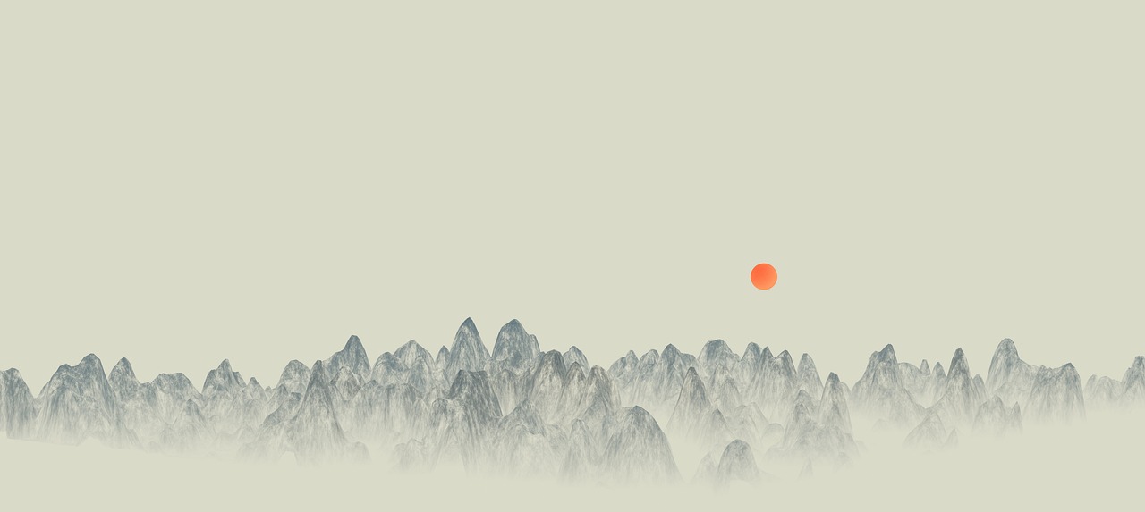
The distinction between warm and cool colors is crucial in setting a painting's mood. Warm colors can create an inviting and energetic atmosphere, making them perfect for lively scenes or portraits that aim to evoke joy. In contrast, cool colors are ideal for landscapes or abstract works that require a sense of tranquility. For example, a painting featuring a sun-drenched beach scene with warm yellow and orange tones will feel vastly different from a cool-toned forest scene bathed in shades of blue and green. The choice of color temperature can dramatically alter the viewer's emotional response.
Achieving color harmony is essential for creating a cohesive painting. Techniques such as analogous and triadic color schemes can help artists create visually appealing compositions. An analogous color scheme uses colors that are next to each other on the color wheel, providing a serene and comfortable look. On the other hand, a triadic scheme employs three colors that are evenly spaced around the wheel, resulting in a vibrant and dynamic palette. Utilizing these techniques can ensure that the colors in your painting work together rather than compete for attention.
Color contrast is another powerful tool in an artist's arsenal. By strategically using contrasting colors, you can draw attention to specific areas of your painting, creating depth and visual interest. For instance, placing a bright yellow object against a deep blue background can make it pop, guiding the viewer's eye exactly where you want it to go. This technique is not just about aesthetics; it can also enhance the narrative of your painting, emphasizing key themes or subjects.
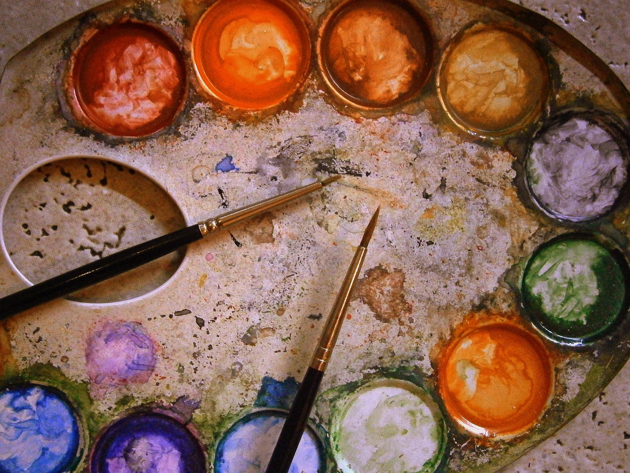
Mastering color mixing is a rite of passage for any artist. It’s not just about knowing how to blend colors; it’s about understanding how different pigments interact. Here are some tips for effective color mixing:
- Start with primary colors and gradually mix to achieve secondary and tertiary colors.
- Experiment with ratios to find the perfect hue or shade for your artwork.
- Keep a mixing chart to track your color combinations for future reference.
By honing your mixing skills, you can ensure that your final piece reflects your vision, with hues that resonate and create the desired emotional impact.
Different painting techniques and mediums can significantly influence the final outcome of your artwork. Whether you choose oil, acrylic, or watercolor, each medium has its unique characteristics that can alter the texture, depth, and overall feel of your painting. For instance, oil paints allow for rich, vibrant colors and are known for their blending capabilities, making them ideal for detailed portraits. Acrylics, on the other hand, dry quickly and can be layered easily, offering a versatile option for artists who enjoy experimenting.
The way you handle your brushes can add texture and depth to your painting. Techniques such as glazing and impasto can significantly enhance artistic expression. Glazing involves applying a thin layer of transparent paint over a dried layer, creating luminosity and depth. Impasto, however, is about applying paint thickly, allowing brush strokes to stand out and create a three-dimensional effect. Each technique tells a different story and can evoke different feelings within the viewer.
Layering and glazing are techniques that can create luminosity and complexity in your artwork. By applying multiple layers of paint, you can achieve a rich, multi-dimensional appearance that captivates the viewer. For instance, a landscape painting may benefit from layering various shades to depict the changing light throughout the day. This method not only adds depth but also invites the viewer to explore the nuances of the scene.
Q: What is the most important element of a painting?
A: While all elements are important, composition often serves as the foundation for a successful painting, guiding the viewer's eye and establishing balance.
Q: How can I improve my color mixing skills?
A: Practice is key! Start with primary colors and experiment with different ratios to discover new hues and shades.
Q: What medium should a beginner choose?
A: Acrylics are often recommended for beginners due to their versatility, quick drying time, and ease of use.
Composition Fundamentals
Understanding composition is crucial for creating balance and harmony in a painting. Think of composition as the backbone of your artwork; it’s what holds everything together and guides the viewer’s eye through the piece. Without a solid composition, even the most vibrant colors and intricate details can fall flat. So, how do you ensure your composition is on point? Let’s dive into some key principles that can enhance your visual storytelling.
One of the most important concepts in composition is the Rule of Thirds. Imagine dividing your canvas into a grid of nine equal parts, like a tic-tac-toe board. The idea is to place the most important elements of your painting along these lines or at their intersections. This technique draws the viewer's eye naturally to focal points, creating a more engaging visual experience. For instance, if you’re painting a landscape, consider positioning the horizon along the top or bottom third of the canvas, rather than smack dab in the middle.
Another vital principle is the use of leading lines. These are lines that guide the viewer's eye throughout the painting. They can be actual lines, such as roads or rivers, or implied lines created by the arrangement of elements in your artwork. By strategically placing leading lines, you can create a sense of movement and direct attention to the focal point of your piece. Imagine walking down a winding path in a forest; your eyes naturally follow the curves and turns, leading you deeper into the scene.
Don’t forget about focal points. Every good painting needs a star player, something that immediately captures attention. This could be a vibrant flower in a still life or a dramatic figure in a portrait. To make your focal point stand out, consider using contrasting colors or textures. It’s like having a great story; you need a captivating character to keep the audience engaged!
To further enhance your composition, you might also want to explore the concept of negative space. This refers to the empty areas around your subject. While it may seem counterintuitive, negative space can be just as important as the subject itself. It helps to define and emphasize the main elements of your painting, creating a sense of balance. Think of it as breathing room; it allows the viewer to focus on the essential parts of the artwork without feeling overwhelmed.
In summary, mastering composition is about understanding how to arrange elements in a way that creates harmony and guides the viewer’s eye. By applying principles like the Rule of Thirds, leading lines, focal points, and negative space, you can elevate your paintings from ordinary to extraordinary. Remember, every brush stroke counts in the grand tapestry of your artwork!
- What is the Rule of Thirds? The Rule of Thirds is a composition guideline that suggests dividing your canvas into a grid and placing important elements along these lines or their intersections.
- Why are leading lines important? Leading lines help to guide the viewer's eye through the painting, creating a sense of movement and directing attention to focal points.
- How can I create a focal point in my painting? You can create a focal point by using contrasting colors, textures, or positioning an important element strategically within the composition.
- What is negative space? Negative space refers to the empty areas surrounding your subject, which can help to define and emphasize the main elements of your painting.

Color Theory Essentials
Color theory is the backbone of visual art, serving as a guide for artists to create works that resonate with viewers. Understanding how colors interact, evoke emotions, and convey messages can elevate a painting from ordinary to extraordinary. At its core, color theory revolves around the color wheel, which categorizes colors into primary, secondary, and tertiary hues. This wheel acts as a map, helping artists navigate the vast landscape of color relationships.
One of the most important concepts in color theory is the idea of complementary colors. These are pairs of colors that, when combined, cancel each other out, producing a grayscale color. On the color wheel, complementary colors are located directly across from each other. For instance, blue and orange or red and green. Using complementary colors can create vibrant contrasts that draw the viewer's eye, adding dynamism to a painting.
Moreover, colors possess psychological effects that can influence how viewers perceive a piece. For example, warm colors like red, orange, and yellow often evoke feelings of warmth, energy, and passion, while cool colors like blue, green, and purple can instill calmness and serenity. Artists can harness these emotional triggers to create a specific mood or atmosphere in their work.
Understanding the distinction between warm and cool colors is crucial for artists aiming to set a specific tone. Warm colors tend to advance in a composition, creating a sense of closeness, while cool colors recede, giving an illusion of depth. This interplay can be likened to a dance, where warm colors invite the viewer in, and cool colors provide a backdrop that enhances the overall composition. For instance, a sunset scene might employ rich oranges and reds to convey warmth and intimacy, contrasted with deep blues to suggest the vastness of the sky.
Achieving color harmony is essential for a cohesive painting. Artists can utilize various techniques, such as analogous and triadic color schemes, to create aesthetically pleasing compositions. An analogous color scheme involves using colors that are next to each other on the color wheel, providing a serene and comfortable look. On the other hand, a triadic scheme involves three colors that are evenly spaced around the wheel, creating a vibrant and dynamic effect. Both approaches can significantly enhance the visual appeal of a painting, making it more engaging for the audience.
Utilizing color contrast is another vital aspect of color theory. Contrast can draw attention and create depth within a painting. For example, placing a bright yellow object against a deep blue background can make the yellow pop, guiding the viewer's eye to that focal point. This technique not only enhances visual interest but also adds layers of meaning and complexity to the artwork. Understanding how to balance contrasting colors effectively can elevate an artist's work, transforming a simple image into a captivating story.
Mastering color mixing is key for any artist looking to create their unique palette. It’s not just about knowing which colors to combine; it’s about understanding the nuances of each hue and how they relate to one another. For instance, mixing a bit of blue with yellow yields green, but the resulting shade can vary dramatically based on the proportions used. Artists can experiment with different combinations and techniques to achieve the desired hues and shades, ensuring their final piece is polished and reflective of their vision.
Q: What is the color wheel, and why is it important?
A: The color wheel is a circular diagram that organizes colors based on their relationships. It is essential for understanding color theory, helping artists choose harmonious color combinations.
Q: How do warm and cool colors affect a painting?
A: Warm colors tend to advance in a composition, creating a sense of closeness, while cool colors recede, providing depth. This contrast can significantly impact the mood of the artwork.
Q: What are complementary colors, and how can they be used?
A: Complementary colors are pairs located opposite each other on the color wheel. They can create vibrant contrasts when used together, making certain elements in a painting stand out.
Q: How can I achieve color harmony in my artwork?
A: You can achieve color harmony by using techniques like analogous or triadic color schemes, which help create a balanced and aesthetically pleasing composition.
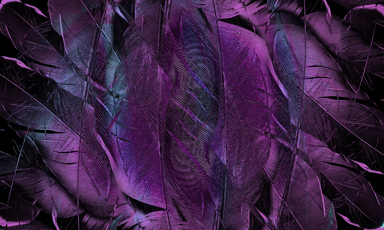
Warm vs. Cool Colors
When it comes to painting, understanding the distinction between warm and cool colors is like having a secret weapon in your artistic arsenal. These two categories of colors can dramatically alter the mood and atmosphere of your artwork. Imagine stepping into a room painted in warm hues of red and orange; it feels inviting and cozy, doesn’t it? Now, picture a space adorned with cool blues and greens—suddenly, it’s serene and calming. This emotional response is no accident; it’s all about how these colors interact with our perceptions.
Warm colors, which include reds, oranges, and yellows, tend to advance in a composition. They draw the viewer's eye and create a sense of energy and excitement. Think of a blazing sunset or the flicker of a campfire; these colors evoke feelings of warmth, passion, and even aggression. Artists often use warm colors to create focal points or to convey emotions like joy, love, or anger. For instance, a painting featuring a vibrant red apple can feel lively and fresh, while a deep crimson might suggest intensity or even danger.
On the flip side, cool colors—such as blues, greens, and purples—are known for their ability to recede in a composition. They create a sense of calm and tranquility, reminiscent of a peaceful ocean or a lush forest. When you incorporate cool colors into your artwork, you're often aiming to evoke feelings of serenity, sadness, or introspection. A landscape painted in shades of blue and green can transport viewers to a tranquil place, making them feel relaxed and at ease.
To illustrate the impact of warm and cool colors, consider the following table:
| Color Type | Examples | Emotional Impact |
|---|---|---|
| Warm Colors | Red, Orange, Yellow | Excitement, Energy, Warmth |
| Cool Colors | Blue, Green, Purple | Calm, Serenity, Sadness |
It's essential for artists to consider how they want their audience to feel when viewing their work. By strategically using warm and cool colors, you can create a dynamic interplay that not only captures attention but also conveys a deeper message. For example, a painting that features a warm sun setting over a cool ocean can create a stunning contrast that emphasizes the beauty of both elements. This interplay can guide the viewer's eye and evoke a sense of nostalgia or longing.
Moreover, combining warm and cool colors can lead to exciting visual effects. When used together, they can create a sense of depth and dimension. Think of a landscape where the foreground is painted in warm tones while the background fades into cool blues; this technique not only enhances perspective but also enriches the overall composition. It’s like a dance between the elements, where each color plays its role, contributing to the story you wish to tell.
As you explore the world of painting, remember that the choice between warm and cool colors is not just a technical decision; it’s an emotional one. It’s about connecting with your audience and eliciting feelings that resonate on a personal level. So, the next time you pick up your brush, ask yourself: what emotions do I want to evoke? By understanding the power of warm and cool colors, you’ll be one step closer to creating impactful and memorable artwork.
- What are warm colors? Warm colors include reds, oranges, and yellows, and they tend to evoke feelings of energy and warmth.
- What are cool colors? Cool colors consist of blues, greens, and purples, often creating a calming and serene atmosphere.
- How can I effectively use warm and cool colors in my painting? Consider the mood you want to convey and use warm colors for energy and excitement, while cool colors can bring calmness and tranquility.
- Can I mix warm and cool colors? Absolutely! Mixing warm and cool colors can create depth and enhance the overall composition of your artwork.
Color Harmony Techniques
When it comes to creating a visually stunning painting, achieving color harmony is absolutely essential. Think of color harmony as the secret sauce that ties together various elements of your artwork, creating a sense of unity and balance. Just like a well-composed song, where every note complements the others, a harmonious color palette can make your painting sing. But how do you achieve this elusive harmony? Let's dive into some techniques that can elevate your artwork to new heights.
One of the most effective ways to create color harmony is through the use of analogous color schemes. These are colors that sit next to each other on the color wheel, such as blue, blue-green, and green. By employing these colors together, you can create a serene and cohesive look that feels both natural and inviting. Imagine a peaceful forest scene where the greens and blues blend seamlessly; it evokes a sense of tranquility that viewers can almost feel.
On the flip side, you have triadic color schemes, which involve using three colors that are evenly spaced around the color wheel. A classic example would be red, blue, and yellow. This technique can inject energy and vibrancy into your artwork, making it pop with excitement. However, balance is key. Too much of these bright colors can overwhelm the viewer, so it’s important to use them wisely. Consider this: if you were to throw a party, you wouldn't invite too many loud guests at once; you'd want to mix in some quieter ones for balance!
Another technique worth exploring is the use of monochromatic color schemes. This involves using variations of a single color, which can create a harmonious yet dynamic look. For instance, a painting that employs different shades of blue can evoke feelings of calmness and depth, akin to the vastness of the ocean. You can play with light and dark shades to add dimension and interest without straying from the core color.
To illustrate these concepts, let’s take a look at a simple table that outlines the different color harmony techniques:
| Technique | Description | Example Colors |
|---|---|---|
| Analogous | Colors next to each other on the color wheel | Blue, Blue-Green, Green |
| Triadic | Three evenly spaced colors on the color wheel | Red, Blue, Yellow |
| Monochromatic | Variations of a single color | Light Blue, Medium Blue, Dark Blue |
Another important aspect of color harmony is understanding the emotional impact of colors. Each color can evoke specific feelings and reactions. For instance, warm colors like reds and oranges can create a sense of excitement or warmth, while cool colors like blues and greens tend to be calming. By mixing these colors thoughtfully, you can guide the viewer's emotional journey through your painting.
In conclusion, mastering color harmony is not just about knowing the rules; it's about understanding how colors interact and the emotions they convey. Whether you choose to go with analogous, triadic, or monochromatic schemes, the key is to experiment and find what resonates with you and your artistic vision. Remember, art is a personal expression, so let your intuition guide you as you create your masterpiece!
- What is color harmony? Color harmony refers to the pleasing arrangement of colors in a painting that creates a sense of balance and unity.
- How can I achieve color harmony in my artwork? You can achieve color harmony by using techniques such as analogous, triadic, and monochromatic color schemes.
- Why is color harmony important? Color harmony is important because it enhances the visual appeal of your artwork and can evoke specific emotions in the viewer.
- Can I break the rules of color harmony? Absolutely! While understanding the rules is essential, feel free to experiment and find your unique style.
Color Contrast Importance
When it comes to painting, color contrast is like the spice in your favorite dish—it can make or break the entire experience. Imagine walking into a gallery where every painting looks flat and lifeless; it’s like eating a bland meal. Now, think about how a well-placed contrasting color can make an artwork leap off the canvas, grabbing your attention and pulling you into its world. This is the magic of contrast, and understanding its importance is essential for any artist aiming to create visually engaging pieces.
At its core, color contrast refers to the difference between colors, and it plays a pivotal role in guiding the viewer's eye and enhancing the overall composition of a painting. When used effectively, contrasting colors can create a sense of depth, highlight focal points, and even evoke emotional responses. For instance, the stark contrast between dark and light colors can add drama, while complementary colors can create a vibrant, energetic feel. Think of it as a dance—when the colors interact harmoniously, they create a captivating performance that draws the viewer in.
Here are some key aspects to consider when utilizing color contrast in your artwork:
- Focal Points: Use contrasting colors to direct attention to the main subject of your painting. For example, a bright red flower against a green background will immediately catch the eye.
- Depth and Dimension: Contrast can create an illusion of depth. By placing darker colors in the foreground and lighter ones in the background, you can give your painting a three-dimensional feel.
- Emotional Impact: Different colors evoke different feelings. By contrasting warm and cool colors, you can create tension or harmony, depending on the mood you want to convey.
Moreover, the use of color contrast is not just limited to the colors themselves; it also encompasses the saturation and brightness of the colors used. A bright yellow next to a muted blue can create a lively interaction, while two equally bright colors may compete for attention instead of complementing each other. It’s all about balance and knowing when to let one color dominate.
To illustrate the importance of color contrast, consider the famous artwork, "Starry Night" by Vincent van Gogh. The swirling blues and yellows create a dynamic contrast that not only draws the viewer’s eye but also evokes a sense of movement and emotion. This is the kind of impact that a well-thought-out use of contrast can achieve in your own paintings.
In conclusion, mastering color contrast is a powerful tool in an artist's arsenal. It can transform a simple painting into a captivating masterpiece that resonates with viewers. So, the next time you pick up your brush, remember that the right contrast can elevate your artwork to new heights, making it not just seen, but felt.
1. What is color contrast?
Color contrast refers to the difference between colors, which can create visual interest and guide the viewer's eye in a painting.
2. How can I use color contrast effectively?
You can use color contrast to highlight focal points, create depth, and evoke emotions by pairing complementary or contrasting colors.
3. What are some examples of color contrast in famous artworks?
Vincent van Gogh's "Starry Night" is a classic example, showcasing dynamic contrasts between swirling blues and vibrant yellows.
4. Can color contrast affect the mood of a painting?
Absolutely! Different color combinations can evoke various feelings, making the use of contrast crucial in setting the mood of your artwork.

Color Mixing Strategies
Mastering color mixing is akin to unlocking a secret door to artistic expression. It’s where creativity meets technique, and understanding how to blend colors effectively can elevate your artwork from ordinary to extraordinary. Whether you're a novice or a seasoned artist, the ability to mix colors not only allows you to achieve the desired hues but also helps in creating a unique voice in your paintings. But how do you mix colors like a pro? Let's dive into some essential strategies!
First off, it’s crucial to understand the basics of the color wheel. The color wheel is your best friend when it comes to mixing colors. It consists of primary colors (red, blue, yellow), secondary colors (green, orange, purple), and tertiary colors, which are mixes of primary and secondary colors. By familiarizing yourself with the color wheel, you can easily identify which colors complement each other and how to create new shades. For instance, if you want to create a vibrant green, you would mix blue and yellow together. But what if you want a muted green? Simply add a touch of red to tone it down!
Another effective strategy is to use a limited palette. This means selecting a few colors and mixing them to create a broader range of hues. Not only does this simplify the process, but it also ensures harmony throughout your painting. A common limited palette might include a warm and cool version of primary colors, plus white and black. By mixing these, you can create a stunning array of shades without overwhelming yourself with choices.
When mixing colors, always remember the importance of values. Value refers to the lightness or darkness of a color, and it plays a vital role in creating depth in your artwork. For example, if you're mixing a blue and you want it to appear more vibrant, try adding white to lighten it. Conversely, if you want to create a shadow, add a bit of black or a darker hue to your mix. This understanding of value will help your colors pop and create a three-dimensional effect in your paintings.
Moreover, experimenting with different mediums can also influence your color mixing strategies. For instance, oil paints offer a longer drying time, allowing for more blending and layering. On the other hand, acrylics dry quickly, which might require you to work faster but can lead to exciting, spontaneous results. Each medium has its unique properties, and understanding these can help you decide how to approach your color mixing.
Finally, practice makes perfect. The more you experiment with mixing colors, the more intuitive it will become. Don’t be afraid to make mistakes; sometimes, the most beautiful colors emerge from unexpected combinations. Keep a color mixing journal where you can note down your experiments, the ratios used, and the final results. This will serve as an invaluable reference for future projects.
- What is the best way to start mixing colors?
Begin with a limited palette and gradually mix primary colors to create secondary and tertiary colors. This helps in understanding color relationships. - How can I create darker shades of a color?
Add a small amount of its complementary color or a darker hue to deepen the shade without losing vibrancy. - Why is color value important?
Value helps in creating depth and dimension in your artwork, making it visually appealing and dynamic. - Can I use colors straight from the tube?
While it’s okay to use tube colors, mixing them can help you achieve a more personalized palette that reflects your unique style.
Techniques and Mediums
When it comes to creating stunning artwork, the choice of techniques and mediums can make all the difference. Each method and material carries its own unique characteristics, allowing artists to express their visions in diverse ways. For instance, oil paints are renowned for their richness and depth, while acrylics offer versatility and quick drying times. Watercolors, on the other hand, are perfect for achieving delicate washes and transparency. Understanding these mediums is essential for any artist looking to create impactful pieces.
Let's dive deeper into some of the most popular painting techniques and mediums:
| Medium | Characteristics | Best For |
|---|---|---|
| Oil Paint | Rich, vibrant colors; slow drying time | Detailed work, blending, and glazing |
| Acrylic Paint | Fast drying; versatile; water-soluble | Mixed media, layering, and bold colors |
| Watercolor | Transparent; fluid; delicate washes | Light and airy landscapes; detailed illustrations |
| Pastels | Soft texture; vibrant colors; blendable | Portraits and soft landscapes |
Each medium also requires different techniques to fully harness its potential. For example, oil painters often utilize glazing techniques, layering thin washes of color to build depth and luminosity. This method can transform a flat image into a vibrant masterpiece that seems to glow from within. Similarly, acrylic artists might employ impasto techniques, where paint is applied thickly to create texture and dimension. These techniques not only enhance the visual appeal but also add a tactile quality to the artwork.
Another essential aspect is understanding how to manipulate the tools at your disposal. The brushwork can significantly affect the outcome of a painting. Various brush strokes can create different textures and effects, from smooth blends to rough, expressive marks. Artists often experiment with different brushes to discover what works best for their style and the medium they are using. For instance, a flat brush might be used for broad strokes, while a round brush is perfect for detailed work.
Layering and glazing are two techniques that can elevate a painting to new heights. Layering involves applying multiple layers of paint, allowing each layer to dry before adding the next. This builds complexity and depth, making the artwork more engaging. Glazing, on the other hand, involves applying a thin, transparent layer of paint over a dry layer. This technique can alter the color and tone of the underlying paint, creating a rich, luminous effect that captivates the viewer.
As you explore the world of painting, remember that the choice of medium and technique is a personal journey. Each artist develops their unique style over time, influenced by their experiences and preferences. Don't be afraid to experiment with different combinations of techniques and mediums; after all, the beauty of art lies in its endless possibilities!
- What is the best medium for beginners? Acrylic paint is often recommended for beginners due to its versatility and ease of use.
- How do I choose the right brush for my painting? The type of brush depends on the technique you wish to use; flat brushes are great for broad strokes, while round brushes are ideal for details.
- Can I mix different mediums in one painting? Yes, many artists successfully mix mediums, but it's essential to understand how they interact with each other.
- What is the importance of layering in painting? Layering adds depth and complexity to your artwork, making it visually richer and more engaging.

Brushwork Techniques
When it comes to painting, brushwork techniques are like the secret sauce that can transform an ordinary piece into something extraordinary. The way you wield your brush can add texture, depth, and even emotion to your artwork. Think of your brush as an extension of your hand, expressing not just your artistic vision but also your feelings. Whether you're creating a soft landscape or a bold abstract piece, mastering various brush techniques is essential.
One of the most popular techniques is called glazing. This method involves applying thin, transparent layers of paint over a dried layer. Imagine it as putting a sheer veil over a beautiful dress—each layer adds depth and complexity. Glazing can create a luminous effect, allowing underlying colors to shine through, enhancing the overall richness of the painting. To achieve a successful glaze, artists often use a medium that slows the drying time, allowing for better manipulation of the paint.
On the other hand, we have impasto, a technique that involves applying paint thickly onto the canvas. This method creates a three-dimensional texture, almost like sculpture. When you look closely, the brush strokes seem to leap out at you, inviting the viewer to engage with the artwork on a tactile level. Impasto is perfect for adding drama to a piece, as the thick paint catches the light in interesting ways, creating shadows and highlights that change as you move around the painting.
Another essential brushwork technique is dry brushing. This technique involves using a dry brush with very little paint to create a scratchy, textured effect. It’s perfect for adding fine details or creating a sense of movement. For instance, if you’re painting grass or fur, dry brushing can give a sense of realism and life that a smooth application might lack. It’s like the difference between a smooth, glassy surface and a rough, natural one—each has its own beauty, but they evoke different feelings.
To help you visualize these techniques, here’s a quick comparison:
| Technique | Description | Effect |
|---|---|---|
| Glazing | Applying thin, transparent layers of paint | Creates luminosity and depth |
| Impasto | Applying paint thickly | Adds texture and drama |
| Dry Brushing | Using a dry brush with minimal paint | Creates a scratchy, textured effect |
Understanding these techniques can significantly enhance your artistic expression. As you practice, don’t be afraid to experiment with combining different brushwork methods. For instance, you might start with a glazing technique for the background and then use impasto for the foreground elements to create a striking contrast. The beauty of painting lies in the freedom to explore and discover what works best for your style.
As you develop your skills, remember that brushwork is not just about technique—it's also about feeling. Allow your emotions to guide your strokes. When you paint with passion, your brushwork will naturally reflect that energy, making your artwork resonate with viewers on a deeper level.
- What is the best brush for glazing? A soft, flat brush is often recommended for glazing, as it allows for even application of thin layers.
- Can I use impasto with acrylic paints? Absolutely! Acrylics are perfect for impasto techniques due to their quick drying time and thick texture.
- How do I clean my brushes after using different techniques? It's essential to clean your brushes thoroughly to avoid mixing paint types. Use warm soapy water for acrylics and solvents for oils.
Layering and Glazing
Layering and glazing are two essential techniques in painting that can transform a flat image into a vibrant masterpiece. Imagine you’re building a cake; each layer adds flavor and texture, creating a more complex and satisfying experience. Similarly, layering in painting involves applying multiple coats of paint to create depth and richness. This technique allows artists to develop a sense of luminosity, making the colors appear to glow from within. By using transparent layers of paint, artists can achieve a beautiful interplay of light and shadow, resulting in a captivating visual effect.
Glazing, on the other hand, is the process of applying a thin, transparent layer of color over a dried layer. This can enhance the underlying colors, creating a sense of depth and complexity that is hard to achieve with a single coat. Think of glazing as adding a filter to a photograph; it can dramatically change the mood and tone of the image. Artists often use glazing to modify the colors, tone down brightness, or add a subtle hue to an area without completely covering the underlying details.
To master these techniques, consider the following tips:
- Start with a solid base: Ensure your initial layer is fully dry before applying glazes. This prevents muddying the colors and maintains clarity.
- Choose the right medium: Use mediums like linseed oil or acrylic glazing medium to create the desired transparency and flow.
- Experiment with transparency: Not all colors are created equal; some are naturally more transparent than others. Test your colors to see how they behave when layered.
Layering and glazing can be particularly effective in creating skin tones or landscapes where subtle shifts in color and light are essential. For example, when painting a sunset, a base layer of warm yellow can be glazed with a transparent red to create a glowing effect that mimics the natural beauty of the sky. This technique allows for a greater range of expression and can elevate your artwork to new heights.
As you practice layering and glazing, remember that patience is key. These techniques require time and a gentle touch, but the results can be profoundly rewarding. With each layer, you’re not just adding paint; you’re building a story, inviting the viewer to look closer and discover the intricacies of your work.
1. What is the difference between layering and glazing?
Layering involves applying multiple coats of paint to build depth, while glazing refers to applying a thin, transparent layer over dried paint to modify the color and create luminosity.
2. Can I use glazing with acrylic paints?
Yes, glazing can be effectively used with acrylics by mixing them with a glazing medium to achieve the desired transparency.
3. How do I know when to stop layering?
It often comes down to personal preference and the desired effect. Step back frequently to assess your work and determine if additional layers enhance the painting or if it’s time to stop.
4. Are there specific brushes to use for glazing?
Soft, flat brushes or fan brushes are typically recommended for glazing, as they allow for smoother application and better control over the paint.
Frequently Asked Questions
- What are the key elements of a good painting?
A good painting typically includes essential elements such as composition, color theory, technique, and emotional impact. Each of these components plays a crucial role in how the artwork is perceived and appreciated by viewers.
- How does composition affect a painting?
Composition is like the backbone of a painting; it provides balance and harmony. Key principles such as the rule of thirds, leading lines, and focal points help guide the viewer's eye and enhance the overall visual storytelling.
- What is the importance of color theory in painting?
Color theory is vital because it helps artists understand how to use color to convey mood and emotion. By mastering the color wheel and understanding concepts like complementary colors, artists can create more impactful and engaging artwork.
- How do warm and cool colors affect a painting?
Warm colors like reds and yellows can create an inviting and energetic atmosphere, while cool colors such as blues and greens tend to evoke calmness and tranquility. The choice between warm and cool colors can dramatically alter the painting's emotion and atmosphere.
- What techniques can be used to achieve color harmony?
To achieve color harmony, artists can use techniques like analogous and triadic color schemes. These methods help create a cohesive look in a painting, ensuring that the colors work together rather than clash.
- Why is color contrast important in painting?
Color contrast is essential because it draws attention to specific areas of a painting, creating depth and visual interest. By using contrasting colors effectively, artists can guide the viewer's eye and enhance the overall impact of the artwork.
- What are some tips for effective color mixing?
To master color mixing, artists should start with a limited palette and gradually blend colors to achieve desired hues and shades. Experimenting with different ratios and observing how colors interact can lead to a more polished final piece.
- What techniques are commonly used in painting?
Popular painting techniques include oil, acrylic, and watercolor. Each medium has unique characteristics that can influence the final outcome, allowing artists to express their creativity in various ways.
- How does brushwork impact a painting?
The way brushes are used can add texture and depth to a painting. Techniques like glazing and impasto can enhance artistic expression and bring a painting to life, making it more engaging for the viewer.
- What is layering and glazing in painting?
Layering and glazing techniques involve applying multiple layers of paint to create luminosity and complexity. These methods allow artists to achieve a rich, multi-dimensional appearance, adding depth to their artwork.


