
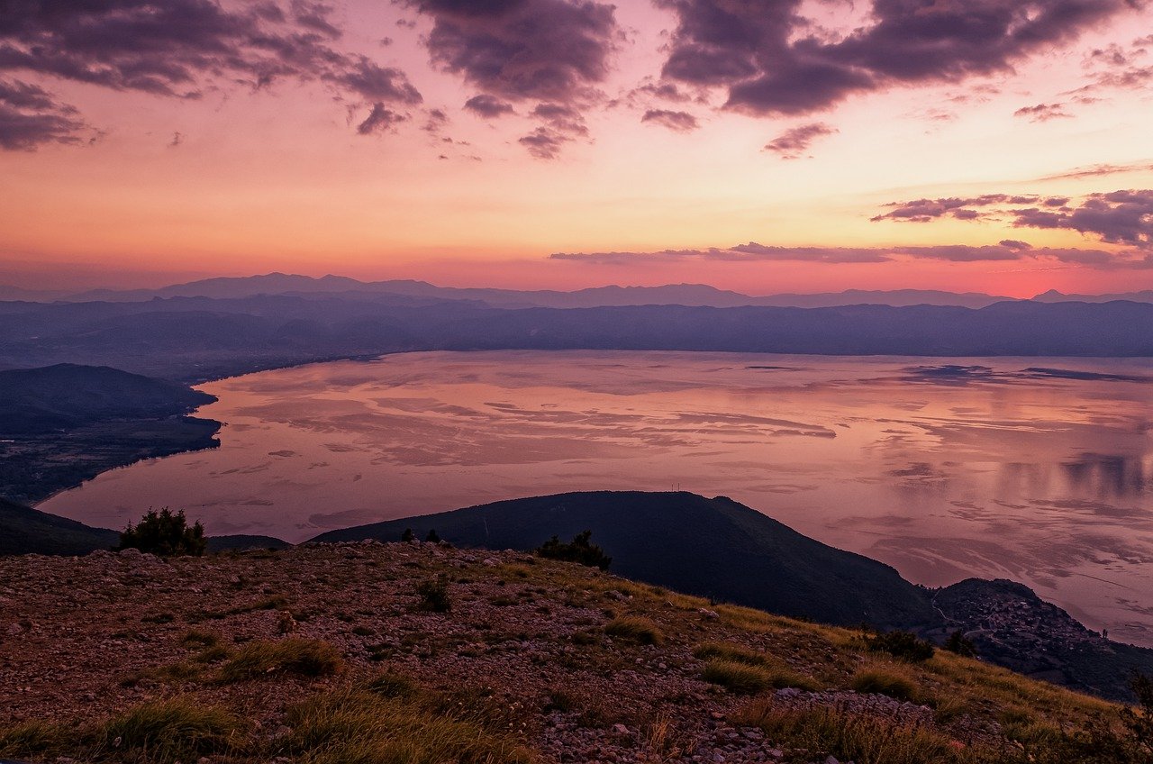
Drawing and Rendering a Picture Perfect Sunset
Creating a stunning sunset artwork can be one of the most rewarding experiences for any artist. The vibrant colors, the soft transitions, and the emotional impact of a sunset can elevate your work from ordinary to extraordinary. But how do you capture that fleeting moment when the sun dips below the horizon, painting the sky with hues that seem almost too beautiful to be real? This article explores techniques and tips for creating stunning sunset artwork, covering everything from color choices to composition and lighting effects, ensuring your sunset drawings are truly captivating.
One of the most enchanting aspects of sunsets is their rich palette of colors. Picture this: as the sun sets, the sky transforms into a canvas of oranges, pinks, purples, and deep blues. These colors can evoke feelings of warmth, tranquility, and even nostalgia. To effectively mix and apply these hues, you can start by familiarizing yourself with the basic color wheel and how colors interact with one another. For instance, combining a vibrant orange with a soft lavender can create a stunning gradient that mimics the natural beauty of a sunset.
When painting sunsets, consider using the following color combinations:
- Warm Colors: Reds, oranges, and yellows to depict the sun's glow.
- Cool Colors: Blues and purples to represent the sky's fading light.
- Neutral Tones: Grays and browns for adding depth and balance.
Experimenting with these colors can lead to a more dynamic and vibrant sunset scene. Remember, the key is to blend these colors seamlessly to create depth and vibrancy in your artwork.
The medium you choose can significantly affect the outcome of your sunset artwork. Each artistic medium has its unique qualities that can enhance the way you render colors and textures. Here’s a brief overview of some popular mediums:
| Medium | Characteristics | Best For |
|---|---|---|
| Watercolors | Translucent, easy to blend | Soft, atmospheric sunsets |
| Acrylics | Vibrant colors, quick drying | Bold, textured sunsets |
| Pastels | Rich pigmentation, easy to layer | Soft edges and blending |
Choosing the right medium depends on the effect you want to achieve. Watercolors are fantastic for creating soft and ethereal sunsets, while acrylics can produce strikingly bold colors that capture the intensity of the moment. Pastels, on the other hand, can provide a unique texture that adds depth to your artwork.
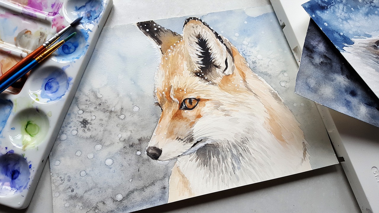
Watercolors can be particularly magical when it comes to painting sunsets. The fluid nature of the medium allows for beautiful blending and layering. To achieve soft, atmospheric sunset effects, consider these techniques:
- Layering: Start with light washes and gradually build up color intensity.
- Blending: Use a wet brush to blend colors while they are still wet on the paper.
These methods can help you mimic the delicate transitions found in nature, allowing your artwork to breathe life into the canvas.
When working with watercolors, understanding the difference between wet-on-wet and wet-on-dry techniques is crucial. Wet-on-wet involves applying wet paint onto a wet surface, which can create soft edges and beautiful gradients. In contrast, wet-on-dry involves painting wet colors onto dry paper, resulting in sharper lines and more defined shapes. By mastering both techniques, you can choose how to depict various sunset effects and textures in your artwork.
For an innovative approach to adding texture, consider using salt in your watercolor sunset paintings. When salt is sprinkled onto wet paint, it absorbs the moisture and creates unique patterns as it dries. This technique can simulate the look of clouds or distant mountains, adding an unexpected twist to your artwork.
If you prefer working with acrylics, you have the opportunity to create bold colors and textures that capture the essence of a sunset. Acrylics dry quickly, allowing you to layer colors effectively. Use a palette knife to apply thick layers of paint for a textured effect that can mimic the rugged beauty of a sunset. You can also experiment with glazing to add depth and luminosity to your colors, creating a more vibrant scene.
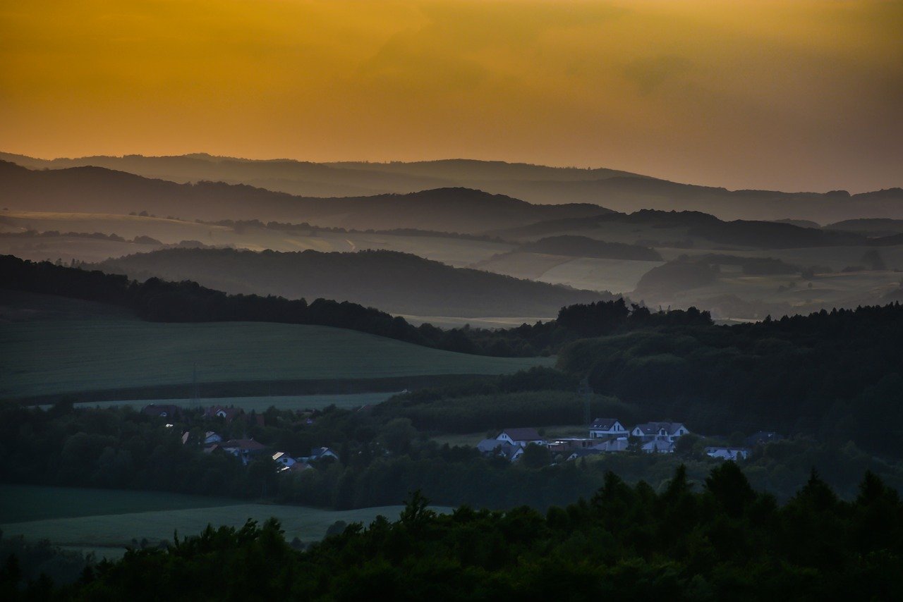
Understanding composition is crucial for effective sunset drawings. The way you position elements within your artwork can significantly impact its visual appeal. A well-composed sunset scene draws the viewer's eye and creates a sense of balance. Consider the placement of the horizon line—this can guide the viewer's gaze and enhance the overall composition.
Balancing foreground and background elements is essential in creating depth and interest in your sunset compositions. Consider adding silhouettes of trees, mountains, or buildings in the foreground to contrast against the vibrant sky. This not only adds interest but also helps to frame the sunset, making it the focal point of your artwork.
The horizon line plays a significant role in sunset artwork. It can create a sense of distance and perspective, guiding the viewer's eye across the canvas. A low horizon line can emphasize the sky, while a higher horizon can bring more focus to the foreground elements. Experiment with different placements to see how they affect the overall feel of your piece.
Light interacts with colors in fascinating ways during sunsets. Understanding how to depict light sources and shadows can enhance the realism of your drawings. Use strategic highlights and shadows to create a three-dimensional effect, making your sunset come alive on the canvas.
Using white strategically can highlight areas in your sunset artwork, creating contrast and enhancing luminosity. For instance, adding white to the edges of clouds can simulate the sun's reflection, giving your painting a glowing effect. This simple technique can elevate your artwork and make it stand out.
Rendering shadows effectively is another crucial aspect of depicting sunsets. Shadows can convey the fading light of the setting sun, adding depth and realism to your scene. Use darker shades of the colors in your sunset palette to create shadows that complement the overall color scheme.
Once you've completed your sunset artwork, it's time to consider the finishing touches. Varnishing and framing your piece can protect it and enhance its visual impact. A good varnish can bring out the colors and add a professional finish, while a well-chosen frame can complement your artwork and make it pop.
Varnishing is an essential step in preserving your artwork. It protects the surface from dust, UV rays, and moisture, ensuring that your sunset painting remains vibrant for years to come. Choose a varnish that suits your medium—glossy for acrylics and matte for watercolors can yield stunning results.
Framing can make a world of difference in how your sunset artwork is perceived. Select frames that complement the colors and style of your painting. A simple, elegant frame can allow the artwork to shine, while a more ornate frame can add a touch of sophistication. Remember, the frame is part of the presentation, so choose wisely!
Q: What is the best medium for beginners wanting to paint sunsets?
A: Watercolors are often recommended for beginners due to their forgiving nature and ease of blending. However, acrylics can also be a great choice for their vibrant colors and versatility.
Q: How do I create depth in my sunset painting?
A: To create depth, balance foreground and background elements, use varying shades of color, and pay attention to your horizon line placement.
Q: Can I use photographs as references for my sunset artwork?
A: Absolutely! Using photographs can help you understand color transitions and compositions, but try to add your personal touch to make it unique.
Q: What are some common mistakes to avoid when painting sunsets?
A: Some common mistakes include overusing black for shadows, not blending colors well, and neglecting the importance of composition. Always strive for balance and harmony in your artwork.

Understanding Sunset Colors
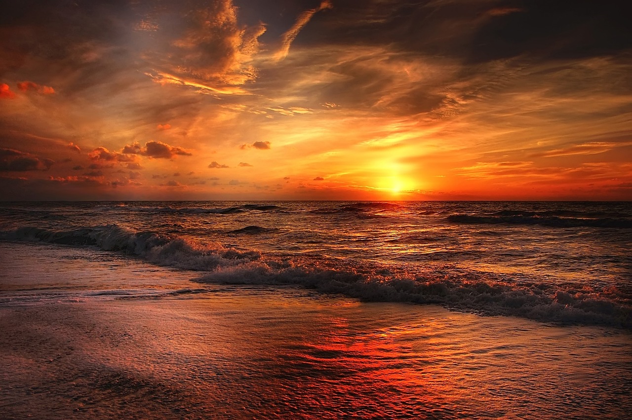
Sunsets are a breathtaking spectacle, showcasing a vibrant tapestry of colors that can leave any artist in awe. The rich palette of hues that emerge during this magical time of day is not just a feast for the eyes; it's a treasure trove of inspiration for artists looking to capture nature's beauty on canvas. From fiery oranges to soft purples, understanding these colors is crucial for creating a stunning sunset artwork. So, how do you effectively mix and apply these hues to create depth and vibrancy in your pieces?
To begin with, it’s essential to recognize the primary colors that dominate a sunset. Typically, you’ll see a gradient of colors that can be categorized into warm tones and cool tones. Warm tones like reds, oranges, and yellows often dominate the sky, radiating warmth and energy. In contrast, cool tones such as blues and purples can add a sense of calmness and depth, creating a beautiful balance. Here’s a quick breakdown of some common sunset colors:
| Color | Emotion/Effect |
|---|---|
| Red | Passion, intensity |
| Orange | Joy, enthusiasm |
| Yellow | Happiness, warmth |
| Purple | Mystery, tranquility |
| Blue | Calm, serenity |
When mixing these colors, consider the color wheel as your best friend. Complementary colors can create stunning contrasts, while analogous colors can produce a harmonious blend. For instance, pairing warm oranges with cooler blues can evoke a sense of drama and intrigue. It’s like creating a symphony of colors where each note plays a vital role in the overall composition.
Don’t forget about the importance of layering your colors. Start with lighter shades and gradually build up to darker hues. This technique not only adds depth but also mimics the natural transition of colors seen in a sunset. Experiment with different blending techniques to see how colors interact with each other. Sometimes, you might find that a splash of white can elevate your artwork, creating highlights that mimic the last rays of sunlight.
As you embark on your sunset painting journey, remember to observe real sunsets. Take the time to step outside and watch the sky transform. Notice how the colors shift and change, and try to capture that essence in your artwork. After all, the beauty of a sunset is not just in the colors themselves but in how they interact and evolve over time. So grab your brushes, and let the colors of the sunset inspire you to create something truly captivating!
- What colors should I use for a sunset painting? Focus on warm tones like reds, oranges, and yellows, complemented by cool tones like blues and purples.
- How do I create depth in my sunset artwork? Use layering techniques and mix lighter colors first, gradually adding darker shades.
- Can I use any medium for sunset paintings? Yes, but different mediums like watercolors and acrylics will yield different effects.

Choosing the Right Medium
When it comes to creating breathtaking sunset artwork, the choice of medium can make all the difference. Each medium brings its own unique qualities, allowing artists to express the vibrant hues and soft transitions of a sunset in various ways. Whether you lean towards the fluidity of watercolors, the boldness of acrylics, or the subtlety of pastels, understanding these options will empower you to choose the best fit for your artistic vision.
Watercolors are often the go-to choice for artists aiming to capture the delicate and ethereal nature of sunsets. The beauty of watercolors lies in their ability to blend seamlessly, creating soft gradients that mimic the sky's colors as they shift from fiery oranges to deep purples. One of the key advantages of using watercolors is the ability to layer and create depth, allowing the artist to build the sunset gradually. However, mastering watercolors requires practice, particularly in controlling water and pigment to achieve the desired effects.
Acrylic paints, on the other hand, offer a different experience. These paints are known for their vibrant colors and quick drying time, making them ideal for artists who want to work swiftly. The boldness of acrylics can bring a sunset to life with striking contrasts and textures. When using acrylics, you can easily create sharp lines and defined shapes, which can be particularly effective for depicting silhouettes against a sunset backdrop. However, the challenge lies in blending, as acrylics dry quickly, requiring artists to work efficiently to achieve smooth transitions.
If you prefer a more tactile approach, consider pastels. This medium allows for a hands-on experience, where you can apply color directly onto the paper. Pastels can produce stunningly rich colors and soft textures, perfect for portraying the warm glow of a sunset. The downside is that pastels can be messier and may require a fixative to preserve the artwork, but the results can be incredibly rewarding.
To help you decide, here’s a quick comparison of the three mediums:
| Medium | Characteristics | Best For |
|---|---|---|
| Watercolors | Soft, fluid, and transparent | Delicate sunset effects and blending |
| Acrylics | Bold, vibrant, and quick-drying | Sharp contrasts and defined shapes |
| Pastels | Rich, textured, and tactile | Warm, glowing sunset colors |
Ultimately, the right medium for your sunset artwork depends on your personal style and the effect you wish to achieve. Experimenting with different mediums can lead to exciting discoveries and unique results. So, grab your brushes, pastels, or paints, and start creating your masterpiece!
- What is the best medium for beginners? Watercolors are often recommended for beginners due to their forgiving nature and ease of blending.
- Can I mix mediums in my artwork? Absolutely! Many artists combine mediums to take advantage of the unique properties of each.
- How do I preserve my sunset artwork? Using a fixative for pastels and varnish for acrylics can help protect your artwork from fading and damage.
Watercolor Techniques
When it comes to capturing the ethereal beauty of a sunset, are among the most effective methods. The fluidity and transparency of watercolors allow artists to create soft gradients and luminous effects that mimic the natural transitions of light and color in a sunset. One of the key techniques to master is layering, which involves applying multiple washes of color to build depth and vibrancy. Start with a light wash of yellow or orange to establish the base of your sunset, then gradually layer deeper hues like reds, purples, and blues as you move towards the horizon.
Another essential technique is blending, which can be achieved by wetting the paper before applying paint or by using a wet brush to smooth out the edges between colors. This creates a seamless transition, making your sunset look more realistic. Remember, the goal is to evoke the feeling of being present at that magical moment when the sun dips below the horizon, so focus on creating soft, flowing colors rather than harsh lines.
Additionally, don't shy away from experimenting with different tools. A fan brush can be particularly useful for creating the wispy clouds that often accompany sunsets. By lightly dragging the brush across the paper, you can mimic the delicate, feathery shapes of clouds illuminated by the setting sun. The key is to keep your strokes light and airy, allowing the colors to blend naturally.
Furthermore, consider using a wet-on-wet technique where you apply wet paint onto wet paper. This allows the colors to diffuse beautifully, creating soft edges and a dreamy quality that is perfect for sunsets. However, it's essential to control the amount of water you use; too much can lead to a muddy effect. Instead, aim for a balance where the colors flow without losing their vibrancy.
For those looking to add a unique twist to their watercolor sunsets, try incorporating salt into your technique. Sprinkling salt onto wet paint creates fascinating textures and patterns as it absorbs the paint, resulting in a stunning visual effect that can mimic the sparkle of water or the roughness of clouds. This technique not only adds interest but also enhances the overall composition of your artwork.
In summary, mastering watercolor techniques for sunset paintings involves a combination of layering, blending, and experimenting with various tools and methods. The beauty of watercolors lies in their unpredictability, allowing you to create unique and captivating sunset artworks that resonate with viewers. So grab your brushes, mix those vibrant hues, and let the magic of sunset painting unfold!
- What type of paper is best for watercolor painting?
It's recommended to use 300gsm (140lb) cold-pressed watercolor paper for its ability to hold water without warping. - Can I use acrylics for sunset paintings?
Absolutely! Acrylics can provide bold colors and textures, making them a great alternative to watercolors. - How do I achieve vibrant colors in my sunset?
Start with a clean palette and mix your colors well. Use high-quality pigments for the best results.
Wet-on-Wet vs. Wet-on-Dry
When it comes to painting sunsets, understanding the difference between wet-on-wet and wet-on-dry techniques can elevate your artwork to new heights. Both methods offer unique advantages, and knowing when to use each can make a significant difference in the final outcome of your piece. So, let’s dive into these two exciting techniques!
The wet-on-wet technique involves applying wet paint onto a wet surface. This method is fantastic for creating soft, blended transitions, particularly in the vibrant colors of a sunset. When you drop a fresh wash of color onto a damp canvas, the pigments spread and merge beautifully, mimicking the natural diffusion of light in the sky. Imagine the way colors bleed into one another at dusk—this technique captures that essence perfectly. However, it can be challenging to control the outcome, as the colors can mix unpredictably. But hey, that’s part of the beauty of it! Embrace the surprises!
On the other hand, the wet-on-dry technique involves painting wet pigments onto a dry surface. This method allows for more precision and control, making it ideal for adding details to your sunset artwork, such as silhouettes of trees or buildings against the colorful sky. With this approach, you can achieve sharper edges and defined shapes, which can be essential when you want to create contrast in your composition. Think of it like the outline of a mountain range against a fiery sunset; the clarity adds drama and depth to your work.
To summarize the differences, here’s a quick comparison:
| Technique | Characteristics | Best For |
|---|---|---|
| Wet-on-Wet | - Soft blends - Unpredictable mixing - Atmospheric effects |
- Creating gradients - Mimicking natural light diffusion |
| Wet-on-Dry | - Sharp edges - More control - Defined shapes |
- Adding details - Creating contrast |
Ultimately, the choice between wet-on-wet and wet-on-dry techniques boils down to the effect you wish to achieve in your sunset artwork. Why not experiment with both? You might find that combining the two techniques yields stunning results, allowing you to create a sunset that is not only vibrant but also rich in detail. So grab your brushes and paints, and let your creativity flow!
- Can I use both techniques in one painting?
Absolutely! Many artists find that combining wet-on-wet and wet-on-dry techniques can create a more dynamic and interesting piece. - Which technique is better for beginners?
Wet-on-wet might be easier for beginners since it allows for more forgiving blending. However, practicing wet-on-dry can also be beneficial for developing control. - What types of brushes are best for these techniques?
Soft, round brushes work well for wet-on-wet, while flat or angled brushes are great for wet-on-dry techniques, allowing for precision.
Using Salt for Texture
When it comes to creating captivating sunset artwork, the use of salt as a texturing tool can truly elevate your painting to the next level. Imagine the shimmering effect of sunlight dancing on water or the soft, grainy texture of clouds as they catch the last rays of the day. Salt has a magical ability to absorb water and pigment, resulting in stunning patterns that mimic the natural beauty of a sunset. This technique is not only simple but also allows for a level of creativity that can surprise even the most seasoned artists.
To start this process, you will want to apply your watercolor paint onto wet paper. This is where the real magic happens! As you paint, the salt can be sprinkled onto the wet surface, and it will begin to absorb the surrounding pigments. The result? Unique textures that can resemble everything from distant mountains to wispy clouds, enhancing the depth and vibrancy of your sunset scene. The key here is to experiment with the amount of salt you use, as different quantities can yield different effects. A light sprinkle might create a subtle texture, while a heavier application can lead to more dramatic, bold patterns.
Here’s a quick guide on how to effectively use salt in your sunset paintings:
- Choose the Right Salt: Coarse sea salt or kosher salt works best, as the larger grains create more pronounced textures.
- Apply While Wet: Make sure your paint is still wet when you sprinkle the salt. This ensures that the salt interacts properly with the pigments.
- Let it Dry: Allow your painting to dry completely before brushing off the salt. This is when the magic happens, revealing the beautiful textures underneath.
One of the most fascinating aspects of using salt is the unpredictability of the results. Just like a sunset itself, each piece you create will be unique. You might find that some areas absorb more pigment than others, creating a beautiful contrast that draws the viewer's eye. This spontaneity is what makes using salt such an exciting technique; it encourages you to embrace the unexpected and celebrate the beauty of imperfections.
As you experiment with salt, don’t be afraid to combine it with other techniques as well. For instance, layering salt textures with wet-on-wet techniques can create a stunning interplay of colors and patterns. You can even use salt in conjunction with other materials, such as alcohol or rubbing alcohol, to create even more dynamic effects. The possibilities are endless, and with each experiment, you will discover new ways to represent the breathtaking beauty of a sunset.
Q: Can I use regular table salt instead of coarse salt?
A: While you can use regular table salt, it tends to dissolve more quickly and may not create the same textured effects as coarse salt. Coarse salt is recommended for better results.
Q: How long should I leave the salt on my painting?
A: It’s best to leave the salt on until the painting is completely dry. This allows the salt to absorb the pigment fully and create the desired texture.
Q: Can I reuse the salt after it’s been used in painting?
A: It’s not advisable to reuse salt that has been used in painting, as it may contain pigments and moisture that could affect future projects.

Acrylic Techniques
When it comes to capturing the breathtaking beauty of a sunset, acrylic paints offer a vibrant and versatile medium that can truly bring your artwork to life. One of the most appealing aspects of acrylics is their ability to dry quickly, allowing artists to layer colors and create stunning effects without long wait times. Imagine being able to paint the fiery oranges and deep purples of a sunset in just a few strokes, watching as the colors blend seamlessly on your canvas. To get started, you’ll want to consider a few key techniques that can elevate your sunset paintings to new heights.
One popular technique is the wet-on-wet method, where you apply wet paint onto a wet surface. This technique allows for smooth blending, which is essential for replicating the soft gradients of a sunset sky. By using a large brush, you can create sweeping strokes that mimic the gentle movement of clouds, while a smaller brush can help you add details like distant mountains or silhouettes of trees. The beauty of acrylics lies in their opacity and vibrancy, so don’t be afraid to layer colors to achieve the depth and richness that a sunset deserves.
Another effective approach is to use glazing. This is where you apply thin, transparent layers of paint over a dried base layer. Glazing can help you achieve a luminous quality in your sunset artwork, making the colors appear as if they are glowing from within. Start with a base layer of warm tones like yellows and oranges, and then add a glaze of deep reds or purples to create that stunning twilight effect. Remember, the key to successful glazing is to allow each layer to dry completely before adding the next one.
Texture is also an important element in acrylic sunset paintings. You can create interesting textures by using various tools and techniques. For instance, a palette knife can be used to create sharp lines and peaks that resemble the jagged edges of clouds. Alternatively, you can experiment with sponges or even your fingers to dab on paint, creating a more organic, abstract look. The goal is to capture the essence of the sunset, so don’t hesitate to let your creativity run wild!
If you want to take your sunset artwork a step further, consider incorporating metallic paints or iridescent mediums. These can add a shimmering quality to your sky, reflecting light in a way that mimics the sun’s rays as they dip below the horizon. Just a touch of metallic gold or silver can transform an ordinary sunset into something truly extraordinary.
Finally, remember that practice makes perfect. Don’t be discouraged if your first few attempts don’t turn out exactly as you envisioned. Each painting is a step towards mastering the art of acrylic sunsets. Keep experimenting with different techniques, color combinations, and compositions until you find your unique style. After all, every sunset is different, and your artwork should reflect that diversity.
- What is the best type of acrylic paint for sunset paintings? Look for high-quality, artist-grade acrylics that offer vibrant colors and good coverage for the best results.
- Can I mix acrylics with other mediums? Yes! Acrylics can be mixed with mediums like gels and pastes to enhance texture and finish.
- How do I clean my brushes after using acrylic paint? Rinse your brushes in water immediately after use, and use soap to clean them thoroughly to prevent paint from drying on the bristles.
Composition and Perspective
When it comes to capturing the breathtaking beauty of a sunset, composition and perspective play pivotal roles in how your artwork resonates with viewers. Think of composition as the framework of your painting; it’s the way you arrange elements to create a harmonious and engaging scene. Just like a well-composed photograph, a sunset drawing must draw the eye and evoke emotion. But how do you achieve that perfect balance? It all starts with understanding the placement of your elements.
One of the most effective ways to enhance your sunset artwork is by considering the rule of thirds. Imagine dividing your canvas into a 3x3 grid. By positioning key elements along these lines or at their intersections, you create a sense of movement and interest. For instance, placing the horizon line along the lower third of your canvas allows the vibrant colors of the sunset to dominate the upper two-thirds, making your artwork feel expansive and inviting. But remember, rules are meant to be bent! Feel free to experiment and find what works best for your unique vision.
Another crucial aspect of composition is the balance between the foreground and background. A well-balanced composition can add depth and interest to your sunset drawing. For example, consider adding silhouettes of trees or mountains in the foreground. This not only frames your sunset but also provides a striking contrast against the vivid colors of the sky. By incorporating these elements, you lead the viewer’s eye through the artwork, creating a journey that enhances the overall experience. Here’s a simple breakdown of how to achieve this:
| Element | Purpose |
|---|---|
| Foreground | Frames the scene and adds depth. |
| Background | Sets the mood and atmosphere. |
Now, let’s talk about horizon lines. They are not just a boundary between land and sky; they are a powerful tool for guiding the viewer’s gaze. A low horizon line can evoke feelings of vastness and freedom, while a high horizon line can create a sense of intimacy, drawing the viewer closer to the scene. Experimenting with the placement of your horizon line can drastically change the emotion conveyed in your artwork. So, don’t hesitate to adjust it based on the mood you want to create!
In addition to horizon lines, consider the use of leading lines within your composition. These can be natural elements like a winding river or a pathway that draws the viewer’s eye toward the sunset. Using leading lines effectively can create a sense of depth and perspective, making your artwork feel more dynamic and engaging. It’s like inviting the viewer to step into the scene and experience the sunset firsthand.
Ultimately, the key to mastering composition and perspective in sunset artwork lies in practice and experimentation. Don’t be afraid to try different arrangements and perspectives. Sometimes, the most unexpected compositions yield the most stunning results. So grab your brushes, let your creativity flow, and remember that every sunset is a unique masterpiece waiting to be captured!
- What is the rule of thirds in art? The rule of thirds is a composition guideline that suggests dividing the canvas into a 3x3 grid and placing key elements along these lines or intersections for a more balanced and dynamic composition.
- How can I create depth in my sunset drawing? You can create depth by balancing foreground and background elements, using horizon lines effectively, and incorporating leading lines to guide the viewer's eye through the artwork.
- What should I consider when choosing my horizon line? Consider the mood you want to convey; a low horizon line can create a sense of vastness, while a high horizon line can provide intimacy and closeness to the scene.
Foreground and Background Balance
When it comes to creating a stunning sunset artwork, achieving a harmonious balance between the foreground and background is essential. Think of your painting as a stage where the sunset is the star of the show, but the supporting cast—the elements in the foreground—are just as important. They help frame your masterpiece and guide the viewer's eye, adding depth and interest to your composition. Without this balance, your artwork may feel flat or disjointed, lacking the dynamic quality that makes sunsets so captivating.
To establish this balance, consider the following key elements:
- Layering: Use layers to create a sense of depth. The foreground can feature darker, more detailed elements, while the background can be lighter and more abstract, allowing the vibrant colors of the sunset to shine through.
- Contrast: Utilize contrasting colors and tones to differentiate the foreground from the background. For instance, if your sunset features warm oranges and pinks, consider using cooler shades like blues and purples in the background to create a striking visual effect.
- Size and Scale: Incorporate larger objects in the foreground to draw attention, while keeping background elements smaller and less detailed. This technique tricks the eye into perceiving depth, making the scene feel more immersive.
Imagine standing on a beach at sunset. The gentle waves lapping at the shore (your foreground) are painted in rich, dark blues and greens, while the sky above explodes with fiery oranges and soft pinks. The contrast between the two draws your gaze upward, inviting you to lose yourself in the mesmerizing colors of the setting sun. This is the kind of balance you want to achieve in your artwork.
Moreover, consider the placement of elements. A well-placed silhouette of a tree or a distant mountain range can add intrigue and serve as a visual anchor in your painting. By strategically positioning these elements, you can create a sense of movement and flow, guiding the viewer's eye across the canvas. Remember, the foreground and background should not compete for attention; instead, they should work in harmony to enhance the overall impact of your sunset scene.
In conclusion, mastering the balance between foreground and background is crucial for creating captivating sunset artwork. By layering, using contrast, and thoughtfully placing elements within your composition, you can create a dynamic and engaging piece that captures the breathtaking beauty of a sunset. So grab your brushes and start experimenting with these techniques—your canvas is waiting!
- What is the best way to create depth in sunset paintings? Layering different elements and using contrasting colors can help establish depth.
- How do I choose colors for my sunset artwork? Observe real sunsets and try to replicate the vibrant hues you see, mixing them to achieve the desired effect.
- Can I use multiple mediums for sunset art? Absolutely! Experimenting with different mediums can yield unique textures and effects.

Using Horizon Lines
The horizon line is an essential element in sunset artwork, serving as the dividing line between the sky and the earth. Its placement can dramatically affect the overall composition and emotional impact of your piece. Imagine standing on a beach, watching the sun dip below the ocean; that line where the water meets the sky is what creates depth and perspective in your drawing. By carefully considering where to position your horizon line, you can guide the viewer's eye and evoke a sense of tranquility or drama.
When drawing sunsets, the horizon line can be placed in various positions to achieve different effects:
- Low Horizon Line: Placing the horizon line lower in your composition emphasizes the sky, showcasing the vibrant colors of the sunset. This approach can create a sense of openness and freedom.
- High Horizon Line: A higher horizon line shifts the focus to the foreground, often incorporating elements like trees, mountains, or buildings. This can add interest and complexity to your artwork, drawing attention to the interplay between the foreground and the sunset.
Additionally, consider the angle of the horizon line. A straight horizontal line can create a calm and peaceful atmosphere, while a diagonal line can introduce a dynamic tension, suggesting movement or change. Think of how a diagonal horizon might evoke the feeling of a storm brewing on the horizon, contrasting with the serene colors of a sunset. Experiment with these placements to find what resonates with your artistic vision.
It's also important to remember that the horizon line can be influenced by the landscape you choose to depict. For example, a coastal sunset may feature a horizon line that dips into the ocean, while a desert sunset might have a horizon line that stretches across vast, flat terrain. Each landscape offers unique opportunities to play with the horizon line and enhance your sunset artwork.
In conclusion, the horizon line is not just a simple line; it is a powerful tool that can shape the mood and message of your sunset artwork. By thoughtfully considering its placement and angle, you can create compositions that not only capture the beauty of a sunset but also tell a story that resonates with viewers.
- What is the best position for the horizon line in sunset drawings?
The best position depends on the effect you want to achieve. A low horizon line emphasizes the sky, while a high horizon line focuses on the foreground. - How can I make my horizon line more interesting?
Consider using diagonal lines or integrating landscape elements to create depth and movement in your artwork. - Can the horizon line affect the mood of my artwork?
Absolutely! The placement and angle of the horizon line can evoke feelings of calmness, tension, or openness.
Lighting Effects in Sunset Art
When it comes to capturing the essence of a sunset in your artwork, understanding lighting effects is crucial. The interplay of light and color during this magical time of day can transform a simple scene into a breathtaking masterpiece. Think of a sunset as nature's own light show, where the sun dips below the horizon, casting a warm glow over everything it touches. This section will guide you through the techniques to effectively depict light sources and shadows, enhancing the realism and emotional impact of your sunset art.
The first step in mastering lighting effects is to observe how light interacts with different elements in your scene. During sunset, the sky is often ablaze with hues of orange, pink, and purple, while the ground may be bathed in soft shadows. By understanding these dynamics, you can create a more realistic representation of a sunset. For instance, consider how the light from the setting sun can create a glow on clouds, making them appear almost ethereal. To replicate this effect, use lighter shades of your sunset colors, blending them gently with deeper tones to create a smooth transition.
One effective technique for highlighting areas in your sunset artwork is the strategic use of white paint. By adding touches of white to your palette, you can enhance luminosity and create striking contrasts that draw the viewer's eye. For example, when painting the sun itself, a bright white or pale yellow can make it pop against the darker shades of the surrounding sky. This technique not only adds depth but also gives your painting a sense of vibrancy that captures the fleeting beauty of a sunset.
Another important aspect of lighting in sunset art is the depiction of shadows. Shadows play a vital role in creating depth and dimension in your artwork. As the sun sets, shadows lengthen and soften, which can dramatically change the appearance of your landscape. To effectively render shadows, consider the following tips:
- Observe Real Life: Take note of how shadows behave in natural light. This will help you replicate them in your artwork.
- Use Cool Colors: Shadows are typically cooler than the areas they fall on. Incorporate blues or purples into your shadow palette for a more realistic effect.
- Blend Gently: Avoid harsh lines when painting shadows. Instead, use soft transitions to mimic the gradual fading of light.
As you work on your sunset painting, remember that the goal is to evoke emotion and capture the viewer's imagination. By mastering the art of lighting, you can create stunning visuals that not only depict the beauty of a sunset but also transport your audience to that serene moment when day transitions to night. So grab your brushes and let the magic of light guide your creativity!
Q: What colors should I use for a sunset painting?
A: The colors of a sunset can vary widely, but common hues include oranges, pinks, purples, and yellows. It's essential to blend these colors smoothly to create a natural gradient.
Q: Which medium is best for painting sunsets?
A: Watercolors and acrylics are both excellent choices for sunset paintings. Watercolors can create soft, atmospheric effects, while acrylics allow for bold colors and textures.
Q: How can I make my sunset painting look more realistic?
A: Focus on the interplay of light and shadow. Use lighter colors to highlight areas where the sun hits and incorporate cooler tones for shadows. Observing real sunsets can also provide inspiration.

Highlighting with White
When it comes to capturing the breathtaking beauty of a sunset, can truly elevate your artwork to new heights. Think of white as the secret ingredient that brings your painting to life, much like a sprinkle of salt enhances the flavor of a delicious dish. By strategically applying white, you can create stunning contrasts that mimic the shimmering light of the setting sun reflecting off clouds or water.
One effective technique is to use white to highlight the areas where the sun’s rays are most intense. Imagine the sun dipping below the horizon, casting a warm glow across the sky. By adding a touch of white to these areas, you can simulate that radiant effect. This not only adds depth but also draws the viewer's eye to the focal point of your sunset scene. However, moderation is key; too much white can overpower the delicate balance of colors that define a sunset.
To achieve a soft, glowing effect, consider using a dry brush technique. Here’s how you can do it:
- Start with a clean, dry brush and dip it lightly into white paint.
- Gently brush it over the areas where you want to create highlights, using a light touch to avoid harsh lines.
- Layer the white gradually, allowing each layer to dry before adding more, which helps to build a soft luminosity.
Another approach is to use a palette knife to apply white paint. This can create a textured effect that adds an exciting dimension to your sunset artwork. The knife allows for more control over the amount of paint applied, helping you to achieve sharp highlights that can contrast beautifully with the softer hues of the sunset.
In addition to these techniques, consider the placement of your highlights. A well-placed touch of white can guide the viewer’s eye across your painting, creating a sense of movement and fluidity. For example, if your sunset features clouds, adding white highlights to the edges can simulate the sun’s rays illuminating them, making them appear more three-dimensional.
Remember, the key to successful highlighting is not just about adding white but understanding how it interacts with the other colors in your palette. Experiment with different shades of white—some artists prefer a warm white mixed with a bit of yellow or orange to maintain that sunset glow, while others might opt for a cooler white to create a more dramatic effect. The choice is yours, and it can significantly change the mood of your artwork.
In conclusion, highlighting with white is an essential technique for creating captivating sunset artwork. It’s about more than just the color; it’s about the emotion and atmosphere you wish to convey. So next time you sit down to paint a sunset, don’t forget to reach for that tube of white and let your creativity shine!
- What type of white paint should I use for highlighting? Acrylic or watercolor white paints work well, but choose a shade that complements your overall palette.
- Can I use white for highlights in other types of artwork? Absolutely! Highlighting techniques can be applied to various styles and subjects, not just sunsets.
- How do I avoid overusing white in my paintings? Start with a small amount and build up gradually, assessing the effect as you go.
Shadow Techniques
When it comes to capturing the essence of a sunset in your artwork, understanding is crucial. Shadows are not just dark patches; they are an integral part of the composition that adds depth and realism. Imagine standing on a beach, watching the sun dip below the horizon. The way the light fades and the shadows elongate can evoke emotions and set the mood of your piece. So, how do you effectively render these shadows in your sunset paintings? Let's dive into some techniques that can help you achieve stunning results.
One of the most important aspects of shadow rendering is understanding the light source. During a sunset, the sun is low on the horizon, casting long, dramatic shadows. To mimic this effect, you should consider the angle of your light source. For instance, if the sun is setting to the left of your canvas, the shadows will stretch towards the right. This directional quality of light can be emphasized by using a gradual transition from light to dark. Start with a light base color and gradually add darker shades to create the illusion of depth.
Another effective technique is to use layering. Begin with a base layer of your shadow color, which should be slightly darker than the colors surrounding it. After this initial layer dries, add additional layers, incorporating different hues to reflect the colors of the sunset. For example, if your sunset features vibrant oranges and pinks, consider adding subtle hints of these colors into your shadows to create a cohesive look. This technique not only enhances the shadows but also ties them into the overall color palette of your artwork.
Moreover, consider the texture of your shadows. Shadows can vary in softness or hardness depending on the object casting them. For softer edges, use a wet brush to blend the edges of your shadows into the surrounding colors. This technique is especially effective in watercolor, where the fluid nature of the medium allows for beautiful transitions. On the other hand, if you’re working with acrylics, use a dry brush technique to create more defined, sharper shadows. This contrast can add a dynamic quality to your sunset scene.
Lastly, don't forget about the foreground elements. Incorporating objects like trees, mountains, or buildings can enhance the shadow play in your artwork. When these elements are placed strategically, they can create a sense of scale and perspective, making the sunset feel more immersive. As the sun sets, the shadows cast by these objects can stretch dramatically, leading the viewer's eye across the canvas. This interplay of light and shadow not only adds interest but also invites the viewer to explore the entire scene.
In summary, mastering shadow techniques in sunset artwork requires a blend of understanding light sources, layering colors, manipulating textures, and considering foreground elements. By applying these techniques, you can create captivating sunset paintings that not only depict the beauty of nature but also evoke emotions and tell a story. So grab your brushes and start experimenting with shadows to elevate your sunset art to new heights!
- What colors should I use for shadows in sunset paintings?
Shadows during sunsets can incorporate darker shades of the colors present in the sunset itself. Consider using deep purples, blues, or even hints of the warm sunset colors like oranges and pinks to create a harmonious look. - How can I make my shadows look more realistic?
To achieve realistic shadows, focus on the direction of your light source and ensure that your shadows follow that direction. Use blending techniques to soften edges and create depth. - Can I use different mediums for shadow techniques?
Absolutely! Watercolors allow for soft blending, while acrylics can create sharper shadows. Experiment with both to see which effects you prefer.
Final Touches and Finishing Techniques
When it comes to creating stunning sunset artwork, the journey doesn't end with the strokes of your brush or pencil. The final touches and finishing techniques are what truly elevate your piece from good to breathtaking. Think of this stage as the cherry on top of a delicious sundae; it’s the finishing flourish that pulls everything together and makes your artwork shine. One of the first steps in this process is to consider the protective measures you want to take, such as varnishing.
Varnishing your artwork is essential, especially for mediums like acrylics and oils. It not only offers a protective layer against dust and UV light but also enhances the vibrancy of your colors. When choosing a varnish, consider the following options:
| Type of Varnish | Finish | Best for |
|---|---|---|
| Glossy Varnish | High shine | Bold colors and textures |
| Satin Varnish | Soft sheen | Balanced look |
| Matte Varnish | No shine | Subtle, soft pieces |
After selecting the right varnish, applying it correctly is crucial. Use a clean, wide brush to apply an even coat, ensuring you cover the entire surface without leaving any streaks. Allow it to dry completely, and you’ll see how the colors pop, making your sunset artwork even more captivating!
Next up is the framing of your artwork. The right frame can dramatically enhance the visual appeal of your piece. Just like a well-chosen outfit can elevate a person’s appearance, a good frame can make your sunset painting stand out. When selecting a frame, consider the following:
- Style: Choose a frame that complements the mood of your artwork. A rustic wooden frame might enhance a tranquil sunset, while a sleek metallic frame could suit a more modern piece.
- Color: Think about colors that will either contrast or harmonize with your sunset hues. Neutral tones often work well, but don't shy away from bold colors if they match the artwork's vibe.
- Size: Ensure the frame is proportional to your artwork. Too small, and it might look cramped; too large, and it could overwhelm the piece.
Finally, don’t forget about the presentation. Whether you’re displaying your artwork in a gallery or at home, the way it’s presented can make a significant difference. Consider using a mat board to add depth and create a visual buffer between the artwork and the frame. This small detail can make your sunset piece look even more polished and professional.
In conclusion, the final touches and finishing techniques are where your sunset artwork truly comes to life. By taking the time to varnish, frame, and present your piece thoughtfully, you ensure that it captures the essence of those vibrant sunset colors and leaves a lasting impression on anyone who gazes upon it. So, grab your varnish and frame, and let your artwork bask in the spotlight it deserves!
Q: How long should I wait before applying varnish to my artwork?
A: It's best to wait at least 6 months for oil paintings and 1 month for acrylics to ensure they are completely dry before varnishing.
Q: Can I use a spray varnish instead of a brush-on varnish?
A: Yes, spray varnishes can provide an even coat and are great for larger pieces, but make sure to use them in a well-ventilated area.
Q: What should I do if my artwork gets dusty?
A: Use a soft, dry cloth to gently wipe off dust. Avoid using water or cleaning solutions as they can damage the artwork.

Varnishing Your Artwork
When it comes to showcasing your stunning sunset artwork, varnishing is an essential step that should never be overlooked. Not only does varnish enhance the visual appeal of your painting, but it also provides a protective layer that guards against dust, dirt, and environmental factors. Imagine your vibrant sunset colors being dulled by time—varnishing is like putting a seal on your masterpiece, keeping it as breathtaking as the day you completed it.
There are several types of varnish available, each with its unique properties and finishes. The choice you make can significantly impact the final look of your artwork. Here’s a quick comparison of the main types:
| Type of Varnish | Finish | Best For |
|---|---|---|
| Gloss Varnish | Shiny | Enhancing vibrant colors |
| Satin Varnish | Soft sheen | Balanced look with some shine |
| Matte Varnish | No shine | Softening bold colors |
Before you start varnishing, ensure your painting is completely dry. This is crucial because applying varnish on a wet or even slightly damp surface can lead to uneven results and potential damage. Once you’ve confirmed that your artwork is ready, you can apply the varnish using a clean, soft brush or a spray can, depending on the type you've chosen. Consistency is key, so aim for even strokes and avoid overworking the area. A single, smooth coat is often enough, but don't hesitate to apply a second coat for added protection.
Varnishing not only enhances the colors of your sunset but also adds a layer of depth that can make the clouds and sky feel more lifelike. If you’re feeling adventurous, consider experimenting with a gloss varnish to amplify the vibrancy of the sunset hues. Just remember that a high-gloss finish can sometimes make imperfections more noticeable, so be sure your artwork is up to par.
After varnishing, allow your artwork to cure properly. This can take anywhere from a few hours to several days, depending on the varnish type and environmental conditions. Once fully cured, your painting will be ready to frame, and you can take pride in knowing that you’ve taken the necessary steps to protect your beautiful sunset masterpiece.
- How long should I wait before varnishing my painting? It's best to wait at least 24 hours after the paint has dried, but for thicker applications, waiting a week is advisable.
- Can I use a spray varnish on an acrylic painting? Yes, spray varnishes are suitable for acrylics and can provide an even coating.
- Is it possible to remove varnish from my artwork? Yes, but it requires special solvents and should be done carefully to avoid damaging the painting underneath.
Framing for Impact
When it comes to showcasing your stunning sunset artwork, the right frame can make all the difference. Think of framing as the finishing touch that not only protects your piece but also enhances its overall aesthetic. A well-chosen frame can draw the viewer's eye and elevate the impact of your artwork, making it a true centerpiece in any room. So, how do you choose the perfect frame for your sunset masterpiece?
First, consider the style of your artwork. Is it vibrant and modern, or does it lean towards a classic, serene vibe? The frame should complement the mood of your painting. For instance, if your sunset piece bursts with bright oranges and pinks, a sleek, contemporary frame might enhance its energy. On the other hand, a rustic wooden frame can beautifully accentuate softer, more muted color palettes, creating a harmonious look.
Next, think about the color of the frame. It’s essential to choose a color that either contrasts with or complements the colors in your artwork. For example, if your sunset features deep blues and purples, a silver or gold frame can add a touch of elegance and sophistication. Alternatively, a dark frame can create a striking contrast, making the colors of your sunset pop even more. Here’s a quick guide to help you decide:
| Artwork Color Palette | Frame Color Suggestions |
|---|---|
| Warm tones (oranges, yellows) | Natural wood, gold, or white |
| Cool tones (blues, purples) | Silver, black, or dark wood |
| Mixed vibrant colors | Simple black or white for balance |
Another important factor is the width of the frame. A wider frame can add a bold statement, giving your artwork a gallery-like feel, while a narrower frame can create a more delicate and subtle presentation. Additionally, consider the matting. Adding a mat can provide a buffer between the frame and the artwork, allowing the colors to breathe and adding depth to the presentation. A white or off-white mat can make colors appear brighter, while a darker mat can create a more dramatic effect.
Finally, don’t forget about the quality of the materials. Invest in a frame that is made from durable materials to ensure your artwork is well-protected. Look for acid-free mats and UV-protective glass to prevent fading and deterioration over time. Remember, your sunset artwork deserves to be displayed in a way that reflects its beauty and significance.
In conclusion, framing is not just about aesthetics; it's about enhancing the experience of your artwork. By carefully considering the style, color, width, matting, and quality of the frame, you can create a stunning presentation that captures the essence of your sunset piece. So go ahead, frame your artwork with care and let it shine!
- What type of frame is best for watercolor sunset paintings?
Watercolor paintings benefit from frames that allow for some breathing room, such as those with a mat, which prevents the glass from touching the artwork. - Can I use a frame that is too ornate for my simple sunset painting?
While ornate frames can add flair, they can also overpower a simple artwork. It’s best to choose a frame that complements rather than competes with your piece. - How do I measure my artwork for framing?
Measure the height and width of your artwork, and consider adding extra space for matting. Always round up to the nearest inch when selecting a frame size.
Frequently Asked Questions
- What are the best colors to use for drawing sunsets?
When it comes to capturing a sunset, think of a vibrant palette! Warm hues like oranges, reds, and yellows blend beautifully with cooler shades like purples and blues. Mixing these colors can create a stunning depth and vibrancy that mimics the natural beauty of a sunset.
- Which medium is best for rendering sunsets?
It really depends on your style! Watercolors are fantastic for soft, atmospheric effects, while acrylics allow for bold, striking colors. Each medium offers unique textures and outcomes, so it’s worth experimenting to see which one resonates with your artistic vision.
- How can I create depth in my sunset artwork?
Creating depth involves balancing your foreground and background elements. Use horizon lines to guide the viewer's eye and position your elements thoughtfully. Adding layers can also enhance the perception of distance and interest in your composition.
- What techniques should I use to depict light in my sunset drawings?
To effectively portray light, consider using highlights with white to create contrast and luminosity. Additionally, mastering shadow techniques can help you illustrate the fading light of a sunset, adding realism and drama to your artwork.
- How do I finish my sunset artwork?
Finishing touches are crucial! Applying a suitable varnish can protect your piece while enhancing its colors. Don’t forget about framing—select a frame that complements your artwork and adds to its overall presentation.


