
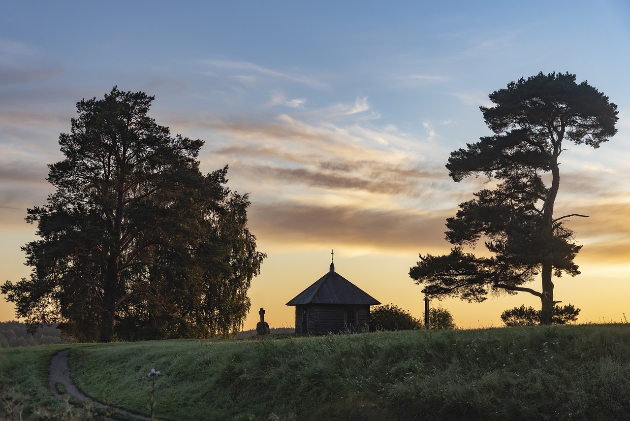
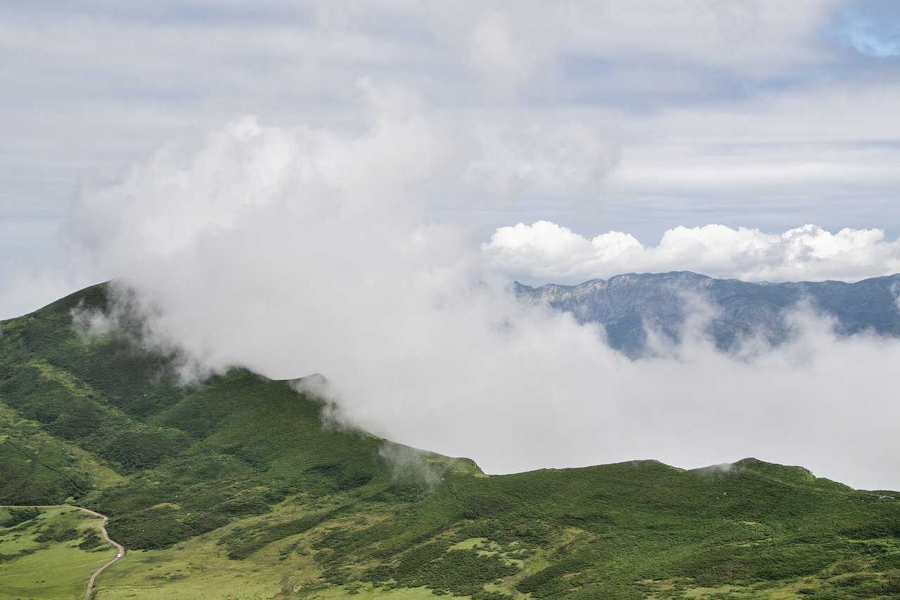
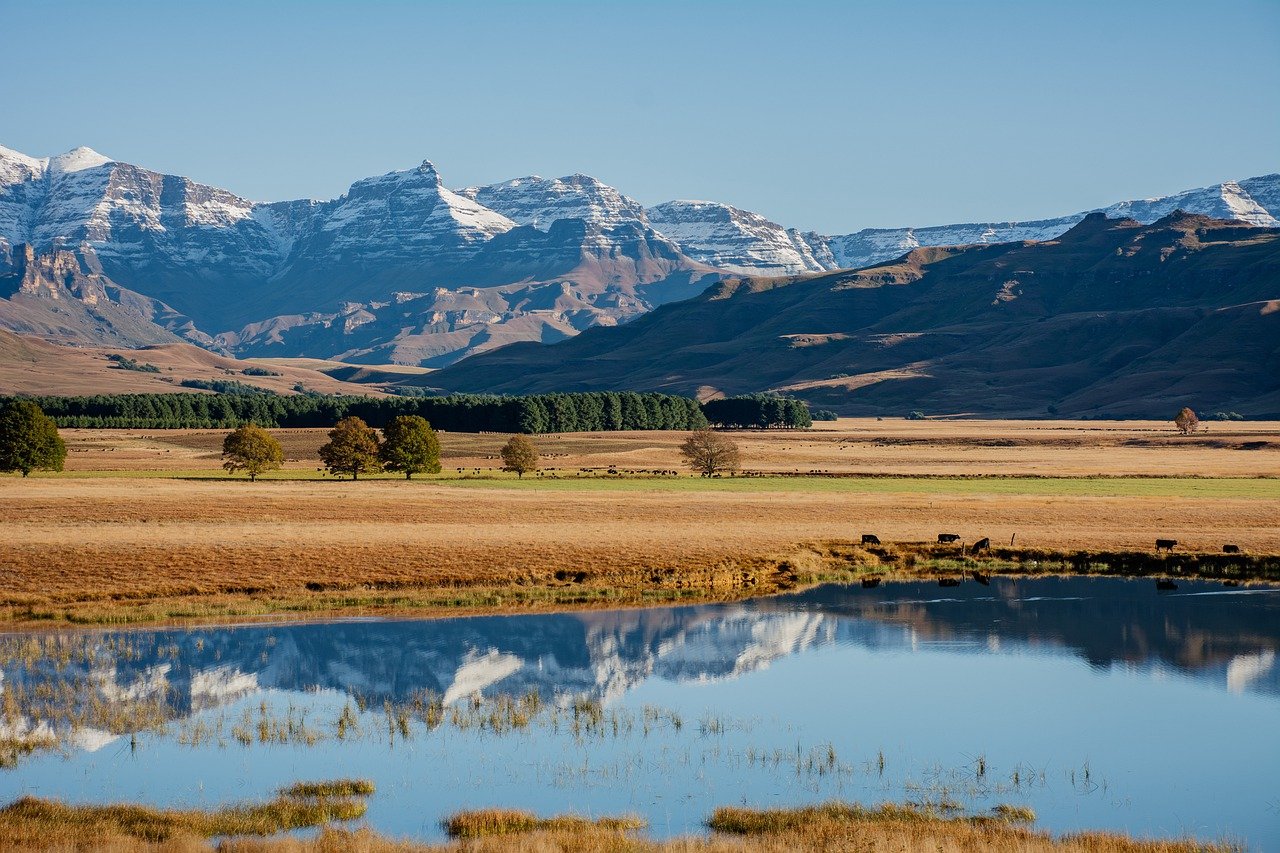
Mastering the Art of Landscape Drawing
Welcome to the captivating world of landscape drawing! If you've ever gazed at a breathtaking view and thought, "I wish I could capture that on paper," you're in the right place. This article explores essential techniques, tools, and tips for creating stunning landscape drawings, helping both beginners and experienced artists enhance their skills and express their creativity through this captivating art form. Whether you’re sketching a serene sunset over the mountains or a bustling cityscape, mastering landscape drawing can be a rewarding journey that allows you to share your unique perspective with the world.
Landscape drawing is not just about replicating what you see; it's about interpreting the beauty and emotion of the scene. Imagine standing on a hilltop, the wind gently tousling your hair, and the colors of the sky shifting as the sun begins to set. How do you translate that feeling onto paper? That's where understanding the fundamentals comes in. From composition to the choice of materials, every decision you make can significantly impact the final outcome of your artwork.
As we dive deeper into this artistic endeavor, remember that practice is key. Just like a musician perfects their craft through repetition, you too will hone your skills with each stroke of your pencil. So grab your sketchbook, and let’s embark on this creative journey together! Along the way, we’ll uncover the secrets to creating depth, capturing light and shadow, and selecting the right materials to bring your landscapes to life.
A strong composition is vital in landscape drawing. This section discusses the principles of composition, including the rule of thirds, balance, and focal points, to guide artists in creating visually appealing scenes. Think of composition as the backbone of your drawing; it holds everything together and gives it structure. Without a solid composition, even the most intricate details can get lost. So, how do you ensure your landscape has that wow factor?
One effective method is the rule of thirds. Imagine dividing your canvas into nine equal parts with two horizontal and two vertical lines. By placing key elements along these lines or at their intersections, you create a more dynamic and engaging composition. Additionally, consider the balance of your drawing. A well-balanced piece will guide the viewer's eye across the artwork, creating a sense of harmony.
Selecting appropriate materials can significantly impact the quality of your landscape drawings. Here, we explore various drawing tools, papers, and mediums, providing insights on how to choose the best options for your style. The right tools are like a chef's knives; they can make all the difference in the final dish. So, what should you consider when choosing your materials?
Graphite pencils are versatile tools for landscape drawing. They come in various grades, ranging from hard (H) to soft (B), allowing artists to achieve a wide range of effects. For instance, harder pencils are great for fine details, while softer pencils are perfect for rich, dark tones. Understanding the properties of different grades can help you manipulate light and shadow effectively, adding depth to your work.
Colored pencils add vibrancy to landscape drawings. They allow you to layer colors and create stunning gradients that mimic the beauty of nature. Techniques for blending and layering colors can transform a simple sketch into a vibrant masterpiece. Think of colored pencils as your palette; the more you experiment with them, the more you'll discover their potential.
Charcoal and pastels provide unique textures and tones. Charcoal is perfect for creating dramatic contrasts and bold lines, while pastels offer a softer, more painterly effect. This combination can help you convey the mood of a scene effectively. Experimenting with these mediums can open up new avenues for expression in your landscape drawings.
The choice of paper can influence the final outcome of a drawing. Different paper types have various textures and weights, which can affect how your medium interacts with the surface. For instance, rough paper is ideal for charcoal, while smooth paper works well with colored pencils. Understanding the characteristics of different papers can help you make informed decisions that enhance your artwork.
- What is the best medium for beginners? Graphite pencils are a great starting point due to their versatility and ease of use.
- How can I create depth in my landscape drawings? Techniques like overlapping elements, using atmospheric perspective, and effective shading can help create depth.
- What are the best papers for landscape drawing? It depends on the medium; for pencils, smooth paper is ideal, while textured paper works well for charcoal.
- How important is composition in landscape drawing? Composition is crucial as it guides the viewer's eye and helps create a balanced and engaging artwork.
Understanding Composition
When it comes to landscape drawing, composition is the backbone of your artwork. Think of it as the blueprint of a building; without a solid foundation, everything else falls apart. A strong composition not only guides the viewer's eye but also conveys the mood and emotion of the scene you’re depicting. To create a visually appealing landscape, artists must consider several fundamental principles of composition.
One of the most effective tools in your composition arsenal is the rule of thirds. Imagine dividing your canvas into a grid of nine equal parts, like a tic-tac-toe board. The key is to place your focal points along these lines or at their intersections. This technique naturally draws the viewer's attention and creates a balanced composition. For example, if you're drawing a majestic mountain range, position the peaks at one of these intersection points, allowing the viewer to engage with the artwork more dynamically.
Another crucial aspect is balance. A well-balanced composition feels stable and harmonious. You can achieve balance through symmetrical arrangements, where elements mirror each other on either side, or asymmetrical balance, where different elements complement each other. For instance, if you have a large tree on one side of your drawing, consider placing a smaller hill or a cluster of bushes on the opposite side to create visual equilibrium. This interplay can make your landscape feel more complete and engaging.
Don't forget about focal points—these are the stars of your landscape drawing. Every artwork needs a point that captures the viewer's attention. Whether it’s a sparkling lake, a towering mountain, or a quaint cottage, your focal point should be distinct and inviting. To enhance its prominence, you can use contrast, color saturation, or detail. For example, if your focal point is a bright red barn in a green field, the contrast will naturally guide the viewer's eye toward it.
As you explore composition, remember that it’s not just about placing objects on the canvas; it’s about creating a story. Think about how the elements interact with each other and the emotions they evoke. For instance, a winding path leading to a distant horizon can create a sense of journey and exploration. This narrative quality adds depth to your work and invites viewers to linger a little longer.
In summary, mastering composition in landscape drawing involves understanding the rule of thirds, achieving balance, establishing focal points, and weaving a visual story. As you practice these principles, you'll find that your landscapes become more engaging and expressive. So grab your pencils and start sketching with these compositional techniques in mind—your next masterpiece awaits!
Choosing the Right Materials
When it comes to landscape drawing, the materials you choose can make or break your artistic expression. Imagine trying to paint a vibrant sunset with a dull brush; it just wouldn’t do justice to the beauty of the scene. In the world of art, your tools are your voice, and selecting the right ones is crucial for translating your vision onto paper. So, let’s dive into the world of drawing tools, papers, and mediums, and discover how to pick the best options that align with your personal style.
First off, let’s talk about drawing tools. The most common ones include graphite pencils, colored pencils, charcoal, and pastels. Each of these tools has its unique qualities and can produce different effects in your landscape drawings. For instance, graphite pencils are incredibly versatile and allow for fine details and smooth shading, while colored pencils can add a burst of color, bringing life to your artwork. Charcoal, on the other hand, offers rich, deep tones and can create dramatic contrasts. Understanding the strengths of each tool is essential in choosing the right one for your project.
Next, the type of paper you use can significantly influence the outcome of your artwork. Not all paper is created equal, and selecting the right kind can enhance your drawing experience. For instance, if you're working with graphite or colored pencils, a smooth paper will allow for easy application and blending of colors. However, if you’re using charcoal or pastels, a textured paper is preferable as it holds the medium better, allowing for richer tones and more dynamic textures. Here’s a simple table to summarize various paper types and their suitability:
| Paper Type | Best For |
|---|---|
| Smooth Paper | Graphite and Colored Pencils |
| Textured Paper | Charcoal and Pastels |
| Watercolor Paper | Mixed Media and Watercolors |
Now, let’s not forget about mediums. The medium you choose can dramatically affect the mood and feel of your landscape drawing. If you prefer a more traditional approach, sticking with graphite or charcoal might be your best bet. However, if you want to explore vibrant landscapes, colored pencils or even watercolors can add a whole new layer of depth and emotion to your work. Each medium has its own set of techniques, and experimenting with them can help you find your unique artistic voice.
In summary, choosing the right materials is not just about picking up whatever is at hand; it’s about understanding how each tool, paper type, and medium can contribute to your artistic vision. So, take the time to explore and experiment with different options. Your landscape drawings will not only improve but also reflect your personal style and creativity in ways you never thought possible.
- What are the best pencils for landscape drawing? Graphite pencils are great for detailed work, while colored pencils can add vibrancy.
- Can I use regular paper for my drawings? While you can, using specialized paper can enhance the quality and texture of your artwork.
- What medium is best for beginners? Graphite and colored pencils are user-friendly and great for beginners to start with.
Graphite Pencils
When it comes to landscape drawing, are the unsung heroes of the artist's toolkit. They offer a remarkable range of versatility, allowing artists to create everything from delicate sketches to bold, dramatic shading. Understanding the different grades of graphite pencils is crucial for any artist looking to enhance their landscape drawings. Graphite pencils are graded on a scale from H to B, with H indicating harder pencils and B indicating softer ones. The number preceding the letter indicates the degree of hardness or softness. For example, a 2H pencil is harder than an H pencil, while a 4B pencil is softer than a 2B pencil.
Here’s a quick breakdown of what these grades mean for your artwork:
| Grade | Characteristics | Best Used For |
|---|---|---|
| H | Hard, light marks | Fine details, light shading |
| HB | Medium hardness | General-purpose drawing |
| B | Soft, dark marks | Shading, bold lines |
For landscape artists, the choice of pencil can significantly influence the final outcome. Softer pencils (like 2B or 4B) are excellent for creating rich, dark shadows, which can add depth and drama to your scenes. On the other hand, harder pencils (like H or 2H) are ideal for fine details, such as the intricate textures of leaves or the delicate outlines of distant mountains. The beauty of using graphite lies not just in its ability to create a range of tones, but also in how it allows for blending and layering. This means you can achieve a smooth gradient in the sky or the subtle transitions of light and shadow on a hillside.
Moreover, mastering the technique of pressure control is essential. By varying the pressure you apply to the pencil, you can create a dynamic range of values. Light pressure yields faint lines, while heavier pressure produces darker strokes. This technique can be particularly effective when trying to depict the texture of different natural elements in your landscape. For instance, a soft touch can mimic the softness of clouds, while a firmer grip can replicate the ruggedness of rocky terrain.
In addition to pressure, the angle at which you hold your pencil can also alter the outcome. Tilting the pencil allows for broader strokes, which can be useful for shading larger areas like the ground or water. Conversely, holding it straight up can help you achieve fine lines for details like tree branches or blades of grass. Experimenting with these techniques will not only enhance your skills but also add a personal touch to your landscape drawings.
In conclusion, graphite pencils are an indispensable tool for any landscape artist. They offer flexibility, control, and a wide range of applications, making them perfect for capturing the beauty of the natural world. Whether you're just starting or looking to refine your skills, understanding how to use different grades of graphite pencils will undoubtedly elevate your landscape drawings to new heights.
Colored Pencils
Colored pencils are a fantastic medium for artists looking to add vibrancy and life to their landscape drawings. They offer a unique blend of precision and creativity, allowing you to layer colors, create gradients, and achieve stunning effects that mimic the beauty of nature. One of the most appealing aspects of colored pencils is their versatility. Whether you’re capturing the lush greens of a forest or the soft pastels of a sunset, colored pencils can help you express the full spectrum of colors found in the natural world.
When using colored pencils, it’s essential to understand the techniques that can elevate your artwork. Blending is one of the most effective methods for creating smooth transitions between colors. By layering different shades and gently rubbing them together with a blending tool or even your fingers, you can achieve a soft, painterly effect. Additionally, layering is crucial; start with lighter colors and gradually build up to darker shades. This approach not only enhances depth but also allows for greater control over the final look of your drawing.
Another technique to consider is burnishing, which involves applying heavy pressure with a light-colored pencil over your colored layers. This process smooths out the pencil strokes and gives your drawing a polished, vibrant finish. However, be cautious with burnishing; it can be challenging to add more layers afterward, so it’s best used towards the end of your drawing process.
To help you get started, here’s a quick overview of some popular colored pencil brands and their characteristics:
| Brand | Characteristics | Best For |
|---|---|---|
| Prismacolor | Soft, rich pigments; easy to blend | Detailed work and vibrant colors |
| Faber-Castell | Harder leads; excellent lightfastness | Fine details and layering |
| Derwent | Wide range of colors; good for mixed media | Experimenting with different techniques |
Choosing the right colored pencils can make a significant difference in your artwork. It’s worth investing in a quality set that suits your style and preferences. Remember, practice is key! The more you experiment with different techniques and color combinations, the more you’ll develop your unique artistic voice.
As you embark on your journey with colored pencils, don’t forget to embrace the joy of exploration. Each stroke is an opportunity to discover new ways to express your creativity. So grab your pencils, find a serene landscape to inspire you, and let your imagination run wild!
- What paper should I use for colored pencils? It’s best to use paper that has a bit of texture, such as drawing or watercolor paper, which helps grip the pencil and allows for better layering.
- Can I use water with colored pencils? Yes, some colored pencils are water-soluble, allowing you to blend with water for unique effects. Be sure to check the packaging to see if your pencils are suitable for this technique.
- How do I fix mistakes made with colored pencils? You can often lift some color with an eraser or use a light-colored pencil to cover small mistakes. For larger errors, you may need to start over on a new piece of paper.
Charcoal and Pastels
When it comes to landscape drawing, charcoal and pastels are two mediums that can truly elevate your artwork, providing unique textures and a wide range of tones. Charcoal, with its rich, deep blacks and velvety finish, allows artists to create dramatic contrasts that can bring a scene to life. Whether you're sketching a serene sunset or a bustling forest, charcoal's ability to blend and smudge can add depth and emotion to your work. On the other hand, pastels offer a vibrant palette that can infuse your landscapes with color and light. The soft, chalky texture of pastels makes them perfect for capturing the delicate nuances of natural scenes, from the soft glow of morning light to the rich hues of autumn foliage.
To effectively use charcoal and pastels in your landscape drawings, it's essential to understand their characteristics and how they interact with each other. For instance, charcoal can be used for the initial sketch, allowing you to outline the composition and establish the tonal values. Once the basic shapes are in place, you can layer pastels on top to add color and detail. This technique not only enhances the visual appeal but also creates a sense of depth and realism.
Here are some tips to help you make the most of charcoal and pastels:
- Experiment with Blending: Use your fingers or blending stumps to soften the edges and create smooth transitions between colors and values.
- Layering Techniques: Start with a base layer of charcoal, then gradually build up layers of pastel for added vibrancy.
- Fixatives: To preserve your artwork, consider using a fixative spray. This will help set the charcoal and pastels, preventing smudging and allowing your drawing to last longer.
Ultimately, the combination of charcoal and pastels can lead to stunning landscape drawings that are rich in texture and color. By mastering these mediums, you'll be able to express your artistic vision more effectively, capturing the beauty of the natural world in a way that resonates with viewers. So grab your charcoal and pastels, and let your creativity flow!
Q: Can I use charcoal and pastels together in one drawing?
A: Absolutely! Many artists find that using both mediums together can create a beautiful contrast and enhance the overall depth of their work.
Q: How do I prevent my charcoal from smudging?
A: To minimize smudging, you can use fixatives after completing your drawing. Additionally, try to avoid resting your hand on the paper while you work.
Q: What paper is best for charcoal and pastels?
A: Look for textured paper that can hold the medium well. Papers specifically designed for charcoal and pastel work best, as they provide the necessary grip for layering.
Paper Types
When it comes to landscape drawing, the choice of paper is more than just a surface to work on; it's the foundation that can make or break your artwork. Different papers interact uniquely with various mediums, which means that selecting the right one is crucial for achieving the desired effects. For instance, if you're using graphite pencils, a smooth paper can help you achieve fine details, while textured paper can add an interesting dimension to your work. Similarly, using colored pencils on the right paper can enhance the vibrancy and depth of your colors.
Here are some common types of paper you might consider for your landscape drawings:
- Sketch Paper: Ideal for quick studies and practice, sketch paper is generally lightweight and can handle dry mediums like graphite and colored pencils.
- Drawing Paper: This type has a bit more weight and texture, making it suitable for a variety of media, including charcoal and ink.
- Watercolor Paper: If you plan to incorporate watercolors into your landscape drawings, this paper is specially designed to absorb water without warping.
- Pastel Paper: With a unique texture, pastel paper allows for better adhesion of pastels, making it a great choice for vibrant landscapes.
Each of these paper types has its own characteristics that can influence your drawing experience. For example, sketch paper is perfect for loose and quick sketches, while drawing paper can handle more detailed work. Watercolor paper, on the other hand, is fantastic if you want to blend colors and create washes, but it might not be the best for fine pencil work due to its rough texture. Understanding the differences can help you choose the right paper for your artistic vision.
Moreover, the weight of the paper is also an essential factor to consider. Paper weight is measured in grams per square meter (gsm), with heavier paper generally being more durable and capable of handling more layering and erasing. For instance, if you're using charcoal or pastels, opting for a heavier paper (around 200 gsm or more) will allow you to build up layers without the risk of tearing.
Lastly, don’t forget about the color of the paper! While many artists opt for traditional white, colored papers can add a unique twist to your landscape drawings. A toned paper can enhance the contrast of your artwork and give it a different mood. So, whether you’re sketching a serene sunset or a bustling forest scene, the right paper can elevate your drawing from ordinary to extraordinary.
Q: Does the type of paper really affect my drawing?
A: Absolutely! The right paper can enhance your artwork, allowing for better blending, shading, and overall presentation.
Q: Can I use any paper for colored pencils?
A: While you can use various papers, smoother surfaces often yield better results for colored pencils, as they allow for finer details and smoother application.
Q: What is the best paper for beginners?
A: For beginners, a good quality drawing paper or sketch paper is recommended. It’s versatile and can handle various mediums without breaking the bank.
Q: Is watercolor paper only for watercolors?
A: While it’s designed for watercolors, it can also be used for other mediums like colored pencils and inks, especially if you enjoy creating mixed media pieces.
Techniques for Capturing Depth
Creating a sense of depth in landscape drawing is like adding a third dimension to your artwork; it transforms a flat image into a vibrant scene that draws the viewer in. One of the most effective techniques to achieve this is through overlapping. When you position objects in front of one another, it creates a natural hierarchy and guides the viewer's eye through the composition. Imagine a serene forest scene: placing a tree in the foreground, partially obscuring a mountain in the background, instantly adds depth and invites the viewer to explore the layers of your drawing.
Another powerful technique is atmospheric perspective. This method relies on the understanding that objects in the distance appear lighter and less detailed than those in the foreground. By subtly shifting your colors towards cooler tones and reducing contrast as you move back in the composition, you can create an illusion of depth. For instance, the vibrant greens of a nearby meadow can gradually fade into soft blues and grays of distant hills, effectively conveying distance and enhancing realism.
Shading is also crucial when it comes to capturing depth. Utilizing various shading techniques such as hatching, cross-hatching, and stippling can add texture and dimension to your landscape. For example, darker areas can suggest shadows, while lighter areas can indicate highlights. This contrast not only brings your drawing to life but also helps to define the forms within your landscape. A well-placed shadow beneath a tree can ground it in the scene, making it feel more substantial and real.
To further illustrate these techniques, consider the following table that summarizes key methods for creating depth in your landscape drawings:
| Technique | Description | Application |
|---|---|---|
| Overlapping | Positioning objects in front of each other to create layers. | Use in foreground elements to enhance depth. |
| Atmospheric Perspective | Using color and clarity to suggest distance. | Fade colors and reduce detail for distant objects. |
| Shading Techniques | Applying various shading methods to add dimension. | Use hatching and cross-hatching for texture and depth. |
Incorporating these techniques into your landscape drawings can significantly enhance their depth and realism. Remember, it's not just about what you draw, but how you draw it. Each stroke and shade contributes to the overall illusion of space, making your artwork not just a picture, but a window into another world.
Q1: What is the best way to practice depth in landscape drawing?
A1: The best way to practice is by observing real landscapes and trying to replicate the depth you see using overlapping, atmospheric perspective, and shading techniques.
Q2: Can I use digital tools to create depth in my landscape drawings?
A2: Absolutely! Digital tools offer various features that can help you simulate depth, such as layers and blending options, making it easier to experiment with different techniques.
Q3: How do I know if my drawing has enough depth?
A3: Step back and look at your drawing from a distance. If it feels flat, consider adjusting your overlapping elements, enhancing your shading, or modifying your colors to create more contrast.
Atmospheric Perspective
Atmospheric perspective is a fascinating technique that artists use to create the illusion of depth in their landscape drawings. Imagine standing on a hill, gazing at a distant mountain range. The colors of the mountains appear lighter and less detailed than those in the foreground, right? This natural phenomenon is what atmospheric perspective aims to replicate on paper. By manipulating color, clarity, and size, artists can effectively convey the distance between objects, making their artwork feel more three-dimensional and immersive.
To master atmospheric perspective, it's essential to understand how the atmosphere affects our perception of colors and details. As objects move further away, they tend to lose contrast and vibrancy due to the particles in the air. This is why distant mountains often appear bluish or grayish. The following are key principles to keep in mind when applying atmospheric perspective:
- Color Fading: Distant objects become lighter and bluer as they recede into the background. To illustrate this, consider using a gradient of colors that transition from vibrant hues in the foreground to softer shades in the background.
- Detail Reduction: The details of distant objects should be less defined than those in the foreground. This means you can use softer lines and less intricate patterns as you move back in your drawing.
- Size Variation: Objects that are closer to the viewer should be larger and more prominent, while those further away should be smaller. This size difference helps create a sense of scale and distance.
When implementing atmospheric perspective in your landscape drawings, start by sketching the foreground elements with sharp lines and vibrant colors. Gradually transition to lighter and softer tones as you move toward the background. This shift not only enhances the sense of depth but also guides the viewer's eye through the composition. Remember, practice makes perfect! Don't hesitate to experiment with different landscapes and color palettes to find what works best for you.
One effective way to visualize atmospheric perspective is by studying photographs of landscapes. Pay attention to how the colors change from the foreground to the background, and try to replicate that in your drawings. Additionally, consider creating a small study piece focusing solely on this technique. By isolating atmospheric perspective, you can hone your skills and build confidence in applying it to larger works.
In summary, atmospheric perspective is a powerful tool for artists looking to add depth and realism to their landscape drawings. By understanding how distance affects color, detail, and size, you can create stunning compositions that captivate your audience. So, grab your pencils and start experimenting with this technique—your landscapes will never look the same!
What is atmospheric perspective?
Atmospheric perspective is a technique used in art to create the illusion of depth by altering the color and clarity of objects as they recede into the background.
How can I practice atmospheric perspective?
You can practice by sketching landscapes, focusing on how colors change with distance, and experimenting with size and detail variations between foreground and background elements.
Why is atmospheric perspective important in landscape drawing?
It helps create a more realistic and immersive experience for the viewer, enhancing the overall depth and three-dimensional quality of your artwork.
Shading Techniques
Shading is one of the most critical aspects of landscape drawing, as it adds dimension and realism to your artwork. Without effective shading, your drawings can appear flat and lifeless, failing to capture the viewer's imagination. So, how do you transform a simple sketch into a breathtaking scene? The answer lies in mastering various shading techniques that can breathe life into your landscapes.
One popular method is hatching, where you create a series of parallel lines to indicate shadows and texture. The closer the lines are together, the darker the area will appear. This technique is particularly useful for rendering grassy fields or rough terrains. On the other hand, cross-hatching takes it a step further by layering another set of lines in a different direction, allowing for even deeper shadows and richer textures. Think of it as weaving a tapestry of light and dark, where each line adds another layer of complexity to your drawing.
Another effective technique is blending, which involves smoothing out the pencil strokes to create soft transitions between light and shadow. This can be achieved using a blending stump, a piece of tissue, or even your finger. Blending is particularly useful for rendering skies and water, where you want a seamless gradation of colors and tones. Imagine the way the sun sets over a lake, casting a warm glow that gently fades into cooler hues—blending allows you to replicate that effect beautifully.
To enhance your understanding of these techniques, consider the following table that summarizes the key shading methods:
| Shading Technique | Description | Best For |
|---|---|---|
| Hatching | Using parallel lines to create shadow | Rough textures, grassy areas |
| Cross-Hatching | Layering lines in multiple directions | Deep shadows, intricate details |
| Blending | Smoothing pencil strokes for soft transitions | Skies, water, soft surfaces |
As you explore these techniques, remember that practice is essential. Start with simple shapes and gradually incorporate them into your landscape drawings. Don’t be afraid to experiment! Try using different pencils for varying effects—softer pencils can create darker shades, while harder pencils are great for fine details. Each artist has their unique style, and finding what works best for you is part of the journey.
Lastly, always pay attention to your light source. The direction and intensity of light significantly influence how you apply shading. Observing real-life landscapes can provide valuable insights into how shadows fall and how light interacts with different surfaces. By practicing these techniques and understanding the interplay of light and shadow, you will be well on your way to creating stunning, three-dimensional landscapes that captivate your audience.
- What is the best pencil for shading? Soft pencils (B grades) are excellent for darker shades, while harder pencils (H grades) are better for fine details.
- How can I improve my shading skills? Practice regularly, experiment with different techniques, and observe real-life lighting conditions to enhance your skills.
- Is blending necessary for shading? While not always necessary, blending can create smoother transitions and enhance the overall realism of your drawing.
Incorporating Light and Shadow
When it comes to landscape drawing, light and shadow are not just mere additions; they are the very essence that breathes life into your artwork. Imagine standing in front of a breathtaking sunset, where the sun dips below the horizon, casting a warm glow over the landscape. The way light interacts with the elements around you creates a mesmerizing dance of shadows and highlights, which is exactly what you want to replicate on paper. Understanding how to observe and depict this natural light is crucial for enhancing the mood and atmosphere of your drawings.
To start, let’s delve into the importance of light sources. Identifying your light source is essential for creating realistic landscapes. Ask yourself: Where is the light coming from? Is it a bright, sunny day, or is it a moody, overcast afternoon? Analyzing the direction and intensity of the light will guide you in creating convincing shadows and highlights. For example, if the sun is setting to your left, the right side of trees and hills will be illuminated, while the left side will be cast in shadow. This simple observation can dramatically change the perception of depth in your drawing.
Next, let’s talk about creating contrast. Contrast is the secret ingredient that adds interest and depth to your landscape drawings. By balancing light and dark areas, you can create dynamic compositions that naturally draw the viewer's eye. For instance, if you have a bright sky, consider how the shadows of trees and mountains can provide a stark contrast. This interplay between light and shadow not only makes your artwork more engaging but also helps to guide the viewer’s gaze through the scene.
Here’s a quick tip: when you sketch, use a value scale to determine the range of light and dark in your drawing. A simple table can help you visualize this:
| Value | Description |
|---|---|
| 1 | Very Light (Highlights) |
| 5 | Medium Light |
| 10 | Very Dark (Shadows) |
By mapping out your values, you’ll be able to see where you need to add more depth or lighten certain areas. This practice can transform a flat landscape into a vibrant, three-dimensional scene. As you draw, keep in mind that shadows are not just dark spots; they have their own shapes and textures that can enhance the realism of your artwork. Observe how shadows fall and stretch across the ground, and replicate that in your drawing.
Lastly, don’t forget to experiment! The beauty of art lies in its subjectivity. Try different techniques for incorporating light and shadow. Use cross-hatching or stippling to create texture, or play with blending techniques to smooth out transitions. Remember, every artist has their own style, and what works for one may not work for another. So, embrace your creativity and let your personal touch shine through!
- What materials do I need to effectively incorporate light and shadow in my landscape drawings?
While you can use any drawing materials, having a range of pencils (from hard to soft) and a good quality paper can make a significant difference. Experiment with charcoal and pastels for richer textures. - How can I improve my understanding of light sources?
Practice observing real-life scenes at different times of the day. Take note of how light changes and affects the landscape around you. - Can I use digital tools to enhance light and shadow in my drawings?
Absolutely! Digital drawing software often has tools that allow you to manipulate light and shadow easily, enabling you to experiment without the commitment of traditional media.
Understanding Light Sources
When it comes to landscape drawing, is absolutely essential for creating realistic and captivating artworks. Think of light as the artist's brush, shaping the scene and breathing life into the landscape. Just like in photography, where lighting can make or break a shot, in drawing, the way you depict light can transform a flat image into a vibrant, three-dimensional experience. So, how do you go about mastering this crucial element?
First, it's important to identify the primary light source in your scene. This could be the sun, moon, or even artificial lights. Each light source casts shadows and highlights differently, and understanding these nuances will allow you to create depth and realism. For instance, sunlight creates sharp shadows and bright highlights, while overcast skies produce soft, diffused lighting that minimizes contrast.
Next, consider the direction from which the light is coming. Is it coming from above, below, or to the side? The angle of the light can drastically change how objects are perceived. For example:
- If the light is overhead, it will cast shadows directly beneath objects, creating a sense of weight and grounding.
- Side lighting can reveal textures and forms, enhancing the three-dimensionality of your drawing.
- Backlighting can create silhouettes, adding drama and intrigue to your landscape.
Once you've established the light source and its direction, it’s time to analyze the intensity of the light. Is it harsh and bright, or soft and muted? The intensity will affect how you apply your mediums. For example, in bright light, colors appear more saturated and shadows are darker, while in softer light, colors may appear washed out and shadows more subtle. This understanding will guide your choices in shading and color application.
Another aspect to consider is the color temperature of the light. Light can be warm (like the golden glow of sunset) or cool (like the bluish tint of twilight). This temperature not only influences the colors you choose but also sets the mood of the entire piece. For instance, warm light can evoke feelings of warmth and comfort, while cool light might create a sense of calm or melancholy.
To better grasp these concepts, let's take a look at a simple table summarizing the effects of different light sources:
| Light Source | Characteristics | Effects on Landscape |
|---|---|---|
| Sunlight | Bright, harsh | Strong shadows, vibrant colors |
| Overcast Sky | Soft, diffused | Subtle shadows, muted colors |
| Moonlight | Dim, cool | Soft shadows, ethereal quality |
| Artificial Light | Varies (can be warm or cool) | Can create dramatic effects, depending on intensity and direction |
In conclusion, understanding light sources is not just about knowing where the light comes from; it's about how that light interacts with your landscape. By paying attention to the direction, intensity, and color temperature of light, you can enhance your drawings, making them not only more realistic but also more emotionally resonant. So grab your pencils and start observing the world around you—there's a whole spectrum of light waiting to be captured on your canvas!
Q: How can I practice understanding light sources in my drawings?
A: Start by sketching simple objects under different lighting conditions. Observe how shadows and highlights change with the light's intensity and direction. You can also take photographs of landscapes at different times of the day to study how light affects the scene.
Q: What are some common mistakes artists make when depicting light?
A: A common mistake is ignoring the light source altogether, resulting in flat and lifeless drawings. Another is not varying the intensity of shadows and highlights, which can make the artwork look unrealistic.
Q: Do I need expensive materials to effectively depict light in my drawings?
A: Not at all! While high-quality materials can enhance your work, understanding the principles of light and shadow is far more important. You can achieve great results with basic tools and a keen eye for observation.
Creating Contrast
Creating contrast in landscape drawings is like seasoning in a dish; it enhances the overall flavor and makes the artwork pop! When you balance light and dark areas effectively, you not only draw the viewer's eye but also evoke emotions and set the mood of your piece. Think of contrast as the heartbeat of your drawing—without it, your landscapes can feel flat and lifeless.
One of the most effective ways to achieve contrast is by utilizing the light and shadow interplay. For instance, imagine a sunlit meadow with shadows cast by trees. The bright greens of the grass against the dark shadows creates a striking visual that captures attention. To master this, observe how light interacts with objects in real life. Notice how shadows can soften harsh lines or create depth in your drawings.
Another technique involves the use of color contrast. Complementary colors—those opposite each other on the color wheel—can create vibrant contrasts that energize your landscape. For example, pairing a bright orange sunset with deep blue mountains can create a breathtaking scene that feels alive. When selecting colors, consider not just their hue, but also their saturation and brightness. A bright, saturated color next to a muted one can create a dynamic tension that keeps the viewer engaged.
To illustrate the impact of contrast, consider the following table that showcases examples of color combinations and their effects:
| Color Pairing | Effect |
|---|---|
| Blue and Orange | Vibrant and energetic |
| Red and Green | Festive and lively |
| Yellow and Purple | Bold and eye-catching |
| Black and White | Classic and timeless |
Additionally, consider the placement of your contrasting elements. A well-placed dark foreground can make a light sky feel even more expansive. Think of your landscape as a stage where each element plays a role in the overall performance. The foreground, middle ground, and background should all interact harmoniously to create a cohesive scene. Using contrast effectively can help guide the viewer’s eye through the composition, leading them from one focal point to another.
Finally, don't be afraid to experiment! Sometimes the best contrast comes from unexpected combinations. Try using different mediums—like combining charcoal with colored pencils—to see how they interact. Each medium has its own way of producing contrast, whether through texture, saturation, or opacity. So grab your materials and start playing with contrasts; you might just discover a new technique that transforms your landscape drawings into stunning works of art!
- What is the importance of contrast in landscape drawing? Contrast helps to create depth, interest, and visual appeal in your artwork, making it more engaging for viewers.
- How can I create contrast using color? Use complementary colors or play with saturation and brightness to create dynamic contrasts that highlight different elements in your landscape.
- What are some common mistakes to avoid when creating contrast? Avoid using too many similar tones, which can make a drawing feel flat. Instead, aim for a balance of light and dark areas to create depth.
Frequently Asked Questions
- What are the basic techniques for landscape drawing?
When starting with landscape drawing, it's essential to grasp fundamental techniques like composition, perspective, and shading. Begin by understanding the rule of thirds to create a balanced scene. Then, practice overlapping elements to convey depth. Lastly, experiment with different shading techniques to add texture and dimension to your artwork.
- Which materials should I use for landscape drawing?
Your choice of materials can greatly affect your artwork. For beginners, a set of graphite pencils is a great starting point due to their versatility. As you advance, consider adding colored pencils for vibrancy or charcoal for dramatic effects. Don’t forget about the type of paper you use, as it can enhance or detract from your drawing's quality.
- How can I create a sense of depth in my drawings?
Creating depth is crucial in landscape drawing. Techniques like atmospheric perspective, where distant objects appear lighter and less detailed, can help. Additionally, using overlapping shapes and varying the size of elements can enhance the three-dimensional feel. Don’t underestimate the power of effective shading to further establish depth in your artwork.
- What role do light and shadow play in landscape drawing?
Light and shadow are essential for adding realism and mood to your landscapes. Understanding the direction and intensity of light sources helps you create convincing shadows and highlights. By contrasting light and dark areas, you can draw the viewer's eye and create dynamic compositions that feel alive.
- Are there specific techniques for blending colors with colored pencils?
Absolutely! Blending colors with colored pencils can be achieved through layering and using a colorless blender. Start by applying light layers of color and gradually build up to your desired vibrancy. Additionally, you can use a blending stump or even your fingers to smooth out harsh lines and create seamless transitions between colors.
- Can I use digital tools for landscape drawing?
Definitely! Digital tools offer a fantastic alternative to traditional methods. Software like Adobe Photoshop or Procreate allows you to experiment with layers, colors, and effects without the mess of physical materials. Plus, you can easily undo mistakes and try out different styles until you find what works for you.


