
Drawing Flowers in Pastel: A Comprehensive Guide
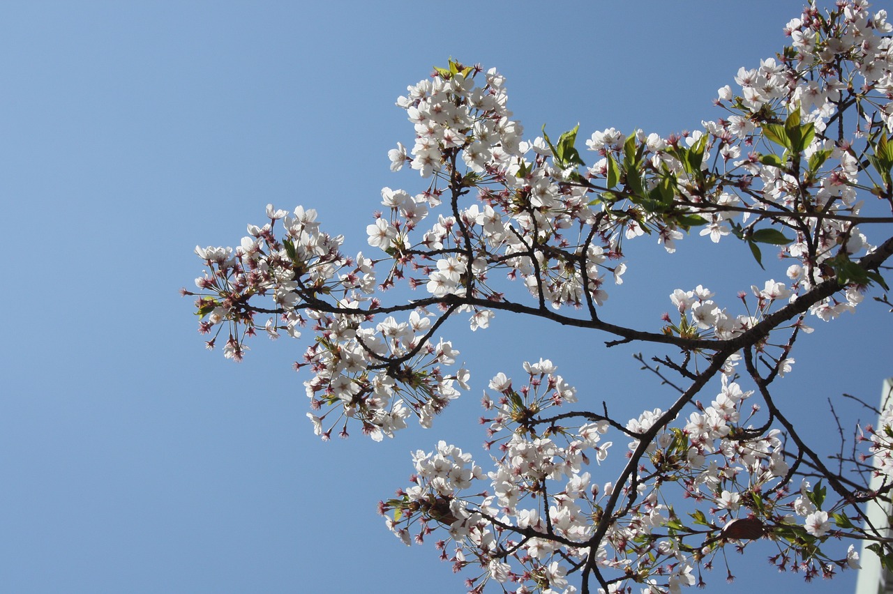
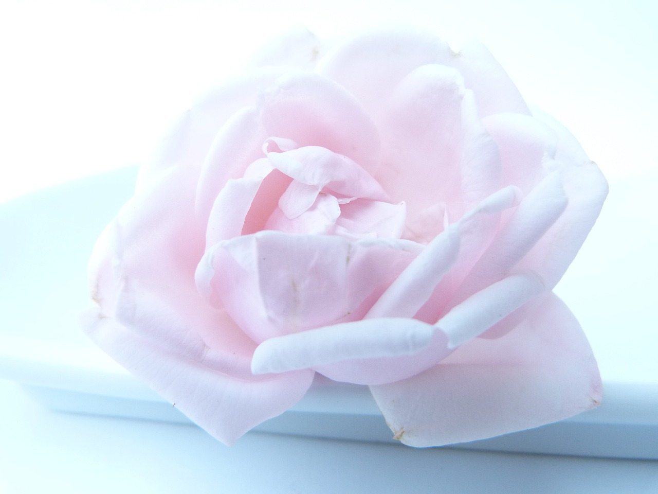
Welcome to the vibrant world of pastel drawing! If you've ever gazed at a beautiful bouquet and thought, "I wish I could capture that on paper," you're in the right place. This guide explores techniques, tips, and insights for creating stunning flower drawings using pastel. Whether you're a complete beginner or an experienced artist looking to refine your skills, this guide is designed to help you bring your floral artwork to life. Imagine the soft, delicate petals of a rose or the bright, cheerful colors of a sunflower—pastels can help you achieve that stunning realism and depth in your creations.
Drawing flowers in pastel is not just about putting colors on paper; it's about understanding the medium, mastering techniques, and allowing your creativity to blossom. You might be wondering, "Where do I start?" or "What tools do I need?" Don't worry! This guide will walk you through everything you need to know, from selecting the right pastels to blending techniques that will make your flowers pop off the page.
As we delve into this artistic journey, remember that practice is key. Just like a flower takes time to bloom, your skills will develop with patience and dedication. So, grab your pastels, a sketchbook, and let's get started on creating beautiful floral masterpieces that will brighten any space!
Before you dive into drawing, it's essential to familiarize yourself with the different types of pastels available. Pastels come in various forms, each with unique properties that affect your drawing technique and the final outcome of your artwork. Here’s a quick overview:
| Type of Pastel | Characteristics | Best For |
|---|---|---|
| Soft Pastels | Highly pigmented, easy to blend, and create rich colors. | Vibrant flower drawings with smooth transitions. |
| Hard Pastels | Less pigmented, great for fine details and outlines. | Adding intricate details to your floral designs. |
| Oil Pastels | Creamy texture, blendable, and water-resistant. | Creating bold, vibrant effects and layering. |
Choosing the right type of pastel can significantly impact your artwork. Soft pastels are fantastic for achieving the lush, velvety look of flower petals, while hard pastels can help you define the edges and details of your composition. Oil pastels, on the other hand, offer a unique texture and vibrant color application that can also enhance your floral drawings.
Now that you have a grasp on the types of pastels, let’s talk about the essential tools and materials you’ll need for drawing flowers in pastel. Having the right supplies is crucial for achieving the desired effects in your artwork. Here’s a rundown of what you’ll need:
- Pastels: A good selection of soft, hard, and oil pastels.
- Paper: Specifically designed for pastel work.
- Blending Tools: Such as tortillons, blending stumps, or even your fingers.
- Fixative: To preserve your artwork once completed.
Each of these tools plays a vital role in the pastel drawing process. For example, the right paper can hold the pastel better, allowing for smoother blending and layering. And trust me, the blending tools will become your best friends as you work to create those soft transitions that make flowers look so lifelike.
Q: Can I use regular drawing paper for pastels?
A: While you can use regular paper, it’s best to use paper specifically designed for pastels. This type of paper has a texture that holds the pastel better and allows for easier blending.
Q: How do I fix my pastel drawing?
A: Once you finish your artwork, use a fixative spray to protect it from smudging. Make sure to apply the fixative in a well-ventilated area and follow the instructions on the can.
Q: What if I make a mistake?
A: Mistakes are part of the process! You can often blend over them or use an eraser to lift some of the pastel off the paper. Remember, art is about exploration and learning!
With this guide, you're now equipped with the knowledge to embark on your pastel flower drawing journey. So, let your creativity flow and enjoy the process of bringing beautiful blooms to life on paper!

Understanding Pastel Types
When it comes to creating stunning floral artwork, understanding the different types of pastels is absolutely essential. Each type of pastel offers unique properties that can significantly affect your drawing technique and the final outcome of your artwork. Whether you're just starting out or looking to refine your skills, knowing the distinctions between soft pastels, hard pastels, and oil pastels can help you make informed choices about your materials.
Soft pastels are known for their vibrant colors and smooth application. They contain a high pigment concentration and very little binder, making them perfect for blending and layering. Artists often love soft pastels for their ability to create rich, luminous effects, especially when depicting delicate flower petals. However, they can be a bit crumbly, so handling them with care is crucial to avoid breakage.
On the other hand, hard pastels are firmer and contain more binder, which makes them less prone to breakage. They are excellent for fine details and precise lines, making them a great choice for outlining your floral sketches. While they may not offer the same level of vibrancy as soft pastels, they can still produce beautiful results when used effectively.
Finally, we have oil pastels, which are unique in their composition. They contain a non-drying oil and wax binder, giving them a creamy texture that allows for smooth application. Oil pastels can be used for layering and blending, but they behave differently than traditional pastels. They tend to have a more painterly quality and can be used to create rich textures in your floral drawings.
Understanding these types of pastels can help you choose the right medium for your artistic vision. Here’s a quick comparison table to summarize the key features:
| Type of Pastel | Texture | Best For | Color Vibrancy |
|---|---|---|---|
| Soft Pastels | Soft and crumbly | Blending and vibrant colors | High |
| Hard Pastels | Firm | Fine details and lines | Medium |
| Oil Pastels | Creamy | Layering and texture | Medium to High |
In conclusion, when selecting the type of pastel for your flower drawings, consider the effects you wish to achieve. Each pastel type offers distinct advantages and challenges, so experimenting with them can lead to exciting discoveries in your artistic journey. So, are you ready to dive into the world of pastels and create breathtaking floral art?
Essential Tools and Materials
This guide explores techniques, tips, and insights for creating stunning flower drawings using pastel. Perfect for beginners and experienced artists alike, discover how to bring your floral artwork to life.
When it comes to drawing flowers in pastel, having the right tools and materials is absolutely crucial. Think of it like cooking; you wouldn't want to whip up a gourmet meal without quality ingredients, right? The same goes for your pastel artwork. First and foremost, you'll need a set of pastels. There are various types available, including soft pastels, which are vibrant and easy to blend; hard pastels, which offer more control for fine details; and oil pastels, known for their creamy texture and rich colors. Each type has its own charm and can significantly impact your drawing technique.
Next up, let's talk about paper. The choice of paper can make or break your artwork. You want to opt for a paper that can hold the pastel well and allow for blending. Textured paper is often preferred because it grips the pastel particles, allowing for more layers and depth. On the other hand, smooth paper can be great for fine details and a more polished look. It's like choosing between a cozy blanket and a sleek throw—each has its own purpose and feel.
But wait, there's more! You'll also need blending tools to achieve those smooth transitions that make your flowers pop. A simple blending stump or even your fingers can work wonders, but be careful not to overdo it. Just like in life, moderation is key! Additionally, consider having a few fixatives on hand to preserve your artwork once you're done. This will help keep your colors vibrant and prevent smudging.
Here’s a quick overview of essential tools and materials you might want to gather:
| Tool/Material | Description |
|---|---|
| Soft Pastels | Vibrant colors, easy to blend, great for layering. |
| Hard Pastels | Controlled application, ideal for fine details. |
| Oil Pastels | Creamy texture, rich colors, suitable for various techniques. |
| Textured Paper | Holds pastel well, allows for layering and blending. |
| Smooth Paper | Good for fine details, offers a polished finish. |
| Blending Tools | Blending stumps, fingers, or soft cloths for smooth transitions. |
| Fixatives | Preserves artwork, prevents smudging. |
In summary, gathering the right tools and materials is not just about having a checklist; it's about setting yourself up for success. When you have everything you need at your fingertips, you can focus on what truly matters: unleashing your creativity and bringing those beautiful flowers to life on paper.
Q: What type of pastels are best for beginners?
A: Soft pastels are often recommended for beginners due to their vibrant colors and ease of blending.
Q: Can I use regular drawing paper for pastels?
A: While you can use regular paper, it’s best to choose paper specifically designed for pastels to achieve better results.
Q: How do I prevent my pastel artwork from smudging?
A: Using fixatives can help preserve your artwork and prevent smudging. Additionally, be mindful of how you handle the paper.
Q: Is it necessary to use blending tools?
A: While blending tools can enhance your artwork, you can achieve great results using just your fingers. It depends on your personal style!
Choosing the Right Paper
When it comes to drawing flowers in pastel, the choice of paper is more crucial than you might think. The right paper can make or break your artwork, influencing everything from color application to blending techniques. So, how do you choose the perfect paper for your pastel creations? Let's dive into the details!
First and foremost, consider the texture of the paper. Textured papers, often referred to as "toothy," provide a grip that allows pastels to adhere better, making them ideal for layering and blending. On the flip side, smooth papers offer a sleek surface that can produce fine details and sharp lines, which can be beneficial for certain flower types. Each texture has its own unique advantages, and experimenting with both can help you discover what works best for your style.
Another important factor is the weight of the paper. Heavier papers, typically ranging from 200 to 300 gsm (grams per square meter), can handle more layers of pastel without warping or tearing. This durability is essential when you're working on intricate flower drawings that require multiple layers for depth and vibrancy. Conversely, lighter papers may buckle under the pressure of heavy application, leading to frustrating results. Therefore, always opt for a weight that complements your technique.
Color is yet another aspect to consider. While it might seem trivial, the paper's hue can significantly affect the vibrancy of your pastel colors. For instance, a darker paper can create a dramatic contrast with bright pastels, enhancing their luminosity. However, if you're working with softer, pastel colors, a lighter paper may provide a more harmonious backdrop. Here’s a quick table summarizing these key factors:
| Factor | Considerations |
|---|---|
| Texture | Textured for layering; smooth for detail |
| Weight | Heavier for durability; lighter may buckle |
| Color | Darker for contrast; lighter for harmony |
In conclusion, selecting the right paper for your pastel flower drawings is a blend of personal preference and practical considerations. Don't hesitate to experiment with various types of paper to find your sweet spot. Remember, the right choice can elevate your artwork from ordinary to extraordinary, allowing your floral designs to truly blossom on the page!
- What type of paper is best for beginners? Start with a medium textured paper that is heavy enough to handle multiple layers.
- Can I use regular drawing paper for pastels? While you can, it may not yield the best results; pastels perform better on textured or pastel-specific papers.
- How do I know if my paper is suitable for pastels? Look for papers specifically labeled for pastel use, which usually indicate weight and texture.
Textured vs. Smooth Paper
When it comes to drawing flowers in pastel, the choice between textured and smooth paper can dramatically influence your artwork's outcome. Each type of paper offers unique characteristics that cater to different styles and techniques. Textured paper, for instance, has a distinct surface that can hold more pastel, allowing for vibrant color application and rich layering. The texture acts like a canvas that grips the pastel particles, making it easier to create depth and dimension in your floral drawings.
On the other hand, smooth paper provides a sleek surface that is ideal for fine details and intricate designs. If you’re aiming for a soft, blended look, smooth paper can facilitate seamless transitions between colors, making it easier to achieve a delicate, ethereal quality in your flowers. However, it may not hold as much pastel as textured paper, which means you might need to build up layers more carefully to avoid a washed-out appearance.
To help you understand the differences better, here’s a quick comparison:
| Feature | Textured Paper | Smooth Paper |
|---|---|---|
| Color Vibrancy | High, due to better pastel grip | Moderate, may require more layers |
| Detailing | Good for broader strokes | Excellent for fine details |
| Layering Capability | Great for multiple layers | Requires careful application |
| Best For | Bold, expressive styles | Subtle, intricate designs |
Ultimately, the choice between textured and smooth paper boils down to your personal style and the specific effects you wish to achieve in your floral artwork. Experimenting with both types can provide valuable insights and help you discover which surface resonates with your artistic vision. So, why not grab a few sheets of each and start exploring the wonderful world of pastels? You might just find that the right paper can elevate your flower drawings to a whole new level!
- What type of paper is best for beginners? Textured paper is often recommended for beginners as it allows for more forgiving blending and layering.
- Can I use watercolor paper for pastels? Yes, watercolor paper can work well, especially if it has a textured surface, but ensure it can handle the dry medium.
- How do I know when to switch paper types? If you find that your current paper isn’t allowing you to achieve the desired effects, it might be time to experiment with a different type.

Paper Weight and Color
When it comes to drawing flowers in pastel, the weight and color of your paper can dramatically influence the vibrancy and overall quality of your artwork. Choosing the right paper is not just about aesthetics; it's about understanding how these factors interact with the pastels to create stunning effects. Let's dive deeper into why these elements matter.
The weight of the paper refers to its thickness and density, which is typically measured in grams per square meter (gsm). A heavier paper (around 200 gsm or more) can handle multiple layers of pastel without buckling or tearing, making it ideal for artists who love to layer and blend. On the other hand, lighter paper may be more suitable for quick sketches or less intensive pastel applications. If you're serious about your floral drawings, investing in a heavier paper will pay off in the long run.
Now, let’s talk about color. The hue of your paper can serve as a background that enhances or detracts from the colors of your pastels. For instance, a warm-toned paper can make your floral colors pop, while a cool-toned paper may create a more subdued effect. Here are a few things to consider:
- Light Colors: Using light-colored paper, like white or cream, can help pastel colors appear brighter and more vibrant.
- Mid-Tones: Papers in shades of gray or beige can provide a neutral backdrop that allows for a balanced color palette.
- Dark Colors: Dark papers can create dramatic contrasts, making lighter pastels stand out beautifully, but they require careful layering to ensure colors remain vibrant.
Ultimately, the choice of paper weight and color should align with your artistic vision. Don't hesitate to experiment with different combinations to see which ones resonate with your style. Remember, the right paper can elevate your floral drawings from ordinary to extraordinary.
In conclusion, understanding the interplay between paper weight and color is crucial for any artist looking to enhance their pastel flower drawings. By selecting the appropriate paper, not only do you ensure that your artwork maintains its integrity, but you also set the stage for a vibrant and engaging piece that truly captures the beauty of nature.
Q1: What is the best paper weight for pastel drawing?
A1: A paper weight of 200 gsm or more is recommended for pastel drawing to prevent buckling and allow for layering.
Q2: Should I choose a colored paper for my pastel drawings?
A2: Yes, colored paper can enhance the vibrancy of pastels. Light colors brighten the artwork, while dark colors create striking contrasts.
Q3: Can I use regular drawing paper for pastels?
A3: While you can use regular drawing paper, it may not hold up well to the layering technique often used in pastel work. It's best to opt for paper specifically designed for pastels.
Blending Techniques
Blending techniques are the secret ingredient to achieving that smooth, ethereal quality in your pastel flower drawings. When you think about blending, imagine how a painter uses a brush to merge colors seamlessly on a canvas. In the world of pastels, blending can elevate your artwork from a simple sketch to a breathtaking floral masterpiece. There are several methods to explore, and each offers its own unique flair and charm.
One of the most popular techniques is the finger blending method. This method allows for a personal touch, as you can control the pressure and movement of your fingers to create soft transitions between colors. Simply apply your pastels to the paper, and then use your finger to gently rub and mix the colors together. It’s like creating a beautiful gradient in the sky at sunset—each color melting into the next. Be cautious, though; too much pressure can cause the paper to wear down, leading to a less-than-desirable outcome.
Another effective technique is using a blending stump or tortillon. These tools are perfect for those who prefer a more precise approach. A blending stump is a tightly rolled piece of paper that allows you to blend colors without getting your fingers dirty. It’s especially useful for small areas where detail is crucial, like the delicate petals of a flower. To use it, simply rub the stump over the pastel to blend, and you’ll notice how it creates a soft, polished look.
For those who enjoy a bit of experimentation, consider the wet blending method. This technique involves using a solvent, like odorless mineral spirits, to create a painterly effect. By applying the pastel and then gently brushing the solvent over it, you can achieve stunning, fluid transitions that mimic the look of oil paints. However, use this method sparingly, as it can change the texture of your paper and affect the vibrancy of your colors.
When blending, it’s crucial to keep in mind the layering principle. Start with lighter colors and gradually build up to darker shades. This not only helps maintain the vibrancy of your pastels but also allows for better blending. Think of it like building a sandwich: if you start with the heaviest ingredients first, it’s going to be a messy experience. Instead, lay down a foundation of lighter flavors before adding the rich, bold toppings.
Lastly, don’t forget to experiment with different paper textures. The surface of your paper can significantly impact how your pastels blend. Textured paper, for instance, holds onto the pastel particles better, allowing for more vibrant layers. In contrast, smooth paper can create a more polished finish but may require more effort to blend effectively. It’s a dance between the medium and the surface, and finding the right combination will elevate your floral artwork to new heights.
In summary, mastering blending techniques is essential for creating stunning pastel flower drawings. Whether you opt for finger blending, blending stumps, or even wet blending, each method offers unique advantages that can help you achieve the desired effects. So grab your pastels, choose your technique, and let your creativity bloom!
- What type of paper is best for pastel blending?
Textured paper is often preferred as it holds the pastel better, allowing for richer colors and easier blending. - Can I use water with pastels?
Yes, using a solvent like odorless mineral spirits can help create beautiful blends, but be cautious as it can alter the texture of your paper. - How do I avoid over-blending?
It's best to blend gradually and step back to assess your work often. This way, you can avoid losing the vibrancy of your colors. - Is blending necessary for all pastel drawings?
While blending can enhance the quality of your artwork, some artists prefer a more textured, layered look without extensive blending.
Color Theory for Floral Art
Understanding color theory is essential for creating harmonious flower drawings that truly captivate the viewer. Just like a painter chooses their colors carefully, you too must consider how colors interact with one another to achieve the desired effects in your artwork. The color wheel is your best friend here, serving as a guide to help you navigate the vast world of hues. It showcases primary, secondary, and tertiary colors, providing a roadmap for creating stunning floral compositions.
When drawing flowers, you'll want to explore complementary colors—those that sit opposite each other on the color wheel. For example, pairing a vibrant yellow flower with a rich violet background can create a dynamic contrast that makes your artwork pop. Similarly, using analogous colors, which are next to each other on the wheel, can foster a sense of harmony and unity. Think of a bouquet with shades of pink, red, and orange; these colors blend beautifully and evoke feelings of warmth and joy.
To help you visualize how to choose colors effectively, consider the following tips:
- Observe Nature: Take a stroll through a garden or park and notice how colors naturally interact. Pay attention to the flowers and their surroundings.
- Create a Color Palette: Before starting your drawing, select a range of colors that resonate with you and reflect the essence of the flowers you want to depict.
- Experiment: Don’t be afraid to mix pastels and test different combinations. Sometimes, unexpected pairings can lead to stunning results.
Creating a color palette is an art in itself. You might want to use a simple table to organize your thoughts and colors:
| Color Type | Examples | Emotional Impact |
|---|---|---|
| Warm Colors | Red, Orange, Yellow | Excitement, Energy |
| Cool Colors | Blue, Green, Purple | Calm, Serenity |
| Neutral Colors | Brown, Gray, White | Stability, Balance |
By understanding the emotional impact of different colors, you can evoke specific feelings in your audience. For instance, warm colors can create a sense of warmth and energy, while cool colors can bring about tranquility and calmness. This knowledge is invaluable when you want to convey the right mood in your floral art.
In conclusion, mastering color theory is a game-changer for artists looking to enhance their floral drawings. By experimenting with complementary and analogous colors, creating thoughtful palettes, and understanding the emotional undertones of colors, you can elevate your artwork to new heights. So grab your pastels, and let your creativity bloom!
Q: What is the best way to choose colors for my floral drawings?
A: Start by observing nature and selecting colors that resonate with you. Consider using a color wheel to identify complementary and analogous colors for a harmonious composition.
Q: How can I create depth in my flower drawings using color?
A: Layering colors and using darker hues in the shadows while applying lighter shades on the petals can create a three-dimensional effect, making your flowers look more lifelike.
Q: Should I stick to realistic colors when drawing flowers?
A: While realism is important, don’t hesitate to experiment with unconventional colors. Artistic expression often thrives on creativity, so feel free to explore!
Creating Color Palettes
Creating a stunning color palette is like picking the perfect ingredients for a delicious recipe; it can make or break your floral artwork. When you’re drawing flowers in pastel, the colors you choose can evoke emotions and set the mood of your piece. So how do you go about selecting the right colors? First, consider the type of flower you’re drawing. Each flower has its own unique hues and shades that can range from vibrant reds to soft pastels. You want to reflect that natural beauty in your artwork.
One effective way to start is by using the color wheel. This handy tool helps you understand the relationships between colors. Complementary colors, which are opposite each other on the wheel, can create stunning contrasts that make your flowers pop. For example, pairing a bright yellow sunflower with a deep purple background can draw the eye and add depth to your piece. Additionally, analogous colors, which sit next to each other on the wheel, can create a more harmonious and soothing effect. Think of a bouquet of roses in various shades of pink and red; these colors blend beautifully and create a sense of unity.
As you create your palette, it's essential to keep in mind the mood you want to convey. Do you want your artwork to feel warm and inviting, or cool and serene? Warm colors like reds and oranges can evoke feelings of happiness and energy, while cool colors like blues and greens can create a calm and peaceful atmosphere. To help you visualize your color choices, consider creating a small swatch board. You can use scrap paper to test out combinations before committing them to your final piece.
Another tip is to take inspiration from nature. Spend some time outside observing the flowers in your garden or local park. Notice how the colors interact with one another, and try to replicate those combinations in your palette. You can also use photographs as a reference. When selecting your pastels, consider the following:
- Vibrancy: Choose colors that are rich and saturated to bring your flowers to life.
- Variety: Include a range of shades, from light to dark, to add dimension to your artwork.
- Contrast: Incorporate both warm and cool tones to create visual interest.
Lastly, don't be afraid to experiment! Sometimes the most unexpected color combinations can yield stunning results. Keep a journal of your color palettes and notes on what works and what doesn’t. This will not only help you refine your technique but also give you a valuable resource to refer back to as you continue your artistic journey.
Q: How do I choose the right colors for my flower drawings?
A: Start by considering the type of flower you’re drawing and use the color wheel to find complementary or analogous colors. Experiment with different combinations to see what resonates with you.
Q: Can I use digital tools to create color palettes?
A: Absolutely! There are many apps and websites that can help you create and visualize color palettes digitally. This can be a fun way to explore different options before applying them to your artwork.
Q: What if I make a mistake in my color choices?
A: Mistakes are part of the learning process! You can always layer new colors over your existing ones or use blending techniques to adjust the hues. Embrace the process and keep experimenting!
Step-by-Step Drawing Process
Creating beautiful flower drawings in pastel can be a rewarding experience, and having a step-by-step process can make it easier, especially for beginners. Let's break it down into manageable steps so you can confidently bring your floral visions to life.
First, start with sketching the flower outline. This is where your artistic journey begins! Use a light hand with your pencil to sketch the basic shapes of the flower. Remember, this outline serves as a guide, so don’t worry about making it perfect right away. Focus on capturing the overall form and structure. Think of it as laying the foundation for a house; without a solid base, everything else may crumble. Once you're satisfied with your outline, you can move on to the next step.
Next, it’s time for layering colors effectively. This is where the magic of pastels truly shines. Start by applying your lightest colors first. Use a gentle touch to layer them onto your paper, building up the colors gradually. You can think of this process like painting with watercolors; it’s all about creating depth and dimension. As you layer, you can blend colors together using your fingers or a blending tool to create smooth transitions. Remember, patience is key here; rushing this step can lead to a muddy appearance.
As you progress, don’t forget to step back and evaluate your work. This is crucial for maintaining perspective on your drawing. Are the colors vibrant enough? Is the composition balanced? Taking a moment to reassess can save you from common pitfalls, such as overworking the pastel or neglecting composition.
Finally, once you’re happy with your flower drawing, it’s time to add those final touches. This might involve adding highlights to certain areas to give your flowers a sense of life and dimension. You can use a white pastel or a lighter shade of the colors you’ve already used to create these highlights. Think of it as putting the icing on a cake; it’s the finishing touch that makes everything pop!
Here’s a simple table summarizing the key steps in the drawing process:
| Step | Description |
|---|---|
| 1. Sketching | Lightly outline the flower's shape and structure. |
| 2. Layering Colors | Apply light colors first, gradually building depth. |
| 3. Evaluation | Step back to assess your work for balance and vibrancy. |
| 4. Final Touches | Add highlights to enhance the lifelike quality. |
By following these steps, you’ll find that drawing flowers in pastel becomes an enjoyable and fulfilling process. Remember, practice makes perfect, so don’t hesitate to experiment with different techniques and styles. Each drawing is a unique expression of your creativity!
Q1: What type of pastels should I use for flower drawings?
A1: Soft pastels are often preferred for their vibrant colors and blendability, but hard pastels can also be useful for fine details. Experiment with both to see what works best for you!
Q2: Can I use regular drawing paper for pastels?
A2: While regular drawing paper can work, it’s best to use paper specifically designed for pastels, as it has a suitable texture to hold the pigment.
Q3: How do I prevent my pastels from smudging?
A3: To minimize smudging, you can use a fixative spray once your drawing is complete, or simply be mindful of your hand placement while working.
Sketching the Flower Outline
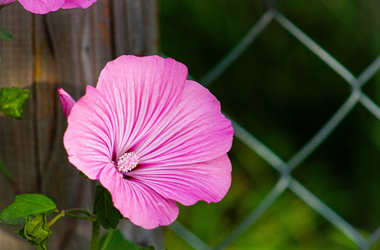
When it comes to , think of it as laying the foundation for a beautiful house. Just as a sturdy foundation is crucial for a home, a well-executed outline is essential for your floral artwork. This step is all about capturing the essence of the flower's structure and form. Start by observing your subject closely—whether it's a vibrant rose, a delicate daisy, or an exotic orchid. Notice the unique shapes and curves that define each petal and leaf.
Begin with a light touch, using a pencil or a pastel pencil to create a rough outline. Keep your lines soft and fluid, allowing for adjustments as you go along. Remember, this is a preliminary sketch, so don’t worry about perfection at this stage. Focus on the overall shape and proportions of the flower. You might want to consider the following tips while sketching:
- Start with Basic Shapes: Break down the flower into simple geometric shapes. For example, petals can often be represented as ovals or teardrops, while the center can be a circle. This method simplifies the drawing process.
- Use Light Lines: Keep your pencil pressure light to allow for easy erasing and adjustments. This will help you refine your sketch without damaging the paper.
- Pay Attention to Proportions: Take a step back and compare the sizes of different elements. Ensure that the petals, leaves, and stem are in proportion to each other.
Once you have the basic outline, you can start adding details. Look closely at the flower and observe the subtle curves and lines that define its character. For instance, if you are sketching a sunflower, notice how the petals radiate from the center and how they overlap slightly. As you add these details, maintain the lightness of your lines, as this will allow you to layer pastels over the sketch later without overwhelming the colors.
After completing your outline, take a moment to step back and assess your work. Does the outline convey the flower's personality? Is it balanced and proportionate? This is your opportunity to make minor adjustments before you dive into the vibrant world of pastels. Once you're satisfied with the outline, you can confidently move on to layering your colors and bringing your floral masterpiece to life.
1. How can I improve my sketching skills?
Practice is key! Try sketching different flowers regularly and experiment with various techniques. Consider taking a class or watching online tutorials to gain new insights.
2. Should I use a reference photo for sketching?
Absolutely! Reference photos can help you capture the details and proportions of the flower more accurately. They serve as a great guide, especially for beginners.
3. What if I make a mistake while sketching?
Don’t worry! Mistakes are part of the learning process. Use an eraser gently to correct any errors, or simply adjust your lines as you refine your sketch.
4. Can I sketch directly with pastels?
Yes, you can! Some artists prefer to use pastels for sketching, especially if they are comfortable with the medium. Just remember to start lightly to avoid overworking the colors.

Layering Colors Effectively
When it comes to drawing flowers in pastel, can make all the difference between a flat illustration and a vibrant, lifelike piece of art. Think of layering as building a beautiful cake; each layer adds flavor and depth, culminating in a delightful visual experience. So, how do you achieve that perfect blend of colors? Let’s dive into some essential techniques that will elevate your floral drawings to the next level.
First off, start with a solid foundation. Begin with a light base layer using a medium hue that represents the overall color of the flower. This initial layer acts as your canvas, allowing you to build upon it without overwhelming the paper. It’s crucial to apply this layer gently; too much pressure can damage the paper and make future layers difficult to apply.
Once your base layer is down, it’s time to add depth. This is where the magic of layering comes into play. Use darker shades to define the shadows and contours of the petals. For instance, if you’re drawing a rose, consider using deep reds or burgundies at the base of the petals where shadows naturally occur. Remember, the key is to apply these darker colors lightly at first; you can always add more, but it's challenging to take away once it’s on the paper.
Next, let’s talk about blending. Blending is crucial for achieving smooth transitions between colors. You can use your fingers, blending stumps, or even soft cloths to gently merge your layers. The goal here is to create soft gradients that mimic the natural beauty of flowers. For example, when drawing a sunflower, you might layer a bright yellow and then blend in some orange at the tips of the petals to create a glowing effect. This technique not only enhances the realism of your artwork but also adds a sense of vibrancy that captivates the viewer.
Another important aspect of layering is contrast. Don’t shy away from using contrasting colors to make certain features pop. For example, if you’re drawing a blue flower, consider adding hints of complementary colors like orange or yellow in the background or as highlights on the petals. This contrast will draw the eye and create a dynamic composition.
Finally, always step back and assess your work. Sometimes, we get so caught up in the details that we forget to look at the bigger picture. Taking a moment to evaluate your drawing from a distance can help you determine if your layers are balanced and if the colors harmonize well. If something feels off, don’t hesitate to adjust. Layering is a process, and it often requires patience and a willingness to experiment.
In summary, layering colors effectively in pastel drawing is about building a solid foundation, adding depth through shadows, blending for smooth transitions, using contrast to enhance vibrancy, and continually assessing your work. By incorporating these techniques, you’ll be well on your way to creating stunning floral artwork that truly comes to life on the page.
- What type of pastels are best for layering? Soft pastels are generally preferred for layering due to their rich pigment and blendability.
- How many layers should I use? There’s no set rule, but typically, 3-5 layers work well for achieving depth without overwhelming the paper.
- Can I use fixative on my layers? Yes, using a fixative can help set your layers, but be cautious as it can alter the colors slightly. Always test on a scrap piece first.
- Is it necessary to blend every layer? Not necessarily! Some layers can remain distinct to create texture or highlight certain areas.

Common Mistakes to Avoid
When it comes to drawing flowers in pastel, even the most seasoned artists can trip over some common pitfalls. Understanding these mistakes is crucial for refining your technique and elevating the quality of your artwork. One major error is overworking the pastel. This happens when you keep layering and blending to the point where the colors become muddy and lose their vibrancy. Instead of achieving that beautiful, soft gradient, you may end up with a dull mess that lacks the life and energy of your initial vision. To avoid this, it’s essential to know when to stop. A good rule of thumb is to step back and assess your work periodically. If you find yourself constantly trying to fix areas, it might be time to put the pastels down and let the piece breathe.
Another common mistake is neglecting composition. Composition is the backbone of any artwork, and without a well-thought-out arrangement, your flowers may look disjointed or unbalanced. Think of composition as the stage where your flowers perform; if the stage is cluttered or poorly arranged, the performance will suffer. To enhance your composition, consider the rule of thirds, leading lines, and focal points. Sketch out several layouts before committing to one. This will not only save you time but also help you visualize the final piece more clearly.
Additionally, many artists overlook the importance of color harmony. Choosing colors that clash or don’t complement each other can detract from the overall beauty of your floral artwork. Understanding color theory can significantly improve your palette choices. For example, using complementary colors can create stunning contrasts, while analogous colors can provide a more harmonious feel. Always test your color combinations on a separate piece of paper before applying them to your main artwork to ensure they work well together.
Lastly, don’t forget about the importance of practice. Many artists expect to create masterpieces right out of the gate, but the truth is that practice makes perfect. Set aside time to experiment with different techniques and styles. Consider keeping a sketchbook dedicated to flowers where you can freely explore without the pressure of creating a finished piece. This will not only improve your skills but also boost your confidence in using pastels.
Here are some common questions artists have when starting with pastel flower drawings:
- What type of pastels should I use for beginners? Soft pastels are often recommended for beginners due to their ease of blending and vibrant colors. However, experimenting with hard and oil pastels can also be beneficial.
- Can I use regular paper for pastel drawings? While you can use regular paper, it’s best to choose paper specifically designed for pastels. This will provide better texture and support for blending.
- How do I preserve my pastel artwork? To protect your artwork, consider using a fixative spray designed for pastels. Additionally, framing your work under glass can help keep it safe from dust and damage.
Overworking the Pastel
Overworking pastels is a common pitfall that many artists, both novice and experienced, encounter while creating their floral masterpieces. When you apply too much pressure or repeatedly go over the same area, you can easily transform vibrant colors into a muddy mess, stripping your artwork of its intended brilliance. Imagine trying to mix a beautiful bouquet of colors only to end up with a dull, lifeless blob; that’s the danger of overworking pastels.
One of the key aspects of working with pastels is understanding their texture and how they interact with the paper. Each stroke adds a layer of pigment, and if you keep layering without allowing the previous colors to settle, you risk losing the vibrancy of your hues. This is especially true with softer pastels, which can become overly blended and lose their individual character. To avoid this, it’s essential to develop a sense of when to stop. Here are some tips to help you recognize when you might be overworking your pastels:
- Watch for Muddy Colors: If your colors start to look less vibrant and more like a brownish hue, it’s a sign you may be overworking the area.
- Texture Loss: If your paper's texture is no longer visible and the strokes look flat, you’ve likely gone too far.
- Clarity of Shapes: If the outlines of your flowers become blurred and indistinct, it’s time to step back.
To maintain clarity and vibrancy in your artwork, try to adopt a more deliberate approach. Start with light pressure and gradually build up your layers, allowing each to dry and settle before adding more. This technique not only helps retain the beauty of the colors but also enhances the overall texture of your piece. Think of it like building a cake; each layer needs time to set before you add the frosting, or you’ll end up with a gooey mess!
Additionally, consider using blending tools sparingly. While they can help create smooth transitions, excessive blending can lead to that dreaded muddy look. Instead, focus on layering colors and using your fingers or a blending stump just enough to soften edges without losing the integrity of the colors. Remember, less is often more when it comes to pastels!
In summary, overworking pastels can lead to disappointing results, but with a mindful approach and awareness of your techniques, you can achieve stunning floral drawings that truly capture the beauty of nature. Embrace the process, trust your instincts, and don’t be afraid to experiment. Your pastel flowers will flourish with a little patience and care!
Q: What are the signs that I am overworking my pastels?
A: Look for muddy colors, loss of texture, and blurred outlines as indicators that you may be overworking an area.
Q: How can I prevent overworking my pastel drawings?
A: Use light pressure when applying pastels, build layers gradually, and limit the use of blending tools to maintain vibrancy.
Q: Is it better to use soft or hard pastels to avoid overworking?
A: Soft pastels can be more prone to overworking due to their creamy texture, while hard pastels allow for more control. Choose based on your comfort level and the desired effect.
Neglecting Composition
When it comes to drawing flowers in pastel, composition is key. It’s the backbone of your artwork, the framework that holds everything together. Imagine walking into a gallery and seeing a stunning floral piece that immediately draws you in. What’s the secret? More often than not, it’s not just the colors or the technique; it’s the way the flowers are arranged on the page. A well-composed piece can transform a simple flower drawing into a captivating visual story.
One of the most common mistakes artists make is neglecting the arrangement of their subjects. When you focus solely on the flowers without considering their placement, you risk creating a disjointed or chaotic look. Think of composition as the art of balancing elements within your drawing. A harmonious composition guides the viewer’s eye and creates a sense of unity. For instance, if you cluster too many flowers in one corner, it can overwhelm the viewer and detract from the overall beauty of your work.
To avoid this pitfall, consider the following tips:
- Rule of Thirds: Imagine dividing your canvas into a grid of nine equal parts. Placing your focal flowers along these lines or at their intersections can create a more dynamic and interesting composition.
- Negative Space: Don't underestimate the power of empty space. Allowing areas of your drawing to remain unoccupied can help emphasize the flowers and create a more balanced look.
- Variety in Size: Incorporating flowers of different sizes can add depth and interest. A mix of large blooms and smaller buds can create a visual rhythm that keeps the viewer engaged.
Additionally, remember that the background plays a crucial role in your composition. A well-thought-out background can enhance the flowers without overshadowing them. Consider using soft, muted colors or gentle textures that complement the vibrant hues of your blooms. This contrast can make your flowers pop, drawing attention to their beauty.
Ultimately, composition is about storytelling. Each flower has its own character, and how you arrange them can convey different emotions. Are you aiming for a serene bouquet or a lively garden scene? Your choices in composition will guide your audience's interpretation of your artwork. So next time you sit down to draw, take a moment to plan your composition. It might just be the magic ingredient your pastel flowers need to truly flourish on the page.
Q: What is the best way to start composing my flower drawings?
A: Start by sketching a light outline of your flowers and consider the overall layout. Use the rule of thirds to place your focal points effectively and think about the balance between positive and negative space.
Q: How can I improve my composition skills?
A: Practice is essential! Study the works of other artists, analyze their compositions, and try to replicate their techniques. Additionally, consider taking a composition-focused art class or workshop.
Q: Should I always follow composition rules?
A: While rules like the rule of thirds can be helpful, don't be afraid to break them! Art is about expression, so feel free to experiment and find what works best for your style.
Frequently Asked Questions
- What types of pastels are best for drawing flowers?
When it comes to drawing flowers, soft pastels are often preferred due to their vibrant colors and blendability. Hard pastels can be useful for fine details, while oil pastels offer a unique texture and finish. Experiment with different types to find what works best for your style!
- What paper should I use for pastel drawings?
The choice of paper is crucial for pastel work. Textured paper is ideal for holding pastel and allows for better blending, while smooth paper can be great for detailed work. Consider the weight and color of the paper as well, as these factors can enhance the vibrancy of your artwork.
- How do I blend pastels effectively?
Blending pastels can be achieved through various techniques such as using your fingers, blending stumps, or even a soft cloth. Start with light pressure and gradually build up layers to create smooth transitions and depth. Remember, practice makes perfect!
- What is color theory and why is it important for floral art?
Color theory is the study of how colors interact and complement each other. Understanding this can help you create harmonious floral compositions. Using the color wheel to find complementary colors can enhance the overall impact of your artwork.
- How can I create an effective color palette for my flower drawings?
To create a stunning color palette, start by selecting colors that reflect the natural beauty of flowers. Look for colors that complement each other, and don’t be afraid to experiment with different combinations. Creating swatches can also help you visualize your palette before applying it to your artwork.
- What are common mistakes to avoid when drawing flowers in pastel?
Some common pitfalls include overworking the pastel, which can lead to a muddy appearance, and neglecting composition, which can make your artwork feel unbalanced. Take your time, step back to assess your work, and don’t hesitate to make adjustments as needed!
- How do I know when to stop working on my pastel drawing?
Recognizing when to stop can be tricky, but a good rule of thumb is to trust your instincts. If you feel like you’re losing vibrancy or clarity, it might be time to step back. Sometimes, less is more!


