
Creating Atmospheric Perspective in Landscape Painting
Creating atmospheric perspective in landscape painting is like opening a window to another world. This technique not only enhances the depth of your artwork but also evokes emotions and moods that resonate with viewers. Imagine standing on a hill, gazing at a vast valley where the colors shift and fade into the horizon. That’s the magic of atmospheric perspective! By skillfully manipulating color, value, and composition, artists can portray distance and create a sense of realism that draws the viewer in.
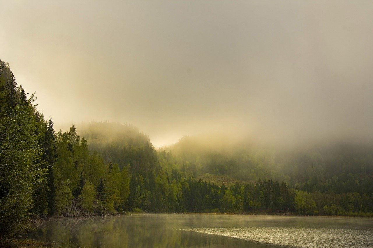
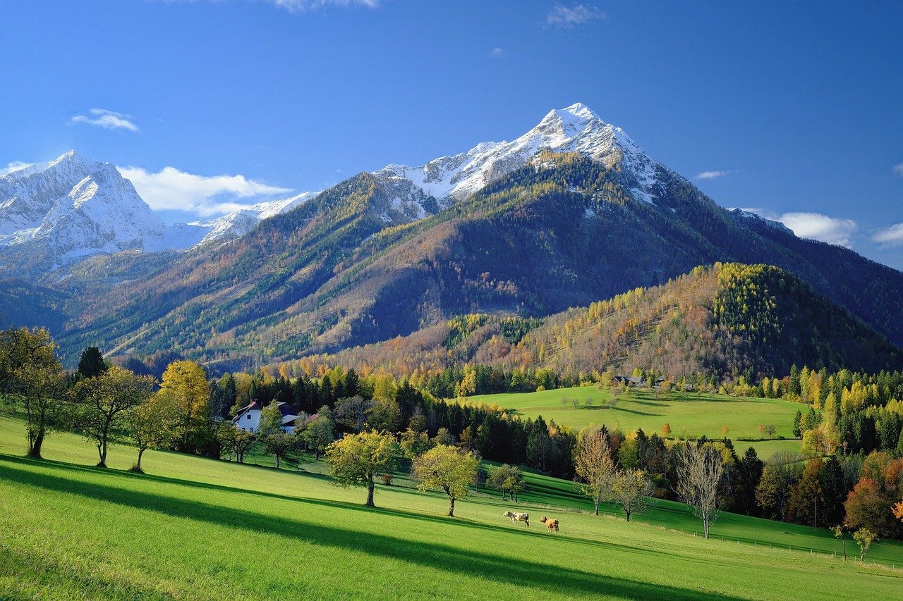
At its core, atmospheric perspective relies on the principle that objects appear lighter and less distinct as they recede into the distance. Think about how distant mountains often appear bluish or grayish compared to the vibrant greens of the foreground. This phenomenon occurs due to the particles in the air scattering light, making distant objects less saturated and more muted. By understanding and applying these principles, you can transform your landscapes into captivating visual experiences that invite exploration.
Throughout this article, we will delve into various techniques and strategies that will help you master atmospheric perspective. From making informed color choices to employing effective composition techniques, each aspect will contribute to your overall ability to convey depth and emotion in your paintings. So, whether you’re a seasoned artist or just starting, get ready to elevate your landscape paintings to new heights!
Atmospheric perspective is a fascinating concept that intertwines art and science. It’s all about how our eyes perceive distance and how that perception can be translated onto canvas. When you look at a landscape, your brain interprets the layers of depth based on the colors and clarity of the objects in view. As you move further away, the details become less sharp, and the colors shift towards the cooler end of the spectrum. This is why mastering atmospheric perspective is essential for any landscape artist.
To illustrate this concept further, let’s break down the key elements involved in creating atmospheric perspective:
| Element | Description |
|---|---|
| Color | Colors become cooler and less saturated with distance. |
| Value | Distant objects tend to be lighter in value. |
| Clarity | Details diminish as objects recede into the background. |
Understanding these elements will give you a solid foundation to begin applying atmospheric perspective in your own landscape paintings. As we explore further, you’ll discover how to make color choices that enhance depth and how to use composition to guide the viewer’s gaze.
When it comes to establishing depth in landscape paintings, the selection of color is crucial. The interplay between warm and cool colors can dramatically influence how viewers perceive distance. Warm colors, such as reds and yellows, tend to advance towards the viewer, creating a sense of closeness and intimacy. In contrast, cool colors like blues and greens recede, giving the illusion of distance.
Let’s dive deeper into how warm and cool colors can be strategically used:
- Warm Colors: Use these for foreground elements to create a sense of immediacy.
- Cool Colors: Apply these to background elements to enhance the feeling of depth.
- Color Harmony: Ensure that your color palette maintains harmony to avoid visual dissonance.
By consciously choosing your colors, you can guide the viewer’s emotional response and create a more immersive experience. Imagine painting a sunset where the warm hues of the sky contrast beautifully with the cool shadows of distant mountains. This not only enhances the depth but also evokes a sense of tranquility and wonder.
Before diving into color, consider planning your painting in grayscale. This approach allows you to focus on value relationships without the distraction of color. By understanding how light and dark values interact, you can create a strong foundation for your atmospheric effects. Think of it as sketching the bones of your painting; once you have a solid structure, you can add the flesh of color and detail.
Another effective way to depict atmospheric changes is through color gradation techniques. Smoothly blending colors can mimic the natural transitions found in the environment. Imagine the way the sky fades from deep blue to soft lavender at dusk. By mastering these gradation techniques, you can create seamless transitions that enhance the realism of your landscapes.
Value plays a significant role in creating depth. By varying light and dark values, you can contribute to the illusion of space in your landscape paintings. High contrast between foreground and background elements can draw attention and create a dynamic visual experience. For instance, a bright, sunlit field contrasted against a shadowy forest in the distance can create a stunning visual narrative.
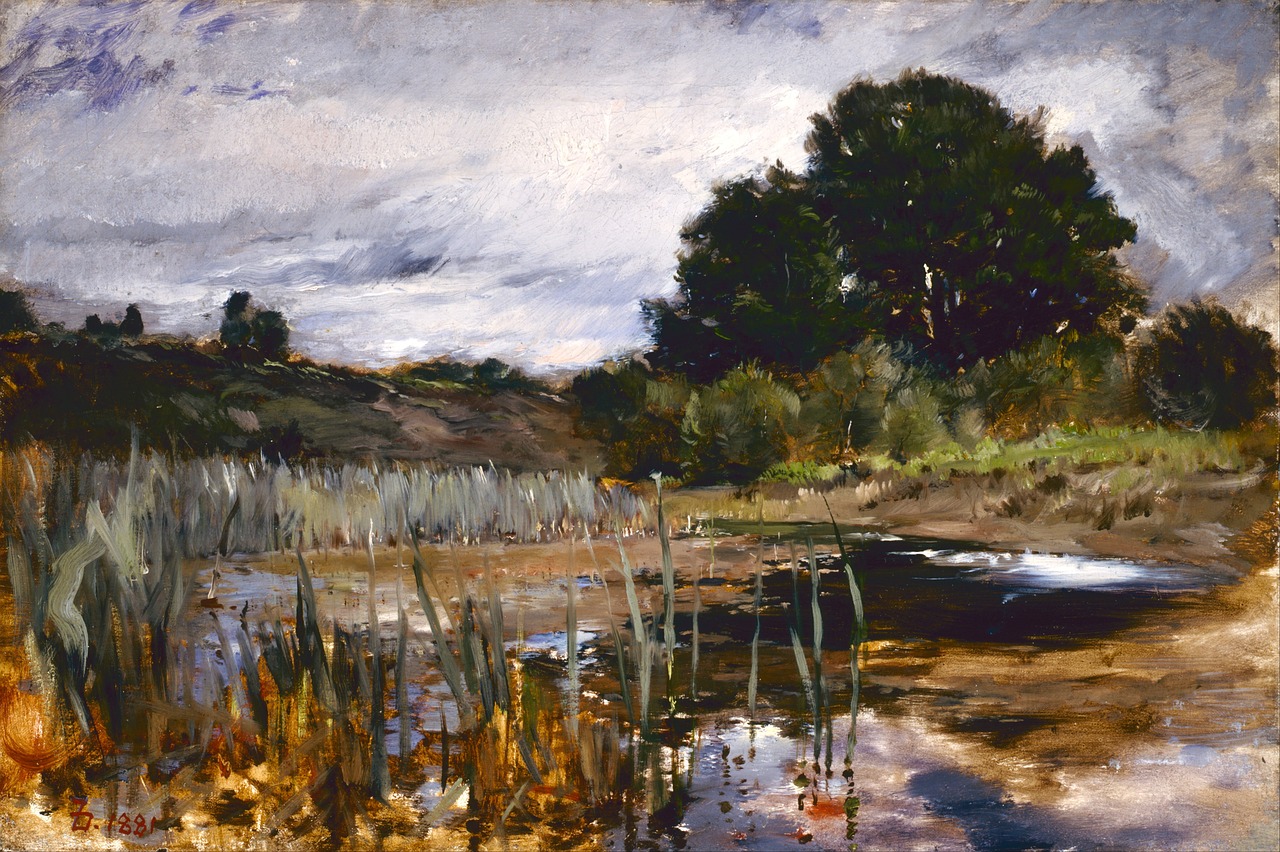
The composition of your landscape painting is equally important in enhancing atmospheric perspective. The way you arrange elements can lead the viewer’s eye through the painting and create a sense of depth. Consider how the placement of trees, mountains, and water can guide the viewer’s gaze and evoke a journey through your artwork.
Using leading lines and focal points can significantly impact depth perception. By strategically placing elements such as paths, rivers, or fences, you can create lines that draw the viewer’s eye deeper into the painting. Think of it as creating a visual pathway that invites exploration. A well-placed focal point, like a distant mountain peak, can serve as a destination for the viewer’s gaze, enhancing the overall depth of the composition.
Layering is essential for achieving atmospheric perspective. By building up layers of color and texture, you can add complexity and realism to your landscape paintings. Start with the background, applying cooler tones and lighter values, and gradually work your way to the foreground with warmer, more saturated colors. This technique not only enhances depth but also adds richness to your artwork.
- What is atmospheric perspective? Atmospheric perspective is a painting technique that uses color and clarity to create the illusion of depth.
- How can I practice atmospheric perspective? Start by painting landscapes in grayscale to understand value relationships, then gradually introduce color.
- Why are warm and cool colors important? Warm colors advance towards the viewer, while cool colors recede, helping to create depth.
Understanding Atmospheric Perspective
Atmospheric perspective is a fascinating technique used in landscape painting that creates the illusion of depth and distance. Imagine standing on a mountain top, gazing out at a sprawling landscape that seems to fade into the horizon. This visual phenomenon occurs due to the way our eyes perceive color and clarity as objects recede into the distance. As artists, understanding this principle allows us to replicate that sense of space and realism on canvas.
At its core, atmospheric perspective relies on three primary elements: color, clarity, and value. As objects move further away, they tend to lose their vibrancy and detail. Instead of the sharp, bright colors we see in the foreground, distant elements appear muted and hazy. This change is not just a trick of the eye; it’s a natural phenomenon influenced by the atmosphere itself. Dust, moisture, and other particles scatter light, softening the appearance of distant objects.
To illustrate this concept, consider a landscape where a vibrant green field is in the foreground, while mountains loom in the background. The mountains, although they are part of the same scene, will appear in softer hues—perhaps a pale blue or gray—compared to the rich greens of the grass. This gradation in color not only creates a sense of distance but also evokes emotion, drawing the viewer into the scene. The more we understand how to manipulate these elements, the more effectively we can convey mood and depth in our artwork.
When applying atmospheric perspective in your paintings, keep these key principles in mind:
- Distance affects color: Colors become cooler and less saturated as they recede.
- Clarity diminishes: Distant objects appear less defined due to atmospheric conditions.
- Value changes: The contrast between light and dark values helps to create depth.
Incorporating these principles into your artwork can transform a flat landscape into a captivating scene that invites viewers to explore its depths. By manipulating color and clarity, you can effectively guide the viewer’s eyes through the painting, creating a journey that feels both natural and immersive.
In summary, understanding atmospheric perspective is essential for any landscape painter looking to enhance their work. By mastering the interplay of color, clarity, and value, you can create stunning pieces that resonate with viewers and evoke a sense of place. So, the next time you pick up your brush, remember to look beyond the surface and consider how you can use these techniques to breathe life into your landscapes.
Color Choices for Depth
When it comes to landscape painting, the selection of color plays a pivotal role in establishing depth and creating an immersive experience for the viewer. Imagine standing on a hilltop, gazing out at a sprawling valley. The colors you see are not just a random collection; they are a carefully orchestrated symphony that guides your perception of distance. In this section, we will explore how warm and cool colors can dramatically influence the viewer's perception of depth in your artwork.
To understand this better, let’s break down the concept of warm and cool colors. Warm colors, such as reds, oranges, and yellows, tend to advance towards the viewer, creating a sense of closeness and intimacy. They can evoke feelings of warmth and comfort, much like a cozy fire on a chilly night. On the other hand, cool colors, including blues, greens, and purples, recede into the background, giving the illusion of distance and tranquility. This is akin to the way the sky appears to fade into a lighter blue as it stretches away from you.
By strategically utilizing these color temperatures, you can create a dynamic sense of foreground and background in your paintings. For example, placing warm colors in the foreground can draw the viewer in, while cool colors in the background can push elements back, enhancing the overall depth of the scene. Consider the following table that summarizes the psychological effects of warm and cool colors:
| Color Type | Examples | Psychological Effect |
|---|---|---|
| Warm Colors | Red, Orange, Yellow | Inviting, Energetic, Closer |
| Cool Colors | Blue, Green, Purple | Calm, Distant, Receding |
In addition to color temperature, the value of the colors you choose also plays a critical role in establishing depth. Lighter values tend to recede, while darker values come forward, much like how the shadows of a mountain can create a sense of volume and solidity. When planning your landscape, think about how you can use value to reinforce the atmospheric perspective. For instance, a distant mountain range might be depicted in lighter hues, while the foreground trees are painted in deeper, more saturated colors.
Another technique to enhance depth through color is color gradation. This involves blending colors smoothly to create a seamless transition that mimics the natural environment. For example, as you paint a sky, you might start with a deep blue at the top and gradually blend it into lighter shades near the horizon. This not only creates a realistic sky but also enhances the feeling of depth, as the viewer's eye is naturally drawn along the gradient.
In conclusion, the choices you make regarding color can significantly impact the depth and realism of your landscape paintings. By understanding the effects of warm and cool colors, utilizing value effectively, and mastering color gradation techniques, you can create stunning landscapes that invite viewers to step into your world. So next time you pick up your brush, remember: color is not just a visual element; it’s a powerful tool that can shape the emotional and spatial experience of your artwork.
Warm vs. Cool Colors
When it comes to landscape painting, the choice between warm and cool colors can dramatically influence the mood and depth of your artwork. Think about how the sun sets; the vibrant oranges and reds of a sunset contrast sharply with the cool blues and purples of the evening sky. This psychological impact of color is not just about aesthetics; it’s about how we perceive depth and distance in a painting.
Warm colors, such as reds, oranges, and yellows, tend to advance towards the viewer. They evoke feelings of warmth and energy, often drawing attention to the foreground of your painting. Imagine standing in a sunlit field; the bright colors around you feel close and inviting. Conversely, cool colors—like blues, greens, and purples—tend to recede into the background, creating a sense of calm and distance. Picture a misty mountain range; the fading blues and purples give the illusion of depth, making those distant peaks seem far away.
To effectively utilize these color families, consider the following:
- Foreground Elements: Use warm colors to highlight elements in the foreground. This can create a sense of immediacy and engagement.
- Background Elements: Employ cool colors for distant objects. This technique helps to reinforce the illusion of depth, making the background appear further away.
- Transition Zones: Blend warm and cool colors in the middle ground to create a smooth transition. This gradient can enhance the overall atmosphere of your painting.
Another effective strategy is to use a limited color palette. By selecting a few warm and cool colors, you can create a cohesive look while still achieving depth. For example, if you’re painting a sunset over a lake, you might choose a vibrant orange for the sun and a soft blue for the water. The contrast not only enhances the visual impact but also emphasizes the distance between the foreground and background.
Ultimately, understanding how warm and cool colors interact is crucial for any landscape painter. It’s like setting the stage for a play; the colors you choose can either draw the audience in or push them away. So, the next time you pick up your brush, think about how you can use these color dynamics to create a more immersive and atmospheric experience in your landscape paintings.
Using Grayscale to Plan
When it comes to landscape painting, planning is half the battle. One of the most effective techniques artists can use to lay a solid foundation is planning their artwork in grayscale. This approach allows you to concentrate on the essential elements of your composition without the distraction of color. By stripping away color, you can focus solely on the relationships between values—light and dark—and how they interact to create depth.
Imagine you're a sculptor, chiseling away at a block of marble. Each strike reveals the form hidden within. Similarly, by working in grayscale, you’re essentially sculpting your painting before adding the intricate colors. This method helps you to visualize how shadows will fall and how light will illuminate your landscape. It’s about understanding the value hierarchy—which areas are meant to recede, and which should leap forward, creating a three-dimensional effect on a two-dimensional surface.
To effectively utilize grayscale, start by creating a value scale. This scale typically consists of a gradient from pure white to pure black, with various shades of gray in between. A simple table can illustrate this concept:
| Value | Appearance | Use in Painting |
|---|---|---|
| 1 (White) | Brightest highlight | Use for light sources |
| 5 (Medium Gray) | Neutral tone | Use for mid-tones |
| 10 (Black) | Deepest shadow | Use for dark areas |
Once you have your value scale, start sketching your landscape using only these values. Focus on the contrast between the lightest and darkest areas. This contrast is crucial for creating a sense of depth. For example, elements in the foreground should be darker and more detailed, while those in the background should gradually lighten and lose detail. This technique mimics how our eyes perceive distant objects, which often appear hazier and less saturated due to the atmosphere.
Moreover, using grayscale can help you identify potential issues in your composition before you commit to color. If your values are not working harmoniously, it’s much easier to adjust them in grayscale than it is once you've added color. Think of it as a rehearsal before the main performance; you want to iron out any kinks before the spotlight is on.
In conclusion, planning in grayscale is a powerful tool for any landscape artist. It trains your eye to see values accurately, allowing you to create a more convincing sense of depth and atmosphere in your paintings. By mastering this technique, you can elevate your artwork, making it not only visually appealing but also rich in emotional depth and narrative.
- Why should I use grayscale for planning? Grayscale helps you focus on value relationships without the distraction of color, ensuring a strong foundation for your painting.
- How do I create a value scale? A value scale can be created by blending black and white to form a gradient of gray shades, which you can use as a reference while painting.
- Can I skip grayscale planning? While it's not mandatory, skipping this step may lead to a less cohesive composition, as understanding value is crucial for depth.
Color Gradation Techniques
When it comes to creating stunning landscape paintings, are your best friends. Imagine standing on a hill, gazing out over a vast expanse of nature. What do you see? The colors shift and blend seamlessly from the vibrant hues of the foreground to the muted tones of the distant mountains. This illusion of depth is what color gradation can achieve in your artwork.
To master this technique, you need to start with a solid understanding of how colors interact with one another. The key is to create a smooth transition between colors, which can be done using several methods. One effective approach is to use a wet-on-wet technique, where you apply wet paint onto a wet surface. This allows the colors to blend naturally, mimicking the soft transitions found in nature. Picture a sunset where the sky transitions from a bright orange to a soft lavender. This is the kind of effect you can achieve!
Another method to consider is the dry brush technique. This approach involves using a dry brush to apply paint lightly over a dry surface. It’s perfect for adding texture and subtle variations in color, especially in areas like clouds or distant hills. Think of it as dusting powdered sugar over a cake; it adds that delicate touch without overwhelming the base.
Additionally, you can use a color wheel to understand how colors relate to each other. By choosing colors that are adjacent to each other on the wheel, you can create harmonious gradations. For instance, blending shades of blue and green can evoke the feeling of a serene lake surrounded by lush forests. On the other hand, contrasting colors can create dynamic shifts that draw the viewer's eye.
Here’s a quick overview of some essential color gradation techniques:
| Technique | Description |
|---|---|
| Wet-on-Wet | Applying wet paint onto a wet surface for seamless blending. |
| Dry Brush | Using a dry brush to create texture and subtle color variations. |
| Color Wheel | Utilizing the color wheel to choose harmonious or contrasting colors. |
Lastly, don’t underestimate the power of practice. Experiment with these techniques on different types of landscapes. Maybe try painting a misty morning scene where the colors fade into one another, or a vibrant sunset where the transitions are more pronounced. The more you play with color gradation, the more natural it will feel, and your landscapes will begin to pop with life and depth!
- What is color gradation in painting? Color gradation refers to the smooth transition between colors, creating depth and realism in a painting.
- How can I practice color gradation techniques? You can practice by trying various methods like wet-on-wet, dry brush, and using a color wheel to experiment with different landscapes.
- Can I use color gradation in other art forms? Absolutely! Color gradation can enhance not only paintings but also digital art, photography, and even graphic design.
Value and Contrast
When it comes to landscape painting, value is one of the most powerful tools in your artistic arsenal. It refers to the lightness or darkness of a color and plays a crucial role in creating depth and dimension. Just like how music can evoke emotions, the contrast between light and dark can significantly influence the mood of your artwork. Imagine standing on a mountain peak, where the foreground is bathed in bright sunlight while the distant hills fade into a soft, shadowy hue. This visual experience is what you aim to replicate on your canvas.
To understand the impact of value and contrast, consider how they can manipulate the viewer's perception. A painting that utilizes a wide range of values will likely feel more dynamic and engaging. For instance, if you were to paint a sunset over a lake, the vibrant oranges and yellows in the sky would contrast beautifully against the deep blues and purples of the water. This not only creates a stunning visual effect but also enhances the sense of depth, drawing the viewer into the scene.
One effective way to explore value is through a simple grayscale study. By focusing solely on shades of gray, you can better understand how different values interact with one another. This technique allows you to plan your composition without the distraction of color, honing in on the relationships between light and dark. Once you’ve established a solid grayscale foundation, you can then layer in color, confident that your values will support the atmospheric perspective you’re aiming for.
Moreover, the use of contrast can help to guide the viewer’s eye throughout the painting. Areas of high contrast naturally attract attention, making them ideal for focal points. For example, if you want to draw attention to a majestic tree in the foreground, you might paint it in rich, dark greens while surrounding it with lighter hues in the background. This technique creates a visual hierarchy, ensuring that the most important elements of your landscape stand out.
To illustrate the importance of value and contrast, consider the following table:
| Value Level | Example Color | Effect on Depth |
|---|---|---|
| Light | Sky Blue | Creates a sense of distance |
| Medium | Grass Green | Enhances foreground elements |
| Dark | Forest Green | Grounds the composition |
In summary, mastering value and contrast is essential for any landscape artist looking to create a sense of depth and realism. By understanding how to manipulate these elements, you can transform a simple painting into a captivating scene that invites viewers to explore every corner of your artwork. Remember, the interplay of light and dark is not just a technical aspect; it’s an emotional journey that you take your audience on, making them feel as though they are stepping right into your painted world.
- What is atmospheric perspective? Atmospheric perspective is a technique used in painting to create the illusion of depth by changing color and clarity.
- How do I choose colors for depth? Use warm colors for foreground elements and cool colors for background elements to enhance the sense of distance.
- Why is value important in landscape painting? Value helps to establish depth and can guide the viewer's eye through the painting, creating a more engaging experience.
- Can I practice value without using color? Yes! Creating grayscale studies can help you understand value relationships before introducing color.

Composition and Layout
When it comes to landscape painting, composition and layout are not just about placing elements on the canvas; they’re about creating a visual journey for the viewer. Imagine walking through a beautiful park: your eyes naturally follow paths, trees, and hills. In the same way, your painting should guide the viewer's gaze through the landscape, creating a sense of depth and movement. The arrangement of elements plays a crucial role in achieving this, and understanding how to manipulate composition can elevate your artwork from ordinary to extraordinary.
One fundamental principle of composition is the use of leading lines. These are lines that direct the viewer's eyes toward the focal point of your painting. Think of a winding road that leads into the distance or a river that meanders through a valley. By incorporating leading lines, you can create a pathway that invites the audience to explore the depths of your artwork. For instance, if you’re painting a mountain scene, a river flowing towards the mountains can act as a natural guide, drawing the viewer's attention from the foreground to the background.
Another essential aspect of composition is the placement of focal points. A focal point is the area of your painting that captures the viewer's attention first. It could be a striking tree, a distant mountain, or even a vibrant sunset. By strategically positioning your focal point, you can create a hierarchy in your landscape. This not only enhances depth perception but also adds interest to your composition. Consider using the Rule of Thirds as a guideline: divide your canvas into a 3x3 grid and place your focal points at the intersections. This simple technique can make your painting feel more balanced and dynamic.
In addition to leading lines and focal points, layering techniques are vital for achieving atmospheric perspective. Layering involves placing elements in front of and behind one another to create a sense of depth. For example, if you’re painting a forest, you might start with the background trees in lighter, cooler colors, and gradually introduce warmer, darker colors for the trees in the foreground. This not only adds dimension but also mimics how we perceive the world around us, where objects further away appear less defined and more muted.
Here’s a quick breakdown of how to enhance your composition:
| Technique | Description |
|---|---|
| Leading Lines | Use natural lines in the landscape to guide the viewer's eye. |
| Focal Points | Strategically place elements that draw attention. |
| Layering | Overlap elements to create depth and realism. |
Finally, don’t overlook the importance of negative space in your composition. Negative space refers to the areas around and between the subjects of your painting. It can be just as important as the subjects themselves, as it helps to define shapes and creates balance. By thoughtfully considering negative space, you can enhance the overall composition, making it feel more cohesive and inviting.
In summary, composition and layout are essential tools in your artistic toolbox. By utilizing leading lines, focal points, layering, and negative space, you can create landscape paintings that are not only visually stunning but also rich in depth and emotion. Remember, every element you include should serve a purpose, guiding the viewer on a journey through your artwork. So grab your brushes and start experimenting with these techniques to bring your landscapes to life!
- What is atmospheric perspective? Atmospheric perspective is a technique used in painting to create the illusion of depth by altering color and clarity.
- How can I create depth in my landscape paintings? You can create depth by using warm and cool colors, incorporating leading lines, and layering elements effectively.
- What are leading lines? Leading lines are visual pathways in your painting that guide the viewer's eye toward the focal point.
- Why is negative space important? Negative space helps define shapes and creates balance in your composition, enhancing the overall visual appeal.
Leading Lines and Focal Points
When it comes to landscape painting, leading lines and focal points are your best friends. Think of them as the secret sauce that guides the viewer's eye through your artwork, creating a natural flow and enhancing the sense of depth. Imagine standing in front of a breathtaking view; your gaze doesn't just wander aimlessly. Instead, it follows paths formed by roads, rivers, or even the edge of a hill. These elements act like invisible strings, pulling your attention toward specific areas of the painting.
So, how do you effectively utilize leading lines? Start by identifying natural lines in your landscape. These could be anything from the curve of a river to the jagged edges of mountains. By incorporating these lines into your composition, you create a pathway for the viewer's eye. For instance, a winding road can lead the viewer from the foreground into the distant background, giving a sense of journey and exploration. This technique not only adds interest but also enhances the illusion of depth by creating layers within the painting.
Now, let’s talk about focal points. A focal point is the area of your painting that draws the most attention, often because of its color, detail, or placement. It’s like the star of the show! To create an effective focal point, consider using contrasting colors or more intricate details. For example, if your landscape features a serene lake, you might want to highlight a small boat or a vibrant tree on the shore. This not only captures the viewer's attention but also provides a sense of scale, making the surrounding elements feel more expansive.
To further illustrate this concept, let’s look at a simple table that outlines the relationship between leading lines and focal points:
| Technique | Description | Example |
|---|---|---|
| Leading Lines | Paths that guide the viewer’s eye through the painting | A winding river that flows from the foreground to the horizon |
| Focal Points | Areas that attract the viewer’s attention | A brightly colored flower in a field of grass |
Incorporating these techniques can significantly elevate your landscape paintings. Remember, the goal is to create a visual journey for your audience. When they look at your artwork, they should feel as though they can step into the scene, exploring its depths and nuances. By strategically placing leading lines and focal points, you can achieve this immersive experience, making your landscapes not just paintings, but gateways to another world.
Now, you might be wondering, how do you find the right balance between leading lines and focal points? The key is to experiment! Try sketching different compositions and see how the eye moves across the page. Ask yourself questions like, "Where do I want the viewer to look first?" or "How can I use lines to enhance the feeling of distance?" With practice, you’ll develop an intuition for creating landscapes that are not only beautiful but also deeply engaging.
- What are leading lines in painting?
Leading lines are compositional elements that direct the viewer's eye towards the focal point of the artwork. - How can I create a focal point in my landscape painting?
You can create a focal point by using contrasting colors, intricate details, or strategic placement of elements within the composition. - Why is depth important in landscape painting?
Depth adds realism and dimension to your artwork, making it more engaging and immersive for the viewer.
Layering Techniques
Layering techniques are essential for creating a sense of atmospheric perspective in landscape painting. This method involves applying multiple layers of paint to build depth and texture, effectively mimicking the way light interacts with objects in the natural world. Imagine painting a landscape as if you were sculpting it; each layer adds another dimension, revealing parts of the scene that would otherwise remain hidden. By understanding and mastering these techniques, you can elevate your artwork from a simple representation to a captivating visual experience.
One of the most effective layering techniques is the use of glazing. This involves applying a thin, transparent layer of paint over a dried base layer. The result is a rich depth of color that can convey the subtleties of light and atmosphere. For instance, if you’ve painted a mountain range in the background, a glaze of blue or violet can enhance the illusion of distance, making those mountains appear more distant and ethereal. The beauty of glazing lies in its ability to create luminous effects that add life to your painting.
Another technique worth exploring is scumbling. This involves applying a thin, opaque layer of paint over a dry layer, allowing some of the underlying color to show through. Scumbling can create a sense of texture and atmosphere, particularly in skies or foliage. For example, when painting a sunset, a light scumble of orange or pink over a blue sky can simulate the soft, glowing effect of the setting sun. This technique not only adds depth but also invites the viewer to explore the layers of color within your work.
Additionally, consider the concept of underpainting. This foundational layer sets the tone for your entire piece. By starting with a monochromatic underpainting, you can establish values and forms before introducing color. This method allows you to focus on the composition and depth without the distraction of color. Once the underpainting is complete, you can gradually build up layers of color, enhancing the depth and richness of the landscape.
Incorporating texture into your layers can also significantly enhance the visual interest of your painting. Using palette knives or different brush techniques can create varying textures that draw the viewer's eye. For instance, a rough texture in the foreground can contrast beautifully with the smoother layers of the background, further emphasizing depth. Remember, the goal is to create a visual journey that invites the viewer to step into the landscape.
As you work through these layering techniques, keep in mind that patience is key. Allow each layer to dry before applying the next, and don't rush the process. The beauty of layering is that it rewards those who take the time to build their painting thoughtfully. By experimenting with these techniques, you’ll discover new ways to express the depth and complexity of your landscapes, ultimately creating pieces that resonate with viewers on a deeper level.
- What is atmospheric perspective?
Atmospheric perspective is a painting technique that creates the illusion of depth by altering color and clarity, making distant objects appear lighter and less detailed. - How do I choose colors for depth?
Using warm colors in the foreground and cool colors in the background can help establish depth and distance in your landscape paintings. - What is glazing in painting?
Glazing is a technique where a thin, transparent layer of paint is applied over a dried base layer to create depth and luminosity. - Can I use layering techniques with acrylics?
Yes! Layering techniques work beautifully with acrylic paints, allowing for a variety of effects and textures.
Frequently Asked Questions
- What is atmospheric perspective in landscape painting?
Atmospheric perspective is a technique used to create the illusion of depth in a painting by manipulating color and clarity. It helps in conveying how objects appear to the eye at different distances, making them look more realistic.
- How do color choices affect depth perception?
Color choices are crucial for establishing depth. Warm colors tend to come forward, making them ideal for foreground elements, while cool colors recede, creating a sense of distance. This strategic use of color can significantly enhance the viewer's perception of space.
- Why is planning in grayscale beneficial?
Planning your painting in grayscale allows you to focus on the value relationships without the distraction of color. This method helps you establish a strong foundation for depth, ensuring that the light and dark areas are balanced before adding color.
- What are color gradation techniques?
Color gradation techniques involve blending colors smoothly to create seamless transitions between different areas of the painting. This mimics the natural atmospheric changes and enhances the overall depth and realism of the landscape.
- How does value and contrast contribute to depth?
Value and contrast are essential in creating depth. By varying light and dark values, you can simulate how objects appear at different distances, enhancing the three-dimensionality of your landscape painting.
- What role does composition play in atmospheric perspective?
Composition is vital for enhancing atmospheric perspective. By arranging elements strategically, you can lead the viewer's eye through the painting, creating a sense of depth and guiding them to focal points within the artwork.
- What are leading lines and how do they affect perception?
Leading lines are compositional elements that direct the viewer's gaze through the painting. By using these lines effectively, you can create a pathway that enhances depth perception and draws attention to key areas of your landscape.
- What are layering techniques in landscape painting?
Layering techniques involve applying multiple layers of paint to build depth and complexity in a landscape. This method allows for greater realism and can effectively simulate the atmospheric effects that occur in nature.


