
Depth in Art: Mastering Atmospheric Perspective
Welcome to the fascinating world of atmospheric perspective! If you’ve ever gazed at a landscape painting and felt as though you could step right into it, you’ve experienced the magic of this artistic technique. Atmospheric perspective, also known as aerial perspective, is all about creating an illusion of depth and distance in a two-dimensional artwork. It’s like a visual trick that plays with our perception, allowing us to feel the vastness of a scene without stepping outside. In this article, we’ll dive deep into what atmospheric perspective is, why it holds such significance in art history, and how you can master this technique to elevate your own creations.
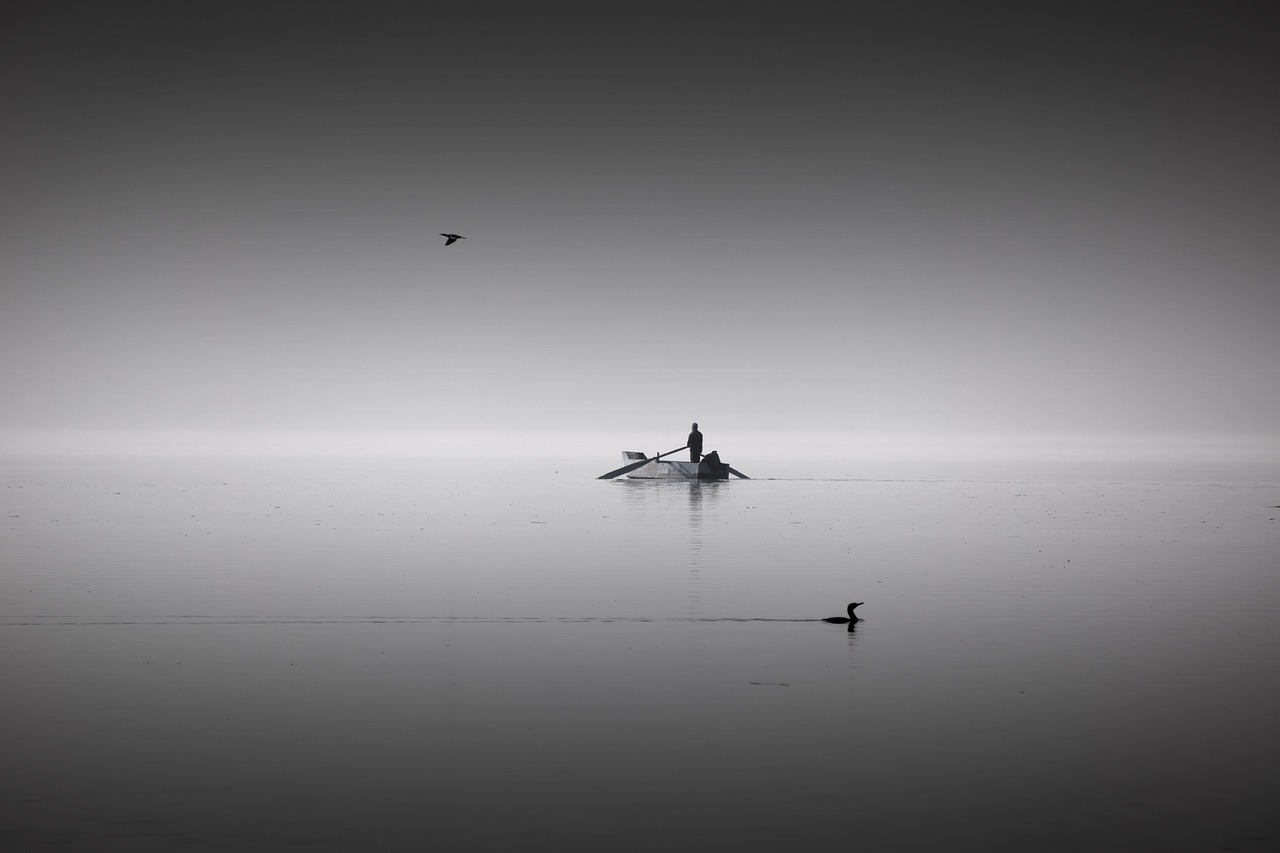
So, what exactly is atmospheric perspective? At its core, it’s a method that artists use to create an illusion of depth by manipulating color and clarity. Imagine standing on a mountain and looking down at a valley. The colors of the objects in the distance appear softer and more muted compared to those right in front of you. This phenomenon is due to the particles in the atmosphere that scatter light, making distant objects appear less vibrant. This technique has its roots in the works of ancient artists, but it gained significant traction during the Renaissance, when masters like Leonardo da Vinci and Raphael began to explore its potential. Understanding this concept is crucial for artists who wish to add a sense of realism and emotional depth to their compositions.
Now that we’ve set the stage, let’s talk about how to implement atmospheric perspective in your artwork. There are several methods that artists can employ to achieve this effect, and we’ll break down a few key techniques that are essential for creating that coveted depth.
One of the primary techniques is color gradation, which involves transitioning from vibrant colors in the foreground to softer, more muted tones in the background. Think of it as a gradient that guides the viewer’s eye through the artwork. This subtle shift in color enhances depth perception and adds a layer of realism that can make your work truly pop. For instance, if you’re painting a landscape, you might use bright greens and yellows for the grass in the foreground, gradually shifting to pale blues and grays for the mountains in the distance.
Another important aspect to consider is the use of warm and cool colors. Warm colors, like reds and yellows, tend to advance towards the viewer, while cool colors, such as blues and greens, recede into the background. This color temperature contrast can create a powerful sense of distance. For example, if you want to depict a sunset over a mountain range, you might use warm oranges and reds in the foreground and cool blues in the background, effectively guiding the viewer’s perception of depth.
Value shifts, or changes in lightness and darkness, also play a crucial role in atmospheric perspective. By varying the value in your artwork, you can suggest depth and distance effectively. Lighter values can indicate areas that are closer and more illuminated, while darker values can suggest shadows and distant objects. This interplay of light and dark can create a three-dimensional feel, making your artwork more engaging and dynamic.
Another technique to consider is layering. This involves building up elements in your painting to create a sense of depth. By adding layers of paint or using mixed media, you can enhance the three-dimensionality of your work. For example, in a landscape painting, you might layer trees and foliage in the foreground, followed by hills and mountains, creating a sense of progression that draws the viewer’s eye deeper into the scene.
Throughout history, many artists have mastered the art of atmospheric perspective, and their works serve as excellent examples for aspiring artists today. From the meticulous details of Renaissance masters to the innovative interpretations of modern artists, the evolution of this technique is truly captivating.
Let’s take a moment to appreciate the Renaissance masters like Leonardo da Vinci and Raphael, who expertly applied atmospheric perspective in their works. They understood how to manipulate color and light to create depth, making their landscapes feel immersive and lifelike. Their contributions to this technique have influenced countless artists and continue to be studied to this day.
In contrast, contemporary artists are reinterpreting atmospheric perspective in innovative ways. Modern art movements often challenge traditional techniques, experimenting with color, form, and space. This evolution shows that while the principles of atmospheric perspective remain, the way artists choose to express them can vary dramatically, reflecting the changing landscape of art.
Q: What is atmospheric perspective?
A: Atmospheric perspective is a technique used in art to create an illusion of depth by altering color and clarity, making distant objects appear softer and less vibrant.
Q: How can I practice atmospheric perspective?
A: You can practice by focusing on color gradation, using warm and cool colors effectively, and experimenting with value shifts in your artwork.
Q: Are there famous artists known for using atmospheric perspective?
A: Yes! Notable artists include Leonardo da Vinci and Raphael, who were masters of this technique during the Renaissance.
Understanding Atmospheric Perspective
Atmospheric perspective is a captivating technique that artists have employed for centuries to create an illusion of depth in their work. Imagine standing on a mountain top, gazing at the landscape below; the colors of the distant hills fade into soft blues and grays, while the vibrant greens of the grass at your feet pop with life. This phenomenon, where objects appear less distinct and more muted as they recede into the distance, is the essence of atmospheric perspective. It alters not only the color but also the clarity of objects, allowing viewers to perceive depth and distance in a two-dimensional space.
The origins of atmospheric perspective can be traced back to ancient civilizations, but it truly flourished during the Renaissance. Artists like Leonardo da Vinci and Raphael recognized its potential to enhance realism in their paintings. By manipulating color and clarity, they were able to guide the viewer's eye through their compositions, creating a sense of three-dimensionality that was revolutionary for its time. This technique became a cornerstone of landscape painting, allowing artists to depict vast expanses of nature with a sense of authenticity that had never been achieved before.
In essence, atmospheric perspective is not merely a set of techniques; it’s a language of visual storytelling. When artists choose how to represent depth, they are making deliberate decisions about how to convey emotion and narrative. The fading of colors, the blurring of shapes, and the subtle shifts in light all work together to create a cohesive experience for the viewer. It invites us to step into the artwork, to feel the distance, and to connect with the scene on a more profound level.
Understanding atmospheric perspective also involves recognizing its psychological impact. For instance, landscapes that utilize this technique can evoke feelings of tranquility and nostalgia, drawing viewers into a serene world that feels both familiar and distant. This emotional resonance is why atmospheric perspective remains relevant in contemporary art. Artists today continue to explore and reinterpret this age-old technique, finding new ways to engage viewers and convey depth in their work.
As we delve deeper into the nuances of atmospheric perspective, we will explore the key techniques that artists employ to achieve this effect. From color gradation to layering, each method plays a vital role in enhancing the viewer's experience and understanding of depth in art.
Key Techniques for Implementation
When it comes to mastering atmospheric perspective, artists have a toolbox of techniques at their disposal. These methods not only create the illusion of depth but also breathe life into their compositions. One of the most fundamental techniques is color gradation, which involves a seamless transition from vibrant colors in the foreground to softer, muted tones in the background. Think of it like a sunset; the colors are more intense close to the horizon, but as you look further away, they become softer and less saturated. This technique not only enhances depth perception but also adds a layer of realism that draws viewers into the artwork.
Another essential aspect is the use of layering techniques. By building up elements in a painting, artists can create a sense of three-dimensionality. Imagine peeling back the layers of an onion; each layer reveals something new and adds to the overall structure. In art, this could mean placing a distant mountain behind a foreground tree, effectively creating a visual hierarchy that guides the viewer’s eye through the piece.
Additionally, the manipulation of light and shadow plays a crucial role in atmospheric perspective. Artists can use light to highlight certain areas, creating focal points, while shadows can suggest depth and volume. For instance, a bright light shining on a foreground object can make it pop, while the shadows cast behind it can imply that there’s more space behind the object than what is immediately visible. This interplay between light and shadow is vital for achieving a convincing depth in art.
Color gradation is not just about the colors themselves; it’s about how they interact with one another. Artists often employ a technique known as color temperature to further enhance the sense of distance. By using warm colors—like reds and oranges—in the foreground and cooler colors—such as blues and greens—in the background, artists can create a visual cue that suggests depth. Warm colors tend to advance towards the viewer, while cool colors recede, giving the illusion of space. This technique can be likened to the way we perceive the atmosphere; objects in the distance often appear bluer and less distinct due to the scattering of light.
The choice between warm and cool colors is not just a stylistic decision; it fundamentally alters the viewer's perception of depth. For example, if an artist paints a vibrant red flower in the foreground against a backdrop of soft blue mountains, the viewer immediately feels the flower's proximity. This contrast not only enhances the visual appeal but also creates a dynamic sense of space. Understanding how to balance these colors can make or break the effectiveness of atmospheric perspective.
Value shifts—changes in lightness and darkness—are another critical component of atmospheric perspective. By varying the value in their compositions, artists can suggest depth and distance. For instance, a dark foreground can create a stark contrast with a lighter background, emphasizing the distance between the viewer and the painted scene. This technique is akin to how we perceive objects in real life; closer objects are often more detailed and darker, while those further away appear lighter and less distinct. By skillfully manipulating value, artists can guide the viewer’s eye and create a more immersive experience.
Layering techniques are where the magic happens. Artists can create depth by stacking elements in a way that mimics the real world. For example, when painting a landscape, an artist might start with a background layer of mountains, add a mid-ground of trees, and finish with a foreground of flowers. This approach not only adds depth but also creates a narrative within the artwork. Each layer tells a part of the story, inviting the viewer to explore the scene more thoroughly. The beauty of layering is that it allows for experimentation; artists can adjust the opacity of each layer, blend colors, and even add textures to enhance the overall composition.
In summary, mastering atmospheric perspective is about understanding and implementing these key techniques. By utilizing color gradation, layering, and the strategic use of light and shadow, artists can create compelling works that draw viewers into their visual narratives. Each technique contributes to a richer, more immersive experience, transforming flat canvases into vibrant worlds filled with depth and emotion.
- What is atmospheric perspective? Atmospheric perspective is a technique used in art to create an illusion of depth by altering color and clarity.
- How does color gradation enhance depth? Color gradation transitions vibrant colors in the foreground to muted tones in the background, enhancing depth perception.
- Why are warm and cool colors important? Warm colors advance towards the viewer while cool colors recede, creating a sense of distance in a composition.
- What role do light and shadow play in depth perception? Light highlights focal points, while shadows suggest depth and volume, enhancing the three-dimensionality of art.
- Can layering techniques be used in all forms of art? Yes, layering techniques can be applied in various art forms, including painting, digital art, and photography, to create depth.
Color Gradation
Color gradation is one of the most captivating techniques in the artist's toolkit, allowing for a stunning transition from vibrant hues in the foreground to softer, muted tones in the background. This gradual shift in color not only enhances the overall depth of a painting but also invites the viewer to immerse themselves in the artwork. Imagine standing in a lush forest; the vivid greens of the leaves closest to you gradually fade into the softer, hazier greens of the trees in the distance. This is the magic of color gradation at work!
When artists employ color gradation, they are essentially manipulating the perception of space and distance. By using a spectrum of colors that diminish in intensity, they create an illusion that draws the eye deeper into the composition. The closer an object is, the more saturated and detailed its colors appear, while distant objects take on a more subdued palette. This technique not only adds realism but also evokes emotional responses, making the scene feel alive and dynamic.
To effectively implement color gradation, artists often consider the following principles:
- Foreground Colors: These are typically rich and warm, grabbing the viewer's attention immediately. Think of the bright reds and oranges of a sunset or the deep greens of a forest floor.
- Background Colors: As the colors recede into the distance, they become cooler and less saturated. This mimics the way our eyes perceive the atmosphere, where colors appear muted due to the air and distance.
- Blending Techniques: Artists may use various methods to blend colors smoothly, such as glazing, layering, or wet-on-wet techniques, to achieve a seamless transition that feels natural.
Color gradation is not just a technique; it's a storytelling device. For instance, in a landscape painting, the artist might use a vibrant blue for a river in the foreground, gradually shifting to a lighter, more ethereal blue as the water flows into the distance. This not only creates depth but also suggests a sense of movement and continuity, as if the viewer can almost hear the water flowing away into the horizon.
In conclusion, color gradation is a fundamental aspect of atmospheric perspective that allows artists to create depth and dimension in their work. By understanding and mastering this technique, artists can transform flat surfaces into immersive experiences, inviting viewers to explore the layers of their artistic vision. So next time you pick up a brush, remember the power of color gradation – it's your ticket to creating worlds that feel as real as the one outside your window!
- What is atmospheric perspective? Atmospheric perspective is a technique used in art to create the illusion of depth by altering color and clarity based on distance.
- How does color gradation enhance depth in art? By transitioning from vibrant colors in the foreground to muted tones in the background, color gradation helps to create a sense of distance and three-dimensionality.
- Can anyone learn to use color gradation effectively? Absolutely! With practice and an understanding of color theory, anyone can learn to implement color gradation in their artwork.
Warm vs. Cool Colors
When it comes to creating depth in art, the contrast between warm and cool colors plays a pivotal role. Imagine standing on a beach, where the vibrant oranges and reds of the sunset seem to leap out at you. Those are warm colors, and they draw the eye forward. In contrast, the distant blue waves that fade into the horizon are cool colors, creating a sense of distance and tranquility. This color temperature not only sets the mood but also guides the viewer's perception of space within the artwork.
Warm colors, such as reds, oranges, and yellows, are often associated with energy, passion, and warmth. They tend to advance in a composition, making objects appear closer to the viewer. On the other hand, cool colors like blues, greens, and purples recede, giving the illusion of distance. This interplay between warm and cool colors can be likened to a dance, where each color has its role, contributing to the overall harmony and balance of the piece.
Artists can effectively use this technique to enhance the three-dimensionality of their work. For instance, by placing warm colors in the foreground and cool colors in the background, an artist can create a visual pathway that leads the viewer's eye deeper into the scene. This method not only adds depth but also evokes emotional responses, making the artwork more engaging.
To illustrate this concept further, consider the following table that summarizes the effects of warm and cool colors:
| Color Type | Examples | Emotional Impact | Spatial Effect |
|---|---|---|---|
| Warm Colors | Red, Orange, Yellow | Energy, Passion, Warmth | Advances the viewer |
| Cool Colors | Blue, Green, Purple | Calm, Tranquility, Distance | Recedes from the viewer |
Incorporating this knowledge into your art can significantly enhance the viewer's experience. Think of it as a visual cue; when someone looks at your painting, the warm colors invite them in, while the cool colors encourage them to explore further. This sophisticated dance of colors not only creates depth but also tells a story, making your artwork resonate on multiple levels.
Value Shifts
When it comes to creating depth in art, are like the secret sauce that can transform a flat image into a dynamic, three-dimensional experience. Value, in the art world, refers to the lightness or darkness of a color. By manipulating these values, artists can suggest distance, form, and atmosphere in their compositions. Think of it like the way sunlight dances across a landscape—some areas are brightly illuminated, while others fade into shadow. This interplay of light and dark not only adds realism but also guides the viewer’s eye through the artwork.
One of the most fascinating aspects of value shifts is how they can create the illusion of space. For instance, when an artist uses lighter values in the background and darker values in the foreground, it mimics how our eyes perceive the world. The atmospheric haze that occurs in nature causes distant objects to appear lighter and less defined. This is why landscapes often look softer and more muted as they recede into the horizon. By applying this principle, artists can effectively push elements back into space or pull them forward, creating a sense of depth that captivates the viewer.
To illustrate the impact of value shifts, consider the following example: imagine a mountain range at dusk. The mountains closest to you might be painted in deep, rich browns and greens, while those further away transition into softer, grayer hues as they blend with the evening sky. This not only establishes a clear foreground but also invites the viewer to journey through the painting, experiencing the layers of depth along the way. Additionally, the use of contrasting values can create focal points within the artwork. For example, a bright, white highlight on a foreground object can draw the eye, while darker values in the background recede, enhancing the overall composition.
In practical terms, artists can achieve effective value shifts through various techniques. Some common methods include:
- Glazing: Applying thin layers of transparent paint to adjust the value without losing the underlying colors.
- Scumbling: Using a dry brush technique to apply lighter values over darker ones, creating a textured effect.
- Chiaroscuro: A technique that emphasizes the contrast between light and dark to create volume and depth.
Ultimately, mastering value shifts is not just about understanding theory; it’s about practice and experimentation. Artists who take the time to study how light interacts with objects in the real world will find that their ability to convey depth improves dramatically. So, the next time you pick up a brush, remember that the subtle dance of light and shadow is your ally in creating stunning visual depth.
- What are value shifts in art? Value shifts refer to the changes in lightness and darkness of colors used in an artwork, helping to create the illusion of depth and dimension.
- How do value shifts affect depth perception? By using lighter values in the background and darker values in the foreground, artists can mimic how we perceive distance in the real world, enhancing the depth of their compositions.
- Can value shifts be applied in digital art? Absolutely! Digital artists can manipulate values just like traditional artists, using software tools to adjust brightness and contrast to create depth.
Layering Techniques
Layering techniques are a fundamental aspect of creating depth in art, allowing artists to build a sense of three-dimensionality that draws viewers into their compositions. Imagine standing in a lush forest; the trees closest to you are vibrant and detailed, while those further away appear softer and less distinct. This is the essence of layering in art, where each layer contributes to the overall perception of space and distance. By strategically placing elements in the foreground, middle ground, and background, artists can create a compelling narrative that guides the viewer's eye through the artwork.
One effective method of layering involves the use of transparent glazes or washes. Artists can apply thin layers of paint to achieve subtle variations in color and tone, which can replicate the effects of atmosphere and distance. This technique is particularly useful in landscape painting, where the atmospheric conditions can greatly influence how objects appear. For instance, a mountain range might be painted with several layers, gradually shifting from deep greens and blues at the base to lighter, hazier tones at the summit, conveying the vastness of the scene.
Another key aspect of layering is the incorporation of texture. Artists can add physical layers through techniques such as impasto, where paint is applied thickly to create a three-dimensional effect. This method not only enhances the visual interest of the artwork but also plays a crucial role in how light interacts with the surface, further contributing to the illusion of depth. By combining smooth and textured areas, artists can create a dynamic interplay that enhances the viewer's experience.
To effectively utilize layering techniques, artists often consider the following elements:
- Foreground Elements: These are the most detailed and vibrant parts of the painting, designed to capture immediate attention.
- Middle Ground: This section acts as a bridge between the foreground and background, often featuring less detail and softer colors.
- Background: Typically painted with muted tones and less clarity, this layer suggests distance and helps to establish the overall atmosphere.
Moreover, layering is not just about physical placement; it also involves the thoughtful application of light and shadow. By layering shadows over lighter areas, artists can create depth and volume, making objects appear more realistic. This interplay of light and dark can evoke emotional responses, drawing the viewer deeper into the narrative of the artwork.
In conclusion, mastering layering techniques is essential for any artist aiming to create depth and dimension in their work. Whether through the use of glazes, texture, or the strategic placement of elements, layering allows for a richer and more immersive experience. As artists continue to explore and innovate with these techniques, the possibilities for visual storytelling remain limitless.
What is atmospheric perspective?
Atmospheric perspective is a technique used in art to create an illusion of depth by altering color and clarity, making objects appear more distant as they recede into the background.
How can I achieve atmospheric perspective in my artwork?
You can achieve atmospheric perspective by using color gradation, layering techniques, and varying the clarity and detail of objects as they move from foreground to background.
Why is layering important in creating depth?
Layering adds dimension and realism to artwork by allowing artists to build up visual elements, creating a sense of space and guiding the viewer's eye through the composition.
Can layering techniques be used in digital art?
Absolutely! Layering techniques are widely used in digital art, where artists can manipulate layers to create depth, texture, and atmospheric effects just like in traditional mediums.
Historical Examples of Atmospheric Perspective
Throughout the annals of art history, atmospheric perspective has played a pivotal role in enhancing the depth and realism of visual compositions. This technique, which manipulates color and clarity to create an illusion of distance, has been employed by various artists across different eras. One of the most notable periods in which atmospheric perspective flourished was the Renaissance, a time marked by a renewed interest in the natural world and human experience. Artists like Leonardo da Vinci and Raphael mastered this technique, effectively transforming their artworks into windows that invite viewers into expansive landscapes.
Leonardo da Vinci, renowned for his meticulous attention to detail, utilized atmospheric perspective to create a sense of depth in works such as the Virgin of the Rocks. In this masterpiece, the foreground figures are rendered in vibrant colors and sharp detail, while the background fades into softer, cooler hues. This transition not only draws the eye inward but also evokes a sense of tranquility and distance. Similarly, Raphael's School of Athens showcases his adept use of atmospheric perspective, where the architectural elements recede into the background, creating a grand sense of space that invites viewers to explore the intellectual dialogue taking place within the scene.
As we move into more modern interpretations, contemporary artists have also embraced atmospheric perspective, albeit with innovative twists. For instance, the Impressionists, such as Claude Monet, often employed this technique to capture the fleeting effects of light and atmosphere in their landscapes. In works like Impression, Sunrise, Monet's use of color gradation and soft brushwork creates a dreamlike quality that immerses the viewer in a moment of time, blurring the lines between foreground and background.
To further illustrate the evolution of atmospheric perspective, let's take a look at some key historical examples:
| Artist | Artwork | Era | Technique Used |
|---|---|---|---|
| Leonardo da Vinci | Virgin of the Rocks | Renaissance | Color gradation, layering |
| Raphael | School of Athens | Renaissance | Architectural recession, value shifts |
| Claude Monet | Impression, Sunrise | Impressionism | Soft brushwork, light manipulation |
These examples highlight how artists have adapted and redefined atmospheric perspective over time. From the detailed realism of the Renaissance to the expressive brushstrokes of Impressionism, the technique remains a vital tool for artists seeking to convey depth and emotion in their work. As we continue to explore the impact of atmospheric perspective in art, it becomes clear that this technique is not merely a method of depiction; it is a bridge connecting the viewer to the artist's vision, drawing us into a world that feels both tangible and infinite.
- What is atmospheric perspective? Atmospheric perspective is a technique in art that creates an illusion of depth by altering color and clarity, typically making objects in the background appear lighter and less detailed.
- Who were the pioneers of atmospheric perspective? Key pioneers include Renaissance artists like Leonardo da Vinci and Raphael, who expertly employed this technique in their works.
- How does color temperature affect atmospheric perspective? Warm colors in the foreground and cool colors in the background can enhance the sense of distance, creating a more immersive experience for the viewer.
Renaissance Masters
During the Renaissance, a period that spanned from the 14th to the 17th century, artists began to explore new techniques that transformed the landscape of art forever. Among these, atmospheric perspective emerged as a groundbreaking method that would allow painters to create an astonishing sense of depth and realism in their works. Artists like Leonardo da Vinci and Raphael not only mastered this technique but also set the stage for future generations to build upon their innovations.
Leonardo da Vinci's approach to atmospheric perspective was revolutionary. He understood that as objects recede into the distance, they become less distinct and their colors fade into softer, cooler hues. In his iconic painting, The Last Supper, da Vinci expertly applies this technique, using a gradual shift from vibrant colors in the foreground to muted tones in the background. This not only creates depth but also draws the viewer's eye toward the central figures, enhancing the narrative of the scene.
Raphael, another titan of the Renaissance, also employed atmospheric perspective with remarkable skill. In works like The School of Athens, he utilized both color gradation and value shifts to create a spatial hierarchy. The figures in the foreground are painted with sharper details and warmer colors, while those in the background are rendered with softer edges and cooler tones. This method not only adds to the three-dimensionality of the composition but also invites the viewer to explore the architectural space Raphael has so masterfully constructed.
To better understand how these masters utilized atmospheric perspective, let’s look at a brief comparison of their techniques:
| Artist | Technique | Notable Work |
|---|---|---|
| Leonardo da Vinci | Color gradation and softening of details | The Last Supper |
| Raphael | Value shifts and spatial hierarchy | The School of Athens |
Both artists not only employed atmospheric perspective but also contributed to its evolution. Their works encapsulate the essence of the Renaissance spirit, where the quest for knowledge and understanding of the natural world was paramount. By manipulating color and clarity, they were able to evoke emotions and create immersive experiences that continue to resonate with viewers today.
As we reflect on the impact of these Renaissance masters, it’s clear that their innovations in atmospheric perspective laid the groundwork for countless artists who followed. Their ability to blend science and art, to observe the world with a keen eye, and to translate those observations onto canvas is what sets them apart. The legacy of their techniques can be seen in countless artworks throughout history, proving that the quest for depth and realism is a timeless pursuit.
- What is atmospheric perspective? - Atmospheric perspective is a technique used in art to create an illusion of depth by altering color and clarity based on distance.
- Which artists are known for using atmospheric perspective? - Notable artists include Leonardo da Vinci and Raphael, who were instrumental in developing this technique during the Renaissance.
- How does color influence atmospheric perspective? - Artists use warmer colors in the foreground and cooler colors in the background to create a sense of distance and depth.
- Can atmospheric perspective be used in modern art? - Yes, contemporary artists continue to reinterpret atmospheric perspective, incorporating it into various styles and movements.
Modern Interpretations
In the world of contemporary art, the concept of atmospheric perspective has undergone a fascinating transformation. Artists today are not just repeating the techniques of their predecessors; they are innovating and redefining how depth and distance are perceived in their work. This evolution reflects a broader shift in artistic expression, where traditional boundaries are pushed, and new mediums and technologies come into play. For instance, many modern artists are embracing digital platforms, allowing for an entirely new way to manipulate color and form to convey depth.
One of the most compelling aspects of modern interpretations of atmospheric perspective is the use of mixed media. Artists combine traditional painting techniques with digital elements, photography, and even sculpture to create layers that challenge the viewer's perception. This fusion not only enhances the depth of the artwork but also invites the audience to engage with it on multiple sensory levels. Imagine standing in front of a piece that appears to shift and change as you move—this is the magic of modern atmospheric perspective!
Moreover, contemporary artists are increasingly aware of how cultural contexts influence perception. For instance, artists from different backgrounds may use color and layering in ways that reflect their unique experiences and environments. This diversity enriches the concept of atmospheric perspective, as it becomes a tool for storytelling and connection. Artists like Yayoi Kusama and James Turrell utilize color and light in ways that create immersive experiences, drawing viewers into their worlds and challenging them to reconsider their understanding of space and depth.
To illustrate this evolution, consider the following table showcasing some modern artists and their approaches to atmospheric perspective:
| Artist | Technique | Notable Work |
|---|---|---|
| Yayoi Kusama | Color and Pattern | Infinity Mirror Rooms |
| James Turrell | Light Manipulation | Skyspace |
| David Hockney | Digital Painting | The Arrival of Spring |
In addition to these artists, the rise of virtual reality (VR) has opened up new dimensions for atmospheric perspective. Artists can create immersive environments where viewers not only see but also experience depth in a completely new way. This technology allows for a dynamic interaction with space, where the audience can navigate through a digital landscape that plays with the principles of atmospheric perspective, blurring the lines between reality and illusion.
Ultimately, the modern interpretations of atmospheric perspective are a testament to the ever-evolving nature of art. As artists experiment with new tools and concepts, they invite us to rethink how we perceive depth and space. This ongoing dialogue between tradition and innovation keeps the spirit of atmospheric perspective alive, ensuring that it remains a vital part of artistic exploration.
- What is atmospheric perspective?
Atmospheric perspective is a technique used in art to create the illusion of depth by altering color and clarity. It involves using lighter and less saturated colors for objects in the background and more vibrant colors for those in the foreground.
- How do modern artists use atmospheric perspective?
Modern artists incorporate atmospheric perspective through various methods, including mixed media, digital art, and immersive installations, which allow for innovative interpretations of depth and space.
- Can atmospheric perspective be used in digital art?
Absolutely! Digital artists utilize atmospheric perspective by manipulating color, light, and layering techniques to create depth in their compositions, often resulting in interactive and immersive experiences.
Frequently Asked Questions
- What is atmospheric perspective in art?
Atmospheric perspective is a technique used by artists to create an illusion of depth in their work. By manipulating color and clarity, artists can make objects appear closer or further away, giving their compositions a three-dimensional quality.
- How do artists achieve atmospheric perspective?
Artists use several techniques to achieve atmospheric perspective, including color gradation, layering, and strategic use of light and shadow. For example, they might transition from vibrant colors in the foreground to muted tones in the background to enhance depth perception.
- What role do warm and cool colors play in creating depth?
Warm colors, like reds and yellows, tend to advance and appear closer to the viewer, while cool colors, such as blues and greens, recede and create a sense of distance. This contrast helps to establish a visual hierarchy and adds to the overall depth of the artwork.
- Can you explain value shifts and their importance?
Value shifts refer to the changes in lightness and darkness within a composition. By varying these values, artists can suggest depth and distance, making certain elements stand out while pushing others back into the background, thus enhancing the three-dimensional feel of the piece.
- What are some historical examples of atmospheric perspective?
Throughout art history, many renowned artists have effectively used atmospheric perspective. For instance, Renaissance masters like Leonardo da Vinci and Raphael skillfully applied this technique to create depth in their paintings, influencing generations of artists to come.
- How is atmospheric perspective interpreted in modern art?
Contemporary artists continue to reinterpret atmospheric perspective in innovative ways, often blending traditional techniques with modern styles. This evolution allows for fresh expressions of depth and distance, demonstrating the technique's enduring relevance in the art world.


