
How to Paint Seascapes: Beginners Guide
Welcome to the vibrant world of seascape painting! If you’ve ever gazed at the ocean and felt a tug at your heartstrings, you’re not alone. Painting seascapes allows you to capture that feeling and share it with others. This guide provides essential techniques and tips for novice artists looking to capture the beauty of seascapes. We’ll dive into the materials you'll need, the methods to use, and the inspiration that can spark your creativity. So, roll up your sleeves, grab your brushes, and let’s get started!
When it comes to painting, the right materials can make all the difference. As a beginner, you don’t need to break the bank, but investing in quality brushes, paints, and canvases is crucial for achieving those stunning effects in your seascape. Here’s a quick rundown of what you’ll need:
- Brushes: A variety of sizes is essential. Flat brushes are great for broad strokes, while round brushes help with details.
- Paints: Acrylics are perfect for beginners due to their quick drying time; however, oils can offer a richer finish for those willing to wait.
- Canvas: Start with pre-stretched canvases or canvas boards. They’re easy to work on and provide a good surface for your paint.
With these materials in hand, you're ready to embark on your artistic journey!
Color theory is the backbone of any painting, and it plays a vital role in creating realistic seascapes. Understanding how to mix and match colors will help you reflect the ocean's hues and the sky's transitions effectively. Think of color theory as the language of painting—once you learn it, your artwork will start to sing!
Creating realistic ocean colors involves understanding the nuances of blues, greens, and whites. Imagine standing on the beach, watching the waves crash and the sunlight glint off the water. To achieve this, you’ll want to mix various shades. For instance:
- Deep Blue: Combine ultramarine blue with a touch of black for depth.
- Aqua Green: Mix phthalo green with white for a refreshing wave color.
- Foamy White: Use titanium white with a hint of blue or green to create the look of sea foam.
These mixtures will help you depict the ocean's character beautifully!
Using layers of color can add incredible depth to your seascape. Think of your painting as a window into the ocean—each layer represents a different view. Start with a base color for the water, then gradually add darker shades to create depth and lighter shades to highlight the surface. This technique not only enhances visual impact but also brings your seascape to life.
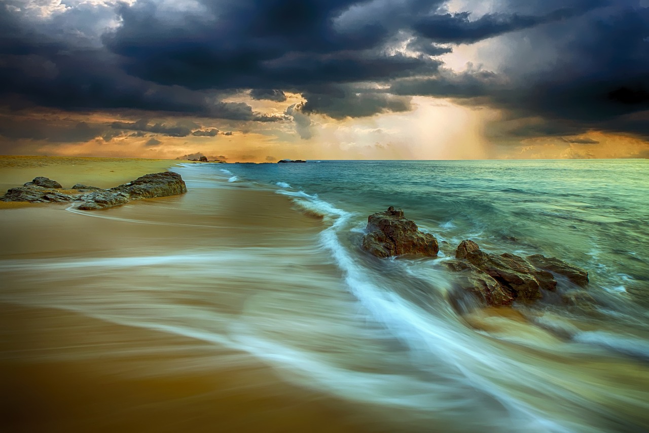
Light and shadow are essential for realism in your painting. Imagine the sun setting on the horizon, casting golden rays on the water. To capture this interplay, use a lighter color where the light hits and a darker shade in the shadows. This contrast will make your painting pop and create a three-dimensional effect.
A well-thought-out composition can elevate your seascape painting from ordinary to extraordinary. Consider the rule of thirds when framing your scene. Place the horizon line either one-third or two-thirds up from the bottom of your canvas. This simple technique can create a balanced and engaging composition, drawing the viewer’s eye to the focal points of your artwork.
Water presents unique challenges in painting, but it also offers endless possibilities for creativity. Here are some techniques to help you render waves, reflections, and the dynamic surface of the sea effectively. Remember, practice makes perfect, so don’t be discouraged if it doesn’t turn out perfectly on your first try!
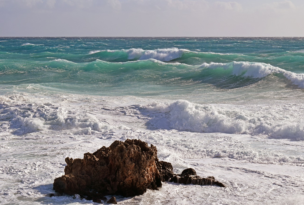
Waves and currents can add movement and energy to your artwork. To portray these elements effectively, use sweeping brush strokes to mimic the flow of water. Think of painting waves like dancing—each stroke should embody the rhythm and motion of the ocean. Don’t forget to include highlights on the crest of the waves to capture the sparkle of sunlight!
Reflections in water can enhance realism and depth. To accurately depict reflections, observe how the colors of the sky and surroundings are mirrored on the water's surface. Use horizontal strokes to create a smooth reflection and remember to darken the colors slightly to simulate the depth of the water. This technique will give your seascape a stunning and lifelike quality.
Inspiration is key to creativity, and seascapes are all around us! Whether it’s a walk along the beach or a beautiful photograph, nature offers endless sources of inspiration. Pay attention to the colors, the movement of the water, and the play of light—these elements can spark your artistic vision.
Reference images can guide your painting process. Select images that resonate with you and analyze their colors and compositions. While it’s essential to use them as a guide, don’t forget to infuse your unique style into the artwork. After all, it’s your vision that makes the painting special!
Experimenting with various painting styles can lead to personal growth. From realism to impressionism, each style offers different ways to express the beauty of the sea. Don’t be afraid to try new techniques and approaches. You might discover a style that truly resonates with you and enhances your artistic voice.
1. What is the best paint for beginners?
Acrylic paints are often recommended for beginners due to their ease of use and quick drying time.
2. How can I create realistic waves?
Use sweeping strokes and varying shades of blue and white to depict the movement and light on the waves.
3. Do I need to use reference images?
While not mandatory, reference images can help you understand color and composition better.
4. Can I paint seascapes without formal training?
Absolutely! Painting is a personal journey, and practice will help you improve over time.
Choosing the Right Materials
When it comes to painting seascapes, the materials you choose can make a world of difference in your final artwork. Think of your materials as the foundation of a house; if the foundation is weak, the entire structure is compromised. So, let’s dive into the essential tools you’ll need to get started on your oceanic journey.
First and foremost, you’ll want to select quality brushes. A variety of brush shapes and sizes will allow you to create different textures and effects. For instance, flat brushes are perfect for broad strokes and skies, while round brushes can help you add fine details, like the foam on waves. Here’s a quick rundown of some recommended brush types:
- Flat Brushes: Great for covering large areas and creating straight lines.
- Round Brushes: Ideal for detail work and curves.
- Filbert Brushes: A versatile option that combines the qualities of flat and round brushes.
- Fan Brushes: Perfect for creating textures like grass or waves.
Next up is your choice of paints. Acrylics are often recommended for beginners because they dry quickly and are easy to work with. However, oil paints can also be a fantastic choice if you prefer a slower drying time, which allows for more blending and layering. When selecting your colors, consider a basic palette that includes:
| Color | Purpose |
|---|---|
| Ultramarine Blue | For deep ocean hues |
| Cerulean Blue | To depict the lighter shades of the sky |
| White | For highlights and foam |
| Cadmium Yellow | To capture sunlight and warmth |
| Burnt Sienna | For sandy beaches and earthy tones |
Now let’s talk about canvases. The surface you paint on can significantly influence your technique. For beginners, stretched canvases or canvas boards are excellent choices. They provide a sturdy surface that can handle multiple layers of paint without warping. If you’re feeling adventurous, you might even try painting on wood panels for a unique texture.
Finally, don’t forget about your palette and easel. A good palette allows you to mix colors easily, while an adjustable easel will help you find the perfect angle for your painting. Remember, the right materials can elevate your artwork, but they should also inspire you to experiment and explore your creativity. So, gather your tools, roll up your sleeves, and get ready to paint those breathtaking seascapes!

Understanding Color Theory
Color theory is the backbone of any painting, especially when you're diving into the mesmerizing world of seascapes. It’s not just about slapping on some blue and green; it’s about understanding how colors interact, how they convey emotion, and how they can bring your ocean scenes to life. Imagine standing on a beach, watching the waves roll in under a vibrant sunset. The colors you see are a symphony of hues, each playing its part in the overall picture. This is what you want to capture on your canvas!
At its core, color theory revolves around the color wheel, which consists of primary, secondary, and tertiary colors. Primary colors (red, blue, yellow) are the building blocks of all other colors. When mixed together, they create secondary colors (green, orange, purple). Tertiary colors are formed by mixing a primary color with a secondary color. Understanding this wheel is essential because it helps you choose the right colors that harmonize and contrast effectively. For instance, in a seascape, you might use various shades of blue and green, but a touch of complementary colors like oranges and reds can create stunning focal points, mimicking the sun setting over the horizon.
When painting seascapes, you’ll want to focus on a few key aspects of color theory:
- Hue: This refers to the actual color (like blue or green). It’s essential to choose the right hue to represent the ocean's character.
- Saturation: This indicates the intensity of a color. A highly saturated blue can depict a calm, tropical sea, while a more muted blue can suggest a stormy atmosphere.
- Value: This refers to how light or dark a color is. Adjusting the value can help create depth and dimension in your painting.
Now, let’s dive deeper into mixing ocean colors. The ocean isn’t just one shade of blue; it’s a blend of many. To achieve realistic ocean colors, you need to consider the various factors that influence the sea’s appearance, such as light, weather, and time of day. For instance, a sunny day might yield bright turquoise waters, while a cloudy day could bring out darker, more muted shades. When mixing your paints, try to incorporate a bit of white to lighten your colors and create that shimmering effect of sunlight on the water. Alternatively, adding a touch of black or a complementary color can help deepen your hues, giving the water a more dramatic look.
In addition to mixing your colors, layering is a fantastic technique to enhance the richness of your seascape. By applying thin layers of paint, you can build up the color gradually, allowing for more complexity and depth. This technique mimics the way light interacts with water, creating a sense of realism. Start with a base layer of your desired ocean color, then gradually add lighter shades on top to represent the sun’s reflection and the movement of the waves.
Finally, don’t forget the importance of light and shadow in your seascape. The interplay of light and shadow can dramatically affect the mood of your painting. Think about how the sun casts shadows on the water and creates highlights on the waves. Use a mix of lighter and darker colors to depict this, ensuring that your seascape feels dynamic and alive. Remember, painting is not just about replication; it’s about interpretation and expression. So, let your creativity flow as freely as the ocean waves!
Mixing Ocean Colors
When it comes to painting seascapes, one of the most enchanting aspects is the myriad of colors that the ocean displays. Mixing ocean colors is not just about slapping some blue paint on your canvas; it’s about capturing the depth, movement, and emotion that water evokes. The ocean is a living entity, constantly changing with the light and the weather, and your palette should reflect that dynamism.
To begin with, understanding the basic color palette is essential. You’ll primarily work with various shades of blue, green, and white, but it’s crucial to know how to mix them to create the perfect ocean hue. For instance, mixing a deep navy blue with a touch of green can give you that rich, dark color of deep waters. On the other hand, adding white to your blue can create the soft, gentle tones of a calm sea. Here’s a simple breakdown of some common ocean colors:
| Color | Mixing Formula | Use |
|---|---|---|
| Deep Ocean Blue | 1 part Ultramarine Blue + 1 part Phthalo Green | For deep water areas |
| Turquoise | 1 part Cerulean Blue + 1 part Cadmium Green | For shallow waters |
| Seafoam Green | 1 part Titanium White + 1 part Phthalo Green | For waves and highlights |
Another vital aspect to consider is the temperature of your colors. Warm colors can create a feeling of sunlight reflecting off the water, while cool colors can convey the depths of the sea. For example, mixing a bit of yellow or orange into your blue can create a sunlit effect. Think of it this way: a sunset over the ocean often transforms the water into a kaleidoscope of colors, from deep purples to vibrant oranges and reds. By mixing these colors effectively, you can bring that same vibrancy to your artwork.
Don’t forget about the importance of layering. When mixing colors, consider how they will appear when layered on top of one another. By applying a base layer of darker shades and then gradually adding lighter tones, you can create a sense of depth and realism. This technique mimics how light interacts with water, making your seascape feel alive. Remember, the key to mastering ocean colors lies in practice and observation. Spend time looking at real oceans, whether it's a beach day or a photograph, and take mental notes of how colors change with the light.
In summary, mixing ocean colors is about more than just blending paints; it’s about understanding the nuances of nature and translating them onto your canvas. By mastering the art of color mixing, you’ll be well on your way to creating breathtaking seascapes that capture the essence of the ocean. So grab your palette, experiment with different combinations, and let the colors of the sea inspire your artistic journey!
- What colors should I start with for painting seascapes? It's best to start with basic colors like Ultramarine Blue, Phthalo Green, Titanium White, and Cadmium Yellow.
- How can I create depth in my ocean painting? Use darker colors for the base and layer lighter colors on top to create a sense of depth.
- Can I use acrylics for seascapes? Absolutely! Acrylics are great for seascapes due to their versatility and quick drying time.
Creating Depth with Layers
When it comes to painting seascapes, one of the most effective techniques to achieve a sense of depth is through the use of layers. Think of layers as the building blocks of your painting, each one adding a new dimension and richness to your artwork. Just like a well-constructed sandwich, each layer contributes to the overall flavor, making it more satisfying and enjoyable. In seascape painting, layering not only enhances visual interest but also creates a sense of realism that draws the viewer into your oceanic scene.
To start layering effectively, you'll want to consider the order in which you apply your colors. Begin with the background, such as the sky, and work your way forward. This technique allows you to establish a solid foundation for your seascape. For example, you might begin with a light wash of blue for the sky, adding in subtle gradients to suggest clouds. As you progress, you can introduce darker shades to represent the ocean's depths, creating a contrast that brings your painting to life.
When layering, it's essential to remember that each layer should be allowed to dry before adding the next. This drying time is crucial as it helps prevent colors from muddying together, ensuring that each hue remains vibrant and distinct. You can use a hairdryer on a low setting to speed up the drying process if you're feeling impatient. Additionally, consider using glazing techniques, where you apply a thin, transparent layer of paint over a dried layer. This method can create stunning effects, allowing the colors beneath to shine through while adding depth and complexity to the surface.
Another technique to enhance depth is to vary the thickness of your paint application. For instance, use thicker paint for the foreground elements, such as crashing waves, to make them pop, while applying thinner layers for background elements, like distant clouds. This contrast in texture can trick the eye into perceiving distance, making your seascape feel more expansive.
Moreover, consider the use of complementary colors in your layers. For example, if your ocean is a deep blue, a hint of orange or yellow can be added to the waves to create a striking contrast. This not only adds depth but also vibrancy to your painting. By strategically placing these colors, you can create a sense of movement and life within your seascape.
In summary, layering is a powerful technique that can transform a flat painting into a rich, dynamic seascape. By starting with a solid foundation, allowing for drying time, varying paint thickness, and utilizing complementary colors, you can achieve a depth that captivates your audience. Remember, practice makes perfect, so don’t be afraid to experiment with different layering techniques until you find the style that resonates with you!
- What type of paint is best for seascapes? Acrylics and oils are popular choices due to their versatility and vibrant colors.
- How can I create realistic waves? Focus on the shapes and movement of the waves, using a combination of brush techniques and layering to capture their essence.
- Do I need to use a reference image? While not necessary, reference images can greatly help in understanding the colors and forms found in nature.
Highlighting Light and Shadow
When it comes to painting seascapes, light and shadow are your best friends. They breathe life into your canvas, creating a sense of depth and realism that can transform a flat image into a breathtaking scene. Imagine standing on a beach as the sun sets, watching how the golden rays dance on the water’s surface. This magical interplay of light and shadow is what you want to capture in your artwork.
To effectively highlight light and shadow in your seascape, start by observing your surroundings. Notice how the sunlight reflects off the water, creating bright spots and shimmering highlights. These highlights can be achieved by using lighter shades of your base colors, such as whites, light blues, and soft yellows. For instance, when painting the ocean, you might mix a bit of white with your blue to create those sparkling highlights that mimic the sun’s reflection.
On the flip side, shadows add depth and contrast to your painting. They can be just as important as the highlights. Think about the areas where the light doesn't reach, such as the depths of a wave or the shadow cast by a rocky outcrop. These areas can be painted with darker shades of blue or green, giving the illusion of depth. For example, a deep navy blue can represent the shadowy parts of the ocean, while a lighter blue can represent the sunlit areas.
One effective technique to master is the use of layering. Start with a base layer of your chosen colors, then gradually build up layers of highlights and shadows. This will not only enhance the dimensionality of your painting but also allow for a more dynamic interplay of light and shadow. As you layer, remember to use a dry brush technique to softly blend the edges of your highlights and shadows, ensuring a smooth transition that mimics the natural flow of light.
Another important aspect is the direction of your light source. Ask yourself, “Where is the light coming from?” This will guide how you place your highlights and shadows. If the sun is setting on the horizon, the light will be coming from that direction, casting longer shadows and creating more pronounced highlights on the water. Pay close attention to how this affects the shapes and colors in your seascape.
To help you visualize this concept, here’s a simple table illustrating the relationship between light, shadow, and color in seascapes:
| Element | Color Example | Description |
|---|---|---|
| Highlight | Light Blue/White | Represents sunlit areas of the water, creating a sparkling effect. |
| Shadow | Dark Blue/Navy | Indicates areas where the light is blocked, adding depth to the scene. |
| Mid-tone | Medium Blue | Serves as the base color of the ocean, blending highlights and shadows. |
As you practice these techniques, don’t forget that mistakes are part of the process. Each brushstroke is a step toward mastering the art of capturing light and shadow. Embrace the learning curve, and soon enough, you’ll find your unique style emerging. Remember, painting is not just about replicating what you see; it’s about expressing how you feel about what you see. So, grab your brushes and let the light guide you!
- What colors should I use for painting the ocean? It's best to use a mix of blues, greens, and whites. Experiment with different shades to find what works for you.
- How do I create realistic waves in my painting? Focus on layering colors and using brush strokes that mimic the movement of water.
- Can I use photographs as references? Absolutely! Reference images can provide valuable guidance while allowing you to infuse your own style into your work.
Choosing a Composition
When it comes to painting seascapes, composition is everything. Think of it as the backbone of your artwork; it sets the stage for the story you want to tell. A well-composed painting not only captures the viewer’s attention but also guides their eye through the piece, allowing them to explore every detail. So, how do you create a composition that resonates? First, consider the rule of thirds. This classic technique involves dividing your canvas into a grid of nine equal parts, creating four intersection points. Positioning your focal point at one of these intersections can create a sense of balance and intrigue.
Next, think about the elements of your scene. Do you want to emphasize the vastness of the ocean or the intimacy of a rocky shore? This decision will influence your composition significantly. For instance, if you want to highlight the ocean's expanse, you might position the horizon line lower on the canvas, allowing more sky to fill the space. Conversely, if you want to focus on coastal details, a higher horizon line can draw attention to the foreground elements.
Another tip is to use leading lines. These are lines that guide the viewer’s eye through the painting, creating a sense of movement and flow. Consider how the shoreline, waves, or even clouds can lead the viewer's gaze across your canvas. Additionally, incorporating foreground, middle ground, and background elements can add depth and interest to your composition. For example, placing a sailboat in the foreground can create a sense of scale and invite viewers into your seascape.
Finally, don’t forget about color and light. The way you use color can affect the overall mood of your composition. Bright, vibrant colors can evoke feelings of joy and warmth, while cooler tones can create a sense of calm or melancholy. Similarly, the direction of light can dramatically change the atmosphere of your painting. Consider how the sun's position affects shadows and highlights in your scene, and use this to enhance your composition.
To summarize, here are a few key points to keep in mind when choosing a composition for your seascape:
- Utilize the rule of thirds for balanced focal points.
- Decide what aspect of the scene you want to emphasize.
- Incorporate leading lines for movement and flow.
- Add depth with foreground, middle ground, and background elements.
- Consider color and light to set the mood.
Choosing the right composition can be the difference between a good painting and a stunning one. So take your time, experiment with different layouts, and don't be afraid to make adjustments until you find the perfect balance that speaks to your artistic vision.
Q: What is the rule of thirds?
A: The rule of thirds is a guideline that suggests dividing your canvas into a 3x3 grid and placing points of interest along the lines or at their intersections to create balance.
Q: How can I create depth in my seascape painting?
A: You can create depth by layering elements in the foreground, middle ground, and background, as well as using varying shades of color to suggest distance.
Q: Should I sketch my composition before painting?
A: Yes! Sketching can help you visualize your composition and make adjustments before committing to paint.
Techniques for Painting Water
Painting water can be one of the most exhilarating yet challenging aspects of creating seascapes. The fluidity, movement, and reflective qualities of water require a keen understanding of various techniques to truly capture its essence. To begin with, it’s crucial to grasp the fundamental properties of water and how light interacts with it. Think of water as a living entity; it shifts and changes, reflecting not just the sky above, but also the colors and shapes of everything around it. This dynamic nature can be portrayed through a few essential techniques that every beginner should know.
One of the first techniques to master is depicting waves and currents. Waves can be painted in a myriad of ways, but a common method is to use a combination of brush strokes that mimic the movement of water. For instance, using a fan brush can help create the frothy tops of waves, while a flat brush can be effective for the water's surface. The key here is to vary your brush pressure and direction to reflect the natural undulation of the sea. Remember, the ocean is never still; it’s always in motion. So, when painting waves, think about how they rise, break, and fall. You might find it helpful to observe real waves or even watch videos of the ocean to grasp their movement better.
Next, let’s talk about capturing reflections. Water acts as a mirror, reflecting the colors and shapes of the sky, clouds, and surrounding landscape. To achieve realistic reflections, it’s essential to use a technique called glazing. This involves applying thin layers of transparent paint over your base layer. For example, if you want to depict a sunset reflecting on the water, start with a base of blue for the water and then add thin layers of orange and pink for the reflection. The result will be a beautiful, luminous effect that captures the magic of the moment.
Another important aspect of painting water is understanding the light and shadow interplay. Just like in any other painting, light plays a crucial role in water depiction. The surface of the water can reflect light differently depending on the time of day, weather conditions, and the angle of the sun. To illustrate this, consider using a palette that includes both warm and cool colors. For instance, during sunset, the water might reflect warm oranges and reds, while during midday, it might appear cooler with blues and greens. By mixing these colors and applying them in layers, you can create a sense of depth and realism.
Finally, it’s essential to practice and experiment. Don’t be afraid to make mistakes; they can often lead to unexpected discoveries in your painting process. Try painting water in different conditions—stormy seas, calm lakes, or vibrant sunsets—to see how each scenario affects your technique. Remember, every artist has their unique approach, so take the time to find what works best for you.
- What materials do I need to start painting water? You’ll need quality brushes, acrylic or oil paints, a palette, and canvas or watercolor paper. Don’t forget a good set of reference images!
- Can I use acrylics to paint water? Absolutely! Acrylics are versatile and dry quickly, making them a great choice for painting water.
- How can I make my water look more realistic? Focus on light, shadow, and reflections. Layering colors and using a variety of brush techniques will enhance realism.
- Is it important to study real water before painting? Yes! Observing real water will help you understand its movement, color variations, and how light interacts with it.

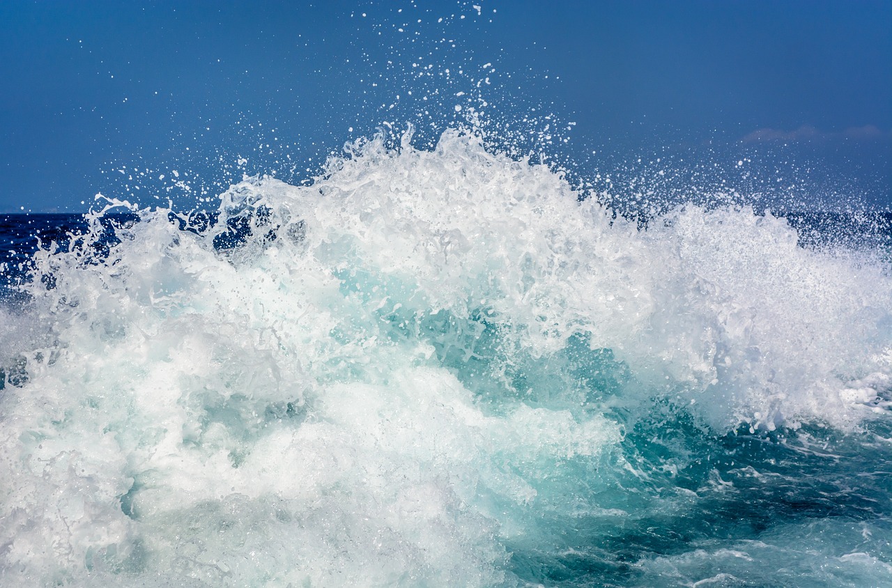
Depicting Waves and Currents
When it comes to painting seascapes, can truly elevate your artwork to another level. Waves are not just a simple blue wash on the canvas; they are dynamic, swirling entities that bring life to your painting. Imagine standing on a beach, feeling the spray of saltwater on your face as you watch the waves crash onto the shore. That sensation, that movement, is what you want to capture in your art.
To effectively portray waves and currents, you need to understand their movement and form. Waves are shaped by the wind and the ocean floor, creating unique patterns that can be both beautiful and challenging to replicate. Start by observing real-life waves or reference photos, noting how they crest, break, and recede. Pay attention to the curvature of the wave and the way it interacts with the light. The highlights on a wave can create a stunning contrast against the deeper blues and greens of the ocean.
One effective technique for painting waves is to use a combination of brush strokes and layering. Begin with a base layer of color to establish the overall hue of the water. Then, using a smaller brush, add in the details of the wave's crest. You can use a dry brush technique to create texture, making the wave appear frothy and alive. Remember, the key to a realistic wave is in the details: the way the light hits the water, the shadows created by the wave's curve, and the reflections from the sky above.
Here are some tips to keep in mind while depicting waves and currents:
- Observe Real Waves: Spend time at the beach or look at photographs to understand how waves behave.
- Layer Your Paint: Start with darker colors and gradually add lighter shades to create depth.
- Use Varied Brush Techniques: Experiment with different brushes to achieve various textures.
- Capture Movement: Use sweeping strokes to convey the fluidity of water.
Additionally, consider the color palette you choose for your waves. The ocean is not just blue; it has countless shades influenced by the time of day, weather conditions, and surrounding environment. From deep navy blues to soft turquoise, the colors you select will greatly affect the mood of your painting. For instance, a stormy sea might call for darker, more tumultuous colors, while a sunny day could use lighter, more vibrant hues.
Finally, don't shy away from adding currents to your painting. Currents can create interesting lines and movement in your artwork. Use sweeping brush strokes to indicate the direction of the water flow, and incorporate varying shades to suggest depth and motion. Remember, the ocean is a living entity, and your art should reflect that vitality. By mastering the depiction of waves and currents, you will bring your seascape to life, inviting viewers to feel the energy and beauty of the ocean.
Q: What materials do I need to paint waves effectively?
A: Start with high-quality acrylic or oil paints, a variety of brushes (including flat and round brushes), and a palette knife for texture. Don’t forget your canvas or painting surface!
Q: How can I make my waves look realistic?
A: Focus on layering colors, using a mix of brush techniques, and studying real waves to capture their movement and light reflections accurately.
Q: What colors should I use for ocean waves?
A: Utilize a range of blues, greens, and whites. Consider the time of day and weather to choose your palette wisely, as these factors greatly influence the ocean's appearance.
Q: Can I paint waves without a reference?
A: While it's possible, using a reference image or observing real waves can significantly improve your accuracy and understanding of how to depict them.
Capturing Reflections
When it comes to painting seascapes, capturing reflections on water is like putting the icing on the cake. It’s what transforms a simple ocean scene into a breathtaking masterpiece. Imagine standing by the shore, watching the sun dip below the horizon, casting a shimmering glow on the water. That magical moment is what you want to recreate on your canvas. But how do you do it? Let’s dive into some techniques that will help you master the art of reflection.
First, it’s essential to understand that reflections are not just mirror images of the objects above the water; they also incorporate the colors and textures of the water itself. To achieve this, you’ll want to pay close attention to the following:
- Color Matching: The colors of reflections often differ from the objects above them. For example, the sky might be a vibrant blue, but the reflection on the water could appear softer or darker due to the water’s surface.
- Surface Texture: The way light interacts with the water's surface can change drastically based on the weather and time of day. Calm waters will produce clearer reflections, while choppy waters may distort them.
- Layering Techniques: Using transparent layers can help you build depth in your reflections. Start with a base layer that captures the general color and then add details on top.
To illustrate these concepts, let's take a look at a simple table that summarizes how different times of the day affect reflections:
| Time of Day | Reflection Characteristics |
|---|---|
| Morning | Soft, pastel colors; clear reflections; calm waters. |
| Noon | Bright, vibrant colors; harsher reflections; potential glare. |
| Evening | Warm, rich colors; elongated reflections; rippling effects. |
Now, let’s talk about technique. Start by lightly sketching the horizon and the objects you want to reflect. Then, paint the water below, using horizontal strokes to suggest the surface's movement. For the reflection, use a slightly darker shade of the colors above, and blend them gently to create that soft, flowing effect. Remember, the key is to keep your brushwork fluid and light, allowing the colors to mingle naturally.
Finally, don't forget the importance of observation. Spend time looking at real water reflections, whether at the beach, a lake, or even in a puddle. Notice how the light plays on the surface and how colors shift. This practice will sharpen your skills and deepen your understanding of how to capture that elusive beauty in your paintings. So grab your brushes and get ready to make some waves!
1. What materials do I need to paint reflections effectively?
To capture reflections, you’ll need quality brushes, acrylic or oil paints, and a good canvas. A palette knife can also be helpful for creating texture.
2. How do I know which colors to use for reflections?
Always start with the colors you see in the sky and surrounding objects, then adjust them based on the water's surface. Use darker and softer shades for the reflections.
3. Can I use photographs to help with painting reflections?
Absolutely! Reference photos can be invaluable. They provide a clear guide to light, color, and texture, helping you replicate what you see.
4. Is it necessary to paint reflections in a seascape?
While not mandatory, reflections can add a layer of depth and realism to your painting, making it more engaging for viewers.
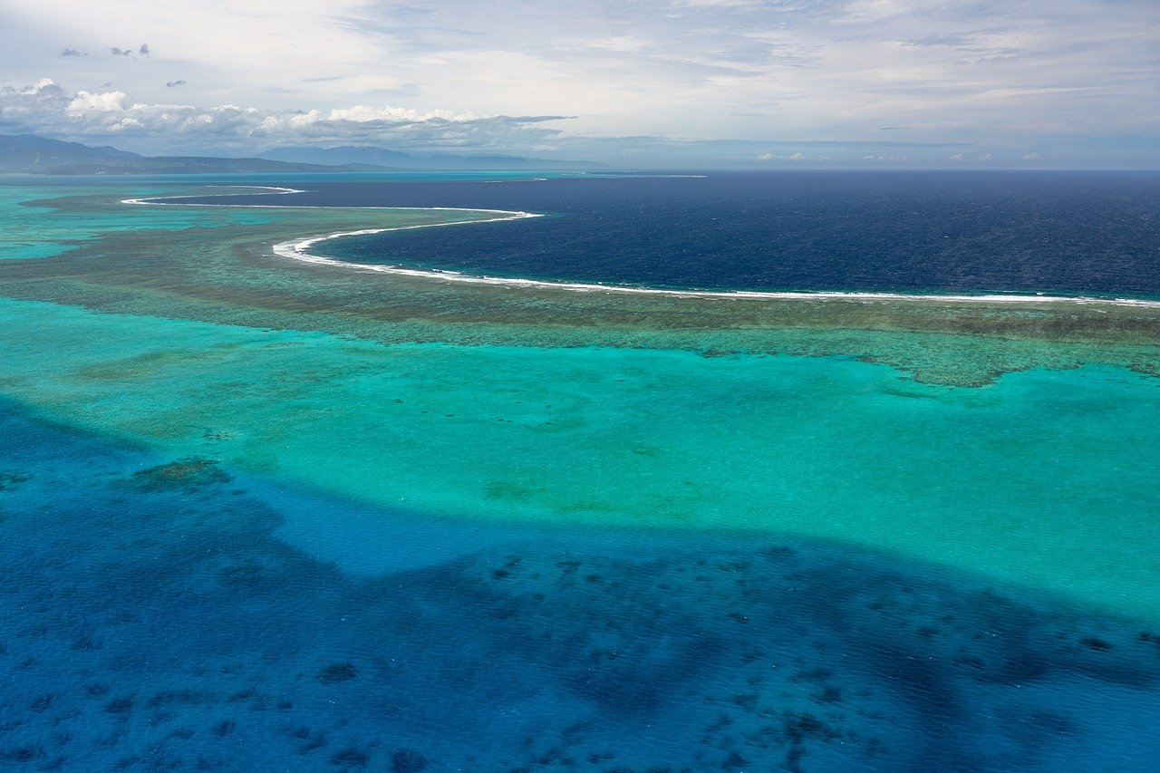
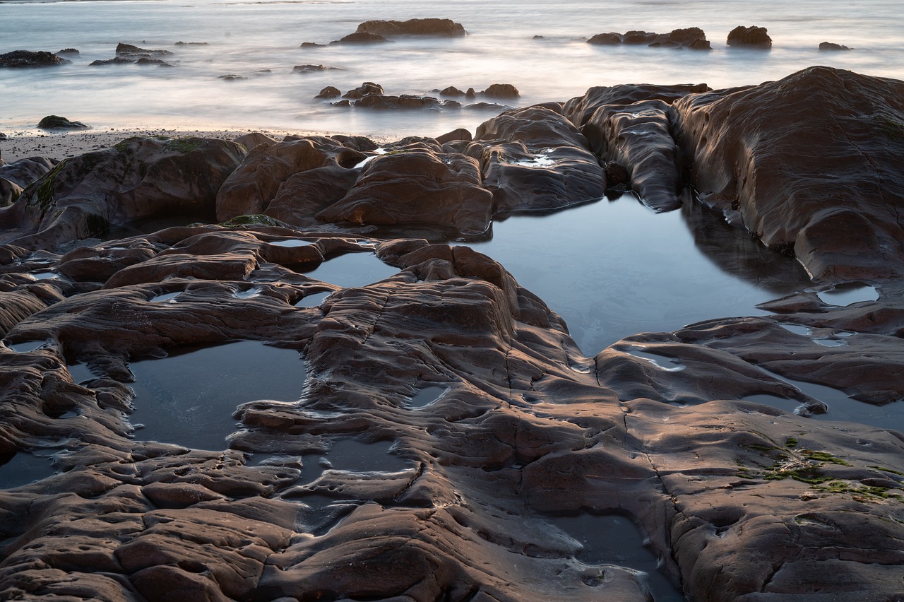
Finding Inspiration
Inspiration is the lifeblood of creativity, especially when it comes to painting seascapes. Imagine standing on a beach, the salty breeze tousling your hair, waves crashing rhythmically against the shore. That feeling, that moment, is what you want to capture on canvas. But where do you find this inspiration when you're not near the ocean? Here are a few ideas to get your creative juices flowing.
First and foremost, nature walks can be incredibly invigorating. Whether you're strolling along a beach, hiking a coastal trail, or simply wandering through a park, pay attention to the colors, textures, and light around you. The way the sunlight dances on the water or how the clouds reflect off the sea can provide you with a treasure trove of ideas. Don't forget to bring a sketchbook along; jot down notes or quick sketches to remember those fleeting moments of inspiration!
Photography is another excellent way to gather inspiration. You can take your own photos or browse through online galleries. Platforms like Unsplash or Pixabay offer stunning, high-quality images that can spark your imagination. When looking for reference images, consider the following:
- Focus on different times of the day—sunrise, midday, sunset—to see how light affects the ocean.
- Look for varied weather conditions; stormy seas can offer dramatic contrasts, while calm waters can evoke tranquility.
- Explore different angles; a bird's-eye view can reveal patterns in the waves that you might not notice from the shore.
Another source of inspiration can be found in art history. Study the works of famous seascape artists like J.M.W. Turner or Winslow Homer. Analyze their techniques and the emotions they convey through their brushstrokes. This not only gives you a deeper appreciation for the art form but can also help you develop your own style. Perhaps you’ll find that you gravitate towards the impressionist style or prefer a more realistic approach. The key is to explore and experiment!
Finally, don't underestimate the power of community. Join local art groups or online forums where you can share your work and see what others are creating. Engaging with fellow artists can provide new perspectives and ideas that you might not have considered. Plus, the encouragement and feedback can be invaluable as you embark on your artistic journey.
Inspiration is everywhere if you know where to look. By immersing yourself in nature, leveraging photography, studying art history, and connecting with other artists, you can cultivate a wellspring of ideas that will fuel your passion for painting seascapes. So grab your brushes, and let the ocean's beauty inspire your next masterpiece!
Q: What if I can't get to the ocean for inspiration?
A: No worries! Inspiration can come from anywhere—consider lakes, rivers, or even photographs of the ocean. The key is to observe how water interacts with light and atmosphere.
Q: How can I maintain my unique style while using reference images?
A: Use reference images as a guide, but don't be afraid to add your personal touch. Change colors, alter compositions, or mix styles to create something that feels authentic to you.
Q: What if I'm feeling stuck and can't find inspiration?
A: It's completely normal to experience creative blocks. Take a break, try a different activity, or revisit your favorite artworks. Sometimes stepping away can help refresh your perspective!

Using Reference Images
When it comes to painting seascapes, using reference images can be a game changer for your artistic process. Think of reference images as your personal treasure map; they guide you through the vast ocean of creativity and help you navigate the waves of inspiration. Whether you're capturing the gentle lapping of waves on the shore or the dramatic crash of surf against rocks, having a visual reference can significantly enhance your painting experience.
But how do you choose the right reference images? Start by selecting images that resonate with you. Look for photographs that showcase the elements you want to incorporate into your artwork—be it the vibrant colors of a sunset reflecting on the water or the intricate details of a rocky coastline. It's essential to find images that not only inspire you but also challenge your artistic skills.
Once you have your reference images, consider the following tips to effectively use them:
- Break it Down: Analyze the image by breaking it down into smaller sections. Focus on the colors, shapes, and textures. This way, you can replicate the essence of the scene without getting overwhelmed.
- Experiment with Angles: Don’t feel restricted to the exact angle of the reference image. Feel free to adjust the composition to suit your style. Remember, you are the captain of your artistic ship!
- Maintain Your Style: While reference images are helpful, it’s crucial to inject your personality into the painting. Use the reference as a guide but let your creativity flow freely.
Additionally, consider creating a mood board with multiple reference images. This can help you visualize the overall atmosphere you want to convey in your seascape. By combining different elements from various images, you can create a unique piece that tells a story only you can tell.
Lastly, don’t forget to take your own photographs! Sometimes, the best reference comes from your personal experiences. Capture the beauty of the ocean during a beach walk or the serenity of a sunrise over the water. These images will hold special meaning and can inspire you in ways that generic stock photos cannot.
1. What type of reference images should I use for seascapes?
Choose images that resonate with you and showcase the elements you want to capture, such as colors, textures, and lighting.
2. Can I modify the reference image in my painting?
Absolutely! Use the reference as a guide, but don't hesitate to adjust the composition or colors to fit your artistic vision.
3. Is it necessary to use reference images?
While it’s not mandatory, reference images can significantly enhance your understanding of the subject and improve your painting skills.

Exploring Different Styles
When it comes to painting seascapes, one of the most exciting aspects is the opportunity to explore different artistic styles. Each style has its own unique flair and can dramatically alter the way your oceanic scenes are perceived. Imagine standing on a beach, the sun setting, and the waves crashing—how you choose to capture that moment can vary widely based on your artistic approach. Are you drawn to the meticulous details of realism, or do you prefer the loose brushwork of impressionism? Each method has its own charm and can evoke different emotions in the viewer.
Realism is often the first style that comes to mind when artists think about seascapes. This approach focuses on accurately depicting the ocean's colors, textures, and movements. The goal is to create a piece that looks as lifelike as possible, allowing viewers to feel as if they could step right into the scene. For beginners, realism can be a great starting point as it emphasizes the importance of observation and technique. However, it can also be quite challenging, requiring a keen eye for detail and a solid understanding of color and light.
On the other hand, impressionism offers a more freestyle approach. This style captures the essence of a scene rather than its precise details. Think of the way Claude Monet painted his water lilies—quick, bold strokes that convey movement and light without getting bogged down by minutiae. If you're someone who loves to express emotion and atmosphere, impressionism might resonate with you. It encourages spontaneity and can be incredibly liberating, allowing your brush to dance across the canvas.
Another style worth exploring is abstract art. In this approach, the ocean can be represented through shapes, colors, and forms rather than realistic depictions. Abstract seascapes can be captivating, inviting viewers to interpret the artwork in their own way. This style allows for a high degree of personal expression and can be a fantastic outlet for those who want to break free from traditional constraints. You might find yourself using vibrant colors to evoke feelings of joy or deep blues and greens to create a more somber mood.
To help you navigate these styles, consider the following table that outlines some key characteristics of each approach:
| Style | Characteristics | Emotional Impact |
|---|---|---|
| Realism | Detailed, lifelike representation of the ocean. | Invokes a sense of awe and wonder. |
| Impressionism | Loose brushwork, focus on light and movement. | Creates a feeling of spontaneity and joy. |
| Abstract | Use of shapes and colors, non-representational. | Encourages personal interpretation and emotional response. |
As you embark on your journey of exploring different styles, remember that there is no right or wrong way to express yourself. Art is subjective, and what matters most is how you connect with your work. Don’t hesitate to mix styles or create your own unique blend. You might find that a touch of realism combined with impressionist techniques can create a stunning seascape that captures both detail and emotion. So grab your brushes, experiment boldly, and see where your artistic instincts take you!
Q: What is the best style for beginners to start with?
A: Realism is often recommended as it helps build foundational skills in observation and technique, but don’t hesitate to explore impressionism or abstract styles if they resonate with you!
Q: How can I develop my own style?
A: Experiment with different techniques and materials, study various artists, and practice regularly. Over time, your unique style will emerge naturally.
Q: Is it okay to mix styles in one painting?
A: Absolutely! Mixing styles can create interesting contrasts and enhance the emotional impact of your artwork.
Frequently Asked Questions
- What materials do I need to start painting seascapes?
To kick off your seascape painting journey, you'll need a few essential materials. Start with quality brushes, preferably a mix of flat and round shapes, to create different textures. You'll also want a good set of acrylic or oil paints, focusing on blues, greens, and whites to capture the ocean's beauty. Don't forget a sturdy canvas or watercolor paper, depending on your preferred medium!
- How can I mix realistic ocean colors?
Mixing realistic ocean colors is all about understanding the nuances. Begin with a base of blue and gradually add touches of green and white to mimic the ocean's depth and light. Experiment with different ratios until you find the perfect shade that resonates with your vision. Remember, the ocean is never just one color—it's a beautiful blend!
- What techniques can I use to create depth in my painting?
Creating depth in your seascape involves layering colors. Start with darker shades at the bottom and gradually lighten as you move upward, mimicking the natural gradient of the ocean and sky. Additionally, using a dry brush technique can help create texture and enhance the illusion of depth, making your painting pop!
- How do I effectively depict waves and currents?
Depicting waves and currents can add a dynamic feel to your artwork. Focus on the movement by using sweeping brush strokes to represent the flow of water. Pay attention to the highlights and shadows, as these will give your waves a three-dimensional appearance. Don't be afraid to practice; capturing movement takes time!
- Where can I find inspiration for seascape paintings?
Inspiration is everywhere! Take nature walks along the beach, visit coastal areas, or even browse through photography books featuring ocean scenes. Social media platforms like Instagram and Pinterest are treasure troves of visual inspiration. Keep a sketchbook handy to jot down ideas or capture scenes that spark your creativity!
- How can I use reference images without copying?
Using reference images is a fantastic way to guide your painting process. Choose images that resonate with you, but remember to interpret them in your unique style. Focus on capturing the essence of the scene rather than replicating it exactly. This way, you can infuse your personality into the artwork while still finding direction!
- What styles can I explore when painting seascapes?
Seascapes are versatile, and exploring different styles can be a fun adventure! From realism, where you aim for lifelike representations, to impressionism, where you focus on capturing the mood and light, the possibilities are endless. Try experimenting with abstract styles as well, allowing your imagination to run wild with colors and forms!


