
How to Frame and Display Your Artwork
When it comes to showcasing your artwork, the right frame can make all the difference. Not only does it enhance the visual appeal of your piece, but it also protects it from dust, dirt, and damage. Think of your artwork as a precious gem; without a beautiful setting, it may not shine as brightly. In this article, we will dive deep into the world of framing and displaying art, exploring various techniques and styles that can elevate your creative expression. Whether you're a seasoned artist or a passionate collector, understanding how to frame and display your artwork effectively can transform your space into a gallery of inspiration.
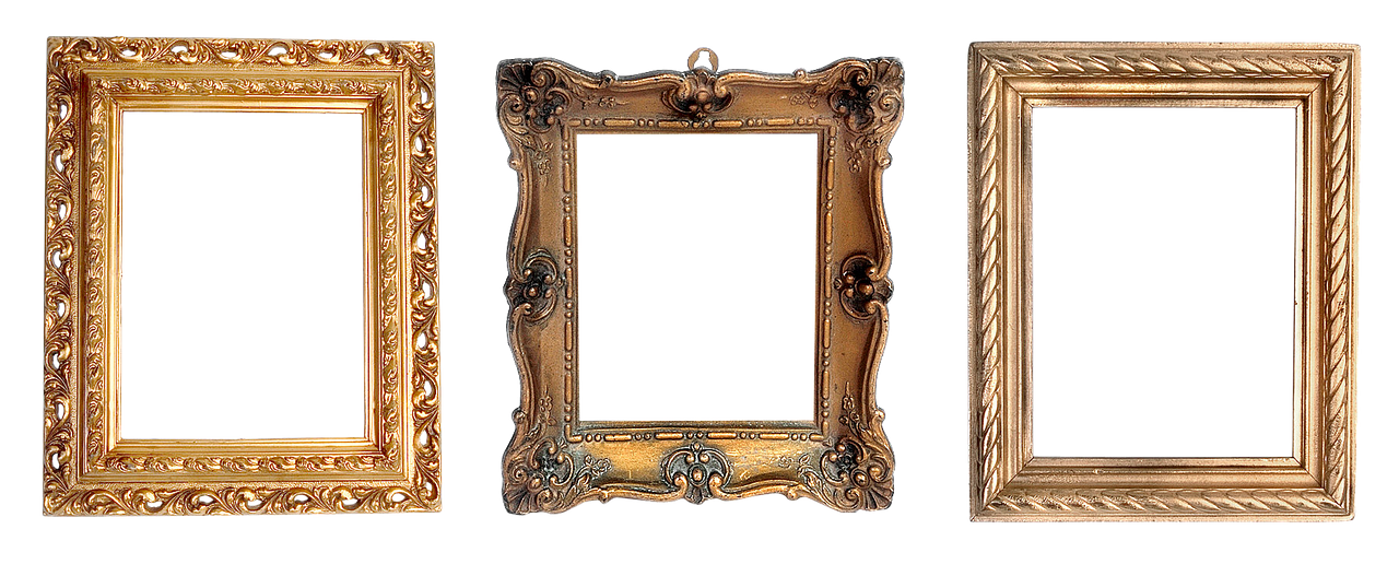
Selecting the appropriate frame is crucial for elevating your artwork. The frame should not only complement the piece itself but also harmonize with your home decor. When choosing a frame, consider the following factors:
- Materials: Wood, metal, or plastic? Each material brings a different vibe and can dramatically change the feel of your artwork.
- Colors: A frame should either match or contrast with the artwork to create a striking visual effect. Don't shy away from bold colors if they suit the piece!
- Styles: From ornate to minimalist, the style of the frame should reflect both the artwork's character and your personal taste.
Think of this process as dressing your artwork for a special occasion. Just like you wouldn’t wear mismatched shoes with a stunning outfit, your frame should enhance rather than detract from the artwork.
Matting adds depth and separation between the artwork and the frame, making it a vital component of the framing process. It not only enhances the overall presentation but also protects the artwork by preventing it from touching the glass. There are various matting options available, each contributing uniquely to the aesthetic appeal of your framed pieces.
When selecting mats, you’ll encounter different types that can significantly impact the look and longevity of your framed artwork. Two popular choices are:
Acid-free mats are essential for preserving artwork over time. They prevent discoloration and damage that can occur due to acidic materials. Investing in acid-free mats is akin to ensuring your artwork has a safe and healthy environment; it’s a small cost for long-term protection.
Colored mats can add a unique flair to your artwork. Choosing the right color can either complement or contrast with your piece, creating maximum visual impact. For example, a vibrant piece of art might benefit from a muted mat to allow the colors to pop, while a more subdued artwork could shine with a bold mat. Experimenting with colors can be a fun way to express your creativity.
Layering different mats and frames can create a stunning visual effect. By using multiple layers, you can enhance the depth and interest of your artwork. Imagine your artwork as a cake; each layer adds flavor and complexity, making the final product more delightful. When layering, be mindful of the colors and textures to ensure they work harmoniously together.
The placement of your artwork affects its impact significantly. A well-placed piece can become a focal point, drawing the eye and sparking conversation. To create a cohesive and visually pleasing display, consider the following arrangement techniques:
Creating a gallery wall allows you to showcase multiple pieces in an engaging way. This arrangement can turn a plain wall into a vibrant story of your artistic journey. When designing your gallery wall, think about:
- Mixing different styles and sizes for an eclectic look.
- Maintaining a consistent theme or color palette for harmony.
- Arranging pieces in a way that guides the viewer's eye across the wall.
Proper height and spacing are key to an appealing display. As a rule of thumb, artwork should be hung at eye level, allowing for easy viewing. Additionally, consider the spacing between pieces; too close can feel cluttered, while too far apart can seem disconnected. Finding that sweet spot is essential for a well-balanced look. Think of it as creating a rhythm in music—each piece should flow into the next, creating a harmonious experience.
Q: How do I know what size frame to choose?
A: Measure your artwork and consider the matting you wish to use. Ensure the frame is slightly larger than the artwork to accommodate the matting.
Q: Can I mix different frame styles in one display?
A: Absolutely! Mixing frame styles can add character and interest to your display, as long as you maintain a cohesive theme or color scheme.
Q: How do I clean my framed artwork?
A: Use a soft, dry cloth to dust the frame and glass. Avoid using harsh chemicals that could damage the artwork.
Choosing the Right Frame
When it comes to showcasing your artwork, the frame is not just a border; it’s a crucial element that can either enhance or detract from the beauty of your piece. Think of the frame as the outfit for your artwork—just like you would choose the right clothes to complement your style, selecting the appropriate frame is essential for elevating your artwork’s visual appeal. So, how do you go about choosing the right frame? Let’s dive into some key considerations!
First and foremost, consider the material of the frame. Wood frames exude warmth and a classic feel, while metal frames can give a more modern and sleek look. If your artwork has a rustic charm, a distressed wood frame might be the perfect match. On the other hand, if you’re showcasing a contemporary piece, a minimalist metal frame could be just what you need. Here’s a quick overview of common materials:
| Material | Style | Best For |
|---|---|---|
| Wood | Classic, Warm | Traditional Art, Landscapes |
| Metal | Modern, Sleek | Abstract Art, Photography |
| Plastic | Lightweight, Affordable | Casual Art, Kids’ Artwork |
Next, let’s talk about color. The color of the frame should not only complement your artwork but also harmonize with your home decor. A neutral frame can act as a subtle backdrop that allows your artwork to take center stage, while a bold color can create a striking contrast, drawing attention to the piece. For instance, a vibrant red frame can make a black-and-white photograph pop, while a soft beige frame can enhance the serenity of a landscape painting.
Now, let’s not forget about the style of the frame. Are you going for a traditional look, or do you prefer something more contemporary? The style of the frame should match the vibe of the artwork. Ornate, vintage frames can add a touch of elegance to classical pieces, while simple, clean lines work well with modern art. Consider the following styles:
- Classic: Intricate designs, often with gold or silver detailing.
- Modern: Minimalist, with clean lines and solid colors.
- Rustic: Distressed wood, perfect for a cozy, homey feel.
Finally, think about the size of the frame. A frame that is too large can overwhelm the artwork, while one that is too small can make it feel cramped. As a rule of thumb, aim for a frame that provides a comfortable border around your artwork, allowing it to breathe and be appreciated. A good guideline is to leave at least 2-4 inches of space between the artwork and the frame, depending on the size of the piece.
In conclusion, choosing the right frame is a blend of art and science. It’s about finding the perfect balance between material, color, style, and size to create an ensemble that highlights your artwork beautifully. So next time you’re framing a piece, remember that every detail counts, and don’t be afraid to experiment until you find the combination that feels just right!

Matting Techniques
When it comes to showcasing your artwork, play an essential role in enhancing its overall presentation. Matting is not just about placing a border around your piece; it's about adding depth, dimension, and a professional touch that can elevate your artwork to new heights. Imagine your favorite painting, beautifully framed, but lacking that extra layer of sophistication—without matting, it might feel incomplete. So, let’s dive into the world of matting and explore how you can use it to make your art truly shine.
Matting serves multiple purposes: it protects your artwork from direct contact with the glass, prevents moisture build-up, and creates a visual separation that draws the viewer's eye. When choosing mats, consider the color, texture, and material. The right mat can either complement your artwork or create a striking contrast that makes it pop. For instance, a simple white mat can offer a classic look, while a vibrant colored mat can add a playful touch. This is where your creativity can really take flight!
There are various types of mats available, but two of the most popular options are acid-free mats and colored mats. Acid-free mats are a must-have for preserving your artwork over time. They prevent discoloration and damage caused by acid, ensuring that your piece remains as stunning as the day you framed it. If you’re investing in quality artwork, using acid-free mats is a no-brainer. On the other hand, colored mats can add a unique flair to your display. When choosing colors, think about the mood you want to convey. Do you want to create a calm and serene atmosphere, or are you aiming for something bold and energetic? The choice is yours!
Let’s take a closer look at the types of mats you can choose from:
| Type of Mat | Description | Benefits |
|---|---|---|
| Acid-Free Mats | Made from materials that won’t damage your artwork over time. | Preserves color and integrity of the artwork. |
| Colored Mats | Mats available in various colors to enhance visual appeal. | Adds personality and can create a striking contrast. |
| Textured Mats | Mats with a textured surface for added dimension. | Creates depth and interest in the display. |
Layering different mats can also create a stunning visual effect. By combining various colors and textures, you can guide the viewer’s eye and create a sense of depth that draws them into the artwork. Think of it as dressing your piece in layers; just like a well-styled outfit, it can make all the difference!
In conclusion, matting is more than just a decorative choice; it's a vital component of displaying your artwork effectively. By choosing the right mats and employing layering techniques, you can enhance the visual impact of your pieces while ensuring their longevity. So, the next time you frame a piece of art, remember: the mat is your canvas's best friend!
Q: What is the purpose of matting?
A: Matting serves to protect the artwork from damage, provides visual separation from the glass, and enhances the overall aesthetic appeal of the framed piece.
Q: How do I choose the right color for my mat?
A: Consider the colors in your artwork and the mood you want to convey. Complementary colors can enhance the piece, while contrasting colors can make it stand out.
Q: Are acid-free mats really necessary?
A: Yes! Acid-free mats prevent discoloration and damage to your artwork over time, making them a worthwhile investment for preserving your pieces.
Types of Mats
When it comes to framing your artwork, the choice of mat can make a significant difference in both aesthetics and preservation. There are several types of mats available, each serving a unique purpose. Understanding these options can help you select the perfect mat that complements your piece while ensuring its longevity.
One of the most important factors to consider is whether to use acid-free mats or not. Acid-free mats are specifically designed to prevent the degradation of your artwork over time. They are made from materials that do not contain acids, which can cause discoloration and deterioration. This is particularly crucial for valuable pieces or those you plan to keep for years to come. Investing in acid-free mats is like putting your artwork in a protective bubble; it keeps harmful elements at bay and allows your art to shine in its full glory.
On the flip side, we have colored mats. These mats can breathe life into your artwork by adding a splash of color that either complements or contrasts with the piece. Choosing the right color can enhance the emotional impact of your artwork. For instance, a vibrant red mat can energize a muted painting, while a soft pastel can bring out the delicate features of a more intricate piece. When selecting a colored mat, consider the following:
- Complementary Colors: Choose colors that enhance the artwork without overpowering it.
- Contrast: A contrasting color can create a bold statement and draw attention to the artwork.
- Theme Consistency: Ensure the color aligns with the overall theme of your room for a cohesive look.
In addition to acid-free and colored mats, there are also specialty mats available, such as textured or patterned mats, which can add an extra layer of interest to your display. These mats can serve as a conversation starter, making your artwork not just a visual treat but also an engaging focal point in your space.
Ultimately, the right mat can elevate your artwork from ordinary to extraordinary. It’s like the perfect frame that not only holds the piece but enhances its beauty. So, take your time exploring different types of mats and how they can transform your artwork into a stunning visual experience.
Q: What is the difference between acid-free and regular mats?
A: Acid-free mats are made from materials that do not contain acids, preventing damage and discoloration to your artwork over time. Regular mats may contain acids that can harm your art.
Q: How do I choose the right color for my mat?
A: Consider the colors in your artwork and the overall theme of your room. Complementary colors enhance the piece, while contrasting colors can create a bold statement.
Q: Are textured mats worth the investment?
A: Yes! Textured mats can add depth and interest to your display, making your artwork stand out even more.
Acid-Free Mats
When it comes to framing your cherished artwork, are not just an option; they are a necessity. You might be wondering, "What exactly makes acid-free mats so special?" Well, let’s break it down. These mats are specifically designed to be free of acid and lignin, substances that can wreak havoc on your artwork over time. Imagine placing a beautiful watercolor painting on a mat that slowly deteriorates and yellows, ruining the vibrancy of your piece. Not a pretty picture, right?
Investing in acid-free mats is like giving your artwork a protective shield against the ravages of time. They help maintain the integrity of your art by preventing discoloration, fading, and other forms of damage. This is particularly important for delicate pieces, such as pastels or photographs, which can be more susceptible to environmental factors. Think of acid-free mats as the bodyguard your artwork deserves!
Additionally, acid-free mats come in a variety of colors and textures, allowing you to enhance the visual appeal of your framed pieces. You can choose a mat that complements the colors in your artwork or opt for a contrasting shade that makes the piece pop. The right mat can create a stunning border that draws the viewer's eye, making your artwork the centerpiece of any room.
Here’s a quick overview of the benefits of using acid-free mats:
- Preservation: Protects against fading and discoloration.
- Longevity: Ensures that your artwork lasts for generations.
- Visual Appeal: Enhances the overall presentation of your pieces.
- Variety: Available in numerous colors and textures to suit any style.
In conclusion, if you want your artwork to stand the test of time while looking fabulous, acid-free mats are the way to go. They are a small investment that pays off in the long run, ensuring that your beloved pieces remain vibrant and protected for years to come. So, the next time you frame a piece of art, don’t overlook the importance of acid-free mats; they could be the difference between a masterpiece and a faded memory.
Q: What are acid-free mats made of?
A: Acid-free mats are typically made from materials that are free of acid and lignin, often using cotton or wood pulp that has been treated to remove these harmful substances.
Q: How can I tell if a mat is acid-free?
A: Look for labels or certifications that indicate the mat is acid-free. Many art supply stores provide mats specifically labeled as acid-free.
Q: Are acid-free mats more expensive than regular mats?
A: Yes, acid-free mats may be slightly more expensive, but the investment is worth it for the protection they offer your artwork.
Q: Can I use acid-free mats for all types of artwork?
A: Absolutely! Acid-free mats are ideal for any type of artwork, including paintings, photographs, and prints, ensuring they remain in pristine condition.

Colored Mats
When it comes to displaying your artwork, can be a game changer. They serve not just as a border but as an integral part of the overall aesthetic, enhancing the visual appeal of your pieces. Imagine your artwork as a beautiful flower; the colored mat is like the vibrant garden that makes it stand out even more. Choosing the right color can either complement your artwork or create a striking contrast that draws the eye.
One of the first things to consider is the color palette of your artwork. If your piece features warm tones like reds, oranges, and yellows, a mat in a contrasting cool tone such as teal or navy can make your artwork pop. Conversely, if your artwork is predominantly cool-toned, a warm mat can provide a lovely contrast. The key is to create a visual dialogue between the artwork and the mat, ensuring that they work together harmoniously.
Here are a few tips to help you choose the perfect colored mat:
- Consider the Mood: Different colors evoke different emotions. For instance, blues and greens can create a calming effect, while reds and yellows can energize a space.
- Test Samples: Before committing to a color, it’s wise to obtain samples. Place them next to your artwork to see how they interact in different lighting conditions.
- Think About the Frame: The mat should complement not just the artwork but also the frame. Ensure that the colors work well together to create a cohesive look.
Another important aspect of colored mats is their ability to define the space around your artwork. A bold, colorful mat can help to create a focal point in a room, drawing attention to the artwork and making it a conversation starter. On the other hand, subtle colors can provide a more understated elegance, allowing the artwork to take center stage. The choice ultimately depends on your personal style and the atmosphere you wish to create in your space.
In addition to enhancing aesthetics, colored mats can also provide a protective layer for your artwork. By using acid-free colored mats, you ensure that your artwork is safeguarded against fading and discoloration over time. This combination of beauty and functionality makes colored mats an essential consideration in your framing choices.
In summary, colored mats are not just an accessory; they are an opportunity to elevate your artwork's presentation. By thoughtfully selecting colors that enhance and complement your pieces, you can create a stunning display that reflects your personal taste and style.
Q: How do I choose the right colored mat for my artwork?
A: Consider the color palette of your artwork, the mood you want to create, and how the mat will interact with the frame. Testing samples in different lighting can also help you make the best choice.
Q: Are colored mats necessary for framing?
A: While not strictly necessary, colored mats can significantly enhance the visual appeal and protection of your artwork, making them a worthwhile investment.
Q: Can I use multiple colored mats?
A: Absolutely! Layering different colored mats can add depth and interest to your artwork, creating a unique and eye-catching display.

Layering Techniques
When it comes to showcasing your artwork, layering techniques can truly transform the way your pieces are perceived. Think of layering as the icing on the cake; it adds that extra touch that makes everything more appealing. By combining different frames, mats, or even artworks, you can create a stunning visual narrative that draws the viewer in. The key is to play with dimensions, colors, and textures to craft a display that tells a story.
One effective method is to use multiple frames for a single piece of art. This can create a sense of depth and dimension that flat framing simply cannot achieve. For instance, consider placing a smaller frame within a larger one. This technique not only highlights the artwork but also adds a layer of sophistication. You could even choose frames of varying widths and styles to create an eclectic yet cohesive look. Just remember, the goal is to complement your artwork, not overwhelm it.
Another exciting approach is to layer mats. Using different colors and textures can significantly enhance the visual impact of your artwork. Imagine a vibrant painting surrounded by a soft, neutral mat, which can serve to make the colors pop even more. Alternatively, you could opt for a bold, contrasting mat that draws attention and creates a striking focal point. The possibilities are endless! When selecting mats, consider these factors:
- Color Harmony: Choose colors that either complement or contrast your artwork effectively.
- Texture Variety: Mixing smooth and textured mats can add depth.
- Proportion: Ensure your mats are proportionate to the artwork and the frames.
Layering can also be applied to the arrangement of multiple pieces. Think of creating a collage effect by overlapping smaller artworks or photographs. This not only saves space but also creates a dynamic visual experience. When arranging your pieces, consider the overall flow and balance. You might want to use a larger piece as a central anchor and surround it with smaller works to create an engaging visual hierarchy.
Additionally, lighting plays a crucial role in layering techniques. Proper illumination can enhance the textures and colors of your layered pieces, making them come alive. Experiment with different lighting options, such as spotlights or soft ambient lighting, to see what works best for your display.
In summary, layering techniques are all about creativity and personal expression. By thoughtfully combining frames, mats, and artworks, you can create a unique and captivating display that reflects your style and enhances the overall aesthetic of your space. So, don’t be afraid to experiment and let your artistic vision shine!
Q: What is the best way to start layering my artwork?
A: Begin by selecting a focal piece that you love, then choose complementary mats and frames. Experiment with different combinations until you find a look that resonates with you.
Q: How do I choose the right colors for my mats?
A: Consider the dominant colors in your artwork. You can either match these colors for a harmonious look or select contrasting colors to create a striking effect.
Q: Can I layer artworks of different styles?
A: Absolutely! Mixing different styles can create an interesting and eclectic display. Just ensure that there is some common thread, like color or theme, to tie everything together.
Q: How can I ensure my layered artwork is well-lit?
A: Position your artwork near natural light sources or use adjustable lighting fixtures to highlight different pieces. Experiment with angles to find the best illumination.

Placement and Arrangement
When it comes to showcasing your artwork, are everything. Imagine walking into a room where every piece of art speaks to you, each one perfectly positioned to draw your eye and evoke emotion. It’s not just about hanging a few pictures on the wall; it’s about creating a visual narrative that enhances the overall atmosphere of your space. So, how do you achieve this? Let’s dive into some effective techniques that can turn any wall into a captivating gallery.
First and foremost, consider the scale and proportion of your artwork in relation to the wall and surrounding furniture. A large canvas can dominate a small wall, while tiny pieces might get lost on a vast expanse. To avoid this, try using the “two-thirds rule” – aim to fill about two-thirds of the wall space with your art. This creates a balanced look that is pleasing to the eye. Additionally, if you're displaying multiple pieces, think about how they interact with each other. They should complement rather than compete for attention.
Another critical aspect is the height at which you hang your artwork. The general rule of thumb is to hang art at eye level, which is typically around 57 to 60 inches from the floor. However, this can vary depending on the height of your furniture and the layout of the room. For instance, if you have a low sofa, you might want to hang pieces slightly lower to create a cohesive look. Conversely, if you have high ceilings, consider using taller frames or grouping smaller pieces to draw the eye upward.
Spacing is equally important. When arranging multiple pieces, maintain a consistent distance between them. A spacing of 2 to 5 inches works well for most arrangements. Too much space can make the display feel disjointed, while too little space can lead to a cluttered appearance. If you're unsure, lay your pieces on the floor first to experiment with different arrangements before committing to the wall.
One of the most exciting ways to display your art is by creating a gallery wall. This allows you to showcase a collection of works in a dynamic way. Start by selecting a central piece and build around it, using various sizes and frames for visual interest. You can opt for a symmetrical arrangement for a more formal feel or an asymmetrical layout for a more casual vibe. Don’t be afraid to mix different styles and mediums – the goal is to create a personal expression that reflects your taste.
Finally, remember that lighting can dramatically affect how your artwork is perceived. Natural light is fantastic, but it can also fade colors over time. Consider using spotlights or picture lights to highlight specific pieces, creating a dramatic effect that draws attention. Dimmer switches can also allow you to adjust the ambiance, making your art look stunning at any time of day.
In conclusion, the placement and arrangement of your artwork can transform your space from ordinary to extraordinary. By considering scale, height, spacing, and lighting, you can create a cohesive and visually appealing display that not only showcases your creativity but also enhances the overall aesthetic of your home.
- What is the best height to hang artwork? Aim for eye level, which is typically around 57 to 60 inches from the floor.
- How do I create a gallery wall? Start with a central piece and build around it, using various sizes and styles to create interest.
- What type of lighting is best for displaying artwork? Use spotlights or picture lights to highlight pieces, and consider dimmer switches for adjustable ambiance.

Gallery Walls
Creating a gallery wall is one of the most exciting ways to showcase your artwork and personal style. It’s like curating your own mini-exhibition right in your living room! Imagine walking into a space where every piece of art tells a story, where colors and textures dance together, and where your creativity shines through. But how do you achieve that perfect balance? Let’s dive into some tips and tricks that will help you design a stunning gallery wall.
First, consider the theme of your gallery wall. Are you looking for a cohesive look with similar frames and colors, or do you want a more eclectic mix that reflects your personality? A unified theme can create a sense of harmony, while a diverse collection can evoke intrigue and conversation. You might want to think about the color palette of the room as well; choosing frames that match or complement your existing decor can tie everything together beautifully.
Next, the arrangement of your artwork is crucial. Start by laying out your pieces on the floor to experiment with different configurations before committing to the wall. You can create a grid pattern for a clean and structured look, or go for a more organic arrangement that flows with the space. Remember, it’s all about finding what feels right for you! Here’s a simple approach to help you visualize:
| Arrangement Style | Description |
|---|---|
| Grid | Uniform spacing and alignment for a modern, clean look. |
| Salon Style | A more eclectic mix, with varying sizes and orientations for a dynamic feel. |
| Symmetrical | Balanced arrangement around a central piece for a classic touch. |
Once you’ve settled on an arrangement, it’s time to hang your artwork. A common rule of thumb is to position the center of your art at eye level, which is typically around 57 to 60 inches from the floor. This height ensures that your pieces are easily viewed and appreciated. Additionally, consider the spacing between each piece. A general guideline is to leave about 2 to 5 inches between frames, but feel free to adjust based on the size of the artwork and the overall look you're aiming for.
Finally, don’t shy away from incorporating different types of artwork into your gallery wall. Mix paintings, photographs, and even three-dimensional pieces like sculptures or wall hangings. This variety not only adds depth but also keeps the viewer’s eye moving across the wall. And remember, your gallery wall is a reflection of you—so let your creativity run wild!
In conclusion, a gallery wall is not just about displaying art; it’s about creating a space that resonates with your personality and style. With thoughtful planning and a bit of creativity, you can transform any wall into a captivating showcase of your artistic journey.
- How do I choose the right artwork for my gallery wall? Start by selecting pieces that resonate with you personally. Consider a mix of styles and mediums to create visual interest.
- What if I don’t have enough art to fill a wall? You can include mirrors, decorative plates, or even framed quotes to fill the space while maintaining an artistic vibe.
- Can I change the arrangement later? Absolutely! One of the great things about gallery walls is that they can evolve over time as you acquire new pieces.

Height and Spacing
When it comes to displaying your artwork, are crucial elements that can make or break the visual impact of your collection. Imagine walking into a room filled with art that is either too high to appreciate or crammed together like sardines. It’s not just unappealing; it can detract from the beauty of the pieces themselves. So, how do you ensure that your artwork is displayed in a way that captivates and engages?
First and foremost, consider the eye level. Ideally, the center of your artwork should be at eye level, which is typically around 57 to 60 inches from the floor. This height allows viewers to appreciate the piece without straining their necks or squinting. If you’re hanging a collection, try to keep the center point of the entire arrangement at this height for a cohesive look. If you have taller or shorter guests, you can always adjust slightly, but this is a good rule of thumb.
Next up is spacing. You want to create a sense of harmony in your display. A good starting point is to leave about 2 to 5 inches of space between each piece. This distance allows each artwork to breathe and stand out on its own while still feeling like part of a larger story. If you’re working with a gallery wall, consider the overall layout and how the different pieces relate to each other. A well-spaced arrangement can guide the viewer's eye and create a natural flow through the collection.
For those who love to mix different sizes and styles, think about using a grid layout or an asymmetrical arrangement. A grid layout works well for uniform pieces, ensuring that each artwork is evenly spaced and aligned. On the other hand, an asymmetrical arrangement can add energy and excitement to your display, but it requires careful planning to avoid a chaotic look. You might want to sketch your design on paper or use painter’s tape on the wall to visualize the arrangement before committing to any nails or hooks.
Lastly, don’t forget about the context of your artwork. The height and spacing can change dramatically depending on the room’s purpose and the furniture around it. For instance, if you’re hanging art above a sofa, ensure it’s not too high—aim for about 6 to 12 inches above the back of the sofa. This creates a cozy, inviting atmosphere and draws the eye toward the seating area. Similarly, if you're displaying art in a hallway, consider the width of the space and adjust the height accordingly to avoid any awkwardness.
In summary, paying attention to height and spacing when displaying your artwork is essential for creating a visually appealing and engaging environment. By following these guidelines, you can transform your space into a gallery that not only showcases your creativity but also invites others to appreciate it fully.
- What is the best height to hang artwork? Aim for the center of the piece to be around 57 to 60 inches from the floor.
- How much space should I leave between pieces? Generally, 2 to 5 inches is recommended for optimal spacing.
- Can I mix different sizes of artwork? Yes, mixing sizes can create visual interest, but be mindful of your arrangement to maintain harmony.
- Should artwork above furniture be hung higher? No, ideally, it should be hung about 6 to 12 inches above the furniture for a cohesive look.
Frequently Asked Questions
- What should I consider when choosing a frame for my artwork?
Choosing the right frame is essential to elevate your artwork. You should consider the materials, colors, and styles that will harmonize with both the artwork and your home decor. Think of it like dressing your artwork; the right frame can enhance its beauty and make it pop in your space.
- Why is matting important for framed artwork?
Matting adds depth and separation between your artwork and the frame, enhancing the overall presentation. It’s like giving your piece some breathing room, allowing it to shine without feeling cramped. Plus, the right mat can protect your art from damage and discoloration.
- What are acid-free mats, and why should I use them?
Acid-free mats are crucial for preserving your artwork over time. They prevent discoloration and damage that can occur from acidic materials. Think of them as a protective shield, ensuring your artwork stays vibrant and intact for years to come.
- How do I choose the right color for my mats?
When selecting a mat color, consider how it complements or contrasts with your artwork. A well-chosen mat can enhance the visual impact, much like a well-placed highlight in a painting. Experiment with different colors to see what brings out the best in your piece!
- What are some tips for creating a gallery wall?
Creating a gallery wall is all about arrangement and balance. Start by laying out your pieces on the floor to visualize the arrangement before hanging them. Use a mix of sizes and styles for an engaging look, and ensure there's a cohesive theme or color palette to tie everything together.
- What is the best height to hang my artwork?
The general rule of thumb is to hang artwork at eye level, which is typically about 57 to 60 inches from the floor. This ensures that your art is easily accessible and visually striking. Think of it as creating a conversation starter in your room!
- How much space should I leave between framed pieces?
A good rule of thumb is to leave about 2 to 5 inches of space between frames. This spacing allows each piece to breathe while still feeling like part of a cohesive display. Too much space can make the wall feel disjointed, while too little can create chaos.


