
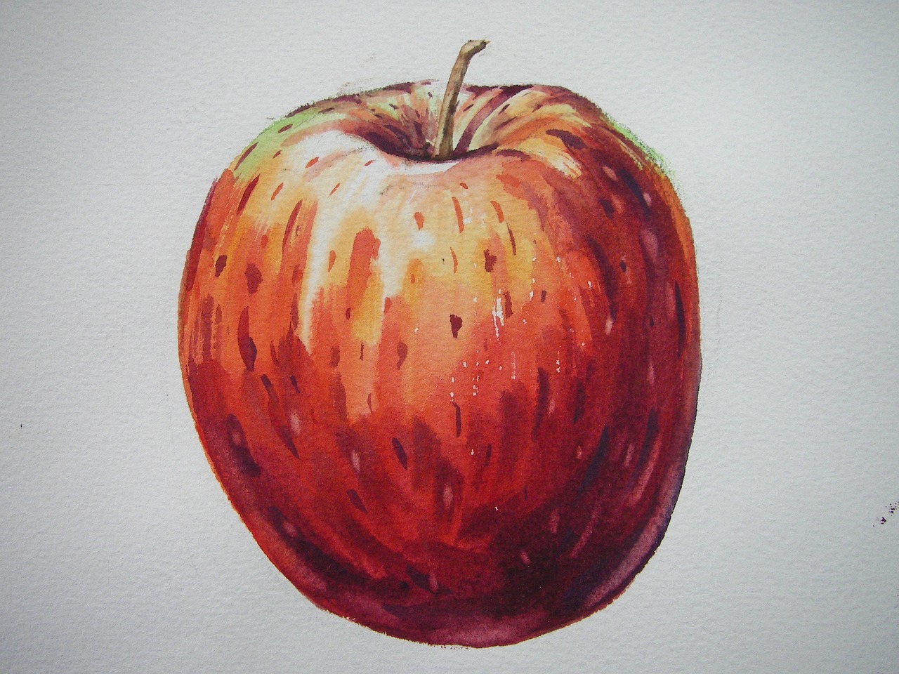
How to Paint Beautiful Botanical Illustrations
Creating stunning botanical illustrations is like embarking on a journey through nature, where each stroke of your brush reveals the intricate beauty of plants. Whether you're a seasoned artist or a curious beginner, the world of botanical illustration offers endless possibilities for expression and creativity. In this article, we will explore various techniques, tips, and materials that will help you bring nature to life on canvas. By the end of this guide, you'll not only appreciate the art of botanical illustration but also feel inspired to create your own masterpieces.
When it comes to botanical illustration, the materials you choose can make or break your artwork. Imagine trying to paint a delicate flower with a coarse brush; it just wouldn’t work! Therefore, selecting the right paints, brushes, and paper is crucial.
- Paints: Watercolors are popular for their transparency and ability to blend beautifully, while acrylics offer vibrant colors and quick drying times. Oil paints can provide a rich texture but require more time and skill.
- Brushes: A variety of brushes, including round, flat, and detail brushes, will allow you to achieve different effects. Fine-tipped brushes are essential for intricate details, while broader brushes are great for washes and backgrounds.
- Paper: The texture and weight of your paper can significantly affect your final piece. Look for watercolor paper with a good weight (200gsm or higher) for watercolors, or a smooth canvas for acrylics and oils.
To create realistic botanical illustrations, having a solid grasp of plant anatomy is essential. Think of it as learning the language of plants; once you understand their structure, you can translate that knowledge onto your canvas. Start by observing the basic components of plants:
- Leaves: Pay attention to their shape, size, and vein patterns.
- Flowers: Notice the arrangement of petals, the center, and how they interact with the stem.
- Stems: Observe the thickness, texture, and color variations.
By understanding these elements, you’ll be able to capture the essence of the plant accurately, making your illustrations not only beautiful but also scientifically informative.
Before diving into painting, effective sketching is your first step. Think of sketching as laying the groundwork for a building; without a solid foundation, everything else may crumble. Start with light pencil strokes to outline your composition. Here are some tips to ensure accurate proportions:
- Use a grid method to help maintain correct proportions.
- Focus on the overall shape before detailing individual elements.
- Don’t be afraid to erase and adjust as you go; sketching is all about refining your vision!
Mastering color mixing is like learning to play an instrument; it takes practice but opens up a world of creativity. Understanding color theory will greatly enhance the vibrancy of your illustrations. Start by familiarizing yourself with the color wheel and how primary, secondary, and tertiary colors interact. Here’s a simple breakdown:
| Color Type | Examples |
|---|---|
| Primary Colors | Red, Blue, Yellow |
| Secondary Colors | Green, Orange, Purple |
| Tertiary Colors | Red-Orange, Yellow-Green, Blue-Purple |
Experiment with blending to create natural hues that reflect the plants you’re illustrating. Remember, nature is rarely one color; it’s a beautiful tapestry of shades!
Layering is a powerful technique that adds depth and dimension to your botanical illustrations. Think of it as building a cake; each layer contributes to the overall flavor and texture. Start with a light base layer and gradually build up your colors, allowing each layer to dry before adding the next. This method creates a rich visual experience that draws the viewer in.
Understanding light and shadow is crucial for enhancing the three-dimensionality of your illustrations. Observe how light interacts with your subject in real life. Notice where the highlights are and where the shadows fall. Replicating this in your artwork can transform a flat image into a dynamic piece. Use a soft brush to blend shadows gently, creating a realistic effect that mimics natural lighting.
A well-composed background can elevate your botanical illustrations. It’s like the perfect frame for a beautiful picture; it should enhance, not overpower. Consider using soft washes of color or subtle textures that complement your main subject. This will create harmony in your artwork and draw attention to the plants you’ve lovingly illustrated.
The finishing touches are crucial for a polished look. Adding details like fine lines or highlights can make a significant difference. Once you’re satisfied with your painting, consider varnishing to protect it and enhance its colors. Finally, presenting your artwork professionally can showcase your talent and dedication. Whether it’s framing or mounting, make sure your hard work is displayed beautifully.
Q: What type of paint is best for botanical illustrations?
A: Watercolor is popular for its transparency, but acrylics and oils can also be used depending on your preference.
Q: Do I need to understand botany to create botanical illustrations?
A: While it helps to know plant anatomy, you can learn as you go. Observation is key!
Q: How long does it take to create a botanical illustration?
A: This varies greatly depending on the complexity of the piece, but expect to spend several hours to days on a single illustration.

Choosing the Right Materials
When embarking on the journey of botanical illustration, one of the most critical steps is choosing the right materials. Think of it like a chef selecting the finest ingredients for a gourmet dish; the quality of your materials can significantly influence the outcome of your artwork. So, what should you consider? Let’s break it down.
First and foremost, the type of paint you choose can make or break your illustration. Watercolors are a popular choice for their transparency and ability to create delicate washes that mimic the soft hues found in nature. On the other hand, acrylics offer vibrant colors and a quicker drying time, which can be beneficial if you prefer to work fast. For those who love detailed work, gouache provides an opaque finish that allows for layering without losing vibrancy. It’s like having a versatile toolbox at your disposal, each paint serving a unique purpose.
Next up, let’s talk about brushes. The right brush can be your best friend in achieving the desired texture and detail. For fine lines and intricate details, a round brush is essential, while a flat brush can help cover larger areas smoothly. You might also want to invest in a few specialty brushes, such as fan brushes for creating foliage textures or rigger brushes for those long, delicate strokes. Remember, quality matters here; a good brush can last for years and significantly enhance your painting experience.
Now, let’s not forget about paper. The surface you paint on can affect how your colors appear and how well they adhere. For watercolors, a heavy, textured paper like cold-pressed watercolor paper is ideal, as it can handle multiple washes without warping. If you’re using acrylics, a smooth canvas or acrylic paper will allow for clean, crisp lines. It’s almost like choosing the right canvas for a masterpiece; the right choice can elevate your work to new heights.
To sum it up, here’s a quick reference table for your materials:
| Material | Best For |
|---|---|
| Watercolors | Soft washes and delicate hues |
| Acrylics | Vibrant colors and quick drying time |
| Gouache | Opaque finishes and layering |
| Round Brushes | Fine lines and details |
| Flat Brushes | Smooth coverage of larger areas |
| Cold-Pressed Watercolor Paper | Watercolor techniques |
| Acrylic Paper | Acrylic painting |
In conclusion, selecting the right materials is not just about grabbing what’s available; it’s about understanding how each component works together to create your vision. So, take your time, experiment with different options, and find what resonates with you. After all, the beauty of botanical illustrations lies not only in the final product but also in the journey you take to create it.

Understanding Plant Anatomy
When it comes to creating stunning botanical illustrations, having a solid understanding of plant anatomy is essential. Just like a skilled architect needs to understand the structure of a building, an artist must grasp the intricate details of plants to depict them accurately. Plants are not just green blobs; they are complex organisms with unique features that tell their own stories.
Let’s break down the key components of plant anatomy that every botanical illustrator should be familiar with:
- Leaves: The leaves are the powerhouses of the plant, responsible for photosynthesis. Pay attention to their shape, size, and texture. Are they smooth and glossy or rough and matte? The veins running through the leaves can add a lot of character and realism to your illustration.
- Flowers: Flowers are the show-stoppers of the plant world. Each flower has its own unique structure, color, and scent. Understanding the arrangement of petals, stamens, and pistils is crucial. Consider how the petals overlap and the way light interacts with different colors.
- Stems: Stems provide support and transport nutrients throughout the plant. They can be thick and sturdy or thin and delicate. Observe how the stem connects to the leaves and flowers, and note any interesting textures or colors.
Understanding these components allows you to create a more realistic portrayal of the plant. For instance, when drawing a flower, consider not only its color but also its shape and structure. Are the petals wide and flat, or are they tubular and elongated? Such details can elevate your artwork from good to truly breathtaking.
Moreover, it’s important to observe how these parts interact with each other. The relationship between the leaves, flowers, and stems can tell a story about the plant's growth and adaptation to its environment. For example, a flower perched atop a long, slender stem might suggest it is adapted for attracting pollinators from a distance. Capturing these nuances in your illustrations will not only enhance their beauty but also educate viewers about the plant's biology.
To further enrich your understanding, consider studying real plants closely. Take a walk in your garden or a local park, and examine different species. Bring a sketchbook along; as you observe, sketch the outlines and details of the plants you encounter. This practice will not only improve your observational skills but also deepen your appreciation for the complexity of nature.
In addition to direct observation, reference materials such as botanical textbooks or online resources can be invaluable. They often include detailed diagrams and descriptions of plant anatomy that can serve as a guide. Creating your own notes and sketches based on these references will help reinforce your learning.
Ultimately, mastering plant anatomy is about more than just technical skill; it’s about developing a connection with nature. The more you understand about how plants function and grow, the more life you can breathe into your illustrations. As you embark on this journey, remember that every stroke of your brush or pencil is an opportunity to share the beauty and intricacies of the natural world.
- What materials do I need to start with botanical illustration? A good set of watercolors or colored pencils, quality paper, and a few brushes are essential. You can start simple and gradually invest in more specialized tools.
- How can I improve my understanding of plant anatomy? Spend time observing real plants, use reference books, and practice sketching regularly. Joining workshops or online courses can also provide valuable insights.
- Is it necessary to be an expert in botany to create botanical illustrations? While a deep knowledge of botany can enhance your work, it’s not a strict requirement. Passion and practice can lead to beautiful illustrations.
Sketching Techniques
When it comes to creating stunning botanical illustrations, the sketching phase is where the magic begins. Think of your sketch as the blueprint of your artwork; it sets the stage for everything that follows. A solid sketch not only captures the essence of the plant but also ensures that your proportions and perspectives are on point. So, how do you get started? First, gather your materials: a good quality sketchbook, pencils (preferably a range of hardness), and an eraser. You might be surprised at how much these simple tools can impact your work!
One effective technique is to start with basic shapes. Break down the plant into simple forms—circles for flowers, ovals for leaves, and lines for stems. This method is akin to building a house; you wouldn’t start with the roof before laying the foundation, right? By focusing on these basic shapes first, you can establish the overall composition before diving into the details. Once you have your basic shapes, begin refining them into more recognizable forms. This is where you can start to observe the unique characteristics of the plant, such as the curvature of a leaf or the intricate patterns of a flower.
Another essential aspect of sketching is understanding the importance of light and shadow. When you sketch, pay attention to where the light hits the plant and where the shadows fall. This not only adds depth to your sketch but also helps in visualizing how you will later apply color. Consider using cross-hatching or stippling techniques to indicate shadow areas, which will give your sketch a more three-dimensional feel. Remember, the goal is not just to replicate what you see but to interpret it in a way that captures its beauty.
It’s also worth mentioning the value of practice. Just like any skill, sketching improves with time and patience. Make it a habit to sketch plants regularly. You can even set up a small sketching station in your home or garden, allowing you to draw inspiration from nature whenever you feel the urge. This consistent practice will help you develop a keen eye for detail and a better understanding of plant anatomy.
For those who may feel intimidated by sketching, remember that it’s all about **finding your style**. Don't be afraid to experiment with different techniques. You might prefer a loose, free-flowing style or a more detailed, precise approach. Try to incorporate various sketching methods such as:
- Contour Drawing: Focus on the outline of the plant without lifting your pencil.
- Gesture Drawing: Capture the essence and movement of the plant quickly.
- Negative Space Drawing: Draw the spaces around the plant instead of the plant itself.
Each of these techniques can help you discover what resonates with you and what works best for your botanical illustrations. And don’t forget to keep your sketches loose and light; you can always refine them later. If you find yourself stuck, consider looking at other artists’ work for inspiration. Just remember, while it’s great to learn from others, your unique style is what will make your illustrations stand out.
In conclusion, sketching is a vital step in the process of creating beautiful botanical illustrations. It’s your opportunity to express your vision and lay the groundwork for your masterpiece. So grab those pencils, find a lovely plant to draw, and let your creativity flow!

Color Mixing Fundamentals
When it comes to creating stunning botanical illustrations, mastering color mixing is essential. It’s not just about slapping colors onto your canvas; it’s about understanding how to blend them to achieve the vibrant, lifelike hues that truly capture the essence of nature. Think of color mixing as cooking; you need the right ingredients and techniques to whip up something delicious. So, let’s dive into the world of colors and explore how to create that perfect palette!
First things first, let’s talk about the primary colors: red, blue, and yellow. These are the building blocks of all other colors. By mixing these primary colors, you can create a spectrum of secondary colors:
| Primary Color | Secondary Color | Mixing Ratio |
|---|---|---|
| Red | Orange | 1 part Red + 1 part Yellow |
| Blue | Green | 1 part Blue + 1 part Yellow |
| Yellow | Purple | 1 part Red + 1 part Blue |
Now, once you’ve got your secondary colors down, you can start mixing those with the primary colors to create a wide range of tertiary colors. This is where the fun really begins! Experimenting with different ratios can yield unique shades that can make your illustrations pop. For example, if you want a softer green, try mixing more yellow into your blue. If you want a deeper purple, add a bit more red to your blue.
Another important concept in color mixing is color theory. Understanding how colors interact with each other can greatly enhance your artwork. Colors can be categorized into warm and cool tones:
- Warm colors: Reds, oranges, and yellows evoke warmth and energy.
- Cool colors: Blues, greens, and purples create a calming effect.
Using warm colors can bring a sense of vibrancy and life to your botanical illustrations, while cool colors can provide a soothing background that complements your main subjects. Balance is key! Consider how the colors you choose can affect the overall mood of your artwork.
Once you’ve got a handle on mixing colors, the next step is to practice blending. This involves seamlessly transitioning from one color to another to create depth and dimension. A great way to practice this is by using a technique called wet-on-wet blending. Here’s how it works:
1. Apply a layer of water to your paper where you want to blend.
2. While the paper is still wet, introduce your first color.
3. Quickly add your second color next to it and use a brush to blend the two together.
As you practice, pay attention to how the colors interact. You’ll discover that some colors blend beautifully while others create unexpected results. This exploration is part of the joy of painting!
Finally, don’t forget to keep a color mixing chart. It’s like having a personal recipe book for your colors! Documenting your mixes can help you remember which combinations worked well for future projects. Plus, it’s a great way to see your progress over time.
In summary, mastering color mixing is a vital skill for any botanical illustrator. By understanding the basics of color theory, experimenting with different mixes, and practicing blending techniques, you’ll be well on your way to creating vibrant, lifelike illustrations that capture the beauty of nature. So grab your brushes and start mixing; the world of color awaits!
- What paints are best for botanical illustrations? Watercolors, acrylics, and gouache are popular choices for their versatility and ease of blending.
- How can I improve my color mixing skills? Practice regularly, keep a color mixing chart, and don’t be afraid to experiment with different ratios.
- Do I need to use expensive materials for good results? While high-quality materials can make a difference, many artists achieve stunning results with budget-friendly options.

Layering Techniques
When it comes to creating stunning botanical illustrations, mastering is a game changer. Think of layering as building a house; each layer adds strength and character to your artwork. By applying multiple layers of paint, you can achieve depth, texture, and a sense of realism that makes your illustrations pop off the page. So, how do you get started with layering? Let’s dive into some effective methods that will elevate your botanical art!
The first step in layering is to understand the importance of transparency. Many artists use transparent watercolors or acrylics, which allow the underlying layers to shine through. This technique can create beautiful gradients and subtle color shifts that mimic the delicate nature of plants. For instance, when painting a leaf, you might start with a light wash of green. Once it dries, you can build up darker greens and even hints of yellow or brown to reflect the leaf's texture and veins.
Another key aspect of layering is the application technique. Using a soft brush for the initial layers can help you achieve a smooth base, while a stiffer brush can be used for adding details and texture in the upper layers. Here’s a quick breakdown of the layering process:
| Layer Number | Technique | Purpose |
|---|---|---|
| 1 | Light Wash | Establish base color |
| 2 | Mid-tone Application | Add depth and dimension |
| 3 | Detail Work | Enhance realism with textures |
| 4 | Final Glaze | Unify colors and add luminosity |
As you progress through these layers, it’s essential to allow each one to dry completely before moving on to the next. This not only prevents muddy colors but also gives you a chance to assess your work and make adjustments as needed. Remember, patience is key in the layering process. It’s like cooking a gourmet meal; you wouldn’t rush the simmering stage, would you?
One effective technique that many botanical artists swear by is the glazing method. This involves applying a thin, transparent layer of color over a dried layer to create depth and complexity. For example, if you’ve painted a vibrant flower, a glaze of a complementary color can enhance its vibrancy and add a unique dimension. Just be cautious—too many glazes can overwhelm the base layer, so use this technique sparingly.
Finally, don’t forget about the importance of observation. When layering, take a moment to closely examine your subject. Notice how light interacts with different parts of the plant and how colors transition from one area to another. This careful observation will guide your layering decisions and lead to a more accurate representation of the botanical world.
In conclusion, layering is not just a technique; it’s an art form that can transform your botanical illustrations from ordinary to extraordinary. By understanding the principles of transparency, mastering application techniques, and practicing patience, you’ll be well on your way to creating breathtaking artwork that truly reflects the beauty of nature.
- What materials do I need for layering? You’ll need high-quality watercolors or acrylics, a variety of brushes, and good watercolor paper to start layering effectively.
- How do I know when to stop layering? It’s essential to step back and assess your work periodically. If you feel the colors are becoming muddy or losing vibrancy, it may be time to stop.
- Can I use layering techniques with colored pencils? Absolutely! Layering with colored pencils can also create depth and texture. Just remember to build up gradually.
Lighting and Shadows
When it comes to botanical illustrations, the magic often lies in the interplay of light and shadow. Understanding how to observe and replicate natural lighting can transform a flat representation into a vibrant, three-dimensional masterpiece. Have you ever noticed how sunlight dances through the leaves, casting intricate shadows on the ground? That’s the kind of effect you want to capture in your artwork. By mastering the nuances of light and shadow, you can add depth and realism to your illustrations, making them pop off the page.
One of the first steps in understanding lighting is to study how it interacts with different surfaces. For instance, shiny leaves will reflect light differently than matte petals. This means you need to pay close attention to the direction of your light source. Is it coming from above, or perhaps from the side? The angle of the light will significantly affect how shadows fall and how colors appear. A light source positioned at a low angle can create long, dramatic shadows, while overhead light results in softer, more diffused shadows.
To effectively incorporate lighting into your botanical illustrations, consider these key points:
- Observe: Spend time looking at your subject in different lighting conditions. Notice how the colors change and how the shadows shift.
- Sketch the Light: Before diving into color, sketch the light and shadow areas. This will help you plan your painting and ensure accurate representation.
- Use a Reference: Photographs can be great references, but nothing beats observing the plant in person. Capture the subtleties that a camera might miss.
When it comes to applying paint, think about layering your colors to create depth. Start with the lighter tones and gradually build up to the darker shades. This technique not only enhances the realism of your work but also allows you to play with the light effects more dynamically. For example, consider using a glazing technique where you apply thin layers of transparent paint over dried layers. This can simulate the way light filters through leaves, giving your illustration a luminous quality.
Additionally, shadows can be just as important as the light itself. They provide context and help define the shape of your subject. Shadows can be soft or harsh, depending on the light source, and they can also vary in color. For instance, a shadow cast by a green leaf might have hints of blue or purple. Experiment with different colors in your shadows to add a unique touch to your artwork.
In summary, mastering light and shadow is essential for creating stunning botanical illustrations. By observing your subjects closely, sketching your plans, and layering your colors thoughtfully, you can bring your artwork to life. Remember, the goal is to create a sense of depth and realism that captures the viewer's eye and draws them into the beauty of nature.
Q: How can I improve my understanding of light in my illustrations?
A: Practice observing different lighting conditions on your subjects. Take notes on how shadows and highlights change throughout the day.
Q: What are some common mistakes artists make with shadows?
A: One common mistake is using a single color for shadows. Instead, try experimenting with different hues to create more depth and interest.
Q: Should I always use black for shadows?
A: Not at all! Using pure black can make shadows look flat. Instead, opt for darker shades of the colors in your artwork to maintain harmony.

Incorporating Background Elements
When it comes to botanical illustrations, the background is often an unsung hero. Many artists focus solely on the vibrant plants, forgetting that a well-composed background can elevate their artwork to an entirely new level. Think of it this way: a beautiful flower is like a star on stage, and the background is the theater that enhances its performance. Without a thoughtfully designed setting, even the most stunning plant can feel lost or underwhelming.
To create a harmonious background that complements your botanical subjects, consider the following techniques:
- Color Harmony: Choose background colors that enhance the colors of your plants. Soft, muted tones often work well, allowing the vibrant hues of the flora to stand out. For instance, if you’re painting a bright red flower, a gentle green or beige background can create a beautiful contrast.
- Texture: Adding texture to your background can create depth. This can be achieved through various techniques, such as sponging, stippling, or even using a palette knife to create interesting patterns that mimic natural elements like soil or foliage.
- Focus and Depth: Use techniques like blurring or fading the background to draw attention to your main subjects. This mimics how our eyes perceive depth in nature, where foreground elements are sharper and background elements are softer.
Moreover, consider the story you want your illustration to tell. Are you depicting a serene garden scene or a wild, untamed forest? The background should reflect this narrative. For instance, if you're illustrating a delicate flower in a garden setting, a subtle hint of garden elements like blurred leaves or distant flowers can enhance the overall composition without stealing the spotlight.
Another important aspect is the placement of elements within the background. Avoid overcrowding your artwork; instead, aim for balance. Use the rule of thirds to position background elements in a way that guides the viewer's eye towards the focal point of your illustration. This not only creates a pleasing composition but also adds a professional touch to your work.
Finally, don’t forget about the final touches! Once your background is in place, revisit it after completing your main subject. Sometimes, a little adjustment in tone or texture can make a world of difference. Take a step back, assess the overall balance, and make any necessary tweaks to ensure that your botanical illustration is not only beautiful but also cohesive.
1. Why is the background important in botanical illustrations?
The background provides context and enhances the main subject, making the overall composition more engaging and visually appealing.
2. How do I choose the right colors for my background?
Consider using soft, muted colors that complement your main subject. Experiment with different shades to find what best enhances your botanical elements.
3. Can I use patterns in the background?
Yes! Patterns can add interest, but be cautious not to overwhelm the main subject. Subtle textures or patterns can create depth without distracting from the focal point.
4. Should the background be detailed or simple?
It depends on the composition. A simple background can help the main subject stand out, while a detailed background can add context. Strive for balance and harmony between the two.
Final Touches and Presentation
When it comes to botanical illustrations, the final touches can make all the difference between a piece that feels complete and one that looks unfinished. After spending countless hours on your artwork, it’s essential to ensure that every detail shines. Start by giving your piece a careful inspection; look for areas that may need a little more definition or contrast. Sometimes, a simple adjustment can elevate your work from good to stunning!
One of the most impactful ways to enhance your illustrations is through the application of details. This can include adding fine lines to enhance textures on leaves or using a white gel pen to create highlights that mimic sunlight glistening on petals. These small details can breathe life into your work, making it feel more dynamic and engaging.
Next, consider varnishing your artwork. This step is crucial if you want to protect your painting from dust, dirt, and fading. A good varnish not only protects but also can enhance the colors, giving them a rich, vibrant look. When choosing a varnish, opt for a product that is specifically designed for the type of paint you’ve used—whether it’s watercolor, acrylic, or oil. Always test the varnish on a small area or a scrap piece of paper to ensure it behaves as expected.
After varnishing, the presentation of your botanical illustrations is just as important as the artwork itself. Consider how you will frame your piece. A well-chosen frame can complement your work and draw attention to it. Here are a few tips for framing:
- Choose a frame that complements your color palette: A neutral frame can allow your colors to pop, while a colored frame can enhance the overall mood of the artwork.
- Use matting: A mat can create a buffer between the artwork and the frame, giving it a professional look and preventing the artwork from sticking to the glass.
- Consider the glass: Non-reflective glass can help minimize glare, allowing viewers to appreciate the details without distraction.
Finally, think about how you will display your artwork. Whether it’s in a gallery, at home, or in a portfolio, the way you present your work can impact how it is perceived. If you’re showcasing your illustrations in a gallery, consider including a small plaque with your name, the title of the piece, and a brief description of your inspiration. This not only adds a professional touch but also engages viewers and invites them into your creative process.
In conclusion, the of your botanical illustrations are crucial for showcasing your hard work and talent. By paying attention to details, varnishing appropriately, and framing your artwork thoughtfully, you can ensure that your illustrations not only look beautiful but also stand the test of time. Remember, your art deserves to shine, so take the time to present it in the best way possible!
Q: How do I choose the right varnish for my botanical illustrations?
A: Select a varnish that is compatible with the type of paint you used. Always test it on a small area first.
Q: What type of frame is best for botanical illustrations?
A: A simple, neutral frame often works best, but consider the colors in your artwork to find a complementary option.
Q: Can I use a digital format for presentation?
A: Absolutely! Digital portfolios are a great way to showcase your work online. Just ensure your images are high-quality and well-lit.
Frequently Asked Questions
- What materials do I need to start painting botanical illustrations?
To create beautiful botanical illustrations, you'll need high-quality materials. Start with good watercolor or acrylic paints, a set of fine brushes for detail work, and smooth, heavyweight paper that can handle water without warping. Don't forget a sketchbook for practice and a palette for mixing colors!
- How important is understanding plant anatomy for botanical illustration?
Understanding plant anatomy is crucial! It’s like knowing the rules before you break them. By grasping how leaves, flowers, and stems are structured, you can create more realistic and accurate representations in your artwork. This knowledge will elevate your illustrations from just pretty pictures to true representations of nature.
- What sketching techniques should I use before painting?
Effective sketching is all about setting a solid foundation. Use light pencil strokes to outline the basic shapes and proportions of your subject. Techniques like grid drawing or using reference images can help ensure accuracy. Remember, the better your sketch, the easier the painting process will be!
- How can I master color mixing for my illustrations?
Mastering color mixing is like learning to cook; it takes practice! Start by familiarizing yourself with the color wheel and basic color theory. Experiment with blending primary colors to create secondary ones, and don’t hesitate to mix in white or black to adjust the shades. The more you play with colors, the more vibrant your illustrations will become!
- What are layering techniques in botanical illustration?
Layering is a fantastic way to add depth and dimension to your paintings. Start with a base layer of color and gradually build up more layers, allowing each to dry before adding the next. This technique creates a rich, textured look that mimics the natural appearance of plants. Think of it as building a cake, where each layer adds to the overall flavor!
- How do I incorporate lighting and shadows in my illustrations?
Lighting and shadows can transform a flat illustration into a three-dimensional masterpiece. Observe how light interacts with your subject in real life and replicate that in your artwork. Use darker shades to create shadows and lighter hues for highlights, giving your illustrations a lifelike quality.
- What should I consider when creating a background for my illustrations?
A well-composed background can enhance your main subject without stealing the spotlight. Consider using soft, muted colors or simple patterns that complement your botanical illustration. The goal is to create harmony and balance, allowing the viewer's eye to focus on the beauty of the plants.
- What are the final touches to polish my botanical artwork?
Final touches are what make your artwork shine! After adding all the details, consider varnishing your piece to protect it and enhance the colors. Presentation is also key; frame your artwork or mount it professionally to showcase your talent. It's like putting the cherry on top of a delicious sundae!


