
How to Successfully Paint in Monochrome
Monochrome painting is a captivating artistic endeavor that invites both beginners and seasoned artists to explore the depths of a single color. Imagine standing before a canvas, armed with just one hue, and yet, the possibilities seem endless. This article dives into the techniques, tips, and philosophies that make monochrome painting a unique and rewarding experience. Whether you’re looking to create a striking piece that speaks volumes or simply wanting to experiment with shades and tints, mastering monochrome can elevate your artistry to new heights.
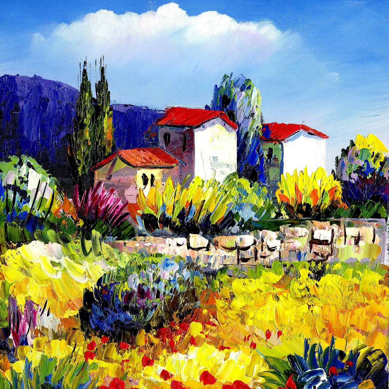
At its core, monochrome painting involves the use of a single color in a variety of shades and tints. Historically, this style has been embraced by numerous artists and movements, each bringing their own interpretation and significance to the medium. From the stark, minimalist works of Kazimir Malevich to the expressive pieces of Yves Klein, monochrome art has challenged perceptions and pushed the boundaries of creativity. The beauty of this technique lies in its ability to focus the viewer's attention on the nuances of color, texture, and form, allowing for a profound exploration of emotional and visual depth.
Selecting the right color for your monochrome painting is crucial. It’s not just about picking a favorite shade; it’s about how that color can convey your artistic vision. When you think about a color, consider its emotional resonance and how it can interact with light and shadow. The harmony and balance achieved through careful selection can transform your artwork from a simple representation into an evocative experience. For instance, a deep crimson can evoke passion, while a soft lavender might inspire tranquility. The choices you make will shape not only the painting itself but also the feelings it elicits in those who view it.
Understanding the emotional impact of warm and cool tones can significantly enhance your monochrome artwork. Warm tones, such as reds, yellows, and oranges, often evoke feelings of comfort and energy, creating a vibrant atmosphere. On the other hand, cool tones—think blues, greens, and purples—tend to convey calmness and serenity, providing a soothing backdrop for your artistic expression. By carefully considering the temperature of your chosen color, you can manipulate the mood of your painting to align with your artistic intent.
Warm tones can ignite a sense of enthusiasm and vitality in your monochrome compositions. For example, using a rich red can evoke a sense of urgency and passion, while a bright yellow can radiate optimism and cheerfulness. When incorporating these colors, consider how light interacts with them. A well-placed highlight can make a warm tone pop, drawing the viewer's eye and creating a dynamic visual experience. Think of your painting as a conversation with the audience; warm tones can serve as the enthusiastic voice that captures attention.
Conversely, cool tones often create a sense of calm and introspection. Blues can remind one of a serene sky or a tranquil ocean, while greens may evoke lush forests and nature's peace. When using cool tones in your monochrome art, you can create a soothing atmosphere that invites viewers to pause and reflect. Imagine a painting dominated by deep indigo; it can transport the audience to a quiet evening, filled with contemplation and serenity. The choice of cool tones can be likened to a gentle lullaby, soothing the senses and calming the mind.
Mastering shading is essential for adding depth and dimension to your monochrome paintings. Various techniques, such as hatching, cross-hatching, and blending, can help you create texture and visual interest. Hatching involves drawing closely spaced parallel lines, while cross-hatching adds depth through intersecting lines. Blending, on the other hand, allows for smoother transitions between shades, giving your artwork a soft, cohesive look. By experimenting with these techniques, you can bring your monochrome pieces to life, transforming flat colors into dynamic forms that engage the viewer's eye.
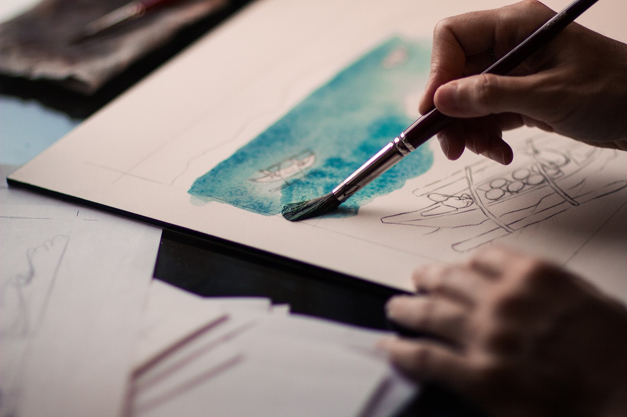
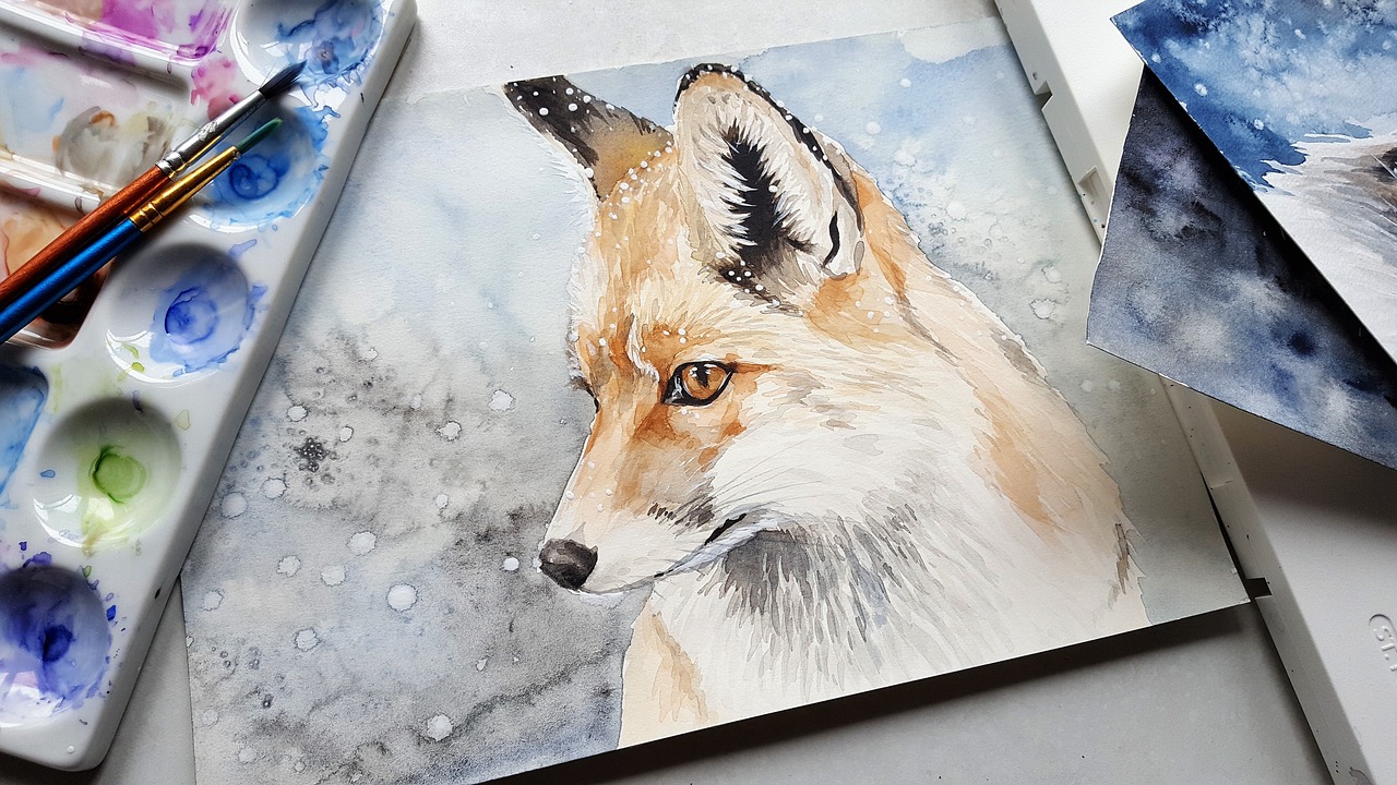
The right tools can significantly affect your painting process and the final outcome of your artwork. Essential materials include brushes, canvases, and high-quality paints. Each of these components plays a vital role in how your vision translates onto the canvas. For instance, the type of brush you use can influence the texture and flow of your paint. Selecting the right canvas can also impact how colors appear, as different surfaces absorb paint differently. Investing in quality materials can elevate your monochrome projects, ensuring that your artistic expression shines through.
Different brush types can produce varied effects in monochrome painting. Flat brushes are excellent for broad strokes and filling in larger areas, while round brushes can create fine details and intricate lines. Filbert brushes offer a versatile option, allowing for both broad strokes and finer details. When selecting brushes, consider the specific techniques you plan to use and how each brush can contribute to achieving your desired effect. It's like choosing the right tool for a job; the right brush can make all the difference in your artistic journey.
Using high-quality paint is crucial for achieving the richness and vibrancy that makes monochrome artwork stand out. The right paint can enhance the texture and depth of your piece, ensuring that your colors remain true and vivid over time. Consider investing in reputable paint brands that offer a range of shades within your chosen color palette. This investment not only elevates your artwork but also provides a more enjoyable painting experience as you see your vision come to life on the canvas.
- What is monochrome painting? Monochrome painting involves using a single color in various shades and tints to create depth and emotion.
- How do I choose a color for my monochrome painting? Consider the emotional impact of the color and how it aligns with your artistic vision.
- What techniques can I use for shading in monochrome painting? Techniques like hatching, cross-hatching, and blending can add depth and dimension to your artwork.
- What types of brushes are best for monochrome painting? Flat, round, and filbert brushes each offer unique advantages depending on your desired technique.
- Why is paint quality important? High-quality paint ensures that your colors remain vibrant and true, enhancing the overall impact of your artwork.
Understanding Monochrome Painting
Monochrome painting is a fascinating art form that revolves around the use of a single color, exploring its various shades, tints, and tones. This technique allows artists to delve deep into the emotional and aesthetic properties of color without the distraction of multiple hues. The history of monochrome art dates back centuries, with roots in various movements and styles. Artists like Kazimir Malevich and Piet Mondrian have famously utilized monochromatic palettes to challenge perceptions and convey profound ideas. Malevich's "Black Square," for instance, is not merely a black square; it represents a radical departure from traditional forms of representation, inviting viewers to contemplate the essence of art itself.
The significance of monochrome painting extends beyond mere aesthetics. It serves as a powerful tool for artists to express emotions, provoke thought, and engage with the viewer on a deeper level. The simplicity of using one color can often lead to a more profound exploration of themes such as identity, isolation, and transformation. By stripping away the complexity of multiple colors, artists can focus on the interplay of light and shadow, texture, and form, creating a visual language that speaks volumes.
Throughout art history, several movements have embraced monochrome painting, each contributing to its evolution. The Dada movement, for example, used monochrome to challenge the conventions of art, while the Minimalist movement emphasized simplicity and purity in artistic expression. These movements have paved the way for contemporary artists who continue to experiment with monochrome techniques, pushing boundaries and redefining what it means to create art.
In understanding monochrome painting, one must also consider the emotional impact of color. Different shades can evoke distinct feelings; for example, a deep navy blue may convey tranquility, while a bright yellow could evoke joy and energy. This emotional resonance is crucial for artists to master, as it can significantly influence how their work is perceived. By carefully selecting a monochromatic color scheme, artists can guide the viewer's emotional journey through their artwork, making the experience both personal and universal.
In essence, monochrome painting is not just about using one color; it’s about exploring the depths of that color and what it represents. It challenges artists to think critically about their choices and how they communicate with their audience. Whether you are a beginner or an experienced artist, embracing the philosophy of monochrome painting can enhance your artistic practice and lead to remarkable discoveries.
- What is monochrome painting? Monochrome painting involves the use of a single color in various shades and tints to create art that explores the emotional and aesthetic properties of that color.
- Who are some key artists associated with monochrome painting? Notable artists include Kazimir Malevich, Piet Mondrian, and Yves Klein, each of whom has made significant contributions to the monochrome movement.
- How does color choice affect monochrome painting? The choice of color can evoke different emotions and set the mood of the artwork, making it essential for artists to consider their palette carefully.
Choosing Your Color Palette
When it comes to monochrome painting, selecting the right color palette is not just a choice; it's a pivotal moment in your artistic journey. The color you choose will serve as the foundation of your artwork, shaping its mood, depth, and overall impact. But how do you make this crucial decision? Well, it all starts with understanding the emotional resonance of different shades and tints of your chosen color. Whether you’re drawn to the fiery passion of reds or the calming serenity of blues, the palette you select can convey a powerful message to your audience.
One effective approach is to create a color wheel that showcases the variations of your chosen color. This allows you to visualize how different shades interact with one another, helping you to maintain harmony throughout your piece. For instance, if you decide to work with a deep blue, consider how lighter tints can be used to create highlights, while darker shades can add depth and shadow. This interplay between light and dark is essential in achieving a balanced composition that captivates the viewer.
Moreover, think about the psychological effects of your color choice. Each color has its own set of associations and emotional responses. For example:
- Red: Passion, energy, excitement
- Blue: Calmness, tranquility, stability
- Green: Nature, growth, renewal
By understanding these associations, you can effectively communicate your intended message through your monochrome painting. Imagine creating a piece that uses varying shades of green to evoke feelings of serenity and growth, or perhaps a composition dominated by reds to ignite passion and energy. The possibilities are endless!
As you hone in on your color palette, consider creating a swatch sheet where you mix different shades and tints of your chosen color. This hands-on approach not only helps you see how the colors interact but also allows you to experiment with different combinations that you might not have initially considered. Plus, having a physical reference can be a lifesaver when you’re deep into the painting process and need to recall a specific shade.
In conclusion, choosing your color palette in monochrome painting is a blend of personal expression, emotional understanding, and practical experimentation. So, take your time, play with shades, and don’t be afraid to step outside your comfort zone. The beauty of monochrome art lies in its simplicity, yet it offers a vast landscape for creativity and emotional depth. Now, let's dive deeper into how warm and cool tones can shape your artwork.
Warm vs. Cool Tones
When diving into the world of monochrome painting, understanding the emotional impact of warm versus cool tones is crucial. Think of warm tones like a cozy blanket on a chilly evening, wrapping you in feelings of comfort and energy. They are the reds, yellows, and oranges that spark excitement and evoke a sense of warmth. On the flip side, cool tones are like a gentle breeze on a hot summer day, bringing calmness and serenity with hues of blue, green, and purple. Each color temperature can significantly alter the mood of your artwork, making it essential to choose wisely based on the emotions you wish to convey.
Warm tones are often associated with feelings of happiness and enthusiasm. For instance, a monochrome painting that utilizes various shades of red can create a sense of passion and intensity. Imagine walking into a room adorned with a vibrant red artwork; it instantly energizes the space and draws attention. In contrast, cool tones can evoke tranquility and peace. A painting dominated by blues can remind one of a serene ocean, inviting viewers to reflect and relax. The choice between warm and cool tones can be likened to selecting the right soundtrack for a movie; it sets the emotional tone and guides the viewer's experience.
To help you visualize this concept, consider the following table that highlights the characteristics of warm and cool tones:
| Color Type | Examples | Emotional Impact |
|---|---|---|
| Warm Tones | Red, Yellow, Orange | Energy, Passion, Comfort |
| Cool Tones | Blue, Green, Purple | Calmness, Serenity, Reflection |
As you embark on your monochrome painting journey, take time to experiment with both warm and cool tones. You might find that a combination of both can create a striking visual balance, much like the harmony of flavors in a well-prepared dish. By carefully selecting your tones, you can not only enhance the aesthetic appeal of your artwork but also create a deeper connection with your audience. Remember, the emotional response elicited by your color choices can be just as powerful as the subject matter itself.
- What are warm and cool tones? Warm tones are colors like red, yellow, and orange that evoke feelings of warmth and energy, while cool tones include blue, green, and purple, often associated with calmness and serenity.
- Can I mix warm and cool tones in a monochrome painting? Absolutely! Mixing both can create a dynamic balance, enhancing the emotional depth of your artwork.
- How do I choose the right tones for my painting? Consider the mood you want to convey and experiment with different shades and tints of your chosen color to see how they affect the overall feel of your piece.

Effects of Warm Tones
Warm tones, encompassing shades of reds, yellows, and oranges, have a unique ability to evoke powerful emotions and create a sense of energy in monochrome paintings. When you think about it, warm colors are like the sun; they radiate warmth and can instantly uplift the mood of a space. This is why many artists choose to incorporate these tones into their work, as they can create a striking visual impact that draws viewers in and keeps them engaged.
One of the most fascinating aspects of warm tones is their ability to stimulate feelings of comfort and excitement. For instance, a painting dominated by vibrant reds can evoke passion and intensity, while softer yellows can bring about a sense of cheerfulness and optimism. Imagine walking into a room adorned with a warm-toned artwork; it feels inviting, doesn’t it? This emotional resonance is what makes warm tones so effective in art.
When using warm colors in your monochrome compositions, consider how different shades can alter the overall mood of your piece. For example, a deep crimson can convey a sense of drama, while a light peach might suggest a gentle warmth. To illustrate this point, here’s a quick breakdown of how various warm colors can impact your artwork:
| Warm Color | Emotional Impact |
|---|---|
| Red | Passion, energy, intensity |
| Yellow | Happiness, optimism, cheerfulness |
| Orange | Enthusiasm, creativity, warmth |
Incorporating these warm tones effectively requires an understanding of how they interact with each other and the overall composition. For example, using a gradient from a vibrant orange to a softer yellow can create a beautiful transition that adds depth and movement to your artwork. Moreover, layering different shades can enhance the visual complexity and draw the viewer's eye through the piece. Think of it as building a warm sunset; each layer adds to the overall beauty and richness of the scene.
Additionally, warm tones can be particularly effective in monochrome landscapes or portraits. They can create a sense of nostalgia or warmth, making the artwork feel more relatable and inviting. Just like the comforting embrace of a loved one, warm colors can create a connection between the viewer and the art. So, when you’re planning your next monochrome project, don’t shy away from experimenting with warm tones. They may just bring your vision to life in ways you never imagined!
- What are the best warm colors to use in monochrome painting? Red, orange, and yellow are the primary warm colors that can create vibrant and energetic compositions.
- How do warm tones affect the mood of a painting? Warm tones often evoke feelings of comfort, energy, and excitement, making them great for creating inviting and dynamic artworks.
- Can I mix warm tones with cool tones in monochrome painting? Yes, mixing warm and cool tones can create interesting contrasts and enhance the overall depth of your artwork.
Effects of Cool Tones
When it comes to monochrome painting, the choice of cool tones can dramatically influence the emotional resonance of your artwork. Cool tones, which typically include shades of blue, green, and purple, are often associated with feelings of tranquility, calmness, and serenity. Imagine standing by a quiet lake at dusk; the soft blues and greens envelop you, bringing a sense of peace that can be beautifully translated onto your canvas. This emotional connection is what makes cool tones a powerful tool for artists.
Using cool tones in your monochrome pieces can transform the atmosphere of your work. For instance, a painting dominated by various shades of blue can evoke a sense of melancholy or reflection, while greens can bring about feelings of growth or renewal. Each color carries its own unique emotional weight, and understanding how to manipulate these shades can enhance your artistic expression. Here’s a quick breakdown of the effects of some common cool colors:
| Color | Emotional Impact |
|---|---|
| Blue | Calmness, Trust, Sadness |
| Green | Harmony, Growth, Balance |
| Purple | Mystery, Creativity, Spirituality |
Incorporating these tones into your artwork requires more than just a basic understanding of color theory; it demands an appreciation of how light interacts with these hues. For example, a lighter shade of blue can create an airy feel, while a deeper navy can invoke a sense of depth and weight. Experimenting with different shades and their combinations can lead to stunning visual effects that resonate deeply with viewers.
Another essential aspect of using cool tones effectively is the play of light and shadow. By mastering shading techniques, you can add depth and dimension to your paintings. Cool colors often recede in space, allowing you to create a sense of distance and perspective. This can be particularly useful in landscape paintings where you want to depict a vast, serene environment. Imagine painting a foggy morning scene; the cool tones will help to create that ethereal quality, drawing the viewer into the tranquil atmosphere.
Ultimately, the use of cool tones in monochrome painting is about more than just color choice—it's about conveying a mood and telling a story. As you explore the effects of these hues, consider how they can enhance the narrative of your artwork. Whether you aim to create a peaceful landscape or a thought-provoking abstract piece, cool tones can serve as your guiding palette, leading your audience through the emotional landscape of your creation.
- What are the best cool colors to use in monochrome painting? The best cool colors typically include shades of blue, green, and purple. Each color has its own emotional impact, so choose based on the mood you wish to convey.
- How can I create depth using cool tones? You can create depth by mastering shading techniques and understanding how different shades interact with light. Darker shades can add weight, while lighter shades can create an airy feel.
- Can I mix cool tones with warm tones in monochrome painting? Yes, mixing cool and warm tones can create dynamic contrasts and enhance the emotional complexity of your artwork.
Shading Techniques
When it comes to monochrome painting, mastering shading techniques is crucial for creating depth and dimension in your artwork. Think of shading as the secret ingredient that transforms a flat image into a captivating visual experience. It’s like seasoning in cooking; without it, your painting might taste bland, but with the right techniques, you can create a feast for the eyes. Let’s dive into some essential shading techniques that every monochrome artist should know.
One of the most popular methods is hatching, where you create a series of parallel lines to build up tone. The closer the lines are to each other, the darker the area appears. This technique is not just for drawing; it can be seamlessly integrated into painting as well. Imagine hatching as the brushstrokes that chart the course of light and shadow across your canvas. It’s all about the rhythm of your strokes!
Another technique to consider is cross-hatching, which involves layering lines in different directions. This method adds complexity and richness to your shading, making your artwork feel more dynamic. Think of cross-hatching as weaving a fabric; each line interlocks with the next to create a beautiful tapestry of tones. By varying the pressure on your brush, you can achieve different intensities of color, enhancing the overall effect.
For those who prefer a softer touch, blending is the way to go. This technique involves smoothing out the edges of your colors to create a seamless transition between light and dark areas. You can use tools like blending stumps or even your fingers to achieve a soft gradient. Blending is akin to the gentle caress of a breeze on a warm day, softly merging elements without harsh lines. It’s perfect for creating atmospheric effects, especially when working with cool tones.
To effectively incorporate these techniques, it’s important to practice regularly. Set aside time to experiment with different methods on scrap paper or canvas. You could even create a small chart to visualize how each technique affects the overall look of your monochrome painting. Here’s a simple table to help you track your progress:
| Technique | Effect | Best Used With |
|---|---|---|
| Hatching | Linear texture and tone | Bold colors |
| Cross-hatching | Depth and complexity | Detailed compositions |
| Blending | Smooth transitions | Soft, atmospheric pieces |
Remember, the key to effective shading in monochrome painting lies in understanding how light interacts with surfaces. Observe the world around you; notice how shadows fall and how light reflects off different materials. By incorporating these observations into your painting, you can bring a new level of realism and intrigue to your work.
As you explore these shading techniques, don't hesitate to combine them. For instance, you might use hatching for the main elements of your painting while blending for the background. This interplay can create a striking contrast, drawing the viewer’s eye to the focal points of your artwork. So, grab your brushes, and let your creativity flow!
- What is the best technique for beginners? Hatching is often recommended for beginners as it is simple to master and can produce effective results.
- Can I use these techniques with color painting? Absolutely! While this article focuses on monochrome, these techniques can enhance color paintings as well.
- How do I know which technique to use? It often depends on the mood you want to convey. Experiment with different techniques to see which best fits your artistic vision.
Tools and Materials
When diving into the world of monochrome painting, having the right tools and materials can make all the difference between a mediocre piece and a stunning masterpiece. It's like cooking; you wouldn't want to bake a cake without quality ingredients, right? Similarly, in art, the tools you choose can significantly influence your creative process and the final outcome of your work. So, let’s explore what you need to get started on your monochrome journey.
First off, your choice of brushes is crucial. Different brushes can create a variety of effects, from fine details to broad strokes. For monochrome painting, you might want to consider a mix of flat, round, and filbert brushes. Flat brushes are excellent for covering larger areas and creating sharp edges, while round brushes are perfect for detail work. Filbert brushes, with their oval shape, are fantastic for blending and creating soft edges. Here’s a quick table summarizing the types of brushes and their uses:
| Brush Type | Best For |
|---|---|
| Flat Brush | Large areas, sharp edges |
| Round Brush | Detail work, lines |
| Filbert Brush | Blending, soft edges |
Next, let’s talk about paints. The quality of your paint can greatly affect the vibrancy and richness of your monochrome pieces. While it might be tempting to go for budget options, investing in high-quality paints will provide you with better pigmentation and consistency. Look for paints that offer a smooth application and good coverage. Brands like Winsor & Newton or Golden are often recommended by artists for their reliability and performance. Remember, the right paint can bring your artistic vision to life!
Another essential material is the canvas. The surface you choose to paint on can impact how your colors appear and how your brush interacts with the medium. For monochrome painting, consider using a textured canvas to add depth and interest to your work. Alternatively, you can use smooth surfaces for a more refined look. The choice between a pre-stretched canvas or canvas boards often comes down to personal preference and the scale of your project.
Lastly, don’t overlook the importance of palette knives and mixing palettes. These tools are invaluable for mixing your paint and can also be used to apply paint in a unique way. Palette knives can create sharp lines and textures that brushes sometimes can’t achieve. Plus, a good mixing palette will help you experiment with different shades and tints of your chosen color, which is key in monochrome artwork.
In summary, while the artistic vision and techniques are crucial, the tools and materials you use will significantly influence your monochrome painting experience. Invest in quality brushes, paints, and canvases, and don’t forget the utility of palette knives and mixing palettes. With the right gear in hand, you’re well on your way to creating captivating monochrome masterpieces!
- What is monochrome painting? Monochrome painting involves using a single color in various shades and tints, creating depth and interest without the distraction of multiple colors.
- Do I need expensive materials to start? While high-quality materials can enhance your work, you can begin with affordable options and gradually invest as you develop your skills.
- Can I use any color for monochrome painting? Yes, you can choose any color, but it's essential to understand how different shades and tints of that color will interact in your composition.
Brush Types
When it comes to monochrome painting, the type of brush you choose can dramatically influence the outcome of your artwork. Each brush serves a unique purpose and can help you achieve specific effects, so understanding the different types available is crucial for any artist. Let's dive into some of the most common brush types you might consider using in your monochrome projects.
First up, we have the round brush, which is incredibly versatile. Its pointed tip allows for detailed work and fine lines, making it perfect for intricate details in your monochrome pieces. Whether you're painting delicate highlights or bold strokes, a round brush can adapt to your needs. On the other hand, if you're looking to cover larger areas with smooth applications, a flat brush is your best friend. This brush type has a square edge that can create sharp lines and broad strokes, allowing you to lay down color quickly and efficiently.
Another essential brush type is the filbert brush, which combines the features of both round and flat brushes. With its oval shape, it’s ideal for softening edges and creating a more blended look in your monochrome work. If you're aiming for texture, a fan brush can be quite handy. Its unique shape is perfect for creating foliage, clouds, or any textured effects that can add depth to your painting. Lastly, consider the detail brush, which is essential for those tiny, intricate areas where precision is key. This brush allows you to get into the nooks and crannies of your artwork without overwhelming the overall composition.
To summarize, here’s a quick reference table of the various brush types and their uses in monochrome painting:
| Brush Type | Best For |
|---|---|
| Round Brush | Detail work, fine lines |
| Flat Brush | Broad strokes, sharp lines |
| Filbert Brush | Soft edges, blending |
| Fan Brush | Texture effects, foliage |
| Detail Brush | Intricate areas, precision |
When selecting brushes for your monochrome painting, consider your artistic goals and the effects you want to achieve. The right brush can make all the difference, transforming a simple stroke into a captivating element of your artwork. So, experiment with different types and find what works best for your unique style!
1. What is the best brush for beginners in monochrome painting?
For beginners, a round brush is often recommended due to its versatility. It can handle both detail work and broader strokes, making it a great starting point.
2. How do I clean my brushes after painting?
Cleaning your brushes is crucial for maintaining their shape and longevity. Use warm water and mild soap, gently reshaping the bristles after cleaning to ensure they dry properly.
3. Can I use acrylic brushes for oil painting?
While you can use acrylic brushes for oil painting, it’s best to use brushes specifically designed for oil, as they are made to handle the thicker consistency of oil paints.
4. How often should I replace my brushes?
The lifespan of a brush depends on its usage and care. If you notice fraying bristles or loss of shape, it’s time to replace it to ensure the quality of your work.
Paint Quality
When it comes to monochrome painting, the quality of your paint can make or break your artwork. Imagine trying to create a masterpiece with dull, lifeless colors; it would be like trying to cook a gourmet meal with expired ingredients! High-quality paints not only provide better coverage but also allow for richer and more vibrant shades, which are crucial when working within the confines of a single color. So, how do you choose the right paint for your monochrome projects?
One of the first things to consider is the type of paint you want to use. There are several options available, each with its own unique characteristics:
- Acrylic Paint: Fast-drying and versatile, acrylics are perfect for beginners and experienced artists alike. They can be easily mixed with water for different effects, making them a popular choice for monochrome work.
- Oil Paint: Known for their rich texture and slow drying time, oil paints allow for extensive blending and layering, which can be particularly beneficial in monochrome pieces where depth and nuance are essential.
- Watercolor: While not traditionally used for monochrome painting, watercolors can produce stunning, translucent effects. However, they require a different approach regarding layering and control.
Furthermore, it's important to consider the pigment quality. Not all paints are created equal, and the pigment concentration can dramatically affect the final outcome of your artwork. High-quality paints often have a higher pigment load, leading to more vibrant colors and better lightfastness. This means your artwork will stand the test of time without fading. When selecting your paint, look for brands that are known for their quality, such as Winsor & Newton or Golden for acrylics, and Gamblin or Michael Harding for oils.
Another factor to consider is the finish of the paint. Monochrome artworks can range from matte to glossy finishes, and each can evoke different feelings. A matte finish can create a more subdued and sophisticated look, while a glossy finish can add vibrancy and depth to your piece. Depending on the mood you wish to convey, choose a finish that complements your artistic vision.
Lastly, don't forget about the mediums. These are additives that can alter the properties of your paint, enhancing its texture, drying time, and finish. For instance, using a glazing medium with acrylics can help create a luminous effect, making your monochrome piece pop with life. Experimenting with different mediums can lead to exciting discoveries in your artwork.
In summary, the quality of your paint is a fundamental aspect of monochrome painting that should not be overlooked. Investing in high-quality materials can significantly elevate your work, allowing you to express your artistic vision with clarity and depth. So, the next time you're in the art store, remember: just like a chef needs the finest ingredients, you need the best paint to create your masterpiece!
- What type of paint is best for monochrome painting? Acrylic and oil paints are often recommended due to their versatility and richness in color.
- How do I know if my paint is high quality? Look for brands with a good reputation, high pigment concentration, and positive reviews from other artists.
- Can I use watercolors for monochrome painting? Yes, watercolors can be used, but they require a different technique and may not provide the same depth as acrylics or oils.
- What is the difference between matte and glossy finishes? Matte finishes are more subdued and sophisticated, while glossy finishes are vibrant and can enhance the depth of your work.
Frequently Asked Questions
-
What is monochrome painting?
Monochrome painting is an artistic technique that involves using a single color in various shades and tints. This style allows artists to explore the depth and nuances of one color, creating a powerful visual impact while conveying emotions and themes without the distraction of multiple colors.
-
How do I choose the right color for my monochrome painting?
Choosing the right color is crucial for effective monochrome painting. Consider the mood you want to convey. Warm tones like reds and oranges evoke energy and passion, while cool tones like blues and greens promote calmness and tranquility. Think about your artistic vision and how different colors can harmonize with your intended message.
-
What are some effective shading techniques in monochrome painting?
Shading is essential for adding depth and dimension to your artwork. Techniques such as hatching, cross-hatching, and blending can create various textures and visual interest. Experimenting with these techniques will help you achieve the desired effects and make your monochrome pieces more dynamic.
-
What tools and materials do I need for monochrome painting?
To start painting in monochrome, you'll need high-quality paints, suitable brushes, and canvases. Different brush types can produce unique effects, so it's essential to choose the right ones based on your technique. Investing in quality materials will enhance the richness and vibrancy of your artwork.
-
Can I use any type of paint for monochrome artwork?
While you can technically use any type of paint, high-quality acrylics or oils are recommended for monochrome painting. These types of paint offer better pigment concentration and blending capabilities, allowing for a more vibrant and textured finish in your artwork.
-
How does the choice of warm or cool tones affect my artwork?
The choice between warm and cool tones can dramatically influence the emotional response of viewers. Warm tones tend to create feelings of comfort and energy, while cool tones are often associated with calmness and serenity. Understanding these effects can help you make informed decisions about your color palette and the overall mood of your painting.


