
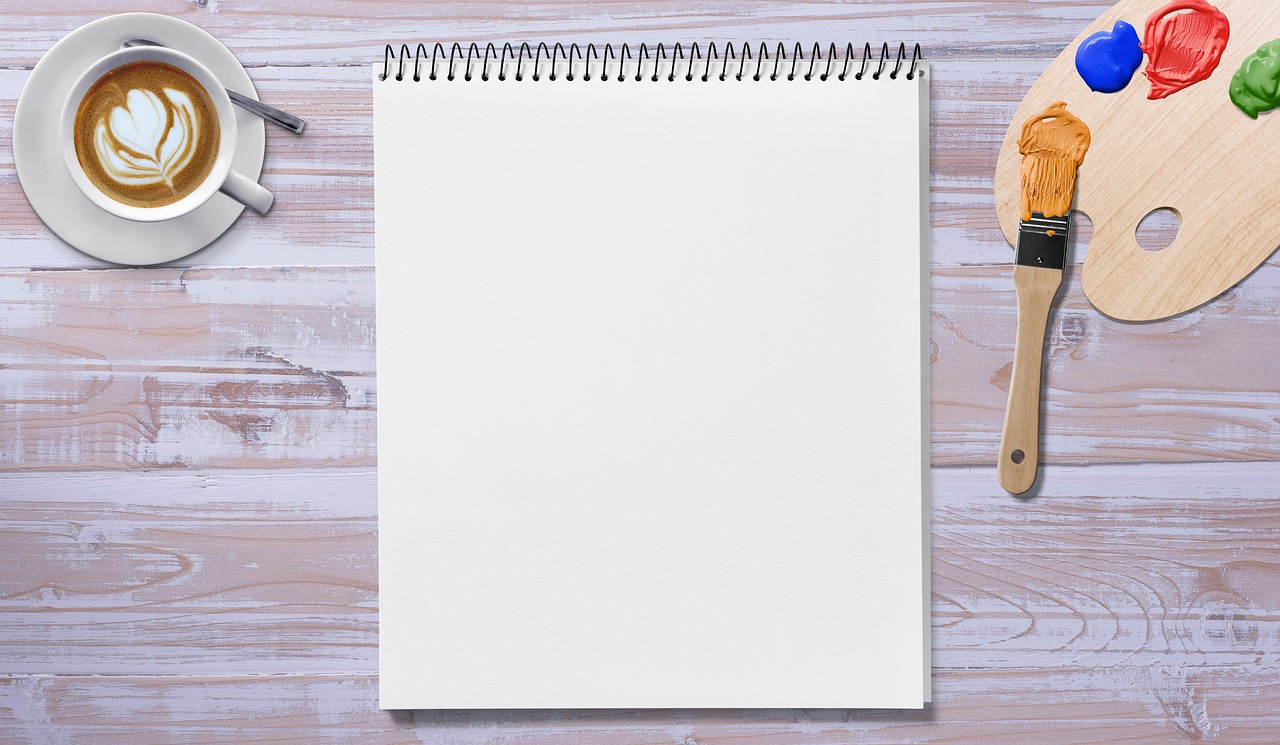
How to Color Block Your Paintings
Color blocking is an exciting and vibrant technique that can transform your paintings from ordinary to extraordinary. Imagine a canvas bursting with bold colors, each section distinct yet harmoniously connected. This article explores the technique of color blocking in painting, offering tips and insights on how to effectively use this method to enhance your artwork and create striking visual compositions. Whether you're a seasoned artist or just starting out, color blocking can add a new dimension to your creative expression. So, grab your brushes and let's dive into the colorful world of color blocking!
Color blocking is a technique that involves using bold, solid colors in distinct areas of a composition. The origins of color blocking can be traced back to various art movements, including the Bauhaus and De Stijl, where artists sought to create harmony through geometric shapes and vibrant colors. This method is significant because it allows artists to play with visual perception, leading the viewer's eye across the canvas in unexpected ways. By using contrasting colors, you can create a sense of excitement and energy in your work. Have you ever looked at a painting and felt instantly drawn in? That's the magic of color blocking!
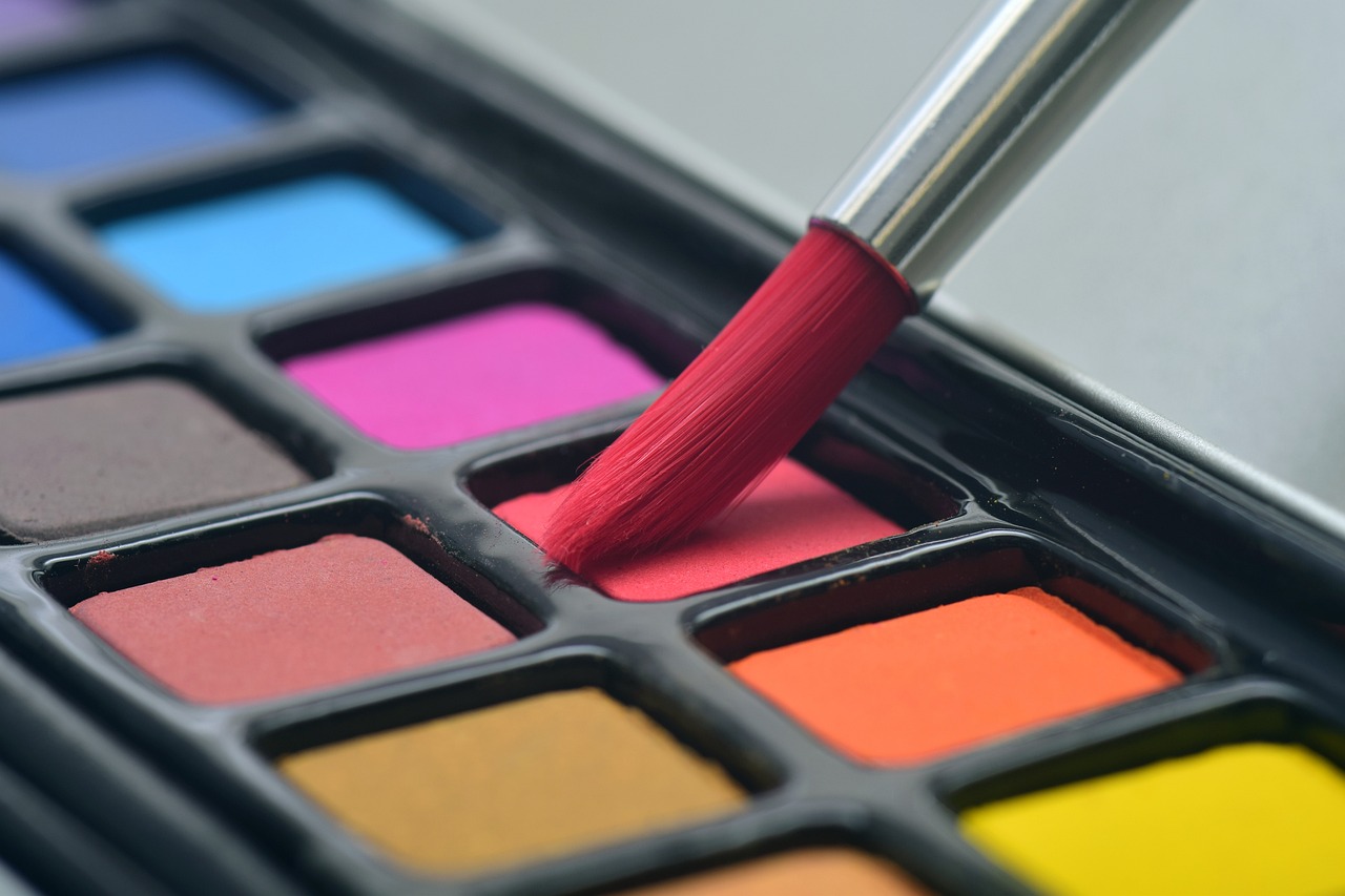
Selecting the right colors is crucial for effective color blocking. A well-thought-out color palette can make or break your painting. Think about the mood you want to convey. Are you aiming for something energetic and lively, or calm and soothing? Here are some methods for choosing complementary and contrasting colors:
- Color Wheel: Use a color wheel to find colors that complement each other.
- Analogous Colors: Choose colors that are next to each other on the wheel for a harmonious look.
- Contrasting Colors: Select colors opposite each other on the wheel for a bold, dynamic effect.
By understanding the relationships between colors, you can enhance your artistic vision and create a dynamic visual impact that captivates your audience.
Before diving into color blocking, preparing your canvas is essential. A well-prepared canvas ensures that your colors apply smoothly and stick well. Start by priming your canvas with gesso; this creates a suitable surface for paint application. After priming, sketch your design lightly with a pencil. This step is crucial, as it helps you visualize the layout of your colors. Think of it as laying down the foundation before building a house. You wouldn’t want to start painting without a solid base, right?
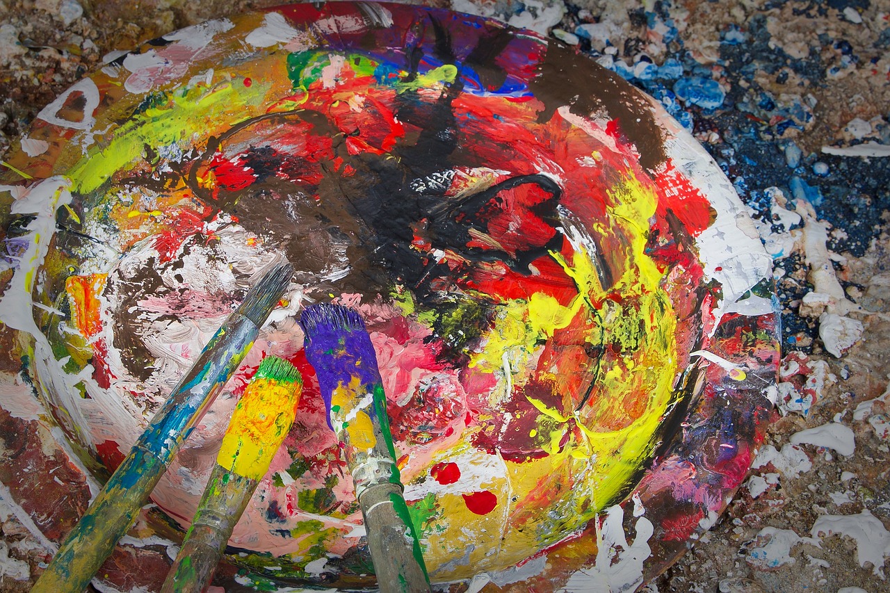
There are various techniques to apply color in a color-blocked painting. One of the most important aspects is achieving clean, defined edges between colors. You can use different brush strokes, such as:
- Flat Brushes: Ideal for straight lines and sharp edges.
- Sponges: Great for creating texture.
- Masking Tape: Use this to tape off areas for crisp lines.
Layering colors can also add depth to your work. Start with the lightest colors and gradually work your way to the darkest. This technique not only enhances the vibrancy of your colors but also helps you achieve a more professional finish.
Adding depth to color-blocked paintings can elevate the overall effect. Consider using shading and highlights to create a sense of three-dimensionality. For instance, if you have a block of yellow, adding a bit of orange or brown at the edges can give it a rounded appearance. Additionally, incorporating texture through techniques like dry brushing or stippling can add another layer of interest. Think of your painting as a landscape; the more layers you add, the more it comes to life!
Even experienced artists can make mistakes when color blocking. Here are some common pitfalls to watch out for:
- Overmixing Colors: This can lead to muddy hues.
- Ignoring Composition: Remember that color blocking is not just about colors; it's about how they interact.
- Skipping Preparation: Always prepare your canvas properly.
By being aware of these mistakes, you can ensure a smoother painting process and achieve better results.
Many renowned artists have utilized color blocking in their work. For example, Piet Mondrian is famous for his use of primary colors and geometric shapes, creating a sense of balance and harmony. Another artist, Mark Rothko, used large blocks of color to evoke emotion and contemplation. Studying their techniques can provide valuable insights into how you can effectively incorporate color blocking in your own art.
Once your color-blocked painting is complete, adding final touches is essential. Varnishing your artwork not only enhances the colors but also protects it from dust and UV rays. Framing your piece can also elevate its presentation, making it more appealing for display. Think of your artwork as a jewel; the right setting can make it shine even brighter!
After completing your color-blocked painting, showcasing it effectively is key. Consider displaying your work online through social media platforms or art websites. If you're showcasing in a physical space, think about the lighting and placement to attract attention. Engaging with your audience can also create a deeper connection with your art, making it more memorable.
Q: What is color blocking?
A: Color blocking is a painting technique that uses bold, solid colors in distinct areas to create visual interest.
Q: How do I choose a color palette?
A: Use a color wheel to find complementary and contrasting colors that resonate with your artistic vision.
Q: What are some common mistakes in color blocking?
A: Common mistakes include overmixing colors, ignoring composition, and skipping canvas preparation.
Q: How can I add depth to my painting?
A: Use shading, highlights, and texture to create a sense of three-dimensionality in your artwork.
Q: How should I showcase my finished painting?
A: Consider online platforms for digital display or ensure good lighting and framing for physical exhibitions.

Understanding Color Blocking
Color blocking is more than just a trendy term thrown around in the art world; it’s a vibrant technique that can truly transform your paintings. At its core, color blocking involves the use of bold, solid colors applied in distinct areas of a composition. Imagine a canvas where colors are not just splashed randomly but are carefully chosen to create striking contrasts and harmonious interactions. This method can elevate an ordinary piece of art into something that captivates and engages the viewer.
The origins of color blocking can be traced back to various art movements, including the De Stijl movement in the early 20th century, characterized by geometric forms and primary colors. Artists like Piet Mondrian famously used this technique to convey simplicity and order through color. The significance of color blocking lies in its ability to evoke emotions and reactions from the audience. When you see a painting that uses this technique, you might feel energized, calm, or even intrigued. It’s all about how colors interact with one another and how they can be used to tell a story or convey a message.
One of the most fascinating aspects of color blocking is how it can transform the perception of space within a painting. By using large swaths of color, artists can create a sense of depth and dimension, drawing the eye across the canvas. Think of it as a visual journey where the viewer’s gaze is guided from one block of color to another, creating a narrative that unfolds with each glance. This technique also allows for a playful exploration of color theory, where artists can experiment with complementary and contrasting colors to see what resonates best with their artistic vision.
In practical terms, color blocking can be achieved through various methods. For instance, you might start by sketching out your composition lightly on the canvas, marking areas where different colors will go. Then, using a brush or even a palette knife, you can apply the paint in bold strokes, ensuring that the edges between colors remain clean and defined. The key is to embrace the boldness of the colors you choose, allowing them to stand out and speak for themselves.
Overall, understanding color blocking is about recognizing the potential of color as a powerful tool in your artistic arsenal. It’s about breaking free from traditional painting techniques and allowing your creativity to flourish in a way that is both visually stunning and emotionally resonant. So, whether you’re a seasoned artist or just starting, embracing this technique can lead to exciting new directions in your artwork.
Choosing Your Color Palette
Choosing the right color palette is one of the most crucial steps in the color blocking technique. It's like picking the perfect outfit for a special occasion; the right colors can make or break your artwork! First, it's essential to understand the emotional impact colors can have. For instance, warm colors like reds and yellows can evoke feelings of energy and excitement, while cool colors such as blues and greens often convey calmness and serenity. So, what mood do you want your painting to express?
When selecting your colors, consider using the color wheel as your best friend. This tool can guide you in finding complementary and contrasting colors that work harmoniously together. Complementary colors are those that sit opposite each other on the wheel, such as blue and orange. Using them can create a vibrant visual dynamic that draws the viewer's eye. On the other hand, analogous colors, which are next to each other on the wheel (like blue, blue-green, and green), can create a more soothing, cohesive look.
Another method to consider is the 60-30-10 rule, a classic interior design principle that can be applied to painting as well. This rule suggests that you should use:
- 60% of a dominant color
- 30% of a secondary color
- 10% of an accent color
By following this guideline, you can create a balanced composition that doesn't overwhelm the viewer. For example, if your dominant color is a bold red, you might use a softer beige as your secondary color and a striking black as your accent.
Don't be afraid to experiment! Sometimes, the most unexpected color combinations can lead to stunning results. Grab some paint swatches or even use digital tools to visualize how different colors work together. Remember, the palette you choose sets the tone for your entire piece, so take your time and enjoy the process.
Lastly, consider the context of your painting. What is the subject matter? Is it abstract, or does it depict a landscape? The theme can significantly influence your color choices. For instance, if you’re painting a sunset, you might want to lean towards oranges, pinks, and purples to capture that magical moment. In contrast, a winter scene might call for icy blues and whites.
In summary, selecting a color palette for your color-blocked painting is an exciting journey. By understanding color theory, experimenting with combinations, and considering the context of your artwork, you can create a stunning visual impact that truly resonates with your audience.
Preparing Your Canvas
Before diving into the exciting world of color blocking, it's essential to prepare your canvas properly. Think of your canvas as the foundation of a house; if the foundation isn't solid, everything built on top will be unstable. A well-prepared canvas ensures that your colors pop and adhere properly, allowing for a stunning visual impact. So, how do you get your canvas ready? Let's break it down into a few critical steps.
First and foremost, you need to choose the right type of canvas. There are various options available, such as cotton, linen, or synthetic materials. Each type has its unique characteristics that can influence how your paint interacts with the surface. For instance, cotton canvases are budget-friendly and great for beginners, while linen canvases offer a luxurious texture that seasoned artists often prefer. Once you've selected your canvas, it's time to prime it. Priming is like putting on a protective coat that prevents the paint from soaking into the fabric, which can dull the colors.
To prime your canvas, you can use a commercial gesso or make your own using a mixture of white paint and a binder. Apply a thin layer evenly across the surface using a large brush or a roller, and allow it to dry completely. This step is crucial, as it creates a smooth, workable surface that will enhance your color-blocking technique.
Next, sketching your design lightly on the primed canvas is a good idea. This is where you can plan out your color blocks and ensure that the composition flows well. You can use a pencil or charcoal for this step, but keep it light to avoid any unwanted lines showing through your paint. If you're feeling adventurous, consider using painter's tape to create sharp, clean edges for your color blocks. The tape acts as a barrier, preventing colors from bleeding into one another, which is essential for achieving that crisp color-blocked look.
Lastly, don’t forget to consider the size of your canvas. A larger canvas allows for more extensive color blocks, while a smaller one might require a more intricate design. Regardless of size, the key is to ensure that your canvas is well-prepared so that when you start applying those bold colors, the result is nothing short of breathtaking.
In summary, preparing your canvas involves:
- Selecting the right canvas material.
- Priming the canvas with gesso.
- Sketching your design lightly.
- Using painter's tape for clean edges.
- Choosing the appropriate canvas size for your artwork.
By following these steps, you'll set yourself up for success and ensure that your color-blocked painting stands out in all its glory!
Q: Do I really need to prime my canvas?
A: Yes, priming your canvas is essential as it prevents paint from soaking into the fabric, ensuring vibrant colors and a smooth finish.
Q: Can I use any type of paint on my canvas?
A: While you can technically use any paint, acrylics and oils are popular choices for color blocking due to their opacity and vibrant colors.
Q: How do I clean my brushes after using acrylic paint?
A: Acrylic paint can be cleaned with soap and water while it's still wet. Once it dries, it becomes more challenging to remove, so act quickly!
Q: What if I make a mistake while painting?
A: Mistakes are part of the creative process! You can often fix them by painting over them or incorporating them into your design.
Techniques for Applying Color
When it comes to color blocking in painting, the way you apply your colors can make all the difference between a striking piece and a muddled mess. Think of your canvas as a blank stage, waiting for the vibrant actors—your colors—to take the spotlight. To achieve that perfect balance and clean edges between colors, you'll want to explore a variety of techniques that can elevate your artwork to new heights.
One of the most effective methods for applying color is through brush strokes. The type of brush you choose can drastically alter the outcome of your painting. For instance, a flat brush is fantastic for creating bold, sweeping strokes that cover large areas quickly, while a round brush allows for more detail and precision in smaller sections. Experimenting with different brushes can help you discover which shapes and styles resonate with your artistic vision.
Another technique to consider is layering. This method involves applying multiple layers of paint to create depth and richness in your colors. Start with a base layer of color, let it dry, and then add additional layers on top. This not only enhances the vibrancy of your colors but also allows for interesting visual textures. Just be cautious—too many layers can lead to a heavy, impasto effect that may not align with your desired outcome.
For those aiming for sharp, defined edges between color blocks, the use of masking tape can be a game changer. By applying tape to the areas where you want to maintain clean lines, you can paint right up to the edge without worrying about colors bleeding into one another. Once your paint is dry, carefully remove the tape to reveal crisp boundaries that can make your color blocks pop. It's like creating a protective barrier that ensures your masterpiece remains true to your vision.
In addition to brushes and tape, consider using sponges or palette knives for unique textures and effects. Sponges can create soft, blended edges, while palette knives are perfect for applying thick layers of paint and adding an element of surprise to your color blocks. Each tool can bring its own personality to your artwork, so don't hesitate to mix and match techniques to find what works best for you.
Finally, remember that practice makes perfect. Don’t be afraid to experiment with your colors and techniques. Every artist has their own style, and the beauty of color blocking is that it allows for endless creativity. Try different combinations, play with your brushwork, and let your intuition guide you. It’s all part of the artistic journey!
- What is color blocking? Color blocking is a painting technique that involves using bold, solid colors in distinct areas of a composition.
- Which brushes are best for color blocking? Flat brushes are great for broad strokes, while round brushes offer more precision for details.
- Can I use tape for color blocking? Yes, masking tape is an excellent tool for ensuring clean, defined edges between different colors.
- How do I create depth in my color-blocked paintings? You can create depth by layering colors, adding shading, and using highlights to emphasize certain areas.

Creating Depth and Dimension
When it comes to color blocking, creating depth and dimension can truly elevate your artwork from flat and ordinary to stunning and dynamic. Think of your painting as a three-dimensional space where light and shadow can play a significant role. Just like in real life, where the interplay of light creates depth in our surroundings, you can replicate this effect on your canvas. One effective way to achieve this is through the use of shading and highlights.
Shading involves applying darker tones of your chosen colors in strategic areas of your painting. This technique not only adds depth but also helps to define shapes and forms. For instance, if you have a bold red block on your canvas, adding a darker shade of red or even a complementary color like a deep purple on one side can give the illusion that the red block is protruding from the canvas. On the flip side, highlights can be achieved by using lighter shades or even white to create the effect of light hitting the surface. Imagine the way sunlight glints off a glossy surface; that same principle applies here.
Another method to create depth is through texture. By varying the texture of your brush strokes, you can create a sense of dimension. For example, using a palette knife to apply thick layers of paint in certain areas can contrast beautifully with smoother, blended sections. This not only adds visual interest but also invites the viewer to explore the painting more closely. Consider how a rough, textured area might lead the eye to a smooth, glossy section, creating a journey across the canvas.
Additionally, playing with layering can significantly enhance the depth of your work. Start with a base layer of color, then gradually build up layers of additional colors, allowing some of the underlying colors to peek through. This not only adds complexity but also creates a sense of atmosphere. Just like in photography, where depth of field can draw attention to specific areas, layering can guide the viewer’s eye to focal points in your painting.
To summarize, here are some key techniques to consider when creating depth and dimension in your color-blocked paintings:
- Shading: Use darker tones to define shapes.
- Highlights: Apply lighter colors to suggest light hitting surfaces.
- Texture: Vary brush strokes and tools to create visual interest.
- Layering: Build up colors gradually for a rich, atmospheric effect.
By incorporating these techniques, you can transform your color-blocked paintings into captivating works of art that not only catch the eye but also engage the viewer’s imagination. Remember, the goal is to create a sense of movement and life within your artwork, making it an experience rather than just a visual representation.
Q: How can I choose the right colors for depth?
A: Opt for a range of shades within your color palette. Use darker shades for shadows and lighter shades for highlights to create contrast.
Q: Do I need special tools for texture?
A: While traditional brushes work well, consider using palette knives, sponges, or even your fingers to experiment with different textures.
Q: Can I achieve depth without using a lot of colors?
A: Yes! You can create depth using just a few colors by focusing on shading and highlighting effectively.
Common Mistakes to Avoid
When it comes to color blocking in painting, even the most seasoned artists can stumble upon a few common pitfalls. One of the biggest mistakes is not planning your color palette ahead of time. Imagine embarking on a road trip without a map; you might end up lost or in a place you didn't intend to be. Similarly, diving into color blocking without a clear vision can lead to chaotic results that fail to resonate with viewers. To avoid this, take the time to sketch out your composition and select your colors thoughtfully.
Another frequent error is applying colors too thickly or unevenly. This can lead to a muddy appearance, which defeats the purpose of color blocking. To achieve that crisp, clean look, you want to ensure that your paint is applied in smooth, even layers. Consider using a palette knife or a flat brush to help spread the paint evenly across the canvas. Remember, the goal is to create distinct areas of color that pop, not blend into one another!
Additionally, many artists overlook the importance of allowing layers to dry before adding more colors. It can be tempting to rush, especially when you’re excited about your project, but this can lead to unintended mixing of colors. If you apply wet paint over wet paint, you risk losing the vibrant, bold edges that define color blocking. Patience is key here—let each layer dry completely before moving on to the next.
Lastly, one common mistake that can dampen your artistic expression is not experimenting with different techniques. Sticking to the same brush strokes or tools can make your work feel predictable and stale. Don't be afraid to try out new brushes, sponges, or even your fingers to apply color. Each tool can create different textures and effects that can enhance your composition.
To summarize, here are some common mistakes to keep an eye on:
- Neglecting to plan your color palette
- Applying paint too thickly or unevenly
- Skipping drying time between layers
- Not experimenting with different techniques and tools
By being mindful of these mistakes, you can navigate the color-blocking process more smoothly and create stunning, impactful artwork. Remember, every artist makes mistakes; the key is to learn from them and keep pushing your creative boundaries!
Q: What is color blocking in painting?
A: Color blocking is a technique that involves using bold, solid colors in distinct areas of a composition to create striking visual contrasts.
Q: How do I choose the right colors for color blocking?
A: Selecting complementary and contrasting colors is crucial. Consider using a color wheel to identify colors that work well together.
Q: What tools do I need for color blocking?
A: Basic tools include brushes, palette knives, and sponges. Experiment with different tools to achieve various textures and effects.
Q: Can I mix color blocking with other painting techniques?
A: Absolutely! Color blocking can be combined with other techniques like layering, shading, and texturing to enhance your artwork.
Q: How can I avoid mistakes while color blocking?
A: Plan your palette, allow layers to dry, apply paint evenly, and don’t hesitate to experiment with different techniques.
Inspiration from Famous Artists
When it comes to color blocking, the art world is rich with examples from renowned artists who have mastered this technique. Their innovative approaches not only showcase the power of color but also serve as a source of inspiration for contemporary artists. For instance, the iconic works of Piet Mondrian revolutionized the use of geometric shapes and primary colors, creating a sense of balance and harmony. Mondrian's paintings, characterized by their bold lines and vibrant blocks of color, invite viewers to appreciate the simplicity and beauty of form. His approach teaches us that sometimes less is more, and that the strategic placement of color can evoke strong emotions.
Another artist worth mentioning is Mark Rothko, whose color field paintings are a masterclass in the use of color to convey depth and feeling. Rothko's large canvases, often featuring soft, rectangular blocks of color, create an immersive experience that draws viewers in. His work emphasizes the emotional resonance of color, reminding us that the hues we choose can profoundly impact the mood of our paintings. By studying Rothko, artists can learn how to create an emotional dialogue through color blocking, using gradients and layering to add complexity to their compositions.
Additionally, the work of Henri Matisse cannot be overlooked. Matisse's bold use of color and shape in pieces like "The Snail" showcases the potential of color blocking to create dynamic, engaging artwork. His ability to combine contrasting colors while maintaining harmony is a lesson in balance that every artist should aspire to. Matisse's playful approach encourages artists to experiment with their palettes, pushing the boundaries of traditional color theory to create something truly unique.
To further illustrate the impact of color blocking, let’s take a look at some famous works that exemplify this technique:
| Artist | Artwork | Year | Technique |
|---|---|---|---|
| Piet Mondrian | Composition with Red, Blue and Yellow | 1930 | Geometric Color Blocking |
| Mark Rothko | Orange and Yellow | 1956 | Color Field Painting |
| Henri Matisse | The Snail | 1953 | Cut-Outs and Color Blocking |
These artists not only utilized color blocking but also expanded its definition, showing that the technique can be both simple and complex. By analyzing their works, you can gain valuable insights into how to apply color blocking in your own paintings. Remember, inspiration can be found everywhere—whether it’s in a museum, a book, or even a walk in the park. Keep your eyes open and let the world around you ignite your creativity!
Q1: What is color blocking in painting?
A: Color blocking is a technique that involves using bold, solid colors in distinct areas of a composition to create a striking visual effect.
Q2: Can I use any colors for color blocking?
A: Yes! You can use both complementary and contrasting colors to enhance your artwork. The key is to create a balance that resonates with your artistic vision.
Q3: Do I need special tools for color blocking?
A: While you can use various brushes, sponges, or even palette knives, the most important thing is to have a steady hand and a clear idea of your color placement.
Q4: How can I avoid common mistakes in color blocking?
A: Plan your composition beforehand, and don’t rush the application of colors. Take your time to ensure clean edges and a cohesive look.
Final Touches and Finishing Techniques
Once you've poured your heart and soul into your color-blocked painting, it's time to step back and add those all-important final touches. These finishing techniques can make a world of difference in how your artwork is perceived. Think of it like putting on the final piece of jewelry before heading out; it completes the look and adds that extra sparkle!
One of the first things to consider is varnishing. A good varnish not only protects your painting from dust and UV rays but also enhances the colors, making them pop in a way that can take your breath away. When choosing a varnish, you can opt for either a glossy or matte finish, depending on the effect you want to achieve. Glossy finishes tend to enhance colors and give a vibrant look, while matte finishes can provide a more subdued, sophisticated feel. Remember, the choice of varnish is like selecting the right outfit for an occasion; it should reflect the mood and intent of your artwork.
Before applying varnish, ensure your painting is completely dry. Depending on the medium you used, this could take anywhere from a few days to a couple of weeks. It’s crucial to be patient here—rushing this step can lead to smudging or uneven application. When you’re ready to varnish, use a clean, soft brush and apply it in thin, even layers. A spray varnish can also be an excellent option for larger pieces, as it allows for a more uniform coverage without brush strokes.
Another essential aspect is framing. A well-chosen frame can elevate your painting from a simple piece of art to a stunning focal point in any room. When selecting a frame, consider the colors and style of your painting. A modern piece may benefit from a sleek, minimalist frame, while a more traditional painting might look best in an ornate, vintage frame. Don’t forget to think about the matting as well; it can add depth and draw the viewer's eye toward your artwork.
After framing, it's time to think about how to showcase your masterpiece. Whether you’re displaying it in your living room or sharing it online, presentation matters. If you’re displaying it physically, consider the lighting. Natural light can be your best friend, but be cautious of direct sunlight, which can fade colors over time. For online showcases, high-quality photographs are key. Make sure to capture the details and colors accurately, as this will be the first impression potential admirers have of your work.
Lastly, don’t underestimate the power of storytelling. When showcasing your artwork, consider sharing the inspiration behind it. This could be a brief description or a more detailed narrative that connects viewers to your creative process. It’s like giving them a backstage pass to your artistic journey, and it can make your work resonate more deeply with them.
In conclusion, adding final touches and employing finishing techniques are crucial steps in the painting process. They not only protect your hard work but also enhance the overall aesthetic and emotional impact of your artwork. So take your time, choose wisely, and let your finished piece shine!
Q: How long should I wait before varnishing my painting?
A: It's best to wait until your painting is completely dry. This can take anywhere from a few days to a couple of weeks, depending on the medium used.
Q: What type of varnish should I use?
A: You can choose between glossy and matte varnishes. Glossy varnishes enhance colors, while matte varnishes offer a more subdued look. Select based on the effect you wish to achieve.
Q: How can I photograph my painting for online display?
A: Use natural light and ensure the colors are accurately represented. Taking photos at different angles can help capture the texture and details of your artwork.
Q: Is framing necessary for my painting?
A: While not strictly necessary, framing can significantly enhance the presentation and protection of your artwork, making it more visually appealing.
Showcasing Your Artwork
Once you've poured your heart and soul into a color-blocked painting, the next step is to showcase your masterpiece. After all, what’s the point of creating something beautiful if it stays hidden away? Displaying your artwork is not just about putting it on the wall; it’s about telling a story and inviting others to appreciate your vision. So, how can you effectively showcase your artwork to attract attention and admiration?
First and foremost, consider the environment where your painting will be displayed. If it’s a physical space, think about the lighting. Natural light can bring out the vibrancy of your colors, but be cautious of direct sunlight, which may fade your masterpiece over time. Instead, aim for a well-lit area where your painting can shine without the risk of damage.
When it comes to framing, choose a frame that complements your color-blocked artwork. A bold, modern frame can enhance the contemporary feel of your piece, while a more traditional frame might create a striking contrast. The right frame not only protects your painting but also adds an extra layer of intrigue. Don’t be afraid to experiment with different styles until you find the perfect match!
If you’re showcasing your work online, the presentation becomes even more crucial. High-quality photographs are essential. Use a good camera or even your smartphone, but ensure proper lighting and a clean background. A cluttered backdrop can distract from your artwork. Consider using photo editing tools to enhance the image quality, making your colors pop and your details crisp.
Once you have stunning images, it’s time to share them! Utilize social media platforms like Instagram, Pinterest, and Facebook to reach a wider audience. Create engaging posts that tell the story behind your artwork. You might include a brief description of your inspiration or the techniques you used in your color-blocking process. Remember, people love to connect with the artist behind the piece!
Another effective way to showcase your artwork is by participating in local art exhibitions or fairs. These events provide an excellent opportunity to meet fellow artists and art lovers. Plus, having your work displayed in a gallery or community space can lend credibility and visibility to your art. Don’t shy away from networking; it can lead to valuable connections and future opportunities.
Finally, consider creating a personal website or online portfolio. This can serve as a digital gallery for your work, allowing potential buyers and fans to explore your creations at their leisure. Include a blog section where you can share updates, thoughts on your artistic journey, or even tutorials on color blocking. This not only showcases your artwork but also positions you as an authority in your field.
In summary, showcasing your artwork is about more than just display; it’s about creating an experience for your audience. Whether through physical exhibitions, online platforms, or personal interactions, each method offers a unique way to connect with viewers. So, go ahead—put your art out there and let the world see the beauty you’ve created!
- How do I choose the right frame for my painting? Consider the colors and style of your artwork. A frame should enhance your painting, not compete with it.
- What are the best platforms to showcase my artwork online? Instagram and Pinterest are great for visual art. You can also consider creating a personal website.
- How can I protect my artwork from fading? Display your paintings away from direct sunlight and consider using UV-protective glass in your frames.
- Is it worth participating in local art fairs? Absolutely! It’s a fantastic way to network and gain exposure for your work.
Frequently Asked Questions
- What is color blocking in painting?
Color blocking is a technique where bold, solid colors are used in distinct areas of a composition. It transforms ordinary paintings into captivating pieces by creating visual contrast and interest.
- How do I choose the right color palette for color blocking?
Selecting the right colors is crucial. Consider using complementary colors that enhance each other or contrasting colors that create dynamic visual impact. Experiment with various combinations to find what resonates with your artistic vision.
- What preparations are needed before starting a color-blocked painting?
Before diving in, it’s essential to prepare your canvas. This includes priming it properly and possibly sketching out your design to ensure a smooth application of colors.
- What techniques can I use to apply color effectively?
There are various techniques for applying color, including different brush strokes, layering methods, and using tools like masking tape to achieve clean edges between colors. Experimentation will help you discover what works best for your style.
- How can I create depth and dimension in my color-blocked paintings?
To add depth, consider using shading and highlights. Textures can also be introduced to create a sense of three-dimensionality, making your artwork more engaging.
- What are some common mistakes to avoid when color blocking?
Common pitfalls include using too many colors that clash or not preparing the canvas adequately. It's also important to avoid rushing through the application process, as this can lead to uneven edges and poor color blending.
- Can you give examples of famous artists who used color blocking?
Many renowned artists, like Piet Mondrian and Mark Rothko, have utilized color blocking in their work. Their approaches can provide valuable inspiration and insight into how to effectively use this technique in your own art.
- What are some final touches I should consider for my painting?
Once your painting is complete, think about varnishing it to protect the colors and enhance their vibrancy. Framing can also elevate the overall presentation, making it more appealing for display.
- How can I showcase my color-blocked artwork?
Showcasing your artwork effectively is key. Whether online or in a physical space, consider lighting, placement, and context to attract attention and appreciation for your work.


