
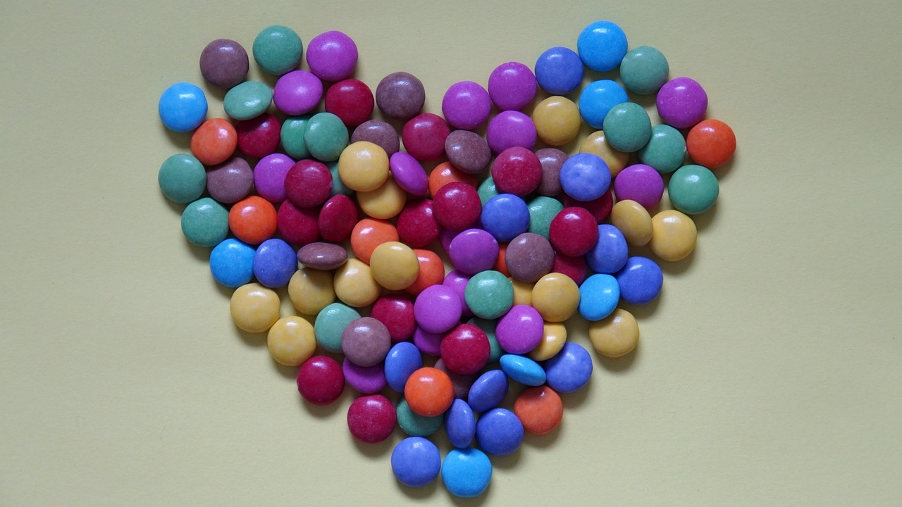
Understanding Color Theory in Painting
Color is more than just a visual element; it’s a language that speaks to our emotions and perceptions. In the world of painting, understanding color theory is essential for artists who wish to convey feelings, create depth, and engage viewers. Imagine walking into a gallery where each painting tells a story not just through its subjects, but through the colors chosen. This article delves into the fundamental concepts of color theory, exploring how colors interact, their emotional impacts, and practical applications in painting to enhance artistic expression.
The journey begins with the color wheel, a circular diagram that organizes colors into a cohesive structure. It’s like a map for artists, helping them navigate the complex relationships between primary, secondary, and tertiary colors. By understanding the wheel, artists can create harmonious palettes that evoke specific emotions and atmospheres. For instance, placing warm colors next to cool ones can create stunning contrasts that draw the eye and invite exploration.
As we dive deeper, we’ll uncover the secrets of color harmony. This refers to the aesthetically pleasing arrangement of colors and is crucial for creating visually engaging compositions. Artists often explore different types of harmony, such as complementary and analogous colors, to enhance their work. Complementary colors, which sit opposite each other on the color wheel, can create vibrant contrasts that add excitement and depth to a painting. On the other hand, analogous colors, which sit next to each other, offer a more serene and cohesive look, perfect for conveying unity in artwork.
Understanding color temperature is another vital aspect of color theory. This concept refers to the perceived warmth or coolness of a color and plays a significant role in setting the mood of a painting. Warm colors like reds and yellows can evoke feelings of energy and excitement, while cool colors like blues and greens often bring about calmness and tranquility. By manipulating these temperatures, artists can effectively create atmospheres that resonate with viewers.
The psychology of color is a fascinating area where art meets science. Different colors can elicit various emotional responses; for example, blue may evoke calmness, while red can stimulate excitement. Artists can leverage this understanding to enhance their narrative and communicate specific feelings and messages through their work. Additionally, colors often carry symbolic meanings across cultures, enriching the viewer's experience and allowing for deeper connections with the artwork.
Finally, the practical applications of color theory in painting are endless. Artists can experiment with various mixing techniques, such as glazing and scumbling, to create unique textures and effects that elevate their work. Moreover, strategically incorporating color into composition can guide the viewer's eye and create a sense of balance. Understanding the placement of color is essential for effective visual storytelling in art.
In summary, color theory is a powerful tool that every artist should embrace. By understanding how colors interact, their emotional impacts, and practical applications in painting, artists can unlock new levels of expression and creativity. Whether you’re a seasoned painter or just starting your journey, mastering color theory will undoubtedly enhance your artistic endeavors.
- What is the color wheel?
The color wheel is a visual representation of colors arranged in a circular format, showing the relationships between primary, secondary, and tertiary colors. - How do complementary colors work?
Complementary colors are located opposite each other on the color wheel and create a vibrant contrast when used together, enhancing visual interest in artwork. - What are warm and cool colors?
Warm colors (like red and yellow) evoke energy and excitement, while cool colors (like blue and green) tend to create calmness and tranquility. - How can I apply color theory in my paintings?
Experiment with different color combinations, understand their emotional impacts, and use mixing techniques to create unique textures and effects in your artwork.
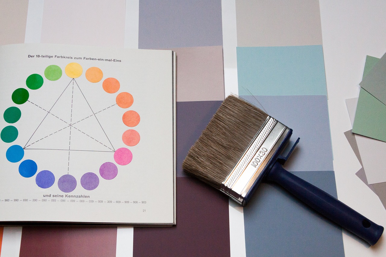
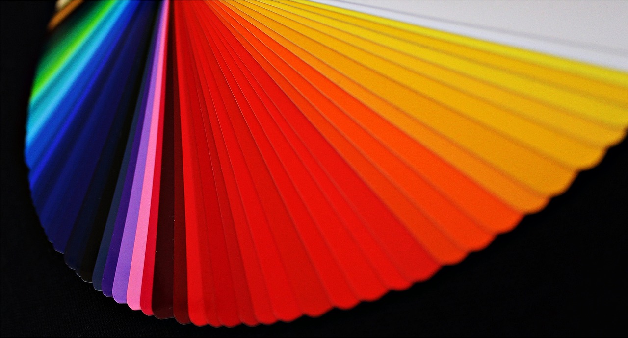
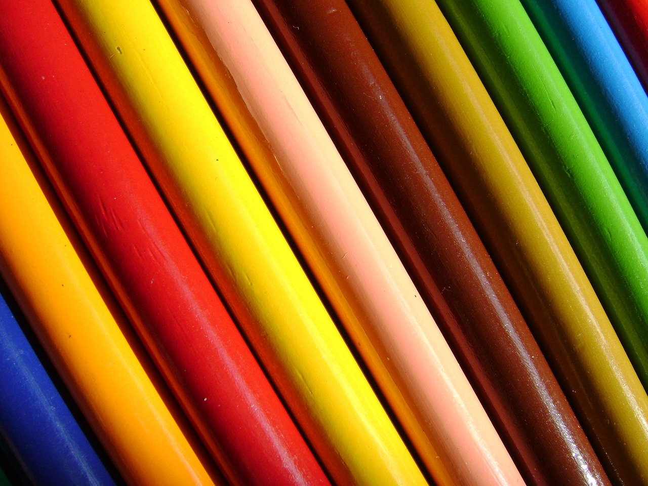
The Color Wheel
The color wheel is more than just a circle of colors; it is a vital tool that helps artists navigate the complex world of color theory. Imagine it as a compass guiding you through the landscape of hues, showing how colors relate to one another. At its core, the color wheel consists of three primary colors: red, blue, and yellow. These colors are like the building blocks of all other colors, and they cannot be created by mixing other colors. From these primary colors, we derive secondary colors—green, orange, and purple—by mixing two primary colors together. For instance, when you blend red and blue, you get purple, while mixing blue and yellow results in green.
But wait, there's more! The color wheel also includes tertiary colors, which are created by mixing a primary color with a secondary color. This results in hues like red-orange or blue-green, adding even more variety to your palette. Each section of the wheel is a vibrant slice of potential, waiting to be explored in your artwork.
One of the most exciting aspects of the color wheel is its ability to help artists create harmonious color palettes. By understanding the relationships between colors, you can create compositions that are visually appealing and emotionally resonant. For example, colors that sit opposite each other on the wheel, known as complementary colors, can create striking contrasts. On the other hand, colors that are next to each other, called analogous colors, can produce a sense of unity and tranquility in your artwork.
To illustrate the relationships between these colors, here’s a simple table:
| Color Type | Examples |
|---|---|
| Primary Colors | Red, Blue, Yellow |
| Secondary Colors | Green, Orange, Purple |
| Tertiary Colors | Red-Orange, Blue-Green, Yellow-Green |
By using the color wheel as your guide, you can experiment with different combinations and discover new ways to express your artistic vision. Whether you're painting a vibrant landscape or a subtle portrait, the color wheel is an essential resource that can help you achieve the desired mood and effect in your artwork. So, next time you pick up your brush, remember the color wheel is there to inspire and guide you through your creative journey!
- What are the primary colors? The primary colors are red, blue, and yellow. They cannot be created by mixing other colors.
- What are complementary colors? Complementary colors are colors that are opposite each other on the color wheel, such as red and green.
- How can I use the color wheel in my painting? The color wheel can help you create harmonious color combinations, understand color relationships, and enhance the emotional impact of your artwork.
- What are analogous colors? Analogous colors are colors that are next to each other on the color wheel, creating a sense of harmony and unity.

Color Harmony
Color harmony is all about creating a visually pleasing arrangement of colors that works together to enhance the overall aesthetic of a painting. Imagine walking into a room painted in a color scheme that feels just right; it’s soothing, inviting, and makes you want to linger. That’s the magic of color harmony! Artists can achieve this effect by understanding the relationships between colors on the color wheel, allowing them to craft compositions that not only look good but also evoke specific feelings and moods.
There are several types of color harmony, each with its unique characteristics and emotional impacts. Some of the most common types include:
- Complementary Harmony: This involves using colors that are opposite each other on the color wheel. The contrast they create can be striking and dynamic, making the artwork pop.
- Analogous Harmony: This type utilizes colors that are next to each other on the wheel, offering a more subtle and cohesive look. It’s perfect for creating serene and unified compositions.
- Triadic Harmony: This approach uses three colors that are evenly spaced around the wheel. It brings a vibrant and balanced feel to the artwork.
Understanding these types of harmony helps artists make informed choices about their color palettes, ensuring that each piece resonates with its intended audience. For instance, a painting using complementary colors might be ideal for conveying excitement or tension, while one with analogous colors could evoke calmness and unity.
Moreover, color harmony isn't just about the colors themselves; it's also about how they interact with one another. For example, a well-balanced composition will guide the viewer’s eye and create a sense of movement throughout the artwork. This is where the artist's skill comes into play, as they must consider not only the colors but also their placement and the overall design of the piece.
Incorporating color harmony into painting is like orchestrating a symphony; each color plays a role, and together they create a beautiful melody that resonates with the viewer. Whether you’re a seasoned artist or just starting out, mastering the art of color harmony can elevate your work to new heights, making it not just visually appealing but also emotionally impactful.
What is color harmony?
Color harmony refers to the aesthetically pleasing arrangement of colors in a composition, allowing them to work together to create a unified and engaging visual experience.
Why is color harmony important in painting?
Color harmony is crucial because it enhances the visual appeal of a painting, evokes emotions, and helps convey the artist's message more effectively.
How can I achieve color harmony in my artwork?
You can achieve color harmony by understanding the relationships between colors on the color wheel and experimenting with different types of color schemes, such as complementary, analogous, or triadic combinations.
Can I break the rules of color harmony?
Absolutely! While understanding color harmony is important, art is also about personal expression. Feel free to experiment and find what resonates with you and your audience.

Complementary Colors
Complementary colors are like the perfect dance partners of the color wheel, positioned directly opposite each other. Think of them as yin and yang in the world of hues. When placed side by side, they create vibrant contrasts that can make any painting pop with life and energy. Imagine a bright orange sunset against a deep blue sky; the two colors not only coexist but also enhance each other's beauty, drawing the viewer's eye and creating a sense of drama. This striking interplay can evoke strong emotional responses, making complementary colors a powerful tool for artists.
Using complementary colors effectively can transform a mundane piece into something extraordinary. For instance, in a landscape painting, an artist might use a rich green for the trees and a vibrant red for the flowers. The result? A visual feast that captures the viewer's attention and evokes feelings of warmth and vitality. This technique can also be used to create depth in a painting, as the contrasting colors can help to define shapes and forms, making them stand out against one another.
However, the magic doesn’t stop there. When mixed, complementary colors neutralize each other, producing muted tones that can be used to create shadows or add depth without overwhelming the composition. For example, mixing blue and orange can yield a range of browns and grays, which are perfect for adding subtlety to a painting. This technique allows artists to maintain a harmonious palette while still achieving the necessary dimensionality in their work.
In summary, complementary colors are essential for any artist looking to elevate their paintings. By understanding how these colors interact, artists can create compositions that not only capture attention but also convey deeper emotional narratives. So next time you're planning your color palette, consider how these opposites can work together to create something truly spectacular!
- What are complementary colors? Complementary colors are pairs of colors that are located directly opposite each other on the color wheel, such as red and green or blue and orange.
- How can I use complementary colors in my paintings? You can use complementary colors to create contrast and draw attention to focal points in your artwork. They can also be mixed to create neutral tones for shadows.
- What is the effect of using complementary colors? Using complementary colors can evoke strong emotional responses and enhance the visual interest of your paintings, creating a dynamic and engaging composition.
- Can complementary colors be used in any type of artwork? Yes, complementary colors can be applied in various forms of art, including painting, graphic design, and photography, to create striking visuals.

Effects of Complementary Colors
Complementary colors are like the dynamic duo of the color wheel, always ready to create a visual spectacle. When these colors are placed side by side, they don't just coexist; they dance together, producing vibrant contrasts that can make any artwork pop. Imagine the electric energy of orange against blue or the fiery passion of red next to green. This juxtaposition can elicit strong emotional responses from viewers, drawing their eyes to focal points in the artwork and creating a sense of depth that can be quite captivating.
One of the most remarkable effects of using complementary colors is their ability to enhance visual interest. When you use these colors in your paintings, you're not just slapping on some paint; you're creating a dialogue between hues that can evoke feelings of excitement, tension, or even harmony. For instance, a painting that features a bold splash of yellow against a deep purple backdrop can create a striking visual experience that feels alive and engaging.
Moreover, complementary colors can serve as a powerful tool for artists looking to convey specific messages or moods. The contrast between these colors can highlight important elements within a composition, making them stand out and ensuring that they capture the viewer's attention. Think of it as a spotlight effect, where the complementary colors work together to illuminate the focal point of your artwork.
However, the effects of complementary colors extend beyond mere visual appeal. When mixed, these colors create neutral tones, which can be incredibly useful for adding shadows and depth to your paintings. This blending allows artists to maintain a balanced composition without overwhelming it with too much color. It's like seasoning in cooking; a little bit goes a long way in enhancing the overall flavor of the dish.
In summary, the effects of complementary colors are multifaceted. They can:
- Evoke strong emotional responses
- Create vibrant contrasts that enhance visual interest
- Highlight focal points in compositions
- Produce neutral tones for shadows and depth
By understanding and utilizing these effects, artists can elevate their work to new heights, transforming simple canvases into powerful visual narratives that resonate with viewers.
- What are complementary colors? Complementary colors are pairs of colors that are opposite each other on the color wheel, such as red and green or blue and orange.
- How do complementary colors affect a painting? They create vibrant contrasts, draw attention to focal points, and can evoke strong emotional responses from viewers.
- Can complementary colors be mixed? Yes, when mixed, complementary colors produce neutral tones that can be used for shadows and adding depth to a painting.
- Why are complementary colors important in art? They help create visual interest, enhance compositions, and allow artists to convey specific moods and messages.
Mixing Complementary Colors
Mixing complementary colors is an essential skill for any artist looking to enhance their palette and create depth in their paintings. When you mix colors that are opposite each other on the color wheel, such as blue and orange or red and green, you create a neutral tone. This neutralization can be incredibly useful for various aspects of your artwork. Imagine you're painting a vibrant sunset; instead of using pure orange, mixing in a bit of blue can help tone it down, making it more realistic and visually appealing.
But how does this work in practice? When you combine two complementary colors, you're not just creating a dull shade; you're also adding complexity to your work. The resulting neutral tones can serve multiple purposes:
- Shadows: Neutral colors can effectively represent shadows, giving your painting depth without overwhelming the viewer with bright colors.
- Backgrounds: These tones can also be used for backgrounds, allowing the focal colors to pop even more.
- Balance: Mixing complementary colors helps in achieving a balanced composition, ensuring that no one part of the painting overshadows another.
For instance, if you’re working on a portrait and want to depict realistic skin tones, you might start with a base of yellow and add a touch of purple (its complementary color) to mute the brightness. This technique not only creates a more lifelike skin tone but also adds depth to the overall composition. Furthermore, understanding how to mix complementary colors allows you to control the vibrancy of your artwork. It’s like having a secret weapon in your artistic arsenal!
In conclusion, mastering the art of mixing complementary colors can transform your paintings from ordinary to extraordinary. It allows you to create nuanced tones, add depth, and maintain harmony within your compositions. So the next time you pick up your brush, remember that the magic lies not just in the colors you choose but in how you mix them!
- What are complementary colors? Complementary colors are pairs of colors that are opposite each other on the color wheel, such as red and green or blue and orange.
- How do I use complementary colors in my painting? You can use complementary colors to create contrast, enhance vibrancy, or to mix neutral tones for shadows and backgrounds.
- Can mixing complementary colors create new colors? Yes, mixing complementary colors will create neutral tones, but you can also experiment to discover unique shades that can enhance your artwork.

Analogous Colors
Analogous colors are a delightful trio of colors that sit next to each other on the color wheel. Think of them as the best friends of the color world; they share similar hues and create a sense of harmony and unity in your artwork. When you paint with analogous colors, you’re essentially creating a visual symphony that resonates with the viewer, evoking feelings of peace and tranquility. For instance, if you select blue, blue-green, and green, you can produce a serene landscape that feels cohesive and inviting.
One of the most beautiful aspects of using analogous colors is their ability to create depth and dimension without overwhelming the viewer. When artists use these colors, they can transition smoothly between shades, allowing the eye to flow naturally across the canvas. This technique is particularly effective in landscapes, where a gradual shift from one color to another can mirror the subtleties of nature. Imagine a sunset where the sky transitions from warm oranges to soft pinks and finally to deep purples; this is the magic of analogous colors at work.
Moreover, using analogous colors can help convey specific moods in your painting. For example, a palette of warm colors, like reds, oranges, and yellows, can evoke feelings of warmth and energy, making your artwork feel lively and vibrant. On the other hand, a combination of cool colors, such as blues, greens, and purples, can create a calming effect, perfect for serene scenes like oceans or forests.
When selecting analogous colors, it’s essential to consider their dominance in your composition. You might want to choose one color as the primary hue and use the other two as accents. This strategy allows you to maintain a focal point while still enjoying the harmonious benefits of the color scheme. For instance, if you decide to paint a lush garden, you could use a dominant green, with soft touches of yellow-green and blue-green to add depth and interest.
In summary, analogous colors are a powerful tool in an artist's arsenal. They not only enhance the visual appeal of a painting but also allow for emotional expression and storytelling. So, the next time you pick up your brush, consider reaching for colors that sit side by side on the wheel. You might just find that they create the perfect atmosphere for your artistic vision!
- What are analogous colors? Analogous colors are groups of three colors that are next to each other on the color wheel, creating a harmonious look.
- How do I choose analogous colors for my painting? Select one color as your dominant hue, then choose the two adjacent colors as accents to create a balanced composition.
- Can I use more than three colors in an analogous scheme? While three colors are standard, you can include more shades for variation, but be cautious not to overwhelm the composition.
- What is the mood created by analogous colors? Depending on whether you choose warm or cool colors, analogous schemes can evoke feelings of energy, tranquility, or harmony.

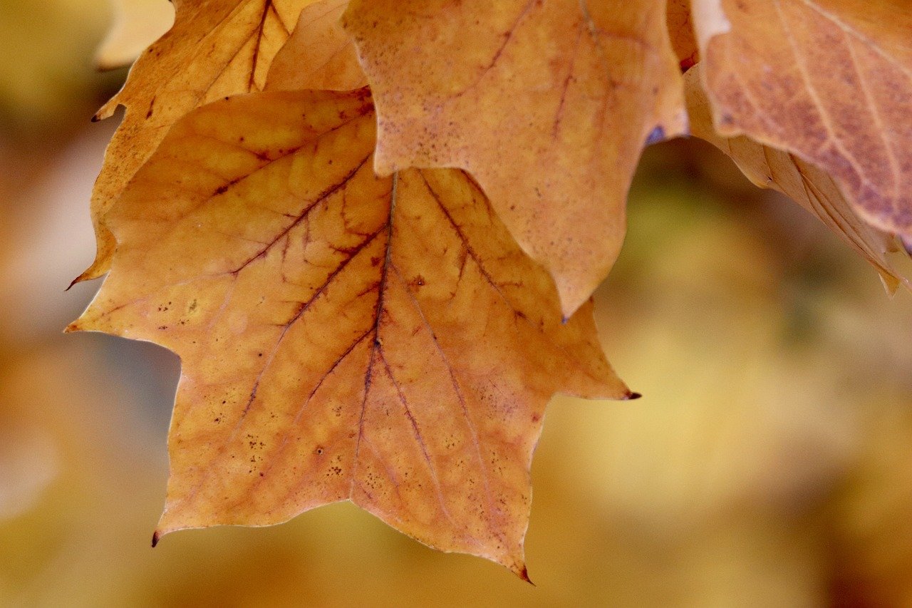
Color Temperature
Color temperature is a fascinating concept that refers to the perceived warmth or coolness of a color. It’s like the mood ring of the color world, where some hues radiate warmth while others evoke a sense of chill. Understanding this concept allows artists to manipulate mood and atmosphere in their paintings effectively. When you think of warm colors, what comes to mind? Perhaps the fiery reds and vibrant yellows that make you feel energized and alive. On the other hand, cool colors like tranquil blues and greens might remind you of a serene lake on a calm day. This ability to evoke feelings through color is an essential skill for any artist.
Warm colors, such as reds, oranges, and yellows, are often associated with energy, passion, and excitement. They can create a sense of urgency and draw the viewer's eye to a focal point in a composition. Imagine walking into a room painted in warm tones; you’re immediately enveloped in a cozy embrace that sparks your creativity. Artists can use these colors to create dynamic compositions that are visually engaging and emotionally charged. For instance, a painting featuring a vibrant sunset can evoke feelings of warmth and nostalgia, transporting viewers to a moment in time.
In contrast, cool colors, including blues, greens, and purples, tend to evoke calmness and tranquility. These colors are often used in landscapes to create depth and distance, making the viewer feel as though they are stepping into a peaceful scene. Think about a serene beach with soft blue waters and gentle green palm trees; the cool colors work harmoniously to create a sense of relaxation. Artists can leverage these hues to establish a soothing atmosphere, inviting viewers to pause and reflect on the beauty of the moment.
To illustrate the differences in color temperature, consider the following table:
| Color Temperature | Color Examples | Emotional Associations |
|---|---|---|
| Warm Colors | Red, Orange, Yellow | Energy, Passion, Excitement |
| Cool Colors | Blue, Green, Purple | Calmness, Tranquility, Serenity |
Understanding color temperature is crucial for artists as it allows them to create a desired mood and atmosphere in their paintings. By thoughtfully choosing warm or cool colors, artists can guide the viewer's emotional journey through their artwork. For example, an artist might choose warm colors for a lively street scene to convey the hustle and bustle of city life, while opting for cool colors in a landscape to evoke a sense of peace and quiet. This strategic use of color temperature not only enhances the visual storytelling but also enriches the overall viewer experience.
Ultimately, color temperature is more than just a technical aspect of painting; it’s a powerful tool for expression. By mastering the interplay of warm and cool colors, artists can transform their work into a vibrant narrative that resonates with viewers on a deeper level. So next time you're picking up your brush, ask yourself: what mood do I want to convey? The answer may just lie in the warmth or coolness of the colors you choose.
- What is color temperature in painting?
Color temperature refers to the perceived warmth or coolness of a color, influencing the mood and atmosphere of a painting. - How do warm colors affect a painting?
Warm colors like reds and yellows evoke energy and excitement, drawing attention to focal points in the artwork. - What emotions do cool colors convey?
Cool colors such as blues and greens evoke feelings of calmness and tranquility, often creating a serene atmosphere. - Can I mix warm and cool colors in a painting?
Absolutely! Mixing warm and cool colors can create dynamic contrasts and enhance the depth and interest of your artwork.

Warm Colors
Warm colors, such as reds, oranges, and yellows, are often associated with feelings of energy, excitement, and passion. These colors can transform a painting, drawing the viewer in and evoking strong emotional responses. Imagine walking into a room painted in bright yellows and fiery reds; you can almost feel the warmth radiating from the walls, igniting a sense of enthusiasm and vigor. In the world of painting, warm colors serve as a powerful tool for artists, allowing them to create dynamic focal points that capture attention and convey feelings of warmth and vitality.
When artists incorporate warm colors into their compositions, they often aim to create a sense of movement or action. For instance, a landscape painted with vibrant oranges and yellows can evoke the feeling of a sunset, filling the viewer with a sense of nostalgia or longing. Similarly, using warm colors in a still life can emphasize the freshness of fruits or flowers, making them appear more inviting and lively. The key lies in how these colors are balanced with cooler tones, which can help to enhance their vibrancy even further.
Another interesting aspect of warm colors is their ability to advance in a composition. This means that warm colors tend to come forward in a painting, creating a sense of closeness or intimacy. For example, a warm red apple placed against a cooler blue background will immediately draw the viewer’s eye, making the apple appear more prominent. This principle is crucial for artists who want to guide the viewer's gaze towards specific elements within their work.
Here’s a quick breakdown of the emotional impacts associated with some common warm colors:
| Color | Emotional Impact |
|---|---|
| Red | Excitement, Passion, Love |
| Orange | Joy, Creativity, Enthusiasm |
| Yellow | Happiness, Energy, Optimism |
In conclusion, warm colors are not just mere pigments on a palette; they are emotional catalysts that can transform a simple painting into a vibrant narrative. Whether an artist is aiming to convey warmth, excitement, or dynamic movement, the strategic use of warm colors can significantly enhance the overall impact of their artwork. So next time you pick up a brush, consider how you can harness the power of warm colors to breathe life into your creations!
- What are warm colors? Warm colors include reds, oranges, and yellows, which evoke feelings of energy and warmth.
- How do warm colors affect a painting? They can create dynamic focal points, evoke strong emotions, and make elements appear closer to the viewer.
- Can warm colors be used with cool colors? Yes, combining warm and cool colors can create balance and enhance visual interest in a painting.

Cool Colors
When you think of cool colors, what comes to mind? You might picture the serene blues of a tranquil ocean or the lush greens of a peaceful forest. , such as blues, greens, and purples, are often associated with calmness, tranquility, and even sadness. These colors can transport viewers to a place of relaxation, making them essential tools for artists who want to evoke specific feelings in their work.
Using cool colors in your paintings can create a sense of depth and distance, especially in landscapes. For instance, when an artist paints a sunset, incorporating cool blues and greens in the background can enhance the perception of space, making the foreground elements pop even more. This technique is akin to layering a delicate veil over a vibrant tapestry, allowing the viewer to appreciate the complexity of the scene.
One of the fascinating aspects of cool colors is their ability to influence the mood of a painting. Here are some emotions often associated with cool colors:
- Blue: Evokes feelings of calmness and serenity. It's often used to represent peace or sadness.
- Green: Represents nature and growth, often associated with renewal and tranquility.
- Purple: Can evoke a sense of luxury or creativity but can also be associated with mystery and introspection.
Incorporating these colors into your artwork doesn't just enhance the visual appeal; it also invites the viewer to experience the emotions you wish to convey. Imagine a painting of a cool, misty morning; the use of soft blues and muted greens can make the viewer feel as if they are standing right there, breathing in the fresh air. This emotional connection is what makes art so powerful.
Moreover, cool colors can be used strategically to create contrast. When paired with warm colors, they can highlight specific areas of a painting. For example, a vibrant orange sun setting against a cool blue sky can create a stunning visual impact, drawing the viewer's eye to the focal point. This interplay of colors is not just about aesthetics; it's about storytelling. The colors you choose can guide the viewer through the narrative you wish to express.
In conclusion, cool colors are more than just hues on a palette; they are vital elements that can shape the emotional landscape of your artwork. By understanding how to use them effectively, you can create paintings that not only please the eye but also resonate deeply with the viewer's feelings and experiences.
- What are cool colors? Cool colors are shades that evoke a sense of calmness and tranquility, including blues, greens, and purples.
- How do cool colors affect mood in art? Cool colors can create feelings of serenity, sadness, or introspection, influencing how viewers perceive the artwork.
- Can cool colors be used effectively with warm colors? Yes, using cool colors alongside warm colors can create striking contrasts and enhance the overall composition of a painting.
The Psychology of Color
The psychology of color is a fascinating field that examines how colors can influence our emotions, behaviors, and perceptions. It's almost like colors have their own language, speaking to us in ways that words sometimes cannot. For artists, understanding this language is crucial, as it allows them to convey specific feelings and messages through their work. Imagine walking into a room painted in soft blues and greens; you might instantly feel a sense of calm and tranquility. Conversely, a space filled with vibrant reds and oranges can ignite feelings of energy and excitement. This emotional response to color is not merely subjective; it is rooted in psychological principles that can be leveraged effectively in artistic expression.
Different colors evoke various emotional responses, and these associations can vary across cultures. For instance, while blue often symbolizes calmness and stability in Western cultures, it can also represent sadness. On the other hand, red is frequently associated with passion and love, but it can also signify danger or aggression. This duality adds layers of complexity to how artists can use color to enhance their narrative. By tapping into these emotional triggers, an artist can guide the viewer's experience, making their artwork not just visually appealing but also deeply resonant.
To illustrate the emotional impact of colors, consider the following table that summarizes common emotional associations with various colors:
| Color | Emotional Associations |
|---|---|
| Red | Passion, Energy, Anger |
| Blue | Calmness, Trust, Sadness |
| Yellow | Happiness, Optimism, Caution |
| Green | Growth, Harmony, Envy |
| Purple | Luxury, Mystery, Spirituality |
As you can see, colors can carry significant weight in the messages they communicate. Artists can use this knowledge to create a specific mood or atmosphere in their paintings. For example, a landscape bathed in warm yellows and oranges might evoke a sunset's warmth, inviting the viewer to feel a sense of nostalgia or joy. In contrast, a painting dominated by cool blues and grays might transport the viewer to a serene winter scene, invoking feelings of calmness and reflection.
Furthermore, color symbolism can add an additional layer of meaning to an artwork. Artists can incorporate colors that hold specific cultural significance to convey deeper themes. For instance, white often symbolizes purity in many cultures, while black can represent mourning or elegance. By understanding and utilizing these associations, artists can enrich their storytelling, allowing viewers to engage with the artwork on multiple levels.
In conclusion, the psychology of color is an essential aspect of painting that artists must consider. By understanding how colors affect emotions and perceptions, they can create more impactful and meaningful works. Whether it's through the energetic vibrancy of red or the calming coolness of blue, colors have the power to evoke feelings, tell stories, and connect with viewers in profound ways.
- How do colors affect emotions?
Colors can evoke specific emotional responses based on cultural associations and psychological principles. For example, warm colors like red and yellow can create feelings of excitement, while cool colors like blue and green tend to evoke calmness. - Can color symbolism vary across cultures?
Yes, color symbolism can differ significantly between cultures. For instance, while white is often associated with purity in Western cultures, it can symbolize mourning in some Eastern cultures. - How can artists use color psychology in their work?
Artists can leverage color psychology to enhance the emotional impact of their artwork by choosing colors that align with the feelings they wish to convey, thus guiding the viewer's emotional experience.
Emotional Responses to Colors
Colors are not just visual stimuli; they are powerful emotional triggers that can influence our feelings and behaviors in profound ways. Think about the last time you walked into a room painted in a soft blue—didn't you feel a wave of calm wash over you? This is the essence of color psychology, where different hues can elicit a wide range of emotional responses. Understanding these reactions can be a game-changer for artists, enabling them to convey messages and feelings through their work more effectively.
For instance, warm colors, such as red, orange, and yellow, are often associated with feelings of energy, passion, and warmth. When you see a bright red painting, it might evoke excitement or even anger. On the other hand, cool colors, like blue, green, and purple, tend to create a sense of calmness, serenity, and even sadness. Imagine a landscape painting dominated by cool greens and blues; it might transport you to a peaceful forest or a tranquil sea, making you feel relaxed and at ease.
Here's a quick breakdown of how various colors can impact emotions:
| Color | Emotional Response |
|---|---|
| Red | Passion, excitement, anger |
| Blue | Calmness, sadness, tranquility |
| Yellow | Happiness, optimism, energy |
| Green | Growth, harmony, freshness |
| Purple | Luxury, creativity, mystery |
Artists can leverage these emotional responses by carefully selecting their color palettes to align with the feelings they want to evoke. For example, if an artist aims to create a sense of warmth and comfort, they might choose a palette rich in warm tones. Conversely, if they want to convey a sense of melancholy or introspection, cooler hues might be more appropriate. This intentional use of color can transform a simple painting into a powerful narrative that resonates deeply with viewers.
Moreover, the context in which colors are used can amplify their emotional impact. A vibrant red in a chaotic scene might evoke feelings of anger or urgency, while the same color in a serene landscape could symbolize warmth and love. This interplay between color, context, and emotion is what makes the study of color responses so fascinating and essential for artists.
Ultimately, mastering the emotional responses to colors allows artists not only to enhance their visual storytelling but also to connect with their audience on a deeper level. By understanding how colors can influence emotions, artists can create pieces that not only capture the eye but also touch the heart.
- How do colors affect mood? Colors can significantly influence our mood and emotions, with warm colors often evoking energy and excitement, while cool colors can create feelings of calmness and tranquility.
- Can the same color evoke different emotions? Yes, the emotional response to a color can vary based on its context, surrounding colors, and personal experiences.
- How can I use color in my art to convey emotion? By understanding the psychological effects of colors, you can choose a palette that reflects the emotions you want to express in your artwork.
Color Symbolism
Color symbolism is a fascinating aspect of color theory that delves into the meanings and associations that different colors hold across various cultures and contexts. Understanding color symbolism allows artists to convey deeper messages and themes within their artwork, enriching the viewer's experience and emotional response. For instance, the color red is often associated with passion, love, and even anger. In contrast, blue typically evokes feelings of calmness, trust, and serenity. These associations can change dramatically depending on cultural interpretations and personal experiences.
To illustrate this concept further, let’s look at some common colors and their symbolic meanings:
| Color | Symbolism |
|---|---|
| Red | Passion, Love, Anger |
| Blue | Calmness, Trust, Sadness |
| Yellow | Happiness, Optimism, Caution |
| Green | Nature, Growth, Fertility |
| Purple | Royalty, Luxury, Mystery |
| Black | Elegance, Power, Mourning |
| White | Purity, Innocence, Simplicity |
Artists can utilize these symbolic meanings to enhance the narrative of their work. For example, a painting that prominently features blue hues might suggest a theme of tranquility or introspection, inviting the viewer to reflect on their inner thoughts. Conversely, incorporating vibrant reds can evoke a sense of urgency and emotion, compelling the audience to engage with the artwork on a visceral level. It's crucial to remember that while these associations can guide artists, the personal interpretation of colors can vary significantly from person to person.
Moreover, the context in which colors are used also plays a vital role in their symbolism. A red rose may symbolize romantic love, while a red stop sign conveys a completely different message—one of caution and alertness. Thus, artists must consider not only the colors they choose but also how they interact with one another and the overall message they wish to communicate. By thoughtfully applying color symbolism, artists can create works that resonate deeply with viewers, making their art not only visually appealing but also rich in meaning.
- What is color symbolism? Color symbolism refers to the meanings and associations that different colors hold, influencing how viewers perceive and emotionally react to artwork.
- How can artists use color symbolism in their work? Artists can use color symbolism to enhance the narrative and emotional impact of their paintings, guiding the viewer's response through strategic color choices.
- Do color meanings vary across cultures? Yes, color meanings can vary significantly between cultures, making it important for artists to consider their audience when choosing colors.

Practical Applications of Color Theory
When it comes to painting, understanding the is like having a secret weapon in your artistic arsenal. It's not just about slapping on paint; it's about making intentional choices that enhance your artwork and convey the right emotions. Whether you're a budding artist or a seasoned pro, mastering these applications can truly elevate your work. So, how do we take this theory off the page and into our paintings?
First off, let’s talk about color mixing techniques. This is where the magic happens! Techniques like glazing and scumbling allow you to layer colors and create depth. For instance, glazing involves applying a transparent layer of paint over a dry layer, which can create luminous effects and enhance the richness of colors. Scumbling, on the other hand, involves brushing a lighter, opaque color over a darker one, allowing the underpainting to show through. This technique can add texture and complexity, making your artwork come alive. Here’s a quick comparison of these techniques:
| Technique | Description | Effect |
|---|---|---|
| Glazing | Applying transparent layers of paint | Creates luminosity and depth |
| Scumbling | Brushing a lighter color over a darker one | Adds texture and complexity |
Next, let’s dive into the role of color in composition. Think of your painting as a story; the colors you choose can guide the viewer’s eye and set the emotional tone. For example, using a dominant color can create a focal point, while a well-balanced palette can lead the viewer through the piece. It’s like a visual roadmap that helps your audience navigate the narrative you’re presenting.
To effectively use color in your composition, consider the following strategies:
- Contrast: Use contrasting colors to highlight key areas. This can draw attention to important elements in your artwork.
- Balance: Distribute colors evenly throughout the piece to create a sense of harmony. Too much of one color can overwhelm the viewer.
- Unity: Stick to a cohesive color scheme to ensure that all elements of your painting work together seamlessly.
Incorporating these strategies not only enhances the visual appeal of your work but also deepens the emotional connection with your audience. Imagine painting a sunset; using warm colors near the horizon and cool colors above can create a stunning transition that evokes feelings of peace and wonder.
Lastly, don’t forget to experiment! The beauty of color theory is that it’s not a strict set of rules; it’s more of a guide. Try mixing colors in unexpected ways, or apply different techniques to see what resonates with you. Remember, art is about expression, and your unique approach to color can set your work apart.
Q: How can I choose a color palette for my painting?
A: Start by selecting a dominant color that reflects the mood you want to convey. Then, choose complementary or analogous colors to create balance and harmony.
Q: What is the best way to practice color mixing?
A: Experiment with different ratios of colors on a palette. Try creating a color wheel or mixing colors to achieve various shades and tones. The more you practice, the more intuitive it will become.
Q: Can color theory help in other art forms?
A: Absolutely! Color theory is applicable in various forms of art, including graphic design, photography, and even fashion. Understanding how colors interact can enhance your work across different mediums.
Mixing Techniques
When it comes to painting, mastering can truly transform your artwork. Just think of mixing colors as a chef blending spices to create a unique dish; the right combination can elevate your painting from ordinary to extraordinary. There are several techniques that artists use to achieve stunning effects, and understanding these methods can help you express your artistic vision more effectively.
One of the most popular mixing techniques is glazing. This method involves applying a thin, transparent layer of paint over a dry layer. The result? A beautiful depth and luminosity that can make your work pop. Imagine the way light filters through leaves in a forest; glazing can replicate that stunning effect, allowing underlying colors to shine through while adding a new hue on top. To achieve a successful glaze, it’s important to use a medium that slows down drying time, such as linseed oil or a commercial glazing medium.
Another technique that deserves attention is scumbling. This involves applying a layer of lighter, opaque paint over a dry layer of darker paint using a dry brush. The technique creates a textured effect that allows the underpainting to show through, adding complexity to your artwork. Think of it as adding a sprinkle of powdered sugar on a cake; it enhances the overall look without overpowering the base flavor. Scumbling is particularly effective for creating highlights and adding dimension to landscapes or textured surfaces.
| Technique | Description | Best Used For |
|---|---|---|
| Glazing | Applying a transparent layer of paint over a dry layer. | Creating depth and luminosity. |
| Scumbling | Applying a lighter, opaque paint with a dry brush over a darker layer. | Adding texture and highlights. |
Additionally, wet-on-wet mixing is a technique that allows colors to blend directly on the canvas while they are still wet. This method can create soft edges and smooth transitions, which are perfect for achieving dreamy landscapes or portraits. Imagine the way colors swirl together in a sunset; wet-on-wet mixing can help you capture that fluidity and movement. However, it requires a bit of practice to control the blending effectively.
Lastly, consider the importance of color theory when mixing. Understanding the relationships between colors can help you make informed decisions about which hues to combine. For instance, mixing warm colors with cool colors can create striking contrasts, while analogous colors can produce a more harmonious effect. Knowledge of complementary colors can also guide you in creating shadows and highlights that enhance the overall composition.
In summary, becoming proficient in mixing techniques is essential for any artist looking to elevate their work. Whether you’re glazing to add depth, scumbling for texture, or blending wet-on-wet for smooth transitions, each technique offers unique possibilities for artistic expression. So grab your brushes and start experimenting! The world of color mixing is waiting for you to explore.
- What is the best way to learn color mixing techniques?
Practice is key! Start by experimenting with different techniques on scrap paper or canvas to see how colors interact. - Can I use any type of paint for mixing techniques?
While most techniques can be applied with acrylics, oils, or watercolors, some methods work better with specific types of paint. For instance, glazing is more commonly used with oils. - How do I know which colors to mix?
Understanding color theory, including the color wheel and color relationships, can guide you in making effective mixing choices.
Color in Composition
When it comes to painting, the way color is used in composition can make or break a piece. Think of color as the thread that weaves together the various elements of your artwork. It’s not just about slapping on some paint; it’s about creating a visual journey for your audience. By strategically placing colors within your composition, you can lead the viewer’s eye, create focal points, and evoke specific emotions. Just like a conductor leads an orchestra, the artist uses color to harmonize the various components of the painting.
One effective way to think about color in composition is through the concept of balance. Imagine a seesaw; if one side is heavier, it tips over. Similarly, in art, if one color dominates the composition without any counterbalance, it can feel off-kilter. To achieve balance, consider using a color wheel to determine how different colors interact. For instance, placing a bold red next to a soft green can create a dynamic tension that draws the eye. This is where the understanding of complementary colors really shines.
Another essential aspect of color in composition is the idea of focal points. These are areas in your painting that you want to highlight, and color plays a crucial role here. By using a bright color against a more muted background, you can create a natural focal point that captures attention. For example, if your painting features a serene landscape, adding a splash of vibrant orange in the sky during sunset can create a stunning focal point that invites the viewer to explore the rest of the piece.
Moreover, the placement of colors can also create a sense of depth. Warm colors tend to come forward, while cool colors recede. This principle can be utilized to create layers within your artwork, adding dimension and intrigue. For instance, in a landscape painting, you might use warm yellows and reds in the foreground to draw the viewer in, while cooler blues and greens can be applied in the background to suggest distance.
Incorporating color into your composition isn’t just about aesthetics; it’s also about storytelling. Different colors can evoke different emotions, and by using them thoughtfully, you can enhance the narrative of your painting. For example, a painting that uses dark blues and blacks can convey feelings of sadness or solitude, while bright yellows and pinks might evoke joy and warmth. The emotional impact of color can create a connection between the artwork and the viewer, making the experience more profound.
To summarize, mastering the use of color in composition involves understanding balance, creating focal points, suggesting depth, and telling a story. It’s a delicate dance that requires practice and experimentation. So, grab your brushes and start playing with colors! After all, art is about exploration and expressing your unique vision.
- What is the importance of color in composition?
Color helps create balance, focal points, depth, and emotional impact in artwork. - How can I create a focal point using color?
Use a vibrant color against a muted background to draw attention to specific areas of your painting. - What are complementary colors?
Complementary colors are those that are opposite each other on the color wheel, and they create a vibrant contrast when used together. - How does color influence the mood of a painting?
Different colors evoke different emotions, so careful selection can enhance the narrative and emotional impact of your artwork.
Frequently Asked Questions
- What is the color wheel and why is it important?
The color wheel is a visual representation of colors arranged according to their chromatic relationship. It's crucial for artists because it helps them understand how colors interact, allowing for the creation of harmonious color palettes. By using the color wheel, artists can easily identify complementary, analogous, and triadic colors, which are essential for achieving balance and visual interest in their paintings.
- How do complementary colors affect a painting?
Complementary colors, which are located opposite each other on the color wheel, create vibrant contrasts that can enhance visual interest and depth in a painting. When used together, they can evoke strong emotional responses, drawing the viewer's attention to focal points in the artwork. This dynamic interplay can make elements of the painting pop, adding excitement and energy to the overall composition.
- What are analogous colors and when should I use them?
Analogous colors are those that are next to each other on the color wheel. They create a serene and harmonious look, making them perfect for conveying unity and cohesion in a painting. Artists often use analogous colors to establish a mood or to create a smooth transition between different elements in their work, which can enhance the overall storytelling aspect of the piece.
- What is color temperature, and how does it influence a painting?
Color temperature refers to the warmth or coolness of a color. Warm colors like reds and yellows can evoke feelings of energy and excitement, while cool colors such as blues and greens tend to create a sense of calmness and tranquility. By understanding color temperature, artists can effectively manipulate mood and atmosphere in their paintings, guiding the viewer's emotional response.
- How can I use color psychology in my artwork?
Color psychology explores how colors influence emotions and behaviors. Different colors can elicit various emotional reactions; for example, blue may evoke calmness, while red can stimulate excitement. By leveraging these associations, artists can enhance their narrative and communicate specific feelings or messages through their work, ultimately enriching the viewer's experience.
- What are some practical techniques for mixing colors?
Learning various mixing techniques, such as glazing and scumbling, allows artists to create unique textures and effects in their paintings. Glazing involves applying thin layers of transparent paint over dried layers, while scumbling involves brushing on a thin, opaque layer of paint. These techniques can enhance the overall impact of the artwork and contribute to a more dynamic visual storytelling experience.
- How does color placement affect composition in painting?
Strategically incorporating color into composition is vital for guiding the viewer's eye and creating a sense of balance. Understanding how to place colors effectively can lead to more engaging artwork. For instance, using brighter colors to draw attention to focal points or employing a balanced distribution of warm and cool colors can enhance the visual storytelling and emotional impact of the painting.


