
Drawing with Pastels: Techniques and Tips
Are you ready to dive into the vibrant world of pastels? Drawing with pastels can be an incredibly rewarding experience, allowing you to unleash your creativity and express your artistic vision. Whether you're a beginner looking to explore this medium or an experienced artist seeking to refine your skills, mastering pastel drawing techniques is essential. In this article, we’ll explore various methods and practical advice that will help you enhance your artistic skills and creativity. From understanding the different types of pastels to mastering blending techniques, we’ll cover everything you need to know to create stunning pastel artworks.
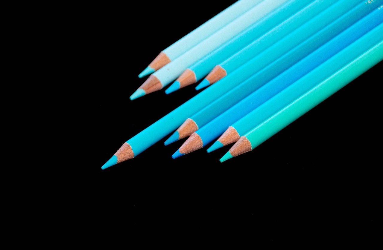
Before you can become a pastel pro, it’s crucial to familiarize yourself with the different types of pastels available. There are four main types: soft pastels, hard pastels, oil pastels, and pastel pencils. Each type has its own unique characteristics that can influence your drawing style and technique. Soft pastels, for example, are known for their vibrant colors and smooth application, making them perfect for blending and layering. On the other hand, hard pastels are firmer and provide more control, ideal for fine details and crisp lines. Oil pastels, with their creamy texture, allow for a different approach, enabling you to create rich, textured effects. Lastly, pastel pencils offer precision for detailed work, combining the convenience of a pencil with the vibrant colors of pastels.
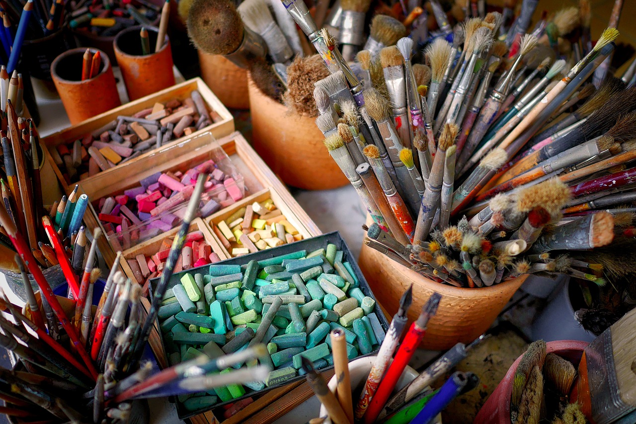
Now that you know about the different types of pastels, let’s talk about the essential tools every pastel artist should have in their arsenal. The right tools can significantly enhance your pastel artwork and improve your overall drawing experience. Here’s a quick rundown:
- Paper: Choosing the right paper is crucial for pastel drawing.
- Blending tools: Tools like blending stumps, tortillons, or even your fingers can help you achieve smooth transitions and textures.
- Fixatives: These are essential for preserving your artwork and preventing smudging.
When it comes to pastel drawing, the choice of paper can make or break your artwork. Different paper types come with varying textures and weights, which can affect how pastels adhere and blend. For instance, textured paper is fantastic for building up layers and creating depth, while smooth paper allows for more control and detailed work. It’s worth experimenting with both to see which suits your style best.
Textured paper has a rough surface that grabs onto the pastel particles, allowing for rich layering and blending. This type of paper is perfect for creating soft, painterly effects. In contrast, smooth paper offers a sleek surface that is ideal for fine lines and detailed work. Think of it as the difference between painting with a brush versus using a fine pen — both can produce beautiful results, but the techniques and outcomes vary significantly.
The color of your paper can also influence the overall composition of your artwork. Light-colored papers can make pastel colors appear brighter, while darker papers can create dramatic contrasts. This choice can set the mood for your piece, much like choosing a backdrop for a stage performance. So, consider the emotional impact you want your artwork to convey when selecting your paper color.
Blending is where the magic happens in pastel drawing. There are several techniques you can use to achieve different textures and effects. Finger blending is a popular method, allowing you to use your fingers to smudge and mix colors directly on the paper. This technique can create soft transitions and a more organic feel. Alternatively, using blending stumps or tortillons can provide more precision, giving you the ability to control the blending process better. For those looking to experiment, wet blending involves dampening the pastels with a brush and water, resulting in a unique, painterly effect that can add depth to your work.
One of the key aspects of pastel drawing is layering. By building up layers of color, you can create depth and dimension in your artwork. Start with a base layer that sets the foundation for your drawing. This initial layer can be a light wash of color that will support the subsequent layers. As you add more colors, think about how they interact with each other, creating highlights and shadows that bring your subject to life.
Beginning with a base layer is like laying the groundwork for a house. It establishes a solid foundation for everything that follows. This layer doesn’t have to be perfect; it’s simply a starting point. As you add more colors and details, you can refine your drawing, gradually building up the richness and complexity of your artwork.
Incorporating highlights and shadows is essential for creating a realistic representation of your subject. Think of highlights as the sparkle in someone’s eye or the sun catching the edge of a leaf. Shadows, on the other hand, add depth and dimension, creating the illusion of form. By strategically placing these elements, you can transform a flat drawing into a dynamic piece that draws the viewer in.
After putting in all that hard work, you’ll want to ensure your artwork lasts. This is where fixatives come into play. Fixatives help preserve your pastel drawings, preventing smudging and fading over time. It’s important to know when and how to use them to maintain the integrity of your work.
There are two main types of fixatives: workable and final fixatives. Workable fixatives allow you to continue working on your piece after application, providing a protective layer without sealing it completely. Final fixatives, on the other hand, are used once you’ve completed your artwork, providing a strong protective barrier against dust and damage.
When applying fixatives, it’s crucial to do so carefully to avoid disturbing your pastel layers. Hold the spray can at a distance and use light, even strokes to cover your artwork. Think of it as a gentle mist rather than a heavy rainstorm. This way, you can achieve the desired preservation results without compromising your hard work.
Q: Can I use water with pastels?
A: Yes! Wet blending with pastels can create beautiful effects, but be cautious not to overdo it, as it can alter the texture of the pastels.
Q: How do I clean my pastels?
A: You can clean pastels by gently wiping them with a soft cloth or using a brush to remove any dust or debris.
Q: What is the best fixative for pastels?
A: A workable fixative is ideal for preserving your work while allowing for additional layers, while a final fixative is best for protecting completed pieces.
Understanding Pastel Types
When it comes to pastel drawing, understanding the different types of pastels is crucial for any artist looking to elevate their skills. Each type has its own unique characteristics, influencing not just the technique but also the final appearance of your artwork. In this section, we will explore the four main types of pastels: soft pastels, hard pastels, oil pastels, and pastel pencils. By the end, you'll have a clearer idea of which type suits your artistic style best.
Soft pastels are perhaps the most popular among artists, known for their vibrant colors and smooth application. They consist of a high pigment content mixed with a binder, which allows for rich color saturation. When applied, soft pastels can create a velvety texture that is perfect for blending and layering. However, they are also more fragile and can easily break, so handling them with care is essential.
On the other hand, hard pastels contain less pigment and more binder, making them firmer and less prone to breakage. They are ideal for fine details and precise lines, allowing artists to create sharp edges and intricate designs. While hard pastels may not offer the same depth of color as soft pastels, they can be layered on top to add texture and dimension to your work.
Oil pastels present a different experience altogether. These pastels are made with a non-drying oil and wax binder, giving them a creamy consistency. This allows for bold, vibrant colors and a unique blending capability. However, oil pastels can be challenging to work with, as they don’t adhere to paper in the same way as traditional pastels. They require specific techniques and surfaces to achieve the best results, but the payoff can be stunning.
Finally, we have pastel pencils, which combine the best of both worlds. These pencils contain pastel pigment encased in wood, making them easy to control and perfect for detailed work. They’re great for artists who want the precision of a pencil with the rich color of pastels. Pastel pencils can be used for adding fine details or for creating delicate lines that complement broader strokes made with softer pastels.
In summary, choosing the right type of pastel is essential for achieving your artistic goals. Whether you prefer the boldness of soft pastels, the precision of hard pastels, the creamy texture of oil pastels, or the fine control of pastel pencils, each type can bring something unique to your artwork. Understanding these differences will not only enhance your skills but also help you express your creativity in new and exciting ways.
| Type of Pastel | Characteristics | Best For |
|---|---|---|
| Soft Pastels | High pigment, smooth application, vibrant colors | Blending, layering, rich textures |
| Hard Pastels | Firm, less pigment, precise application | Fine details, sharp edges |
| Oil Pastels | Creamy, bold colors, unique blending | Vibrant artwork, mixed media |
| Pastel Pencils | Control, encased in wood, fine details | Detailed work, complementing other pastels |
Essential Tools for Pastel Drawing
When it comes to pastel drawing, having the right tools can make a world of difference in your artistic journey. Just like a chef needs quality knives and fresh ingredients, an artist requires specific tools to bring their vision to life. Let's dive into the essential tools that every pastel artist should have at their disposal, ensuring that your creative process is as smooth as possible.
First and foremost, the type of paper you choose is crucial. Unlike regular drawing paper, pastel paper is specially designed to hold the pigment and withstand the pressure of blending and layering. There are various textures and weights to consider, each impacting how the pastels adhere and blend. For instance, a heavier paper with a pronounced texture can hold more layers without tearing, while a smoother paper may allow for finer details but might not support as much color buildup.
When selecting your pastel paper, you might wonder, "What should I look for?" It's all about the texture and weight. Textured papers, often referred to as "toothy," provide more grip for the pastels, allowing for vibrant layering. On the other hand, smooth papers can be great for detailed work and fine lines. Consider experimenting with both types to see which suits your style best.
Here's a quick comparison to help you decide:
| Feature | Textured Paper | Smooth Paper |
|---|---|---|
| Layering | Excellent for multiple layers | Limited layering capability |
| Detail Work | Good, but can be more challenging | Great for fine details |
| Color Vibrancy | Holds color well | May appear less vibrant |
Another factor to consider is the color of the paper. The hue of your chosen paper can significantly influence the appearance of your pastels. For example, if you're working with light pastels on a white or light-colored paper, the colors may appear washed out. Conversely, using a darker paper can enhance the vibrancy of your pastels, giving your artwork a dramatic flair. Think of it like a stage: the background sets the mood for the performance.
Next up on our list of essential tools are blending tools. These can range from simple fingers to more sophisticated blending stumps or tortillons. Each tool has its unique way of creating different textures and effects. For instance, using your fingers allows for a more organic blend, while a blending stump can provide more control and precision. Don't be afraid to experiment with various tools to find what feels right for you.
Finally, we can't forget about fixatives. These are crucial for preserving your artwork once you're done. Fixatives come in two main types: workable and final. Workable fixatives allow you to continue adding layers after application, while final fixatives are used to protect the finished piece. Applying fixatives correctly is an art in itself, as you want to avoid disturbing your carefully layered pastels. Always remember to apply them in a well-ventilated area and from a distance to prevent any smudging.
In conclusion, mastering pastel drawing isn't just about the pastels themselves; it's about the tools that accompany them. From the right paper to blending tools and fixatives, each element plays a vital role in your artistic success. So gather your supplies, experiment with different techniques, and watch your creativity flourish!
- What type of paper is best for pastels? Textured paper is generally recommended, as it holds more pigment and allows for better blending.
- Can I use regular drawing paper for pastels? While you can, it may not hold the pastels as effectively as specialized pastel paper.
- How do I preserve my pastel artwork? Use a fixative to protect your work, applying it carefully to avoid disturbing the pastels.
- What blending tools are recommended? Fingers, blending stumps, and even soft cloths can be used to blend pastels effectively.
Choosing the Right Paper
When it comes to pastel drawing, the paper you choose can make a **world of difference** in how your artwork turns out. Think of it as the canvas of your imagination; the right paper can elevate your work from ordinary to extraordinary. So, how do you choose the right paper? It’s all about understanding the various options available and how they interact with pastels. The texture, weight, and color of the paper will significantly influence the application and blending of your pastels, so let’s dive into these aspects.
First off, let’s talk about texture. The surface of the paper can be classified into two main categories: **textured** and **smooth**. Textured paper has a rough surface that holds more pigment, allowing for vibrant color application and a rich depth in your drawings. On the other hand, smooth paper offers a more controlled surface, which is ideal for fine details and precision work. If you're aiming for a soft, blended look, textured paper is your best friend. But if you're focusing on intricate details, smooth paper might be the way to go.
Next, consider the weight of the paper. Heavier paper (typically 200 gsm and above) can handle multiple layers of pastels without warping or tearing, which is crucial for those who love to layer their colors. If you’re using lighter paper, you may find that it buckles under the pressure of vigorous blending or multiple layers. So, always check the weight; it’s like choosing the right pair of shoes for a long hike—you want something sturdy that can handle the journey!
Now, let's not forget about color selection for your paper. The color of the paper can dramatically affect how your pastels appear. For instance, a dark paper can make bright colors pop, while lighter papers can create a softer, more subtle effect. Choosing a colored paper that complements your subject matter can help create a cohesive look. For example, if you’re drawing a sunset, a warm-toned paper can enhance the glow of your pastels, while a cool-toned paper might mute those vibrant hues.
In summary, here are the key points to consider when choosing paper for your pastel drawings:
- Texture: Choose between textured for depth or smooth for detail.
- Weight: Opt for heavier paper to support multiple layers.
- Color: Select a color that enhances your pastel palette.
Ultimately, the right paper can be the secret ingredient that transforms your pastel artwork into a masterpiece. Don’t hesitate to experiment with different types to find the perfect match for your style and technique. After all, every artist has their unique flair, and the right paper can help you express yours!
1. What is the best type of paper for pastel drawing?
While it depends on your personal preference, many artists favor textured paper for its ability to hold pigment and create depth. However, smooth paper is excellent for fine details.
2. How heavy should the paper be for pastel work?
A weight of 200 gsm or more is recommended to prevent warping when layering pastels.
3. Can I use regular drawing paper for pastels?
Regular drawing paper may not hold up well under the pressure of pastels, leading to tearing or smudging. It’s best to use paper specifically designed for pastels.
4. Does the color of the paper affect the final artwork?
Absolutely! The color of the paper can enhance or mute the colors of your pastels, so choose wisely based on the effect you want to achieve.
Textured vs. Smooth Paper
When it comes to pastel drawing, the choice of paper can significantly affect your artwork's outcome. Textured paper, often referred to as "toothy" paper, is designed to hold onto the pastel pigments more effectively. This texture allows for better layering and blending, making it ideal for artists who enjoy working with multiple layers of color. The raised surfaces create little pockets that trap the pastel, which can lead to richer, more vibrant results. Imagine the way a sponge absorbs water; the texture of the paper works similarly, soaking up the pastels and allowing for a more intense application.
On the other hand, smooth paper provides a different experience. With its flat surface, it allows for a more controlled application of pastels, which can be beneficial for detailed work or fine lines. Artists who prefer a more precise and polished look might gravitate towards smooth paper. However, the downside is that it may not hold as much pigment as textured paper, leading to a less saturated appearance. Think of it like painting on a canvas versus a slick sheet of glass; each surface will yield different results based on how the medium interacts with it.
Ultimately, the choice between textured and smooth paper comes down to personal preference and the specific effects you wish to achieve. Many artists find it helpful to experiment with both types to discover which one aligns best with their style. Here’s a quick comparison to help you decide:
| Feature | Textured Paper | Smooth Paper |
|---|---|---|
| Layering | Excellent for layering and blending | Good for detailed work but less effective for layering |
| Color Saturation | Holds more pigment, resulting in vibrant colors | May appear less saturated due to less pigment retention |
| Application Control | Can be less controlled due to texture | Allows for precise and controlled application |
| Ideal Use | Best for expressive and layered artwork | Best for detailed and refined pieces |
In conclusion, whether you choose textured or smooth paper, each type has its unique advantages and challenges. It’s all about finding the right fit for your artistic vision. So, grab a few sheets of each type, and let your creativity flow. You might just discover a new favorite!
- Can I use regular drawing paper for pastels? While you can use regular drawing paper, it may not provide the best results for pastel work. Specialized pastel papers are designed to hold the pigment better.
- How do I know which paper is best for my style? Experimentation is key! Try both textured and smooth papers to see which one complements your technique and desired outcomes.
- Is textured paper more expensive than smooth paper? Not necessarily. Prices can vary based on brand and quality, but both types are available in a range of price points.
Color Selection for Paper
When it comes to pastel drawing, the color of your paper is just as crucial as the pastels themselves. It's like choosing the perfect canvas for a masterpiece; the right hue can enhance your artwork significantly. Think of your paper color as the stage upon which your pastels will perform. A well-chosen background can either make your colors pop or create a harmonious blend that draws the viewer in.
For instance, using a dark paper can intensify the brightness of your pastels, allowing lighter shades to stand out dramatically. This technique is particularly effective when you want to achieve a vibrant contrast, making your subjects appear more dynamic. Conversely, starting with a lighter paper can create a softer, more subtle effect, allowing for a delicate interplay of color that can evoke a sense of tranquility. The choice between light and dark paper ultimately depends on the mood and style you wish to convey in your artwork.
Additionally, consider the color wheel when selecting your paper. Complementary colors can create stunning visual effects. For example, if you're drawing a landscape filled with greens, a warm-toned paper like a soft beige or light brown can enhance the overall warmth and richness of your scene. On the other hand, if your subject is predominantly warm, opting for a cooler paper color can provide a striking contrast that makes your pastels more vibrant. Here’s a quick overview of how different paper colors can influence your artwork:
| Paper Color | Effect on Pastels |
|---|---|
| Dark Colors | Enhances brightness, creates high contrast |
| Light Colors | Softens tones, promotes a gentle feel |
| Warm Tones | Brings out warmth in greens and cools down reds |
| Cool Tones | Enhances warmth in yellows and oranges |
Ultimately, the key is to experiment with different colors and see how they interact with your pastels. Don’t be afraid to try out a few different options until you find the perfect match for your artistic vision. Remember, the paper is not just a background; it’s an integral part of your composition that can significantly influence the mood and impact of your finished piece.
- What type of paper is best for pastels? It depends on your style, but textured paper often works well for blending.
- Can I use regular drawing paper for pastels? While you can, it may not hold the pastel as well as specialty pastel papers.
- How do I choose the right color for my paper? Consider the colors you’ll be using and how they will contrast with your paper color.
Blending Techniques
Blending is one of the most exciting aspects of working with pastels, as it allows you to create a rich tapestry of colors and textures that can bring your artwork to life. The beauty of pastels lies in their versatility, and mastering blending techniques can elevate your art to new heights. Whether you're aiming for soft, dreamy landscapes or bold, vibrant portraits, knowing how to effectively blend your pastels is essential.
There are several methods you can employ to achieve stunning blending effects. One of the most popular techniques is finger blending. This method involves using your fingers to smudge and mix the pastel colors directly on the paper. It's a hands-on approach that can give you a lot of control over the blending process. However, it’s important to remember that your fingers can get dirty, so keep a cloth handy to clean them when switching between colors.
Another effective blending tool is the blending stump. These are cylindrical tools made of tightly rolled paper, and they can be used to blend pastels with precision. Blending stumps are particularly useful for detailed areas where you want to maintain a level of control while softening edges. To use a blending stump, simply rub it gently over the area you want to blend, applying varying amounts of pressure to achieve different effects.
If you're looking to create a smoother finish, consider the wet blending technique. This involves dampening the paper slightly with water before applying the pastels. The moisture helps the colors to mix more seamlessly, resulting in a softer appearance. It's a fantastic technique for achieving gradients or soft backgrounds, but be cautious not to over-saturate the paper, as this can lead to tearing or warping.
Additionally, you can combine these techniques for even more dynamic results. For example, you might start with finger blending to lay down your initial colors, then switch to a blending stump for finer details, and finish off with wet blending for a smooth transition in the background. The key is to experiment and find the combinations that work best for your style.
To give you a clearer idea of how these techniques can be used, here’s a simple table summarizing the blending methods:
| Blending Technique | Description | Best For |
|---|---|---|
| Finger Blending | Using your fingers to smudge and mix colors directly on the paper. | Soft transitions and organic shapes. |
| Blending Stump | A cylindrical tool for blending with precision. | Detailed areas and controlled blending. |
| Wet Blending | Dampening the paper before applying pastels for a smoother finish. | Gradients and soft backgrounds. |
In conclusion, blending techniques are a crucial part of pastel drawing that can significantly enhance your artwork. By experimenting with finger blending, blending stumps, and wet blending, you can discover new ways to express your creativity and develop a unique style that captures the essence of your subjects. Remember, practice makes perfect, so don’t hesitate to try out these methods and see what works best for you!
- What is the best way to blend pastels? The best way to blend pastels depends on your desired effect. Finger blending offers a soft touch, while blending stumps provide more precision. Wet blending can create smooth gradients.
- Can I use water with pastels? Yes, using a small amount of water can help in wet blending techniques, but be careful not to saturate the paper too much.
- How do I clean my blending tools? For blending stumps, you can gently sand them to remove the pigment buildup. For your fingers, simply use a cloth to wipe them clean between colors.
Layering and Building Depth
When it comes to pastel drawing, layering is not just a technique; it’s an essential part of the art form that can transform a flat image into a vibrant, three-dimensional masterpiece. Think of layering like building a house: you start with a solid foundation and then add layers upon layers to create something beautiful and complex. The same concept applies to your artwork. By carefully layering pastels, you can create depth, texture, and richness that will captivate your audience.
To effectively build depth in your pastel drawings, you should start with a base layer. This initial layer serves as the groundwork for your entire piece. It’s like the first stroke of a painter’s brush, setting the tone for what’s to come. Choose a color that complements your subject matter; for instance, if you’re drawing a sunset, a soft yellow or orange can serve as an excellent base. Once this layer is applied, you can begin to add additional colors on top, gradually building up the intensity and complexity of your work.
As you add layers, remember that transparency is key. Pastels are inherently versatile, allowing for a range of opacity. By applying lighter colors over darker ones, you can create stunning effects that mimic the play of light in the real world. This technique is particularly effective when adding highlights and shadows. For example, if you are drawing a still life with fruits, starting with a deep red for an apple and then layering lighter shades can give your apple a realistic sheen that draws the viewer in.
Another important aspect of layering is knowing when to stop. It’s easy to get carried away, adding layer after layer until your artwork becomes muddy or overworked. A good rule of thumb is to step back frequently and assess your work from a distance. This will help you gauge whether you’re achieving the depth you desire or if it’s time to refine your approach.
In addition to layering, consider the direction of your strokes. Varying the direction can add dynamic movement to your piece. For instance, if you’re drawing a flowing river, using horizontal strokes can enhance the sense of flow and motion, while vertical strokes might be more appropriate for trees or tall structures. Experimenting with different stroke techniques can also help you achieve unique textures that contribute to the overall depth of your work.
To summarize, layering and building depth in pastel drawing is a multifaceted process that involves:
- Starting with a solid base layer
- Gradually adding colors while maintaining transparency
- Varying stroke direction for dynamic effects
- Regularly stepping back to evaluate your work
By mastering these techniques, you’ll not only improve your pastel drawing skills but also enhance your artistic expression. The beauty of pastels lies in their ability to create stunning visual depth, allowing you to convey emotions and stories through your artwork. So grab your pastels, experiment with layering, and watch your drawings come to life!
Q: What is the best way to start layering with pastels?
A: Begin with a light base layer that complements your subject. Gradually add darker colors on top, ensuring to blend and adjust as needed.
Q: How many layers should I apply to achieve depth?
A: There’s no set number, but aim for a balance. Too many layers can muddy your work, so step back and assess frequently.
Q: Can I use fixatives between layers?
A: Yes, using a workable fixative can help preserve your previous layers while allowing you to continue working on top.
Starting with a Base Layer
When it comes to pastel drawing, starting with a solid base layer is like laying the foundation of a house; it sets the stage for everything that follows. This initial layer not only helps to establish the overall composition but also influences the vibrancy and depth of the colors you apply later. Think of it as the canvas upon which your masterpiece will unfold.
To begin, choose a color for your base layer that complements your subject. For instance, if you're drawing a sunset, a warm yellow or soft orange can serve as a stunning foundation, allowing the subsequent layers of pinks and purples to really pop. This technique can enhance the emotional tone of your artwork, making it feel more cohesive and engaging.
When applying your base layer, use broad strokes to cover larger areas, ensuring an even distribution of pigment. This is where the type of pastels you choose plays a crucial role. Soft pastels are ideal for creating smooth, rich layers, while hard pastels can help you achieve more control and precision. Remember, the key is not to press too hard; you want to create a light wash of color rather than a thick, opaque layer. This will allow your subsequent layers to blend seamlessly.
As you build your base layer, consider the following tips:
- Layering Technique: Start with light pressure and gradually increase as needed. This will help maintain the integrity of your base while allowing you to build up color.
- Color Mixing: Don’t hesitate to mix colors directly on the paper. Pastels blend beautifully, and this can create unique tones that enhance your artwork.
- Experimentation: Feel free to experiment with different colors and techniques. Sometimes, unexpected combinations can lead to stunning results!
After establishing your base layer, take a step back and evaluate your work. Look for areas that may need more color or might benefit from a lighter touch. This reflective practice not only sharpens your skills but also helps you develop a keen eye for detail, which is essential in pastel drawing.
In conclusion, starting with a base layer is a fundamental aspect of pastel drawing that shouldn’t be overlooked. It’s the groundwork that allows your creativity to flourish. So grab your pastels, choose your colors wisely, and let your imagination guide you as you lay down that all-important foundation!
Adding Highlights and Shadows
When it comes to pastel drawing, is like giving your artwork a heartbeat. These elements breathe life into your drawings, making them more realistic and engaging. Think of highlights as the sparkle in someone's eye and shadows as the depth of their features. Without these contrasting elements, your artwork might feel flat and lifeless. So, how do you achieve that perfect balance?
First off, understanding the light source in your composition is critical. Ask yourself, where is the light coming from? This will dictate where your highlights and shadows should fall. For instance, if the light is coming from the left, the right side of your subject will likely be in shadow. Conversely, the areas closest to the light source will be illuminated. This understanding will guide your pastel application, ensuring that your highlights and shadows enhance rather than detract from your subject.
Now, let’s dive into some techniques for applying highlights and shadows. One effective method is to use a lighter pastel for highlights. Choose a pastel that is a shade or two lighter than the base color of your subject. Gently apply this pastel to the areas that catch the most light. Remember, it’s better to start with a light touch and build up the color gradually. You can always add more, but it’s tough to take away once it’s there!
For shadows, opt for a darker pastel or even a complementary color. This can create a more dynamic contrast. Apply the shadow pastel in the areas opposite the highlights, blending it softly into the base color to create a seamless transition. This technique not only adds depth but also gives the illusion of form. The key here is to blend well; harsh lines can break the illusion of realism.
Another fantastic technique is to use a blending tool or even your fingers to soften the edges of your highlights and shadows. By gently smudging the pastels, you can create a more natural look that mimics the way light behaves in the real world. Just be cautious not to over-blend, as you want to retain some of the vibrancy and texture of the pastels.
Here’s a quick summary of techniques for adding highlights and shadows:
- Identify the light source: Determine where the light is coming from to position highlights and shadows accurately.
- Use lighter pastels for highlights: Apply a lighter shade to areas that catch the light.
- Choose darker pastels for shadows: Use darker shades or complementary colors for shadow areas.
- Blend effectively: Use blending tools or your fingers to soften edges and create depth.
In conclusion, mastering the art of adding highlights and shadows will elevate your pastel drawings from simple sketches to stunning works of art. With practice and patience, you’ll discover your unique style in applying these essential elements. So grab your pastels, and let the magic of light and shadow transform your creations!
Q: How do I choose the right colors for highlights and shadows?
A: Consider the color of your base layer. For highlights, choose a color that is a couple of shades lighter, and for shadows, opt for a darker shade or a complementary color to create contrast.
Q: Can I use white for highlights?
A: While white can be used for highlights, it’s often more effective to use a lighter version of the base color to maintain harmony in your artwork.
Q: How can I avoid making my shadows look too harsh?
A: Blend your shadows well into the base color, and avoid using too dark of a pastel. Gradual application will help maintain a realistic look.
Fixatives and Preservation
When it comes to pastel drawing, one of the most crucial aspects to consider is the preservation of your artwork. Pastels, while vibrant and beautiful, can be quite fragile. This is where fixatives come into play. They are essential for ensuring that your masterpiece remains intact and vibrant for years to come. But what exactly are fixatives? Simply put, they are sprays that help to bind the pastel pigment to the paper, reducing smudging and fading. However, not all fixatives are created equal, and understanding their different types and applications is key to effective preservation.
There are generally two main types of fixatives that pastel artists should be aware of: workable fixatives and final fixatives. Workable fixatives are designed to allow you to continue working on your piece after application, providing a light layer of protection without completely sealing your pastels. This is particularly useful for artists who like to build up layers progressively. On the other hand, final fixatives are meant to be used once you are satisfied with your artwork. They provide a stronger hold, effectively locking in the layers of pastel and preventing them from smudging or fading over time. Understanding the difference between these two types can greatly influence how you approach your pastel drawing.
Applying fixatives can be a bit daunting, especially if you worry about disturbing your carefully layered pastels. The key to effective application lies in technique. Here are some tips to consider:
- Distance: Always spray from a distance of about 12 to 18 inches. This helps to ensure an even application without saturating any one area.
- Light Coats: Apply fixative in light, even coats. It’s better to do several light applications than one heavy one, which could cause the pastels to run or smear.
- Ventilation: Make sure to work in a well-ventilated area. The chemicals in fixatives can be quite strong, so keeping the air flowing is essential for your health.
Ultimately, the use of fixatives is not just about protecting your artwork; it’s about enhancing its longevity and allowing your creativity to shine through without the fear of damage. By understanding the types of fixatives available and how to apply them effectively, you can ensure that your pastel drawings remain as stunning as the day you created them.
Q: How do I know when to use a fixative on my pastel drawing?
A: You should consider using a fixative when you feel that your drawing is complete or when you want to protect certain areas while continuing to work on other sections. Workable fixatives can be used during the drawing process, while final fixatives are best applied once you are finished.
Q: Can I use fixatives on other mediums?
A: Yes, many fixatives are designed for use with various mediums, including charcoal and graphite. However, always check the label to ensure compatibility.
Q: Will using a fixative change the appearance of my pastels?
A: Some fixatives can slightly alter the appearance of pastels, often darkening the colors or adding a sheen. It’s advisable to test the fixative on a separate piece of paper before applying it to your artwork.
Types of Fixatives
When it comes to preserving your pastel artwork, understanding the available is crucial. Fixatives are sprays or solutions that help to secure the pastel pigments on your paper, preventing smudging and fading over time. There are primarily two categories of fixatives: workable fixatives and final fixatives. Each serves a distinct purpose and can significantly influence the outcome of your artwork.
Workable fixatives are designed to be used during the creative process. They allow you to layer additional pastels without disturbing the previous layers. This is particularly useful when you're building up complex textures or colors, as they provide a temporary hold that keeps your work intact while still remaining flexible. When applying a workable fixative, it’s important to spray lightly and from a distance to avoid saturating your pastels, which can lead to a muddy appearance.
On the other hand, final fixatives are meant for the last stage of your artwork. Once you feel your piece is complete, a final fixative can be applied to lock everything in place. This type of fixative usually provides a more permanent hold and is less likely to allow for any further manipulation of the pastels. However, it's essential to choose a final fixative that is specifically formulated for pastels, as some can alter the colors or sheen of your artwork.
Here’s a quick comparison of the two types:
| Type of Fixative | Purpose | Application Stage |
|---|---|---|
| Workable Fixative | Allows for layering and manipulation | During the drawing process |
| Final Fixative | Secures the finished artwork | After completion |
When selecting a fixative, consider the brand and its formulation. Some artists prefer aerosol sprays, while others might opt for pump sprays for more control. Always test a small area of your artwork first to see how the fixative interacts with your pastels. Remember, not all fixatives are created equal, and finding the right one can make all the difference in preserving the vibrancy and integrity of your work.
Ultimately, the choice between workable and final fixatives depends on your personal style and the specific requirements of your artwork. By understanding these types, you can better protect your creations and ensure they stand the test of time.
- What is the difference between workable and final fixatives?
Workable fixatives allow layering during the drawing process, while final fixatives secure the artwork after completion. - Can I use any fixative on my pastel drawings?
No, it's important to use fixatives specifically designed for pastels to avoid altering colors or textures. - How far should I spray the fixative from my artwork?
It's best to spray from a distance of about 12-18 inches to avoid saturating the pastels.
Application Techniques
When it comes to preserving your pastel artwork, mastering the for fixatives is crucial. Fixatives can be your best friend, ensuring that the vibrant colors and delicate textures you've worked hard to create remain intact over time. But how do you apply them without disturbing your masterpiece? Let’s dive into some effective methods that will help you achieve the best results.
First and foremost, it’s essential to choose the right fixative for your artwork. There are two main types: workable fixatives and final fixatives. Workable fixatives allow you to continue working on your piece after application, whereas final fixatives are used to seal your artwork once you’re completely finished. Understanding the difference can save you from potential disasters, like smudging your carefully layered pastels.
Now, onto the application process! Here are some key techniques to keep in mind:
- Distance Matters: Always hold the canister about 12-18 inches away from your artwork. This distance helps to create a fine mist that evenly coats the surface without overwhelming it.
- Light Coats Are Key: Apply several light coats rather than one heavy application. This technique minimizes the risk of saturating the pastels, which can lead to muddy colors and loss of detail.
- Spray in a Well-Ventilated Area: Fixatives can have strong fumes, so make sure to work in a well-ventilated space. This not only protects your health but also ensures that the fixative dries evenly.
Additionally, consider using a stencil or mask to protect areas of your artwork that you want to keep untouched. This can be particularly useful for maintaining delicate highlights or intricate details that you don’t want to risk smudging. Simply hold the stencil in place while applying the fixative, and you’ll have a clean application that preserves your intended design.
Lastly, patience is a virtue. Allow each layer of fixative to dry completely before applying the next one. This not only helps to prevent any unwanted blending of colors but also ensures that your fixative adheres properly to the pastel surface. It’s a bit like layering a cake—each layer needs to set before adding the next to create a beautiful final product.
In conclusion, mastering the application techniques for fixatives can significantly enhance the longevity of your pastel drawings. By choosing the right type of fixative, applying it from the correct distance, and layering it carefully, you’ll ensure that your artwork remains as vibrant and stunning as the day you finished it.
Q: How long should I wait between applying layers of fixative?
A: It's best to wait at least 15-30 minutes between layers, depending on the humidity and temperature of your workspace. Always check the manufacturer's instructions for specific guidance.
Q: Can I use fixatives on other mediums?
A: Yes, many fixatives are suitable for various mediums, including charcoal and pencil. However, always test a small area first to ensure compatibility.
Q: Will fixatives change the color of my pastels?
A: Some fixatives may slightly alter the appearance of colors, often making them appear darker or more saturated. Again, testing is key to finding the right product for your needs.
Frequently Asked Questions
- What are the different types of pastels available?
There are several types of pastels to choose from, including soft pastels, hard pastels, oil pastels, and pastel pencils. Each type has its unique properties that can affect your drawing style and technique. For instance, soft pastels are known for their vibrant colors and smooth application, while hard pastels are great for fine details.
- What kind of paper should I use for pastel drawing?
Choosing the right paper is crucial for pastel drawing. Textured paper is often preferred as it holds more pigment and allows for better blending, whereas smooth paper can produce cleaner lines. Consider the weight and texture to find what works best for your style.
- How do I blend pastels effectively?
Blending pastels can be achieved using various techniques such as finger blending, blending stumps, or even wet blending. Each method offers different textures and effects, so feel free to experiment to see which technique gives you the result you desire.
- What is the importance of layering in pastel drawing?
Layering is essential for creating depth and dimension in your pastel artwork. Starting with a base layer allows you to build up colors and textures gradually, making your final piece more dynamic and visually appealing.
- When should I use fixatives on my pastel artwork?
Fixatives are important for preserving your pastel drawings. You should use a workable fixative during the drawing process to prevent smudging, and a final fixative once your artwork is complete to protect it from dust and damage.
- What are the different types of fixatives available?
There are primarily two types of fixatives: workable and final. Workable fixatives allow you to continue working on your piece without disturbing the layers, while final fixatives provide a protective layer once your artwork is finished.
- How can I apply fixatives without ruining my artwork?
To apply fixatives effectively, hold the canister at a distance of about 12-16 inches from your artwork and spray in a light, even coat. This helps to avoid saturating any areas and disturbing your pastel layers.


