A Guide to Choosing Quilting Fabric Colors
Choosing the right colors for your quilting projects can feel like standing in front of a vast ocean of possibilities. With countless fabrics and hues at your fingertips, it’s easy to feel overwhelmed. But don’t worry! This article is designed to guide you through the colorful world of quilting fabric selection, helping you unlock your creativity while ensuring that your quilts are visually stunning. From understanding the basics of color theory to practical tips for selecting the perfect palette, you’ll find everything you need to enhance your quilting experience.
Color theory is the backbone of any artistic endeavor, and quilting is no exception. It’s about understanding how colors interact with one another, creating either a sense of harmony or an exciting contrast in your projects. Imagine walking into a room filled with quilts; some catch your eye immediately while others blend into the background. This difference is often due to the effective use of color theory. By grasping the fundamentals—like the color wheel, primary and secondary colors, and complementary shades—you can make informed choices that significantly influence the overall look of your quilt.
When it comes to selecting a color palette for your quilt, it’s essential to start with a vision. What emotions do you want your quilt to evoke? Are you aiming for a serene, calming effect or a vibrant, energetic vibe? By answering these questions, you can begin to create a cohesive and appealing palette. A great way to kick off your palette creation is by gathering inspiration from various sources—nature, artwork, or even your favorite photographs. Once you have a collection of colors that resonate with you, try to organize them into a palette that feels balanced. Here are a few methods to consider:
- Color Wheel Method: Use the color wheel to find complementary or analogous colors.
- Nature Inspiration: Pull colors from a favorite landscape or flower.
- Personal Favorites: Choose colors that you love and feel connected to.
Monochromatic color schemes are all about utilizing varying shades of a single color. This approach can create a subtle and sophisticated look that adds depth while maintaining a unified aesthetic throughout your quilt. Imagine a quilt that transitions beautifully from deep navy to soft sky blue; it’s a visual treat that feels harmonious and intentional.
One of the main advantages of using monochromatic colors is that it simplifies your design process. When you focus on one color family, matching fabrics becomes a breeze, and you can achieve a harmonious look without the risk of overwhelming contrasts or clashing hues. This can also make your quilt feel more cohesive, as the eye flows smoothly across the fabric.
Let’s take a moment to appreciate some stunning examples of monochromatic quilts. These quilts showcase how different shades and textures can create breathtaking visual effects while adhering to a single color family. From a soft lavender quilt that transitions through the spectrum to a bold red piece that plays with light and dark, the possibilities are endless. Each quilt tells a unique story, all while embracing the beauty of a single hue.
On the flip side, we have complementary colors—those vibrant shades that sit opposite each other on the color wheel. Using these colors can create striking contrasts that make your quilt pop! Think of a sunny yellow paired with a deep purple; the combination is not only eye-catching but also adds a dynamic energy to your project. This section will explore how to effectively incorporate complementary colors into your quilting designs, ensuring that your quilt stands out in all the right ways.
Now that you have a handle on color theory and palette selection, let’s dive into the world of fabric types. Did you know that different fabrics can alter the appearance of colors? The texture and material can significantly affect how colors are perceived and how they feel in your quilt. For example, a vibrant color might appear muted on a textured fabric compared to a smooth one. Understanding these nuances can elevate your quilting game!
The dyeing process is another crucial factor that influences how colors appear on fabric. Different types of dyes—reactive, acid, and pigment dyes—can produce varying levels of vibrancy and tone. Knowing how these dyes interact with your chosen fabric can help you select the right materials for your project, ensuring that your colors shine as brightly as you envision.
Finally, let’s discuss the decision between prints and solid fabrics. Each option comes with its own set of pros and cons that can significantly impact your quilt's design. Solid fabrics offer a clean, classic look and allow your color choices to take center stage. On the other hand, prints can add visual interest and texture, creating a playful and engaging quilt. It’s all about finding the right balance that complements your color palette and overall vision for your project.
Q: How do I know which colors work well together?
A: Start by exploring the color wheel! Complementary colors (opposites on the wheel) and analogous colors (next to each other) are great places to begin. Trust your instincts and gather inspiration from your surroundings.
Q: Can I mix different fabric types in one quilt?
A: Absolutely! Mixing textures and fabrics can add depth and interest to your quilt. Just be mindful of how different materials may affect color perception.
Q: What is the best way to test my color palette?
A: Before committing, lay out your fabric choices together to see how they interact. You can also create small swatches to visualize how they will look in your quilt.

Understanding Color Theory
This article provides insights into selecting the right colors for quilting projects, exploring various color theories, fabric types, and practical tips to enhance your quilting experience.
Color theory is essential for quilters. It goes beyond just picking pretty colors; it’s about understanding how colors interact with one another to create harmony or contrast in your projects. Think of color theory as the secret sauce that can elevate your quilt from ordinary to extraordinary! For instance, imagine walking into a room filled with quilts. Some catch your eye immediately, while others blend into the background. This distinction often comes down to how well the colors work together.
At its core, color theory helps you grasp the emotional impact of color choices. Colors can evoke feelings, set moods, and even tell stories. For example, warm colors like reds and yellows can create a sense of energy and warmth, while cool colors like blues and greens can evoke calmness and serenity. So, when you're selecting fabrics, consider what you want your quilt to express. Do you want it to feel cozy and inviting, or perhaps vibrant and lively? Understanding these emotional cues can guide you in making the right choices.
Moreover, color theory introduces you to the color wheel, a tool that showcases the relationships between colors. Here’s a quick breakdown of some key concepts:
- Primary Colors: Red, blue, and yellow. These colors cannot be created by mixing other colors.
- Secondary Colors: Green, orange, and purple. These are made by mixing primary colors.
- Tertiary Colors: These are created by mixing a primary color with a secondary color, leading to hues like red-orange or blue-green.
By understanding these relationships, you can create a quilt that not only looks good but feels good too. For instance, if you’re aiming for a monochromatic scheme, you’ll be working with various shades of a single color, which can produce a soothing effect. On the other hand, if you want to create a quilt that pops, you might explore complementary colors, which are located directly opposite each other on the color wheel. This approach can create striking contrasts that draw the eye and add excitement to your design.
Ultimately, mastering color theory is like learning a new language. The more fluent you become, the more expressive and creative you can be in your quilting projects. So, as you embark on your quilting journey, remember to keep color theory in your toolkit. It will not only enhance your skills but also enrich your quilting experience, making each project a true reflection of your artistic vision.
Selecting a color palette involves understanding your vision and the emotions you want to evoke. This section discusses methods to create a cohesive and appealing palette for your quilting project.
Monochromatic color schemes utilize varying shades of a single color, creating a subtle and sophisticated look. This approach can add depth while maintaining a unified aesthetic throughout your quilt.
Using monochromatic colors can simplify your design process, making it easier to match fabrics and achieve a harmonious look without overwhelming contrasts or clashing hues.
This section showcases various examples of monochromatic quilts, highlighting how different shades and textures can create stunning visual effects while adhering to a single color family.
Complementary colors are opposite each other on the color wheel and create vibrant contrasts. This section explores how to effectively use these colors to make your quilt stand out.
Different fabric types can alter the appearance of colors. This section discusses how texture and material can affect color perception and the overall feel of your quilt.
The dyeing process can influence how colors appear on fabric. This section delves into the types of dyes used and how they can change the vibrancy and tone of your chosen colors.
Choosing between prints and solid fabrics can significantly impact your quilt's design. This section examines the pros and cons of each option and how they can complement your color choices.
Q: How do I know which colors go well together?
A: Start by using a color wheel to explore complementary and analogous colors. Experimenting with different shades can also help you find combinations that resonate with your style.
Q: Can I mix different fabric types in one quilt?
A: Absolutely! Mixing different fabric types can add texture and interest to your quilt. Just be mindful of how the colors might change based on the fabric type.
Q: What if I’m not confident in my color choices?
A: Don’t worry! Many quilters rely on pre-made fabric bundles or color palettes curated by experts. You can also seek feedback from fellow quilters or online communities.
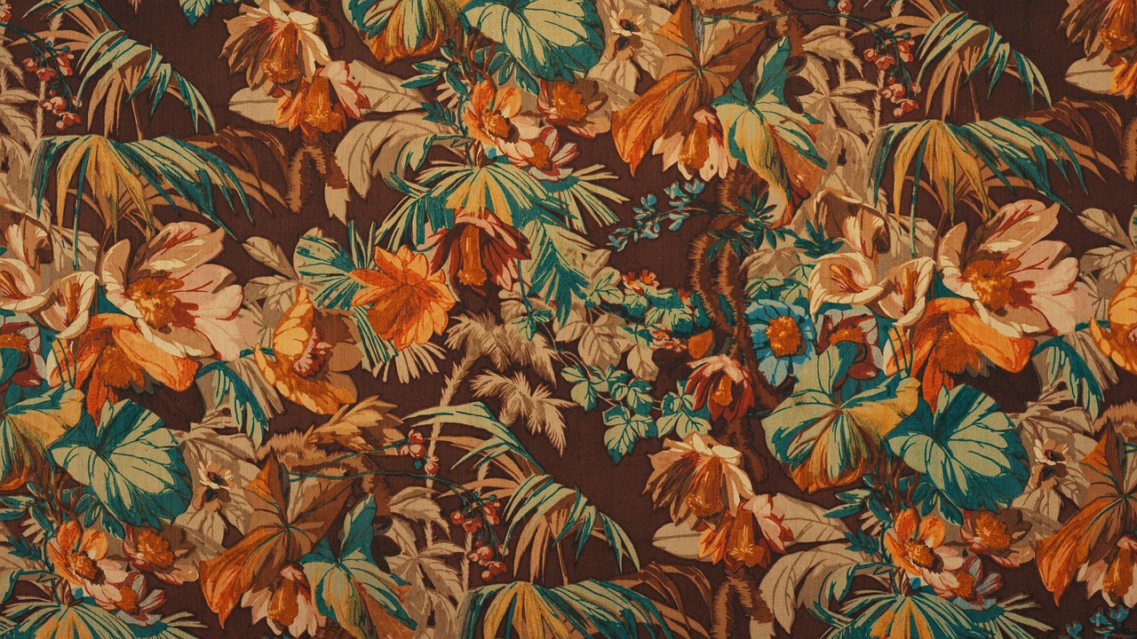
Choosing a Color Palette
Choosing a color palette for your quilting project is like selecting the perfect ingredients for a recipe. It requires a blend of creativity, emotion, and a touch of intuition. First and foremost, you need to consider what vision you have for your quilt. Are you aiming for something vibrant and energetic, or do you prefer a calm and soothing aesthetic? Your choice of colors will evoke different feelings, so think about the emotions you want to convey. For instance, warm colors like reds and oranges can create a sense of excitement, while cool colors like blues and greens can instill a feeling of tranquility.
One effective method to create a cohesive palette is to draw inspiration from nature. Take a walk outside and observe the colors around you. Notice how the greens of the grass complement the blues of the sky or how the vibrant flowers pop against the earth tones of the soil. You can also use online tools or apps that allow you to generate color palettes based on images you love. Simply upload a photo, and watch as it extracts a beautiful array of colors that you can use as a foundation for your quilt.
Another popular approach is to utilize the color wheel. This handy tool can help you understand the relationships between colors. For example, you can choose colors that are analogous (next to each other on the wheel) for a harmonious look, or go for complementary colors (opposite each other) for a bold contrast. Here’s a quick breakdown:
| Color Relationship | Description |
|---|---|
| Analogous | Colors next to each other on the color wheel, creating a serene and comfortable design. |
| Complementary | Colors opposite each other on the color wheel, resulting in vibrant and eye-catching contrasts. |
| Monochromatic | Variations of a single color, providing a subtle and sophisticated appearance. |
When selecting your colors, take the time to gather fabric swatches and play around with different combinations. Lay them out next to each other to see how they interact. Sometimes, a color that looks great on its own may not work well with others. This is where the tactile experience of fabric comes into play. The texture and weight of the fabric can change the way colors are perceived, so don’t hesitate to mix and match until you find the perfect combination that resonates with you.
Lastly, don’t be afraid to trust your instincts! Quilting is a personal expression of creativity, and what matters most is that you love the colors you choose. If you feel drawn to a particular shade or combination, embrace it! After all, the joy of quilting comes from creating something that reflects your unique style and personality.
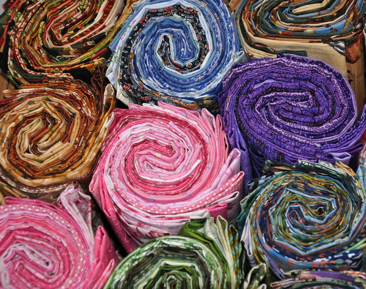
Monochromatic Schemes
When it comes to quilting, monochromatic color schemes can truly elevate your project to a new level of sophistication. By utilizing varying shades, tints, and tones of a single color, you create a quilt that exudes harmony and elegance. Imagine a serene landscape where all the elements blend seamlessly together; that's the effect a monochromatic quilt can have. It’s like painting a masterpiece with a single brush, where the nuances of color bring depth and texture without overwhelming the senses.
Choosing a monochromatic scheme allows you to explore the full spectrum of one color, playing with its lightness and darkness. For instance, if you choose blue as your base color, you can incorporate everything from a soft sky blue to a deep navy, creating a stunning visual journey that captures the eye. This method not only simplifies the design process but also ensures that all the fabrics you select will effortlessly coordinate with one another. No more worrying about clashing hues!
One of the greatest advantages of using a monochromatic palette is that it can evoke specific emotions and feelings. For example, shades of blue may convey calmness and tranquility, while reds can bring warmth and energy. This emotional resonance can be incredibly powerful, transforming your quilt from a simple craft into a personal expression of your feelings or intentions. Think of your quilt as a canvas where you can tell a story through color.
To illustrate the beauty of monochromatic quilts, let’s take a look at some examples:
| Color | Shades Used | Effect |
|---|---|---|
| Blue | Sky Blue, Royal Blue, Navy | Calming, Peaceful |
| Red | Pale Pink, Cherry Red, Burgundy | Warm, Inviting |
| Green | Mint, Forest Green, Olive | Fresh, Natural |
Each of these examples showcases how different shades can work together to create a cohesive yet dynamic quilt. By varying the texture of the fabrics—think smooth cottons paired with soft flannels or textured wools—you can further enhance the visual interest of your quilt, making it not just a feast for the eyes but also a tactile experience.
In conclusion, embracing monochromatic schemes in your quilting projects can lead to stunning results that are both sophisticated and emotionally resonant. So why not give it a try? Dive into the world of color and let your creativity flow!
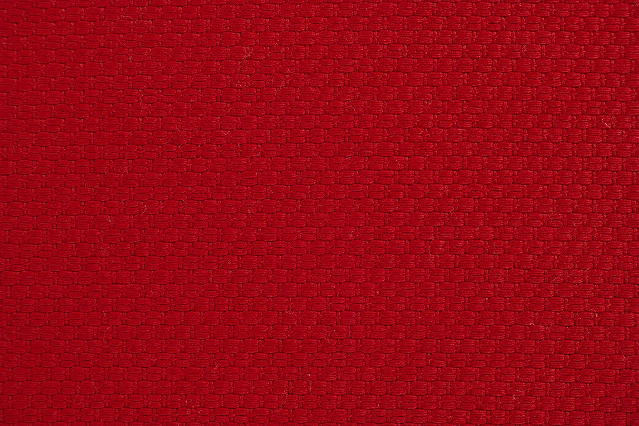
Benefits of Monochromatic Colors
When it comes to quilting, choosing a monochromatic color scheme can be a game-changer. This approach not only simplifies your design process but also creates a visually stunning quilt that feels cohesive and intentional. Imagine walking into a room and seeing a quilt that draws you in with its subtlety and elegance—this is the power of monochromatic colors. By using varying shades, tints, and tones of a single color, you can achieve a sophisticated look that captivates the eye without overwhelming it.
One of the primary benefits of a monochromatic scheme is its ability to create harmony. When all the colors in your quilt belong to the same family, they naturally complement each other. This harmony allows you to focus on other design elements, such as texture and pattern, without worrying about clashing colors. For example, a quilt made with different shades of blue can evoke feelings of calm and tranquility, making it a perfect choice for a bedroom or relaxation space.
Another advantage is that monochromatic designs can add depth and dimension to your quilt. By incorporating a variety of shades—from light pastels to deep, rich tones—you can create a sense of layering and movement that keeps the viewer engaged. This technique can be particularly effective in large quilts, where the eye has more space to explore the subtle variations in color. Think of it as painting with a single brush; the nuances you can achieve are often more profound than if you were to use a plethora of colors.
Additionally, monochromatic color schemes can save you time and stress during the fabric selection process. Instead of sifting through countless colors and patterns, you can focus on finding fabrics that fit within your chosen color family. This streamlined approach not only speeds up your quilting process but also reduces the chances of making mistakes or second-guessing your choices. With fewer variables to consider, you can feel more confident in your design decisions.
In summary, the benefits of using monochromatic colors in your quilting projects are numerous:
- Creates harmony among fabrics
- Adds depth and dimension to your quilt
- Simplifies the fabric selection process
- Enhances the overall aesthetic appeal
So, the next time you're planning a quilting project, consider embracing the beauty of monochromatic colors. Not only will it simplify your design process, but it can also lead to stunning results that you'll be proud to display.
Q: Can I mix different textures with monochromatic colors?
A: Absolutely! Mixing textures can enhance the visual interest of your quilt while maintaining a cohesive color scheme. Fabrics like cotton, linen, and velvet can all work beautifully together in a monochromatic palette.
Q: How do I choose the right shades for my monochromatic quilt?
A: Start by selecting a base color that resonates with you. From there, explore various shades, tints, and tones of that color. You can use color swatches or even digital tools to visualize how these variations will look together.
Q: Are monochromatic quilts suitable for all styles?
A: Yes! Monochromatic quilts can fit into a variety of styles, from modern to traditional. The key is to choose fabrics and patterns that reflect the overall aesthetic you want to achieve.

Examples of Monochromatic Quilts
Monochromatic quilts are a fantastic way to showcase the beauty of a single color while exploring its various shades and tones. Imagine a quilt that flows seamlessly from a deep navy blue to a light sky hue, capturing the essence of a serene ocean. These quilts can evoke a sense of calm and sophistication, making them a popular choice among quilters.
One stunning example of a monochromatic quilt is the “Blue Serenity” quilt. This quilt features a gradient of blues, ranging from rich royal blue to soft baby blue. The use of different fabric textures, such as cotton, silk, and linen, adds depth and interest, allowing the viewer to appreciate the subtle variations in color. The overall effect is a tranquil piece that feels both modern and timeless.
Another remarkable example is the “Emerald Dream” quilt, which utilizes varying shades of green. From deep forest green to light mint, this quilt captures the essence of nature. The quilter cleverly incorporated different patterns within the green palette, such as polka dots and stripes, which provide visual intrigue without straying from the monochromatic theme. This quilt not only tells a story but also invites the viewer to get lost in its lush, verdant hues.
For those who love the warmth of earth tones, the “Rustic Autumn” quilt is a perfect illustration. Featuring a range of browns, oranges, and yellows, this quilt replicates the feeling of a cozy autumn day. The quilter used a combination of solid fabrics and prints, ensuring that each shade complements the others while maintaining a cohesive look. The quilt's texture, achieved through quilting techniques, enhances the warmth of the colors, making it an inviting addition to any home.
In addition to these examples, many quilters experiment with monochromatic designs by incorporating different fabric styles. For instance, using a solid fabric for the quilt's main blocks while adding prints for borders or sashing can create a beautiful contrast that still adheres to the monochromatic theme. This technique allows for creativity while keeping the overall design unified.
Ultimately, monochromatic quilts are not just about using one color; they are about exploring the myriad of possibilities within that color. By varying shades, tones, and textures, quilters can create stunning pieces that resonate emotionally with viewers. Whether you're drawn to the calming blues of the ocean, the lush greens of nature, or the cozy warmth of autumn, there’s a monochromatic quilt waiting to be created that reflects your personal style.
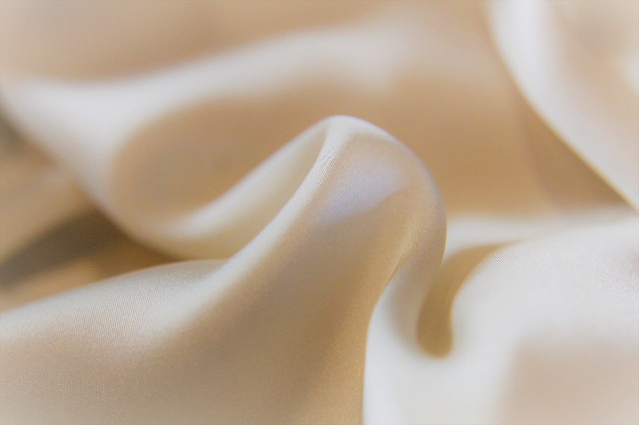
Complementary Colors
When it comes to quilting, are like the dynamic duo of the color world. These colors sit directly opposite each other on the color wheel, creating a striking contrast that can make your quilt truly pop. Imagine a vibrant orange paired with a deep blue; the result is a visual feast that commands attention. But how do you effectively use these bold combinations in your quilting projects? Let's dive in!
Using complementary colors can evoke strong emotions and create a sense of energy in your quilt. For instance, if you're aiming for a lively and cheerful vibe, consider pairing bright yellows with purples. On the other hand, if you want something a bit more subdued yet still impactful, try a soft green with a muted red. The key is to balance these colors carefully to avoid overwhelming the viewer. Think of it as a dance where each color takes turns leading the way.
To make the most of complementary colors, here are some tips:
- Start with a Base Color: Choose one color to dominate your quilt. This will serve as the foundation for your design.
- Use Accents: Incorporate the complementary color as an accent. This could be in the form of borders, patches, or even quilting patterns.
- Experiment with Shades: Don't be afraid to play with different shades and tints of your complementary colors. This adds depth and dimension to your quilt.
One of the best things about complementary colors is their ability to create visual interest without the need for intricate patterns. A simple layout with blocks of complementary colors can be just as stunning as a complex design. For example, a quilt featuring large squares of bright red and green can be striking, especially when paired with a neutral background that allows these colors to shine.
However, it’s essential to consider how the fabric's texture and pattern can influence the overall impact of your complementary colors. A solid fabric may provide a clean and crisp look, while a patterned fabric can add a layer of complexity. For instance, a floral print in complementary colors can soften the boldness of the hues, making the quilt feel more inviting. So, think about the message you want your quilt to convey and choose your fabrics accordingly.
In summary, complementary colors offer a fantastic way to create quilts that are not only visually appealing but also emotionally engaging. By understanding how to balance these colors effectively, you can craft quilts that stand out and tell a story. So grab your fabric swatches, and let your creativity flow!
Q: What are some examples of complementary color pairs?
A: Some classic pairs include blue and orange, red and green, and yellow and purple. These combinations can create vibrant contrasts in your quilting projects.
Q: How do I choose the right complementary colors for my quilt?
A: Start by selecting a dominant color you love, then find its complementary color on the color wheel. Consider the mood you want to evoke and experiment with different shades.
Q: Can I use prints with complementary colors?
A: Absolutely! Prints can add texture and interest to your quilt. Just be mindful of the scale and intensity of the prints to ensure they complement rather than clash with your chosen colors.
Fabric Types and Their Impact on Color
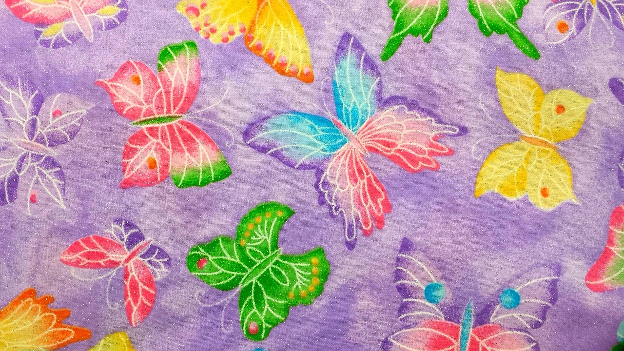
When it comes to quilting, the fabric type you choose can have a profound impact on the way colors appear and interact within your quilt. Imagine walking into a room filled with vibrant quilts; the first thing that captures your attention is how the colors seem to dance across the fabric. This phenomenon is largely influenced by the texture, material, and finish of the fabrics used. Different fabrics can absorb and reflect light in unique ways, which can alter the perception of color significantly.
For instance, cotton is the most popular choice among quilters due to its versatility and ease of use. Cotton fabrics typically provide a crisp, clean look that allows colors to appear bright and true. However, when you switch to a fabric like satin, you may notice that the same color can look richer and more luxurious due to its sheen. This reflects the light differently, creating a sense of depth and richness that cotton simply can't replicate.
Furthermore, the weight of the fabric also plays a crucial role. Heavier fabrics tend to absorb more light, making colors appear darker and more muted, while lighter fabrics can enhance brightness and vibrancy. For example, a bold red might look striking on a lightweight cotton but could appear more subdued on a heavier canvas. This is why it’s essential to consider the fabric type when selecting your colors.
Moreover, the print of the fabric can also influence color perception. Fabrics with intricate prints can sometimes overshadow solid colors, drawing attention away from your chosen palette. On the other hand, solid fabrics can create a clean, cohesive look that allows your color choices to shine. Here’s a quick overview of how different fabric types can affect color:
| Fabric Type | Color Impact |
|---|---|
| Cotton | Bright, true colors; good for detailed patterns. |
| Satin | Rich, luxurious colors; reflective surface enhances depth. |
| Canvas | Muted colors; heavier weight absorbs more light. |
| Linen | Natural, earthy tones; texture can soften color appearance. |
Understanding the nuances of fabric types will not only help you choose the right materials for your quilt but also guide you in selecting colors that will harmonize beautifully. It’s like painting a masterpiece; the canvas you use can completely transform the artwork. So, next time you're perusing fabric stores or online shops, take a moment to consider not just the colors but the fabrics themselves. How will they work together to create the quilt of your dreams?
Q: How does fabric type affect the color of my quilt?
A: Different fabric types reflect and absorb light differently, which can change how colors appear. For instance, cotton generally shows colors more vibrantly, while heavier fabrics may mute them.
Q: Should I use prints or solids for my quilting project?
A: It depends on your design vision. Solids can create a clean look and allow colors to stand out, while prints can add visual interest and complexity. Consider how each will complement your chosen color palette.
Q: Can I mix different fabric types in one quilt?
A: Absolutely! Mixing fabrics can add texture and dimension to your quilt. Just be mindful of how the colors will interact across different materials.
Understanding Fabric Dyes
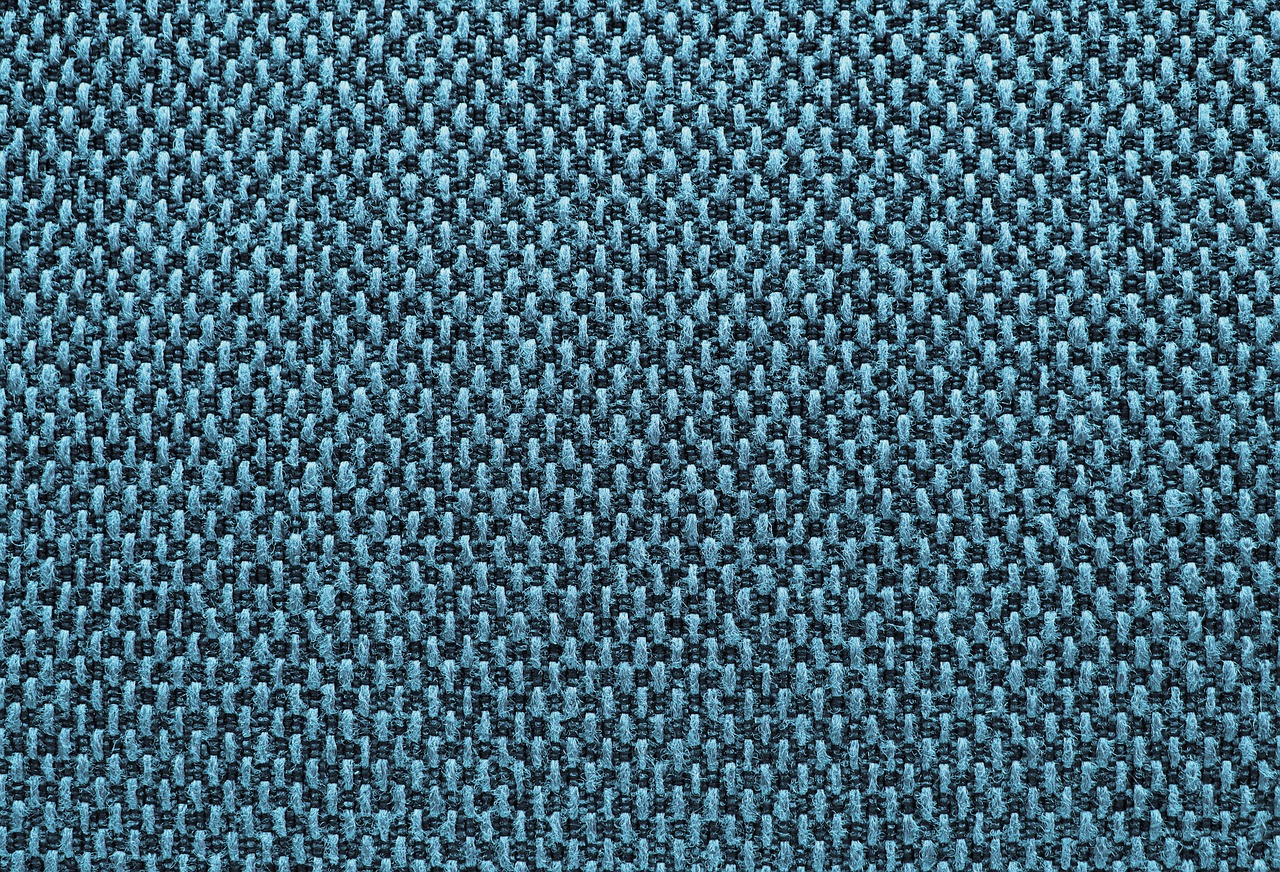
When it comes to quilting, the choice of fabric dyes is a crucial factor that can dramatically impact the final look of your quilt. The dyeing process is not just about color; it influences the vibrancy, tone, and even the texture of the fabric. There are various types of dyes used in fabric production, and understanding these can help you make informed choices for your quilting projects.
Firstly, it's important to know that dyes can be categorized into two main types: reactive dyes and disperse dyes. Reactive dyes are commonly used for natural fibers like cotton and linen. They create a strong bond with the fabric, resulting in vibrant colors that are resistant to fading. On the other hand, disperse dyes are primarily used for synthetic fibers like polyester. These dyes are less vibrant but can still produce rich colors that hold up well under washing.
Another fascinating aspect of fabric dyes is how they can alter the perception of color based on the fabric type and weave. For instance, a bright red dye on a smooth cotton fabric may appear more vivid than the same dye on a textured fabric. This is because the texture can diffuse light differently, affecting how we perceive the color. So, when selecting your fabrics, consider not just the color but also the texture and weave of the material.
Additionally, the dyeing process can lead to variations in color even within the same dye lot. This phenomenon, known as color variation, can be both a blessing and a curse. It adds a unique touch to your quilting project, but it also means you need to be cautious when selecting fabrics from different batches. To avoid any surprises, it’s advisable to purchase all your fabric from the same dye lot whenever possible.
Finally, let’s not forget the environmental aspect of fabric dyes. Many quilters today are becoming more conscious of sustainability. Natural dyes, derived from plants, insects, and minerals, are gaining popularity. While they may not always offer the same vibrancy as synthetic dyes, they provide a unique aesthetic and are often more eco-friendly. If you’re interested in exploring this avenue, consider experimenting with indigo dyeing or using plant-based dyes for a more organic feel.
In summary, understanding fabric dyes is essential for creating beautiful quilts that not only look stunning but also hold up over time. By considering the type of dye, the fabric's texture, and the dyeing process, you can enhance your quilting experience and achieve the perfect color palette for your projects.

Prints vs. Solids
This article provides insights into selecting the right colors for quilting projects, exploring various color theories, fabric types, and practical tips to enhance your quilting experience.
Color theory is essential for quilters. It explains how colors interact, creating harmony or contrast in your projects, which can significantly influence the overall look of your quilt.
Selecting a color palette involves understanding your vision and the emotions you want to evoke. This section discusses methods to create a cohesive and appealing palette for your quilting project.
Monochromatic color schemes utilize varying shades of a single color, creating a subtle and sophisticated look. This approach can add depth while maintaining a unified aesthetic throughout your quilt.
Using monochromatic colors can simplify your design process, making it easier to match fabrics and achieve a harmonious look without overwhelming contrasts or clashing hues.
This section showcases various examples of monochromatic quilts, highlighting how different shades and textures can create stunning visual effects while adhering to a single color family.
Complementary colors are opposite each other on the color wheel and create vibrant contrasts. This section explores how to effectively use these colors to make your quilt stand out.
Different fabric types can alter the appearance of colors. This section discusses how texture and material can affect color perception and the overall feel of your quilt.
The dyeing process can influence how colors appear on fabric. This section delves into the types of dyes used and how they can change the vibrancy and tone of your chosen colors.
When it comes to choosing fabrics for quilting, one of the most important decisions you'll face is whether to use prints or solids. Each option has its own unique qualities and can dramatically affect the overall aesthetic of your quilt. Solid fabrics offer a clean, uninterrupted look that can create a sense of calm and simplicity. They are perfect for creating a modern aesthetic or when you want to highlight the quilting patterns themselves. On the other hand, print fabrics add visual interest and can tell a story through their designs. They can introduce a playful or whimsical element to your quilt, making it more vibrant and engaging.
Think of it this way: using solid fabrics is like painting a blank canvas, where every stitch and design element stands out clearly. In contrast, using prints is akin to a colorful mural, where the interplay of patterns can create a dynamic and lively scene. However, combining both can yield stunning results! Here are some considerations to keep in mind when deciding:
- Visual Balance: Using too many prints can overwhelm the eye, while too many solids can make a quilt feel flat. Finding a balance is key.
- Theme and Mood: Consider the theme of your quilt. A nature-inspired quilt might benefit from floral prints, while a contemporary piece may shine with bold solids.
- Quilting Techniques: Some quilting techniques, like intricate piecing, may work better with solids, while others can be enhanced with prints.
Ultimately, the choice between prints and solids comes down to your personal style and the story you want your quilt to tell. Experimenting with both can lead to delightful surprises, and remember, there are no hard and fast rules in quilting—just creative possibilities!
Q: Can I mix prints and solids in the same quilt?
A: Absolutely! Mixing prints and solids can create a beautiful contrast and add depth to your design. Just be mindful of the balance between the two.
Q: How do I choose the right fabric for my quilt?
A: Consider the overall theme, desired color palette, and the specific quilting techniques you plan to use. Testing fabric swatches together can also help you visualize the final look.
Q: Should I pre-wash my fabrics before quilting?
A: It's often recommended to pre-wash fabrics to prevent shrinking and color bleeding. However, some quilters prefer to work with unwashed fabric for a crisper finish.
Frequently Asked Questions
- What is color theory, and why is it important for quilting?
Color theory is a framework that helps quilters understand how colors interact with each other. It’s crucial because the right color combinations can create harmony or contrast in your quilt, making it visually appealing. By grasping these concepts, you can elevate your quilting projects from ordinary to extraordinary!
- How do I choose a color palette for my quilt?
Choosing a color palette starts with your vision. Think about the emotions you want to evoke. Are you aiming for a calming effect or something vibrant? You can create a cohesive palette by selecting colors that complement each other or by using a monochromatic scheme for a more subtle look.
- What are the benefits of using monochromatic colors in quilting?
Monochromatic colors simplify your design process. They allow you to play with different shades of the same color, creating depth and sophistication without the risk of clashing hues. This approach can help achieve a unified aesthetic that’s both elegant and easy to manage.
- Can you give examples of how to use complementary colors effectively?
Absolutely! Complementary colors are located opposite each other on the color wheel, such as blue and orange. When used together, they create vibrant contrasts that can make your quilt pop. Just be mindful of the balance; too much contrast can be overwhelming, so consider using one color as the dominant hue and the other as an accent.
- How do different fabric types affect color perception in quilting?
Fabric types can drastically alter how colors appear. For instance, a cotton fabric may display colors differently than a silk or polyester. The texture and material can change the vibrancy and tone, influencing the overall feel of your quilt. Always test your colors on the actual fabrics to see how they interact.
- What should I know about fabric dyes when selecting colors?
The dyeing process plays a significant role in how colors show up on fabric. Different dyes can yield varying levels of vibrancy and tone. For example, natural dyes might produce softer hues compared to synthetic dyes. Understanding this can help you make informed choices that align with your desired outcome.
- Should I choose prints or solids for my quilt?
Choosing between prints and solids can greatly impact your quilt's design. Solids are great for creating a clean, modern look, while prints can add visual interest and texture. Consider mixing both for a dynamic effect! Just ensure that your color choices complement each other to maintain harmony.


