
DIY Decor: Making Abstract Art for Your Home
Are you tired of staring at those blank walls in your home? Do you want to add a splash of personality and creativity to your living space? Well, you're in luck! This article explores the exciting world of abstract art, guiding you step-by-step through the creative process of making your own stunning pieces. Not only will you unleash your inner artist, but you'll also create unique decor that reflects your personal style.
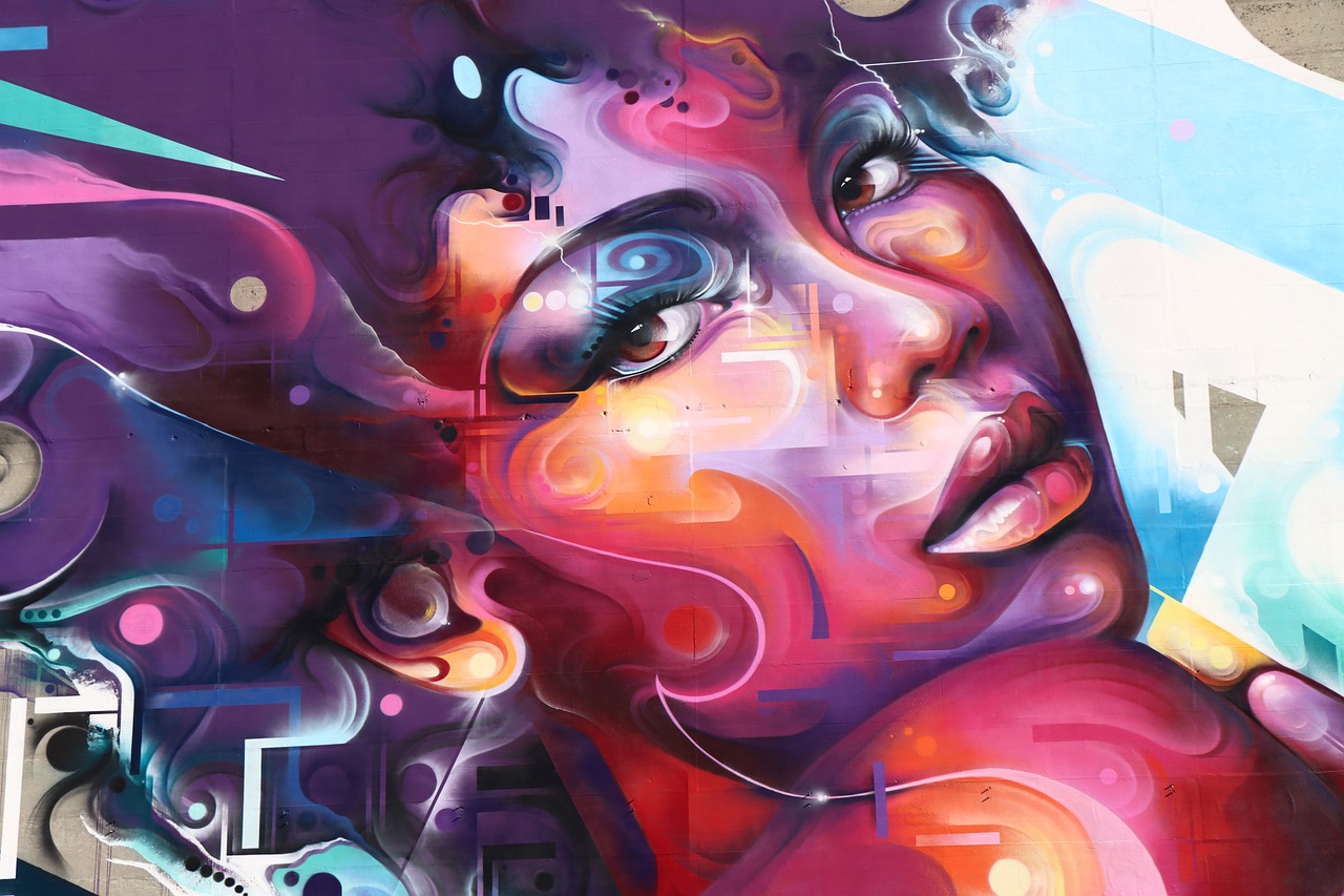
Creating abstract art is like opening a door to a realm where rules don't apply, and imagination takes the lead. It's about expressing emotions, ideas, and experiences through colors and shapes, often without the need for a defined subject. Imagine painting a canvas that speaks to your soul and becomes a conversation starter for guests. Sounds intriguing, right? Let's dive into the essentials of making abstract art that not only beautifies your home but also resonates with who you are.
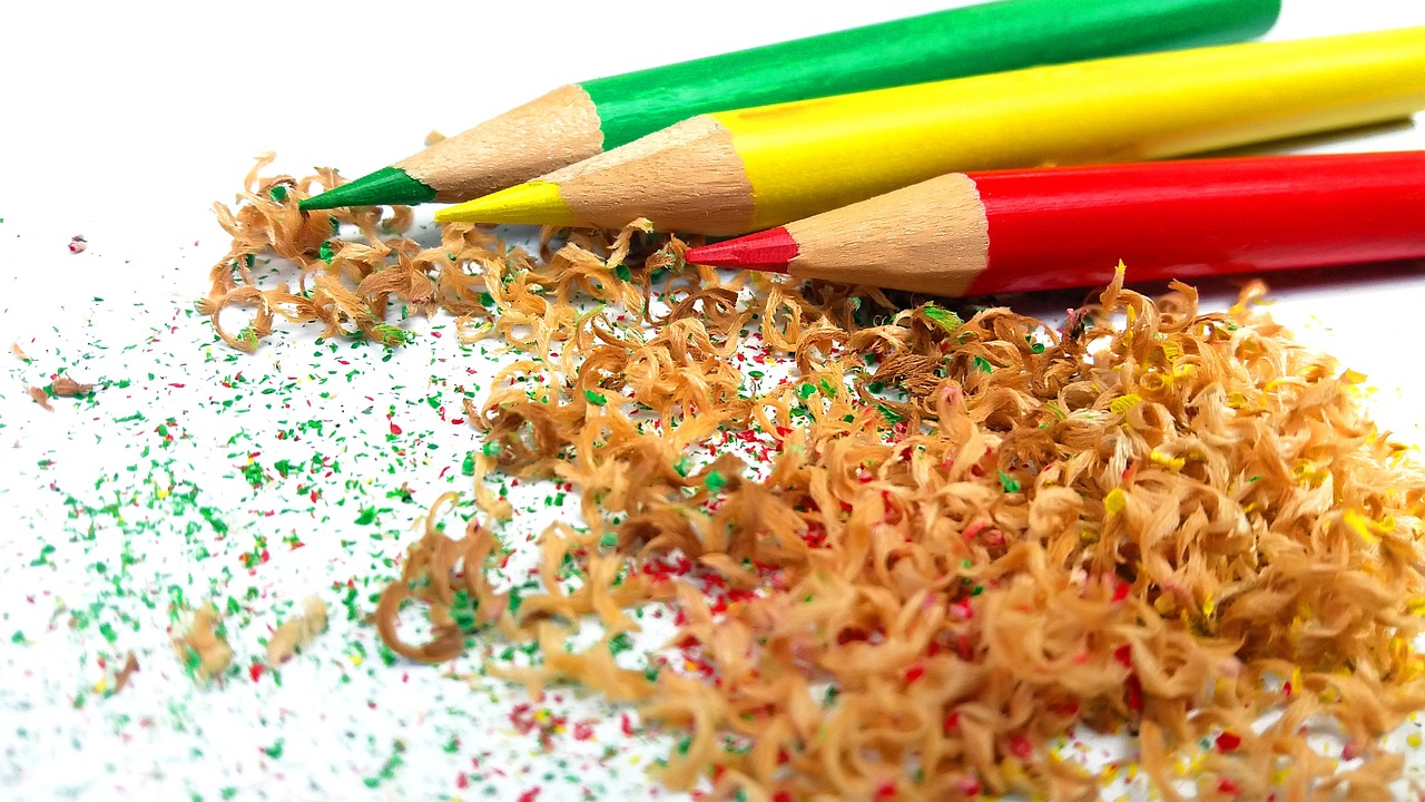
Before you grab your brushes and paint, it’s essential to gather the right materials. Think of your art supplies as the building blocks of your creativity. You'll need canvases, paints, brushes, and perhaps even some unconventional tools like sponges or palette knives. The beauty of DIY decor is that you can use what you have on hand and experiment with different textures and techniques. So, whether you’re a seasoned artist or a complete novice, there’s no limit to what you can create!
As you embark on this artistic journey, remember that the process is just as important as the final product. Embrace the messiness of it all! Sometimes, the most beautiful pieces come from unexpected accidents or spontaneous decisions. So, don’t be afraid to let loose and have fun with your artwork. After all, it’s your home, and you deserve to fill it with pieces that truly represent you.
In the following sections, we will explore everything from choosing your materials to understanding color theory and techniques for creating depth and texture. By the end of this article, you'll be equipped with the knowledge and inspiration to create your own abstract masterpieces. So, grab that paintbrush and let's get started on transforming your home into a vibrant gallery of your own making!
- What materials do I need to start creating abstract art? You’ll need canvases, acrylic or oil paints, brushes, and possibly some mixed media elements like fabric or paper.
- Can anyone create abstract art? Absolutely! Abstract art is about expression, and there are no strict rules. Everyone can create something unique.
- How do I choose a color palette? Start by exploring color theory and consider warm vs. cool colors. Experiment with different combinations to find what resonates with you.
- Is it important to frame my artwork? While not necessary, framing can enhance the presentation and protect your art, making it look more polished.
Choosing Your Materials
When embarking on your journey to create stunning abstract art, choosing the right materials is crucial. The materials you select can significantly influence the outcome of your artwork, so it’s essential to be thoughtful in your choices. Start with the basics: canvases, paints, and brushes. But don’t stop there! There’s a whole world of supplies waiting to be explored that can elevate your creations to new heights.
First, let’s talk about canvases. You can choose from a variety of surfaces, including stretched canvas, canvas boards, and even paper. Each has its unique characteristics. For instance, if you want to create large, bold pieces, stretched canvases are fantastic as they provide a sturdy surface. On the other hand, if you’re experimenting with different techniques, canvas boards or watercolor paper might be more suitable. The texture of your canvas can also impact your painting style, so consider whether you want a smooth or textured surface.
Next up is paint. The type of paint you choose will greatly affect your artwork's vibrancy and texture. Acrylic paints are a popular choice for abstract art because they dry quickly and are versatile. They can be used thickly for texture or thinned with water for a more fluid application. If you’re feeling adventurous, you might want to explore oil paints, which offer rich colors and a longer drying time, allowing for more blending and layering. Watercolors can also be used for abstract pieces, especially if you enjoy a softer, more ethereal look.
But what about brushes? Selecting the right brushes is vital for achieving different effects in your abstract art. You might want to have a variety of shapes and sizes on hand. For example:
- Flat brushes are great for bold strokes and filling in large areas.
- Round brushes are perfect for detail work and creating fine lines.
- Fan brushes can add interesting textures and patterns.
In addition to traditional brushes, consider using palette knives for a completely different approach. They can create sharp edges and add layers of paint in a way that brushes simply cannot. And don’t forget about your palette for mixing colors! A simple plastic or glass palette will do, but you can also use a piece of wax paper for quick clean-up.
Now, let’s not overlook other materials that can add unique touches to your artwork. Think about incorporating textured mediums like gels or pastes to create dimension. You can also use spray paints for a different application method, or even inks for fine details. If you’re feeling particularly creative, try adding found objects like fabric scraps, paper, or even natural elements like leaves or sand. These can bring a whole new layer of interest to your piece.
Finally, it’s essential to have some basic tools at your disposal, such as easels for stability while you paint, and cleaning supplies to keep your workspace tidy. Remember, the goal is to create an environment that inspires you, so surround yourself with materials that excite your creativity!
Understanding Color Theory
Color theory is like the secret sauce of abstract art; it’s the magic that transforms a simple canvas into a captivating visual experience. Understanding how colors interact can significantly elevate your artwork, allowing you to express emotions, set moods, and create harmony in your pieces. So, what exactly is color theory? At its core, it's a set of principles that explains how colors work together. By grasping these concepts, you can make informed decisions about your color choices, ensuring your art resonates with viewers.
One of the fundamental aspects of color theory is the color wheel, which categorizes colors into primary, secondary, and tertiary groups. The primary colors—red, blue, and yellow—are the building blocks of all other colors. When you mix these colors, you get secondary colors like green, orange, and purple. Tertiary colors emerge when you blend a primary color with a secondary color. Understanding this wheel is crucial because it helps you visualize how colors relate to one another, enabling you to create stunning combinations in your artwork.
When diving deeper into color theory, you’ll encounter two essential concepts: complementary colors and analogous colors. Complementary colors are located directly opposite each other on the color wheel. For instance, red and green or blue and orange. Using these colors together can create striking contrasts that draw the eye and energize your art. On the other hand, analogous colors are next to each other on the wheel, such as blue, blue-green, and green. These colors blend seamlessly, creating a more soothing and harmonious look. By mixing and matching these color groups, you can evoke different feelings and reactions from your audience.
Another fascinating aspect of color theory is the distinction between warm and cool colors. Warm colors, such as reds, oranges, and yellows, tend to evoke feelings of warmth, energy, and excitement. Imagine a sunset; the warm hues create a cozy, inviting atmosphere. In contrast, cool colors—like blues, greens, and purples—are calming, often associated with tranquility and serenity. Think of a peaceful ocean scene; the cool colors can instantly transport you to a place of relaxation. Understanding these color groups can help you manipulate the emotional impact of your abstract art.
Delving into the psychology of colors adds another layer to your understanding of color theory. Each color carries its own psychological weight and can influence the viewer's perception and emotions. For example:
| Color | Psychological Effect |
|---|---|
| Red | Passion, energy, urgency |
| Blue | Calm, trust, stability |
| Yellow | Happiness, optimism, warmth |
| Green | Growth, harmony, freshness |
By considering the psychological effects of colors, you can make more intentional choices in your artwork, ensuring that the feelings you wish to convey are effectively communicated through your color palette.
Finally, developing a cohesive color palette is essential for creating visually appealing abstract art. A well-thought-out palette can unify your piece and enhance its overall impact. When creating your palette, consider starting with a dominant color and then selecting complementary and analogous colors to support it. This approach ensures that your artwork feels balanced and harmonious. Don't be afraid to experiment with different shades and tints of your chosen colors, as these variations can add depth and interest to your work.
In summary, understanding color theory is fundamental for any aspiring abstract artist. By mastering the relationships between colors, the emotional responses they evoke, and how to create cohesive palettes, you can elevate your art to new heights. So grab your brushes, unleash your creativity, and let color be your guide!
- What is color theory? Color theory is a set of principles that explains how colors interact and how they can be combined to create visually appealing artworks.
- Why is color important in abstract art? Color can evoke emotions, set the mood, and create harmony or contrast in your artwork, making it a powerful tool for expression.
- How do I choose a color palette? Start with a dominant color, then select complementary and analogous colors to create a cohesive and balanced palette.
Warm vs. Cool Colors
When diving into the vibrant world of abstract art, one of the first decisions you'll face is choosing between warm and cool colors. These two categories of colors can dramatically influence the mood and emotional response of your artwork. But what exactly do these terms mean? Warm colors include reds, oranges, and yellows, evoking feelings of warmth, energy, and excitement, much like a cozy fire on a chilly evening. In contrast, cool colors such as blues, greens, and purples tend to create a sense of calmness and tranquility, reminiscent of a peaceful ocean or a serene forest.
Understanding how to use these color groups can help you convey specific emotions through your art. For instance, if you're aiming to create a piece that feels lively and invigorating, incorporating a palette rich in warm colors can achieve that effect. On the other hand, if your goal is to evoke a sense of peace or introspection, leaning towards cool colors might be the way to go. Think of it like this: warm colors invite you in, while cool colors encourage you to sit back and reflect.
Furthermore, the interaction between warm and cool colors can create a striking visual contrast. When placed side by side, warm colors can appear to advance towards the viewer, while cool colors seem to recede. This dynamic can add depth and interest to your artwork, making it more engaging. For example, imagine painting a sunset where the warm oranges and reds of the sun contrast beautifully with the cool blues of the twilight sky. This interplay can guide the viewer's eye and create a more immersive experience.
To help you understand the differences between warm and cool colors, here's a simple comparison:
| Warm Colors | Cool Colors |
|---|---|
| Reds | Blues |
| Oranges | Greens |
| Yellows | Purples |
In summary, the choice between warm and cool colors is not just about aesthetics; it's about the emotional narrative you wish to convey through your abstract art. By thoughtfully selecting and combining these colors, you can create pieces that resonate deeply with your audience. So, the next time you pick up your brush, consider the emotional journey you want to take your viewers on and choose your colors accordingly!
- What are warm colors? Warm colors include reds, oranges, and yellows, which evoke feelings of warmth and energy.
- What are cool colors? Cool colors include blues, greens, and purples, creating a sense of calmness and tranquility.
- How do warm and cool colors affect the mood of my artwork? Warm colors can energize and invite, while cool colors can soothe and reflect, influencing the viewer's emotional response.
- Can I mix warm and cool colors in my art? Absolutely! Combining warm and cool colors can create contrast and depth, enhancing the overall impact of your artwork.
Psychology of Colors
When it comes to abstract art, the is a fascinating and essential aspect that can significantly influence the viewer's emotions and perceptions. Each color carries its own unique set of meanings and associations, which can evoke feelings ranging from joy and tranquility to anger and sadness. Understanding these associations can help you make informed choices in your artwork, creating pieces that resonate deeply with those who view them.
For instance, consider the color red. Often associated with passion and energy, it can evoke strong emotions and grab attention immediately. In contrast, blue tends to have a calming effect, often linked to feelings of peace and serenity. This dichotomy illustrates how colors can create different atmospheres in your art. Here’s a brief overview of some common colors and their psychological impacts:
| Color | Psychological Effect |
|---|---|
| Red | Passion, energy, excitement |
| Blue | Calm, tranquility, trust |
| Yellow | Happiness, optimism, warmth |
| Green | Growth, harmony, freshness |
| Purple | Luxury, creativity, mystery |
As you create your abstract pieces, think about the emotions you want to evoke in your audience. By strategically using colors, you can guide their feelings and reactions. It’s almost like telling a story through colors; each hue adds a layer to the narrative you wish to convey. For example, if you want to create a sense of warmth and comfort, consider using a palette dominated by warm colors like reds, oranges, and yellows. Alternatively, if your goal is to inspire calmness or reflection, cooler colors like blues and greens may be more effective.
Moreover, the combination of colors can amplify their psychological effects. A harmonious blend of colors can create a soothing atmosphere, while contrasting colors can generate excitement and energy. This is where the concept of color harmony comes into play, allowing you to create visually appealing artworks that resonate with your intended message.
In summary, understanding the psychology of colors is not just about choosing what looks good; it's about creating an emotional experience for your viewers. By considering the meanings and effects of different colors, you can craft abstract art that not only pleases the eye but also touches the heart.
- What colors should I use for a calming effect?
To create a calming effect, consider using cool colors like blue, green, and lavender. - Can I mix colors to change their psychological impact?
Absolutely! Mixing colors can create new shades that might evoke different feelings than the individual colors alone. - How important is the color palette in abstract art?
The color palette is crucial as it sets the mood and tone of your artwork, guiding the viewer's emotional response.
Creating Color Palettes
When it comes to creating stunning abstract art, developing a cohesive color palette is essential. A well-thought-out color scheme not only enhances the visual appeal of your artwork but also communicates your artistic vision effectively. Imagine walking into a room adorned with vibrant hues that evoke feelings of joy and tranquility; that’s the power of a well-crafted palette!
To begin your journey into color palette creation, start by considering the emotions you wish to convey through your artwork. Are you aiming for a calm, serene atmosphere, or do you want to energize the space with bold, striking colors? This initial thought process will guide your choices in selecting colors. You might find it helpful to create a mood board, collecting images, swatches, and textures that inspire you. This visual reference can serve as a foundation for your palette.
Next, you can explore some popular methods for combining colors. One effective approach is to use the color wheel, which illustrates the relationships between different colors. Here are a few strategies to consider:
- Complementary Colors: These are colors that are opposite each other on the color wheel, such as blue and orange. They create a vibrant contrast and can make your artwork pop.
- Analogous Colors: These colors sit next to each other on the wheel, like blue, blue-green, and green. They provide a harmonious and cohesive look, perfect for creating a soothing effect.
- Triadic Colors: This scheme involves three colors that are evenly spaced around the color wheel, such as red, yellow, and blue. This combination can create a lively and dynamic feel.
Once you have chosen your color combinations, it’s time to experiment! Mix and match your selected colors to create different shades and tints. This process can be incredibly rewarding, as you’ll discover unique variations that resonate with your style. Don’t be afraid to play around with transparency and layering; sometimes, unexpected results can lead to the most captivating pieces.
Finally, consider the context in which your artwork will be displayed. The colors you choose should not only reflect your artistic intent but also complement the surroundings of your home. Think about the existing decor, furniture, and lighting in the space. For instance, if your room features warm wooden tones, a palette of earthy colors can create a cohesive and inviting atmosphere.
In conclusion, creating a color palette for your abstract art is a blend of personal expression and strategic planning. By understanding color relationships, experimenting with combinations, and considering your environment, you can develop a palette that not only enhances your artwork but also transforms your living space into a reflection of your unique style.
Q: How do I choose the right colors for my abstract art?
A: Start by considering the emotions you want to evoke. Use the color wheel to explore complementary, analogous, or triadic color schemes that can help guide your choices.
Q: Can I use more than three colors in my palette?
A: Absolutely! While a limited palette can create harmony, using a broader range of colors can add excitement and depth to your artwork. Just be mindful of maintaining balance.
Q: What if I don’t have a color wheel?
A: No worries! You can find digital color wheels online or use color palette generators to explore combinations. Alternatively, simply rely on your instincts and preferences.
Techniques for Abstract Painting
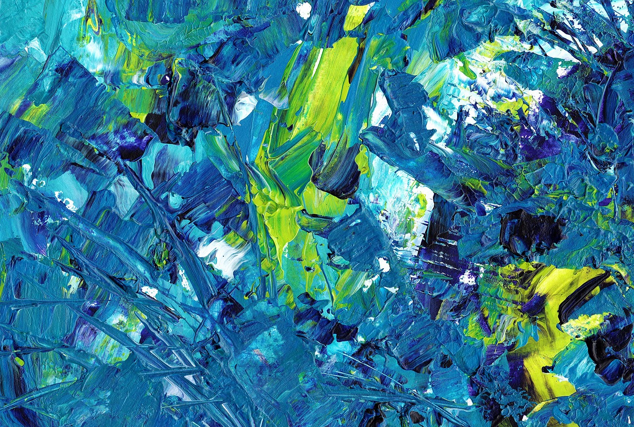
When it comes to creating stunning abstract art, the techniques you employ can make all the difference in your final piece. Abstract painting is all about expressing emotions and ideas through shapes, colors, and forms, rather than depicting realistic subjects. Therefore, experimenting with different techniques can lead to unexpected and exciting results. One popular method is the pouring technique, where paint is poured directly onto the canvas, allowing it to flow and mix in unpredictable ways. This technique can create beautiful, organic patterns that are truly unique to each piece.
Another method to consider is layering. This involves applying multiple layers of paint, allowing each layer to dry before adding the next. Layering can create depth and complexity, making your artwork visually engaging. You can use a variety of tools for layering, such as brushes, palette knives, or even your fingers. The key is to let your creativity guide you. You might find that using a palette knife allows you to create sharp, defined edges, while a brush might give you softer transitions.
Don't forget about brushwork. The way you apply paint can drastically change the feel of your artwork. Experiment with different brush strokes, from quick and energetic to slow and deliberate. Each stroke can convey a different emotion, so think about what you want to communicate with your art. For instance, quick, jagged strokes might evoke feelings of chaos, while smooth, flowing strokes can create a sense of calm.
In addition to these techniques, you can also incorporate mixed media into your abstract paintings. By combining various materials such as fabric, paper, and found objects, you can add layers of texture and interest to your work. This not only enhances the visual appeal but also invites the viewer to engage with the piece on a tactile level. For example, tearing pieces of colored paper and layering them with paint can create a dynamic contrast that draws the eye.
Finally, consider the use of negative space in your compositions. This refers to the areas around and between the subjects of your painting. By leaving some areas blank or less detailed, you can create a sense of balance and focus within your artwork. This technique can be especially effective in abstract art, where the viewer's eye is often drawn to the contrasts between the filled and unfilled spaces.
In summary, abstract painting is a playground for your imagination. Whether you choose to pour, layer, or mix media, the most important thing is to enjoy the process. Allow yourself to make mistakes and embrace the unexpected outcomes. After all, art is about expression, and your unique perspective is what makes your work truly special!
- What materials do I need to start abstract painting?
Basic materials include canvases, acrylic or oil paints, brushes, palette knives, and a variety of surfaces for mixed media. - Can I use household items in my abstract art?
Absolutely! Items like sponges, old credit cards, and even bubble wrap can create interesting textures and patterns. - How do I know when my painting is finished?
Trust your instincts! If you feel satisfied with the colors, shapes, and overall composition, it’s likely done. Sometimes, less is more. - Is there a right or wrong way to create abstract art?
Not at all! Abstract art is subjective and personal. What matters most is that you enjoy the process and express yourself.
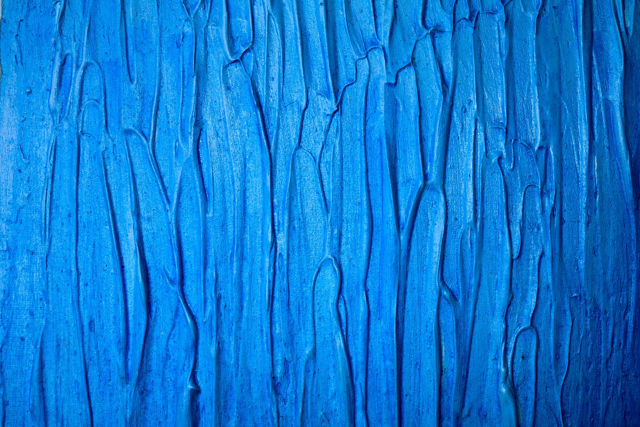
Incorporating Textures
When it comes to abstract art, texture is your secret weapon. It’s not just about the colors you choose or the shapes you create; textures can completely transform a piece, adding depth and intrigue that draws viewers in. Imagine running your fingers over a canvas and feeling the bumps, ridges, and grooves. That tactile experience can evoke emotions and create a connection with the artwork that flat surfaces simply can't achieve. So, how do you go about incorporating textures into your pieces? Let’s dive into some exciting techniques!
One of the easiest ways to add texture is through the use of mixed media. This involves combining various materials to create a layered effect. You can use items like fabric, paper, or even natural elements such as leaves and twigs. Not only does this method introduce different textures, but it also allows you to express your creativity in a more dynamic way. For instance, imagine a canvas where you’ve glued down pieces of burlap, then painted over them with vibrant colors. The result is a stunning interplay of rough and smooth surfaces that captivates the eye.
Another technique to consider is layering. By applying multiple layers of paint or other materials, you can create a sense of depth that invites viewers to explore your artwork. Start with a base layer, using a palette knife to spread paint thickly, then add subsequent layers with different colors and textures. This not only enhances the visual complexity but also adds a three-dimensional aspect to your work. Think of it like building a sandwich; each layer contributes to the overall flavor, making the experience richer and more satisfying.
To really make your textures pop, consider using tools such as sponges, brushes, or even your hands. Each tool can create different effects; for example, a sponge can give you a soft, dappled look, while a palette knife can create sharp, defined edges. Don’t be afraid to experiment! Just like a chef tries out new ingredients, you can mix and match tools to discover what works best for your artistic vision. The key is to keep the process playful and open-ended.
Finally, remember that the background of your artwork can also contribute to its texture. Instead of opting for a plain white canvas, consider using textured paper or even wood panels. These surfaces can provide an interesting foundation for your abstract art, enhancing the overall aesthetic. Additionally, you can apply different techniques to the background itself—like scraping, splattering, or even using a stencil—to create a unique backdrop for your main elements.
Incorporating textures into your abstract art is all about exploration and experimentation. Don't be afraid to step outside your comfort zone and try new materials and techniques. The more you play with textures, the more you’ll discover the endless possibilities they offer for enhancing your creative expression. So grab your supplies and start layering, mixing, and creating a tactile experience that’s uniquely yours!
- What materials can I use to add texture to my abstract art?
You can use a variety of materials such as fabric, paper, sand, or even natural elements like leaves and twigs. The key is to experiment with different combinations to see what works best for your vision.
- How do I create depth in my artwork?
Layering is essential for creating depth. Apply multiple layers of paint or mixed media, and consider using different tools to achieve various textures and effects.
- Can I use household items to create textures?
Absolutely! Items like sponges, plastic wrap, or even your fingers can create unique textures. Get creative and see what everyday objects can add to your artwork!
Using Mixed Media
When it comes to creating abstract art, mixed media opens up a world of possibilities that can elevate your work beyond traditional boundaries. Imagine combining paint with fabric, paper, or even found objects to create a piece that not only catches the eye but also tells a story. The beauty of mixed media lies in its versatility; it allows you to experiment with different textures, colors, and materials, resulting in a truly unique artistic expression.
To get started with mixed media, you'll want to gather an assortment of materials. Here’s a quick list of items you might consider incorporating into your artwork:
- Acrylic paints - These are fantastic for their quick drying time and vibrant colors.
- Textured papers - Think about using scrapbook paper, tissue paper, or even old book pages.
- Fabric scraps - Fabrics can add a tactile element that paint alone cannot achieve.
- Natural elements - Consider using leaves, twigs, or sand for an organic touch.
- Found objects - Items like buttons, bottle caps, or pieces of jewelry can add an unexpected twist.
Once you have your materials, it’s time to let your creativity flow. Start by laying down a base layer of paint on your canvas. This can be a solid color or a blend of colors that resonate with you. After your base is dry, start layering your mixed media elements. You might glue down pieces of paper or fabric, or even incorporate 3D elements like buttons or stones. The key is to allow each layer to dry before adding the next, which will help maintain the integrity of your work.
One of the most exciting aspects of mixed media is the opportunity for spontaneity. Don’t be afraid to let your instincts guide you. If something feels right, go for it! This approach can lead to surprising outcomes that you might not have planned. For instance, if you spill some paint or accidentally tear a piece of paper, think of it as a happy accident. Embrace these moments as they often lead to the most interesting parts of your art.
As you layer different materials, consider how they interact with one another. The contrast between smooth and rough textures can create a dynamic visual experience. You might also want to think about the color palette you’re using. A cohesive color scheme can tie your mixed media elements together, making your artwork feel more unified. Alternatively, a bold clash of colors can evoke strong emotions and draw the viewer in.
Finally, remember that mixed media art is all about self-expression. There are no strict rules, and the only limit is your imagination. So, gather your materials, let your creativity soar, and enjoy the process of creating something that is uniquely yours. Whether you’re a seasoned artist or just starting out, mixed media can be a fulfilling and exciting way to explore your artistic voice.
Q: What is mixed media art?
A: Mixed media art involves using multiple materials and techniques in a single artwork. This can include paint, paper, fabric, and found objects, among others.
Q: Do I need to be an experienced artist to try mixed media?
A: Not at all! Mixed media is perfect for artists of all skill levels. It's a great way to experiment and find your style.
Q: How do I choose materials for my mixed media project?
A: Start with what you have on hand and think about how different textures and colors can complement each other. Don’t be afraid to mix unexpected items!
Q: Can I use mixed media in other art forms?
A: Yes! Mixed media techniques can be applied to various forms of art, including collage, sculpture, and even digital art.

Creating Depth with Layers
When it comes to creating stunning abstract art, one of the most effective techniques is layering. This approach not only adds visual interest but also creates a sense of depth that can transform a flat canvas into a captivating piece of art. Think of layering like building a sandwich; each layer adds a different flavor and texture, making the final product much more satisfying. In abstract art, each layer can represent different emotions, thoughts, or experiences, allowing the viewer to engage with the piece on multiple levels.
To effectively create depth with layers, you can start by selecting a base layer that sets the tone for your artwork. This could be a bold color or a subtle wash that serves as the foundation. Once that’s dry, you can begin to add additional layers using various techniques such as glazing, pouring, or even collage. Each additional layer should contribute to the overall composition, whether by contrasting with the previous layer or by enhancing its colors and textures.
Here are some techniques you can explore to create depth:
- Glazing: This involves applying a thin, transparent layer of paint over a dried layer. It allows the colors underneath to shine through while subtly altering the overall tone.
- Collage: Incorporating materials like paper, fabric, or other found objects can create physical depth. These elements can add a tactile quality that invites viewers to not only look but also feel your art.
- Textured Mediums: Using mediums like modeling paste or gel can add a three-dimensional aspect to your painting. This can be especially effective when combined with traditional paint.
As you layer, don’t be afraid to experiment. Sometimes, a layer that seems out of place can become the focal point of your piece. The key is to let your intuition guide you. If a layer feels too heavy, you can always lighten it with a wash or scrape back some paint to reveal the layers underneath. This process of adding and subtracting can be incredibly rewarding, as it allows you to engage in a dialogue with your artwork.
In addition, consider the color and texture of each layer. Using contrasting colors can create a striking visual impact, while similar colors can help unify the piece. Think of how light interacts with surfaces; a matte layer next to a glossy one can create a stunning contrast that draws the eye. The interplay of different textures can also enhance the depth, creating shadows and highlights that make your artwork pop.
Finally, remember that layering is not just about the physical application of paint or materials; it’s also about the emotional layering of your experiences and thoughts. Each stroke of the brush is a reflection of your journey, and as you build up the layers, you are telling a story that is uniquely yours. So grab your brushes, let your creativity flow, and watch as your abstract art transforms into a multi-dimensional expression of who you are.
Q: How many layers should I use in my abstract art?
A: There’s no set number! It really depends on the effect you want to achieve. Some artists prefer a few thick layers, while others may use many thin layers to build depth.
Q: Can I use different types of paint for layering?
A: Absolutely! Mixing acrylics, oils, and even watercolors can create unique effects. Just be mindful of the drying times and how different paints interact with each other.
Q: What if I don't like a layer I've added?
A: Don’t worry! Art is about experimentation. You can always paint over it, scrape it off, or incorporate it into the next layer. Embrace the process!
Displaying Your Art
Once you’ve poured your heart and soul into creating your abstract masterpiece, the next exhilarating step is showcasing it in your home. After all, what’s the point of crafting something beautiful if it’s hidden away? The way you display your art can transform a simple piece into a stunning focal point that draws the eye and sparks conversation. So, let’s dive into some effective strategies for displaying your art that not only highlight its beauty but also enhance the overall vibe of your space.
First and foremost, consider the location of your artwork. Think about the walls in your home that could use a splash of color or a touch of creativity. The living room, hallway, or even a cozy nook can become a gallery of your own making. When selecting a spot, keep in mind the size and scale of your piece. A large canvas can dominate a small space, while smaller pieces might get lost on expansive walls. Pro tip: hang your art at eye level to create an inviting atmosphere. This makes it easier for guests to appreciate your work without straining their necks!
Next, let’s talk about framing. The right frame can elevate your artwork from ordinary to extraordinary. A well-chosen frame not only protects your art but also complements its style. For abstract pieces, consider using a simple, modern frame that doesn’t distract from the artwork itself. Alternatively, a vintage frame can add a charming contrast to contemporary styles. Don’t forget to experiment with different frame materials and colors to find the perfect match. You might even opt for a floating frame to give your piece a more modern and airy feel.
Another exciting option is to create a gallery wall. This approach allows you to showcase multiple pieces together, creating a dynamic visual experience. You can mix and match sizes, colors, and styles for an eclectic look or stick to a cohesive theme for a more unified appearance. To achieve this, lay your pieces out on the floor first to find the best arrangement before hanging them on the wall. This way, you can visualize how they’ll interact with one another and make adjustments as needed.
When it comes to hanging your art, consider the spacing between each piece. A good rule of thumb is to leave about 2-4 inches between frames for a clean look. If you’re hanging a series of smaller works, try to align them in a grid pattern or follow a linear path for a polished effect. If you want to create a more casual vibe, feel free to mix things up with an organic arrangement. Just remember, the goal is to create a harmonious display that reflects your personal style.
Lastly, don’t underestimate the power of lighting. Proper lighting can make all the difference in how your artwork is perceived. Natural light is fantastic, but it can fade colors over time, so consider using adjustable picture lights or track lighting to spotlight your favorite pieces. This not only enhances the colors and textures of your art but also creates a warm and inviting atmosphere in your home.
In summary, displaying your abstract art is an art in itself! By choosing the right location, framing, and arrangement, you can turn your home into a gallery that showcases your unique style. Remember, the aim is to create a space that resonates with you and invites others to appreciate the beauty of your artistic expressions. So, go ahead, unleash your creativity, and let your art shine!
Q: How do I choose the right spot for my artwork?
A: Look for walls that need a pop of color or creativity. Consider the size of the piece and hang it at eye level to create an inviting atmosphere.
Q: What type of frame should I use for my abstract art?
A: Choose a frame that complements your artwork without distracting from it. Modern frames work well for contemporary pieces, while vintage frames can add charm.
Q: How can I create a gallery wall?
A: Lay your pieces out on the floor to find the best arrangement before hanging them. Mix sizes and styles for an eclectic look or stick to a cohesive theme.
Q: What is the best way to light my artwork?
A: Use adjustable picture lights or track lighting to highlight your pieces. This enhances colors and textures while creating a warm atmosphere.
Frequently Asked Questions
- What materials do I need to start making abstract art?
To kick off your abstract art journey, you’ll need a few essential materials. Start with a canvas or thick paper, acrylic paints in various colors, brushes of different sizes, a palette for mixing, and some water for cleaning your brushes. If you want to get creative, consider adding items like sponges, palette knives, and even fabric or paper for mixed media effects!
- How do I choose the right colors for my artwork?
Choosing colors can feel overwhelming, but it’s all about understanding color theory! Begin by exploring warm and cool colors. Warm colors like reds and yellows can evoke energy, while cool colors like blues and greens can create a calming effect. Experiment with different combinations and don’t hesitate to create a color palette that resonates with your personal style.
- What techniques can I use to create unique abstract art?
There are so many exciting techniques to explore! You can try pouring paint for a fluid look, layering colors to build depth, or using different brush strokes for texture. Don’t be afraid to mix and match these methods to discover what works best for you. Remember, the beauty of abstract art is in its freedom and expression!
- How can I add texture to my abstract paintings?
Adding texture can truly elevate your artwork! You can use mixed media by incorporating materials like fabric, paper, or even natural elements. Techniques like layering paint, using a palette knife, or applying thick paint with a brush can also create interesting textures. The key is to experiment and see what feels right for your piece!
- What’s the best way to display my finished abstract art?
Displaying your art is just as important as creating it! Consider framing your artwork to give it a polished look, or hang it on a wall that complements its colors. You can also create a gallery wall by arranging multiple pieces together. Just remember to hang them at eye level for the best impact!


